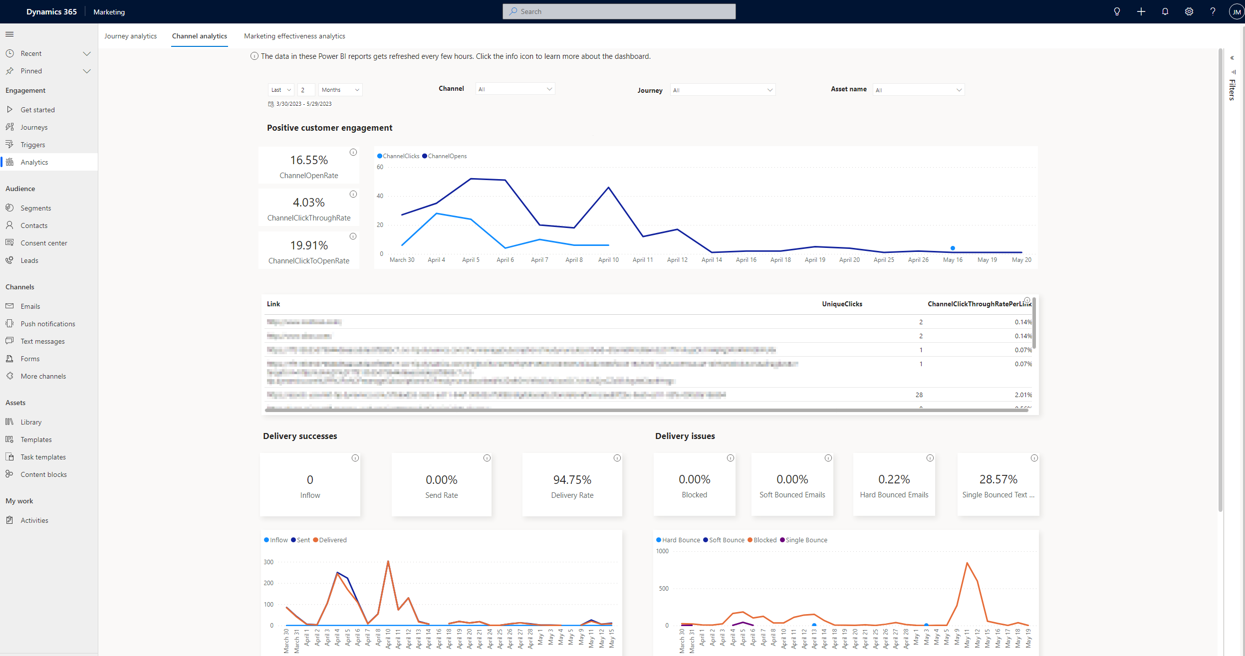
How to use aggregate channel analytics
The built-in aggregate channel analytics dashboard shows important metrics and insights about the delivery and engagement of your marketing assets at any level of aggregation. You can access insights across all journeys and channels as well as zoom in on a particular channel or message. This helps you stay on top of your marketing campaign effectiveness and track the performance of your marketing assets.
Note
Currently, only interaction data from real-time journeys is used to populate the aggregate channel analytics dashboards. Data from outbound marketing customer journeys is not used.
How to use the dashboard
The aggregate channel analytics dashboard allows you to assess important delivery and engagement metrics for your customer journeys, channels, and marketing assets. You can use the date, channel, journey, and “name” filters to learn about key delivery and engagement metrics at any level of aggregation. You can also use the charts in the dashboard to study metric trends over time and investigate any anomalies or spikes. The dashboard has four sections, each of which is described below.
Note
You can learn more about the insights terms (such as open rate, CTR, and click-to-open rate) mentioned below by referring to the Insights glossary article.
Positive customer engagement
This section highlights the open rate, click-through rate, and click-to-open rate for the selected marketing communications. The following key performance indicators (KPIs) are displayed in the report:
- ChannelOpenRate: The number of unique emails/push notifications opened divided by the total number of emails delivered and/or push notifications sent.
- ChannelClickThroughRate: The number of unique emails/text messages/push notifications with at least one link click divided by the total number of emails/text messages delivered and/or push notifications sent.
- ChannelClickToOpenRate: The number of unique emails/push notifications with at least one link click divided by the number of unique emails/push notifications opened.
The trend chart shows the number of opens and clicks over the selected time. Use this section to analyze the performance of all the links in your marketing communications. This will help you learn about the best and worst-performing links in your campaigns. If applicable, the call-to-action (CTA) or link text for each link is also showcased. For each link, the number of unique clicks for the link is highlighted along with the link’s click-through rate (number of unique clicks on a particular link divided by the number of emails/text messages delivered and/or push notifications sent containing that link) to depict its performance.
Opens aren't recorded for text messages, hence, the open rate and click-to-open rate metrics don't apply to text messages. Be mindful when text messages are selected in your filtering criteria, as the trend chart will potentially show clicks to be greater than opens since the text message opens aren't recorded.
Delivery successes
This section highlights the inflow, send rate, and delivery rate for the selected marketing communications. The following KPIs are displayed in the report:
- Inflow: The total number of emails/text messages/push notifications that were attempted to be sent.
- Send Rate: The number of emails/text messages/push notifications sent divided by the total inflow for the selected emails/text messages/push notifications.
- Delivery Rate: The number of emails/text messages delivered divided by the total number of emails/text messages sent.
The trend chart depicts the inflow and number of communications sent and delivered over the selected time. All sent push notifications are delivered, therefore, push notifications aren't included in the delivery rate computation and “delivered” metric in the trend chart.
Delivery issues
This section highlights the percentage of blocked communications, soft bounce, and hard bounce rate for emails as well as single bounce rate for text messages. The following KPIs are displayed in the report:
- Blocked: The number of emails/text messages/push notifications blocked divided by the total inflow for the selected emails/text messages/push notifications.
- Soft Bounced Emails: The number of soft bounced emails divided by the total number of emails sent.
- Hard Bounced Emails: The number of hard bounced emails divided by the total number of emails sent.
- Single Bounced Text Messages: The number of single bounced text messages divided by the total number of text messages sent.
The trend chart depicts the number of blocked communications, soft-bounced emails, hard-bounced emails, and single-bounced text messages. All sent push notifications are delivered, therefore, there's no bounce rate reported for push notifications.
Negative customer engagement
This section highlights the spam rate and unsubscribe rate for emails. The following KPIs are displayed in the report:
- Email Spam rate: The number of emails reported as spam divided by the total number of emails delivered.
- Email Unsubscribe Rate: The number of emails unsubscribed divided by the total number of emails delivered.
For text messages and push notifications, there's no signal to identify negative engagement, hence metrics in this section don't apply to such communications.
Note
Depending on your selection of filters, you might see some metrics show “N/A.” This is because such metrics are not applicable for some or all of the communications based on your selected filters. For example, Hard Bounce, Soft Bounce, Unsubscribe Rate, and Spam Rate apply only to emails. Select emails to show these KPIs.
Learn more
Here are some advanced resources for this topic:
