How to use aggregate cross-journey analytics
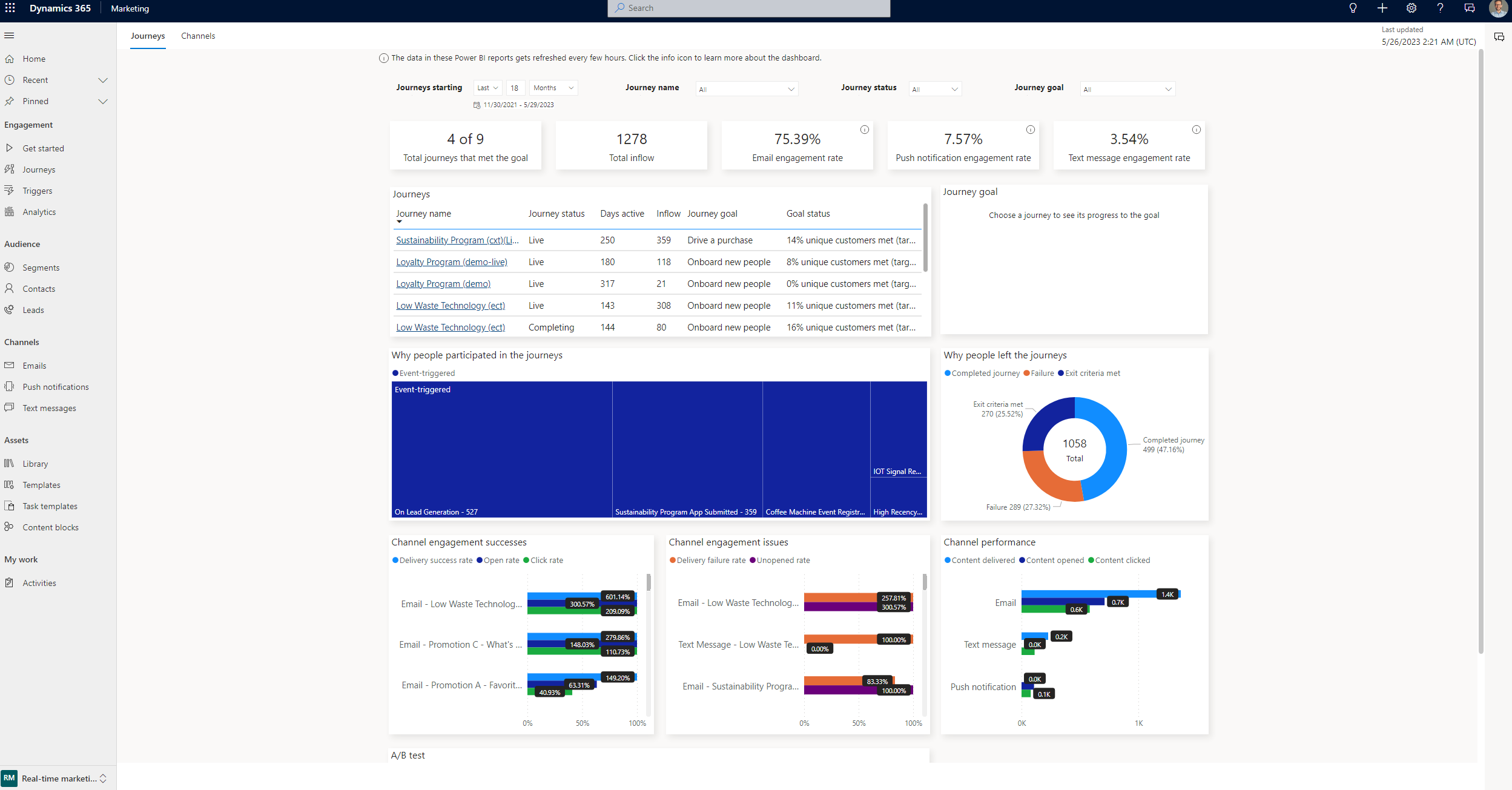
Aggregate cross-journey analytics allow you to analyze your orchestrated journeys and evaluate their performance. Cross-journey analytics address your reporting needs by providing a performance dashboard out of the box with beautiful Power BI visuals. Use the dashboard to enhance stakeholder presentations regarding your journey's performance.
The cross-journey analytics dashboard allows you to check in on the performance of all your orchestrated journeys in one place. This allows you to discontinue underperforming journeys early, or identify ways to optimize and increase a journey’s performance as it continues. Within the dashboard, there are widgets to:
- Give a journey overview to evaluate journey effectiveness against objectives.
- If a goal target has been set, you can view if the journey is on trend to achieve its goal.
- Identify possible friction points of engagement where customers are getting stalled.
- Identify the content pieces where customers are especially engaged, in order to recreate them.
- Check in on the experiments that have been run in a journey.
The following sections describe the widgets in greater depth.
Filters
You can filter the dashboard views based on the date, one or more journeys, journey status, or journey goal. Keep in mind that the dashboard displays journeys created within the period specified in the date filter.
KPI summary charts
KPI summary charts summarize the cross-journey key performance indicators for the specified time period. You can further filter the charts by journey name, journey status, or journey goal.
- Email engagement rate: The number of unique users that opened or clicked on the links divided by the total number of emails sent.
- Push notification engagement rate: The number of unique users that opened or clicked on the links divided by the total number of push notifications sent.
- Text message engagement rate: The number of unique users that opened or clicked on the links divided by the total number of text messages sent.
Overall effectiveness
The list of journeys provides you with key metrics for a clear overview of journeys. Fields such as Days active and Inflow help you understand if your journey is gaining or losing momentum. If your journey has a goal target set (for example, 10 percent), the target will be available in the table and represented on the journey goal chart to the right, showing its trend.
The journey list allows you to select and drill down into a specific journey to present a “single journey” analytical view. You can also select the journey name to go to the journey canvas to better understand the journey design and operational analytics in near real time.
Audience participation in journeys
You can review journey inflow and outflow in an aggregated view, or select an item to see specifics. The participation tree map titled Why people participated in the journeys gives you a clear indication of which segments or real-time events are triggering most of your audience to join the orchestrated journey. You can use the tree map to identify your most engaged segments and triggers to use them in future orchestrations.
The Why people left journeys pie chart helps you determine why individuals are exiting journeys. There are multiple reasons an individual could exit—for example, if they successfully completed the journey, or if they were part of a suppression segment, or if they ran into a problem. This can be beneficial for troubleshooting issues.
Channel engagement successes
This tile provides a ranking of content messages your audience responded best to. The evaluation is done for messages across all the channels (email, text messages, and push notifications) to provide a unified view highlighting engagement high points. Metrics like the Highest delivery rate, Opened rate, and Click through rate are used to create this ranking.
The channel engagement successes tile helps identify the content that is performing well, allowing you to reuse it in future orchestrations.
Channel engagement issues
Complementing the engagement successes tile is a report for messages that are possible friction points with a lower engagement rate across all channels (email, text messages, and push notifications). Here you are presented with messages that had the highest Delivery failure rate, Unopened rate, and Unsubscribe rate.
These statistics don't always mean that the journey containing the messages is doing poorly. Rather, the metrics indicate that the other messages in the journey may have performed better.
Channel performance
With more out-of-the-box channels available in Customer Insights - Journeys, you can compare channel performance across journeys. Use metrics like Content delivery rate, Open rate, and Click through rate to understand channel engagement with your audience. You can then leverage high-performing channels in new orchestrations, or make more use of underused channels to achieve higher audience participation.
Experimentation
Here, you can see an overview of all the experiments that have been run for the journey and the outcomes. Use this information to gain further insights into your audience preferences.
Learn more
Here are some advanced resources for this topic:
