Note
Access to this page requires authorization. You can try signing in or changing directories.
Access to this page requires authorization. You can try changing directories.
In this tutorial, you build a Power BI report from the predictions data you generated in Part 4: Perform batch scoring and save predictions to a lakehouse.
You'll learn how to:
- Create a semantic model from the predictions data
- Add new measures to the data from Power BI
- Create a Power BI report
- Add visualizations to the report
Prerequisites
Get a Microsoft Fabric subscription. Or, sign up for a free Microsoft Fabric trial.
Sign in to Microsoft Fabric.
Switch to Fabric by using the experience switcher on the lower-left side of your home page.

This is part 5 of 5 in the tutorial series. To complete this tutorial, first complete:
- Part 1: Ingest data into a Microsoft Fabric lakehouse using Apache Spark.
- Part 2: Explore and visualize data using Microsoft Fabric notebooks to learn more about the data.
- Part 3: Train and register machine learning models.
- Part 4: Perform batch scoring and save predictions to a lakehouse.
Create a semantic model
Create a new semantic model linked to the predictions data you produced in part 4:
On the left, select your workspace.
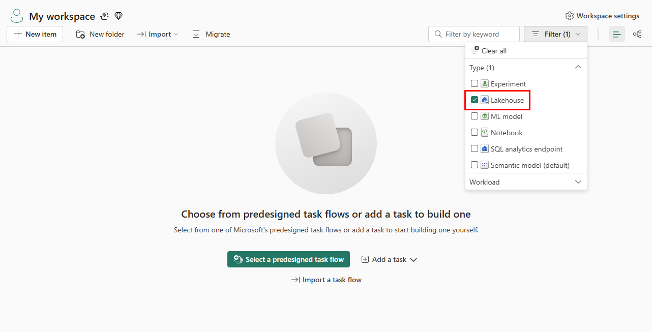
At the upper right, select Lakehouse as a filter, as shown in the following screenshot:
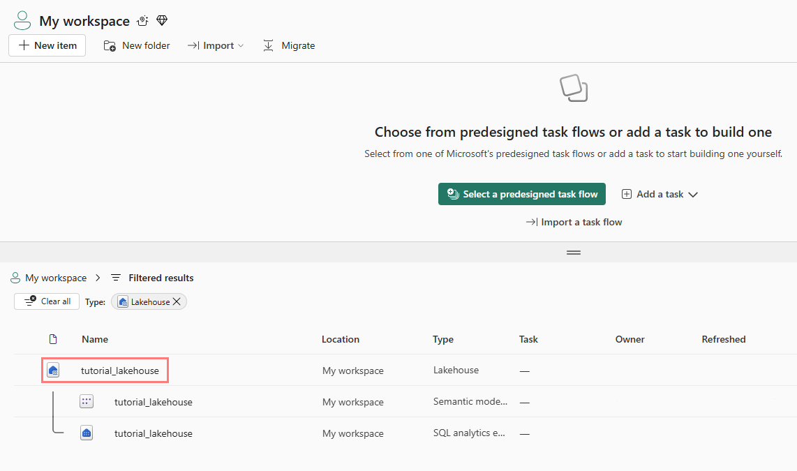
Select the lakehouse that you used in the previous parts of the tutorial series, as shown in the following screenshot:
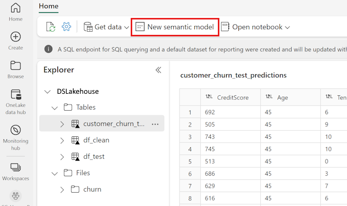
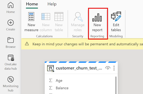
Select New semantic model in the top ribbon, as shown in the following screenshot:
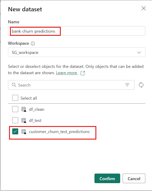
Give the semantic model a name - for example, "bank churn predictions." Then, select the customer_churn_test_predictions dataset as shown in the following screenshot:
Select Confirm.


Add new measures
Add some measures to the semantic model:
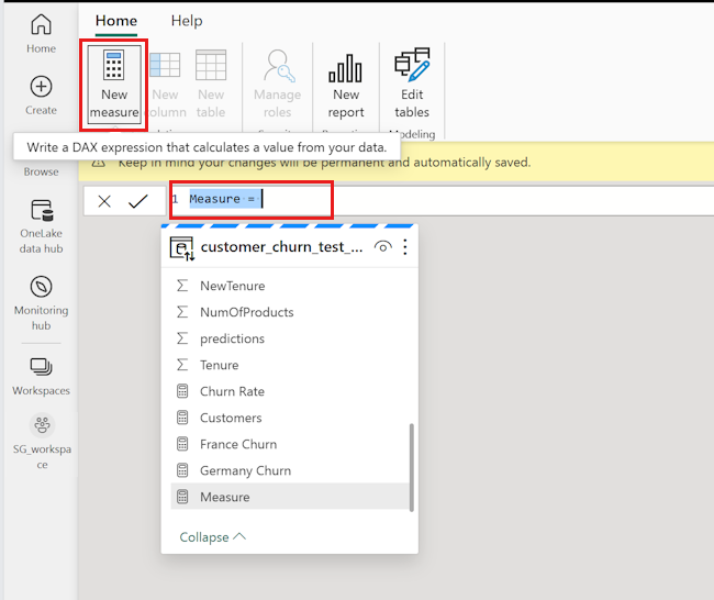
Add a new measure for the churn rate.
Select New measure in the top ribbon. This action adds a new item named Measure to the customer_churn_test_predictions dataset, and it opens a formula bar above the table, as shown in the following screenshot:
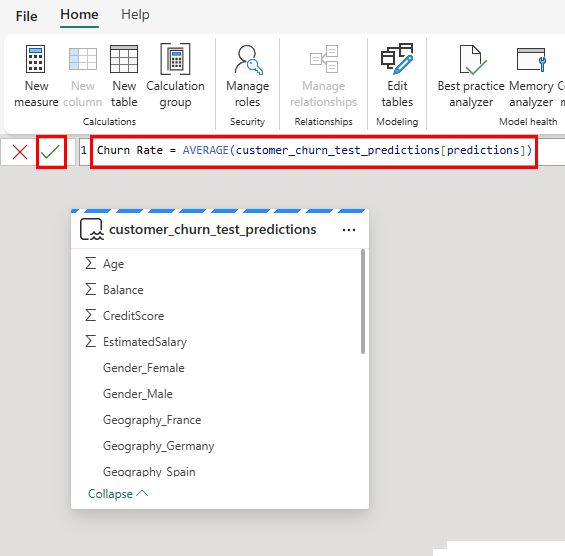
To determine the average predicted churn rate, replace
Measure =in the formula bar with the following code snippet:Churn Rate = AVERAGE(customer_churn_test_predictions[predictions])To apply the formula, select the check mark in the formula bar, as shown in the following screenshot:
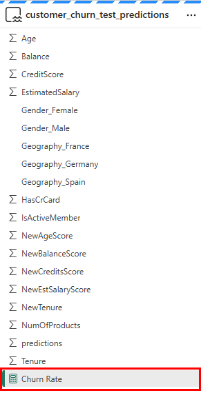
The new measure appears in the data table, as shown in the following screenshot:
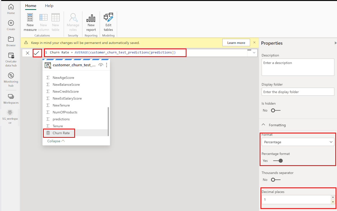
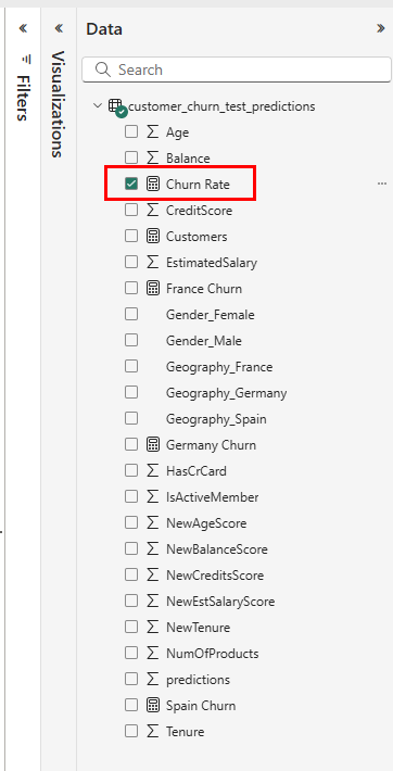
 The calculator icon indicates that it was created as a measure. Select the Churn Rate measure in the data table. Next, make the following selections, as shown in the following screenshot:
Change the format from General to Percentage in the Properties panel.
Scroll down in the Properties panel to change the Decimal places to 1.
Add a new measure that counts the total number of bank customers. The other new measures need it.
Select New measure in the top ribbon to add a new item named Measure to the
customer_churn_test_predictionsdataset. This action opens a formula bar above the table.Each prediction represents one customer. To determine the total number of customers, replace
Measure =in the formula bar with:Customers = COUNT(customer_churn_test_predictions[predictions])To apply the formula, select the check mark in the formula bar.
Add the churn rate for Germany.
Select New measure in the top ribbon to add a new item named Measure to the
customer_churn_test_predictionsdataset. This action opens a formula bar over the table.To determine the churn rate for Germany, replace
Measure =in the formula bar with:Germany Churn = CALCULATE(AVERAGE(customer_churn_test_predictions[predictions]),FILTER(customer_churn_test_predictions, customer_churn_test_predictions[Geography_Germany] = TRUE()))This statement extracts those rows that have Germany as their geography (Geography_Germany equals one).
To apply the formula, select the check mark in the formula bar.
Repeat the previous step to add the churn rates for France and Spain.
Spain's churn rate:
Spain Churn = CALCULATE(AVERAGE(customer_churn_test_predictions[predictions]),FILTER(customer_churn_test_predictions, customer_churn_test_predictions[Geography_Spain] = TRUE()))France's churn rate:
France Churn = CALCULATE(AVERAGE(customer_churn_test_predictions[predictions]),FILTER(customer_churn_test_predictions, customer_churn_test_predictions[Geography_France] = TRUE()))


Create a new report
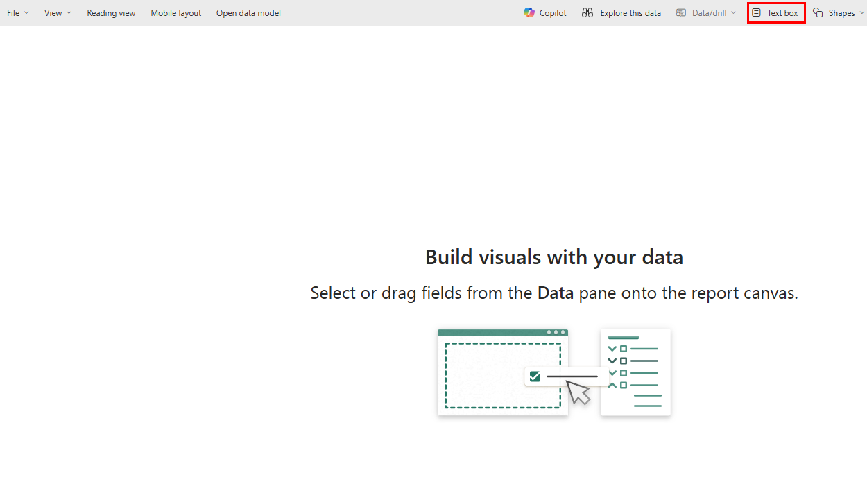
Once you complete all of the operations described earlier, select Create new report in the top ribbon File option list to open the Power BI report authoring page, as shown in the following screenshot:
The report page appears in a new browser tab. Add these visuals to the report:
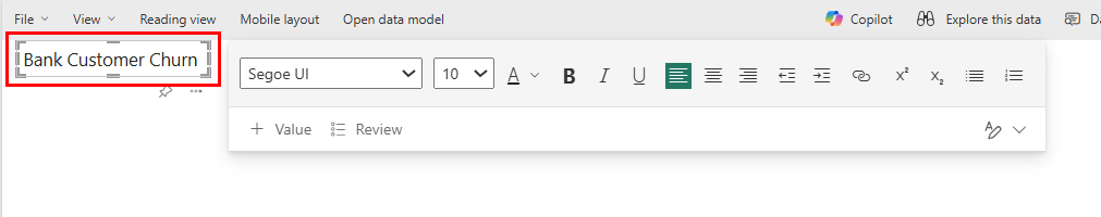
Select the text box in the top ribbon, as shown in the following screenshot:
Enter a title for the report - for example, "Bank Customer Churn" as shown in the following screenshot:
Change the font size and background color in the Format panel. Adjust the font size and color by selecting the text and using the format bar.
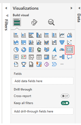
In the Visualizations panel, select the Card icon, as shown in the following screenshot:
At the Data pane, select Churn Rate, as shown in the following screenshot:
Change the font size and background color in the Format panel, as shown in the following screenshot:
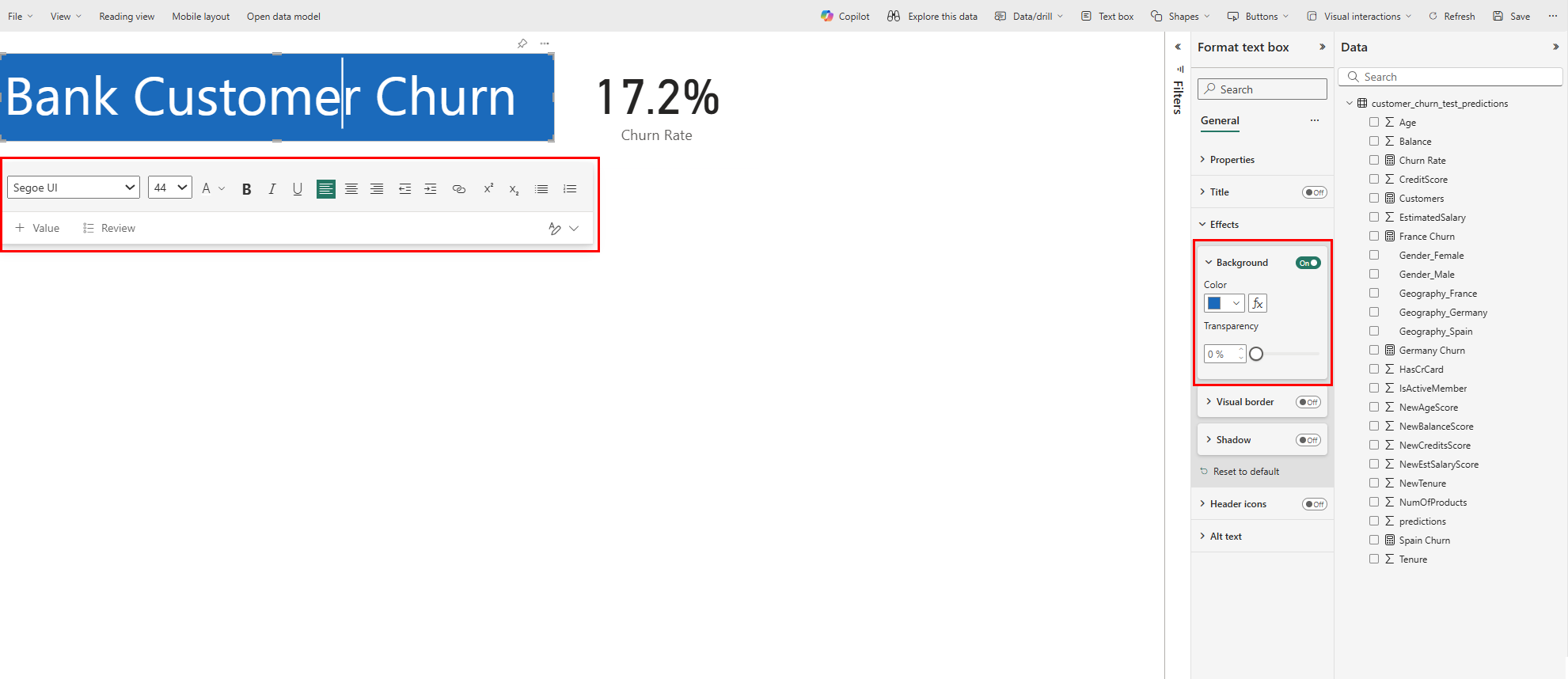
Drag the Churn Rate card to the top right of the report, as shown in the following screenshot:

In the Visualizations panel, select the Line and stacked column chart, as shown in the following screenshot:
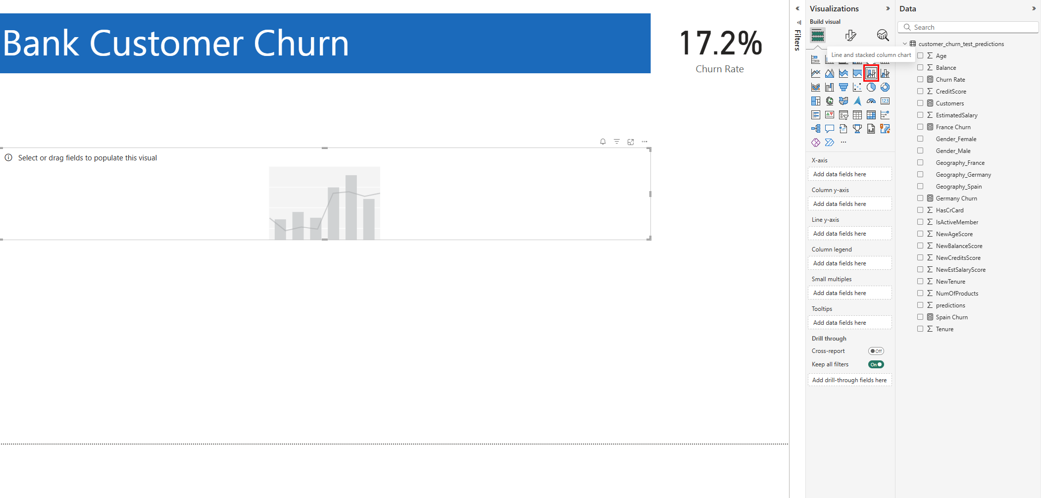
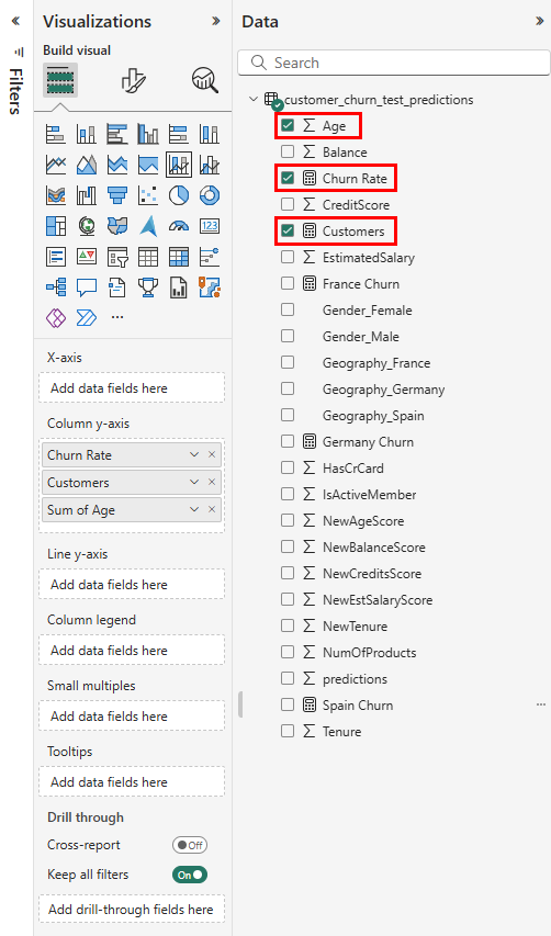
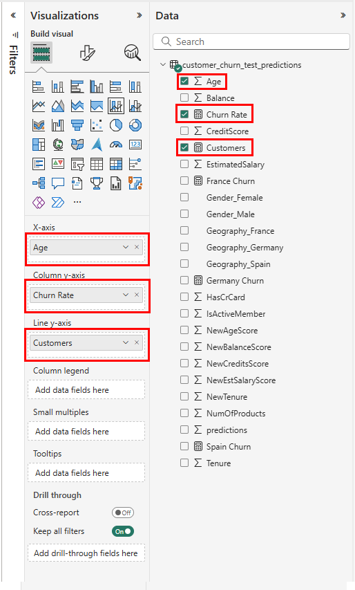
The chart shows on the report. In the Data pane, select
- Age
- Churn Rate
- Customers
as shown in the following screenshot:
Configure the Line and stacked column chart, as shown in the following screenshot.
- Drag Age from the Data pane to the X-axis field in the Visualizations pane
- Drag Customers from the Data pane to the Line y-axis field in the Visualizations pane
- Drag Churn rate from the Data pane to the Column y-axis field in the Visualizations pane
Ensure that the Column y-axis field has only one instance of Churn rate. Delete everything else from this field.
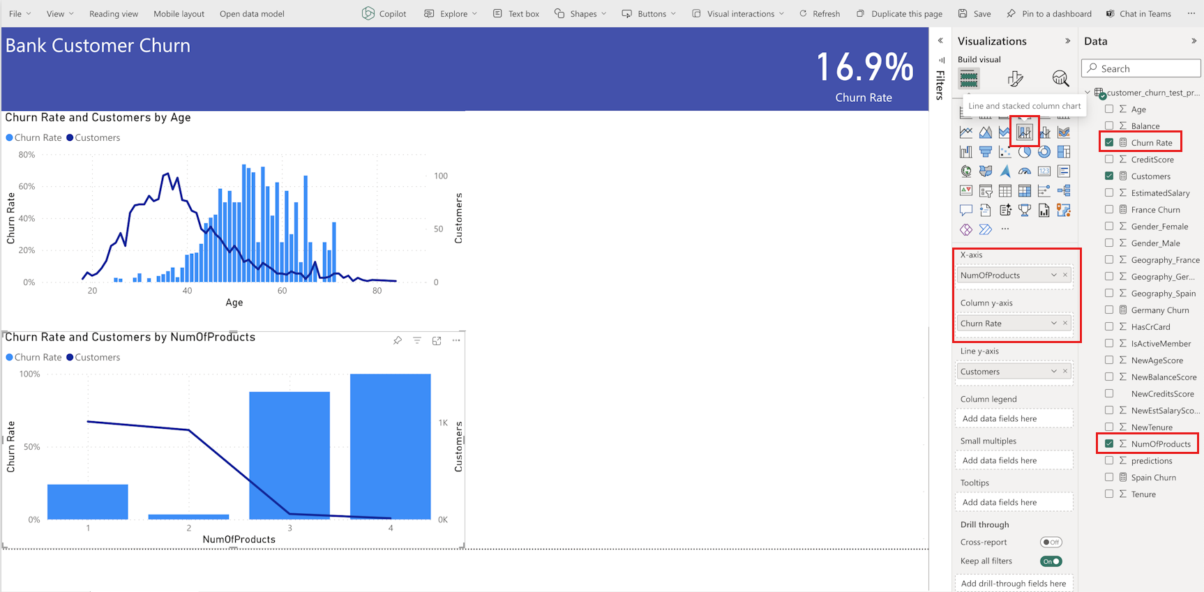
In the Visualizations panel, select the Line and stacked column chart icon. With steps similar to the earlier Line and stacked column chart configuration, select NumOfProducts for x-axis, Churn Rate for column y-axis, and Customers for the line y-axis, as shown in the following screenshot:
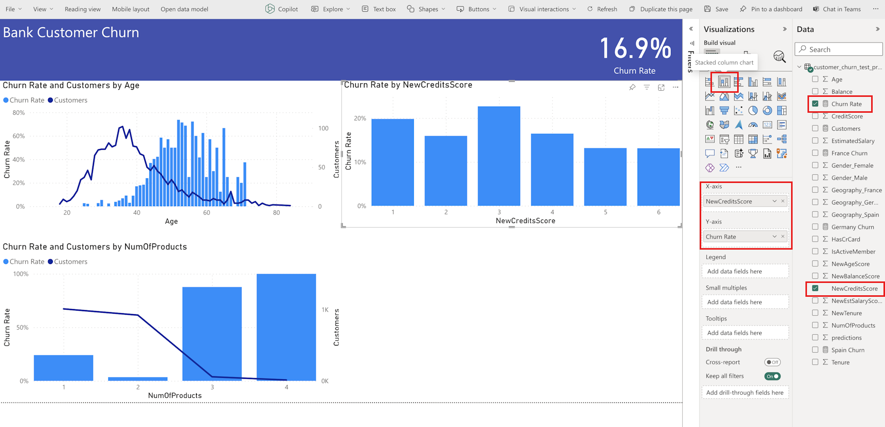
In the Visualizations panel, move the right sides of the two charts to the left to make room for two more charts. Then, select the Stacked column chart icon. Select NewCreditsScore for x-axis and Churn Rate for y-axis as shown in the following screenshot:
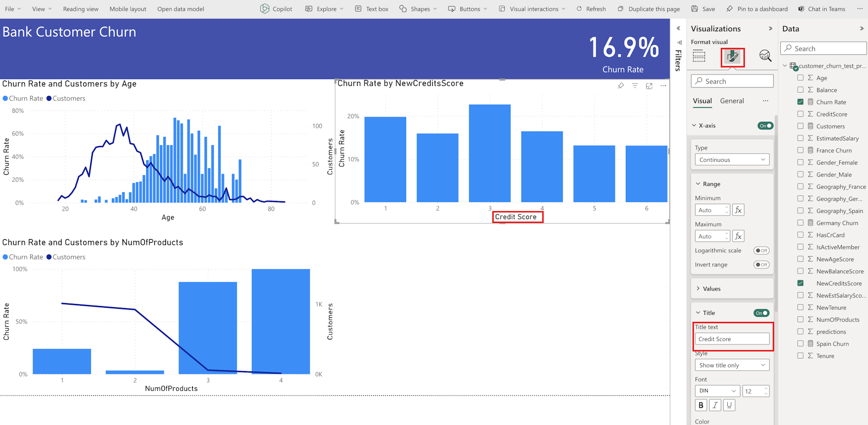
Change the title "NewCreditsScore" to "Credit Score" in the Format panel, as shown in the following screenshot. You might need to expand the x-axis size of the chart for this step.
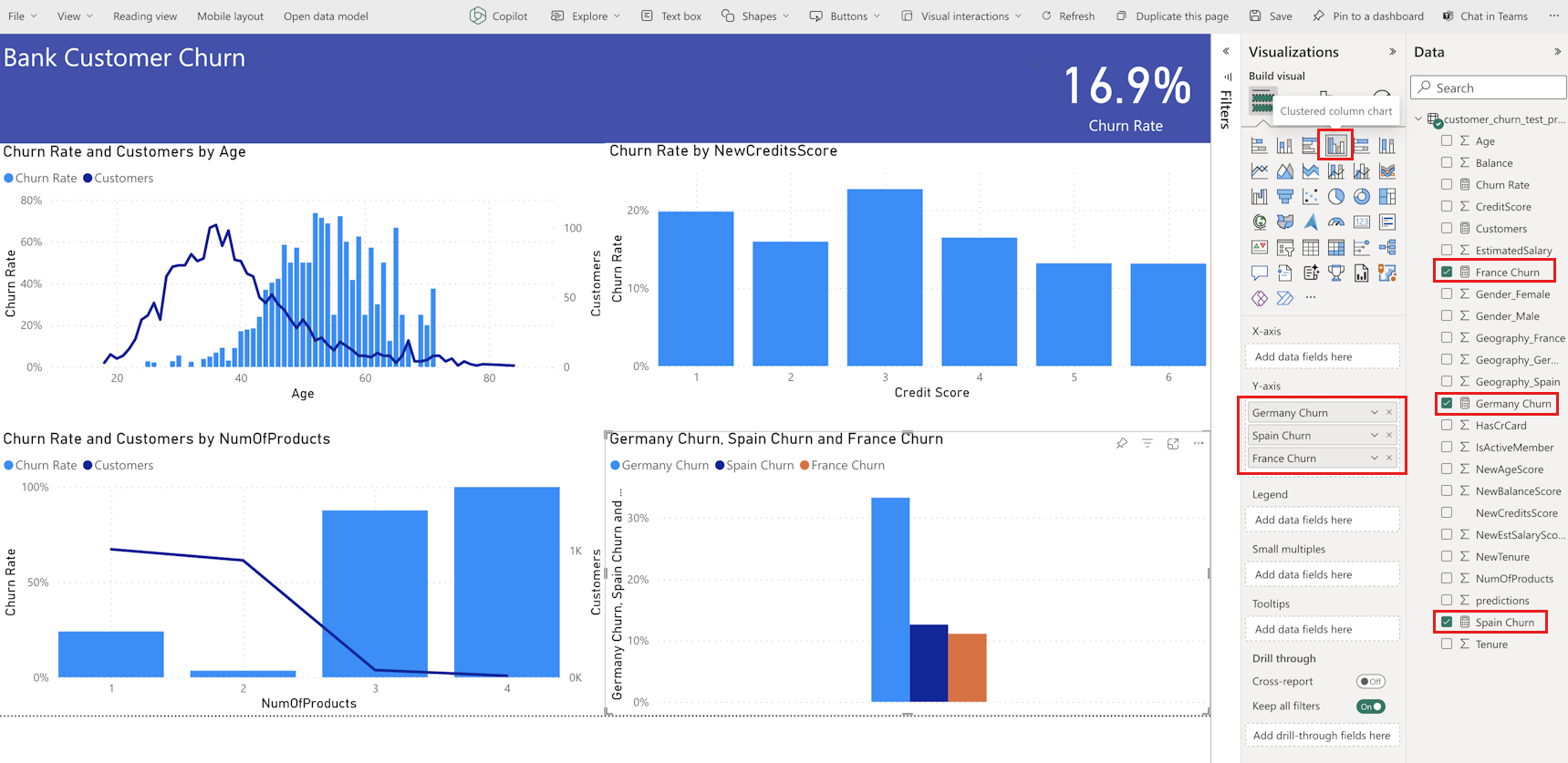
In the Visualizations panel, select the Clustered column chart card. Select Germany Churn, Spain Churn, France Churn in that order for the y-axis, as shown in the following screenshot. Resize the individual report charts as needed.


Note
This tutorial describes how you might analyze the saved prediction results in Power BI. However, based on your subject matter expertise, a real customer churn use-case might need a more detailed plan about the specific visualizations your report requires. If your business analytics team, and firm, have established standardized metrics, those metrics should also become part of the plan.
The Power BI report shows that:
- Bank customers who use more than two of the bank products have a higher churn rate, although few customers had more than two products. The bank should collect more data, and also investigate other features that correlate with more products (review the plot in the bottom left panel).
- Bank customers in Germany have a higher churn rate compared to customers in France and Spain (review the plot in the bottom right panel). These churn rates suggest that an investigation about the factors that encouraged customers to leave could become helpful.
- There are more middle aged customers (between 25-45), and customers between 45-60 tend to exit more.
- Finally, customers with lower credit scores would most likely leave the bank for other financial institutions. The bank should look for ways to encourage customers with lower credit scores and account balances to stay with the bank.
Next step
This completes the five part tutorial series. See other end-to-end sample tutorials: