Note
Access to this page requires authorization. You can try signing in or changing directories.
Access to this page requires authorization. You can try changing directories.
Fluent UI Web Components provides first-class support for accessibility including built in support for Windows High Contrast mode.
Styling components using forced-colors
High contrast mode uses the CSS media feature, forced-colors. When forced-colors is set to active, the user agent will apply a limited color palette to the component.
Simple forced-color example
@media (forced-colors: active) {
  :host {
    background: ButtonFace;
  }
}
Fluent UI Web Components implements FAST's forcedColorsStylesheetBehavior utility function that is used to construct forced-colors in a stylesheet. This function is passed to the withBehavior function from the css tagged template object.
Note
The reason for this behavior is to avoid the runtime cost of applying forced-color style rules when the UA does not match the forced-colors @media query. Fluent UI Web Components exposes a behavior that conditionally adds and removes stylesheets based on this media query, so forced-colors' stylesheets can then be conditionally applied where necessary.
Forced-color example
export const ComponentStyles = css`
  /* ... */
`.withBehaviors(
  forcedColorsStylesheetBehavior(
    css`
      :host {
        background: ButtonFace;
      }
    `,
  ),
);
System Color Keyword
In forced-colors mode, the colors on the component are reduced to a limited color palette chosen by the user. The System Color keywords defined by the CSS Color Module Level 4 specification expose these user-chosen colors.
Fluent UI Web Components (via FAST components) provides a SystemColors enum to use when setting the color value keywords in a forced-colors stylesheet.
System color example
export const ComponentStyles = css`
  /* ... */
`.withBehaviors(
  forcedColorsStylesheetBehavior(
    css`
      :host {
        background: ${SystemColors.ButtonFace};
      }
    `,
  ),
);
Forced colors and Windows High Contrast themes
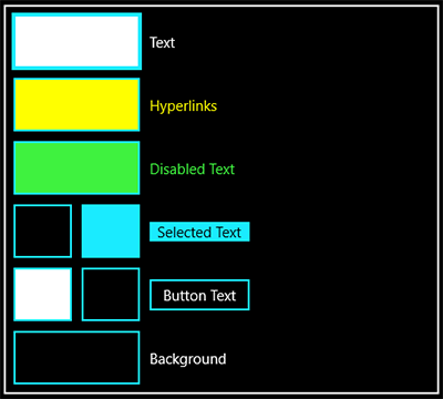
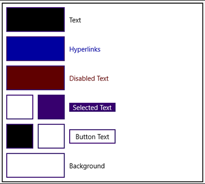
forced-colors works with Windows high contrast mode in Windows, located in Ease of Access within Settings. There are two default themes to test high contrast, High Contrast Black and High Contrast White.


Here is a 1:1 map between the forced-colors keywords and Windows high contrast resource names.
| forced-colors | Windows |
|---|---|
CanvasText |
Text |
LinkText |
Hyperlinks |
GrayText |
Disabled Text |
HighlightText Highlight |
Selected Text |
ButtonText ButtonFace |
Button Text |
Canvas |
Background |
Quick demo
Here is a simple example of adding high contrast to style an accent button. It has selectors for rest, active, hover, focus, and disabled. Note: the base styles shown in the following images use the FAST coloring, but High Contrast for Fluent UI is the same.

export const AccentButtonStyles = css`
  :host([appearance='accent']) {
    background: ${accentFillRest};
    color: ${foregroundOnAccentRest};
  }
  :host([appearance='accent']:hover) {
    background: ${accentFillHover};
  }
  :host([appearance='accent']:active) .control:active {
    background: ${accentFillActive};
  }
  :host([appearance="accent"]) .control:${focusVisible} {
    box-shadow: 0 0 0 calc(${focusStrokeWidth} * 1px) inset ${focusStrokeInner};
  }
  :host([appearance='accent'][disabled]) {
    opacity: ${disabledOpacity};
    background: ${accentFillRest};
  }
`;
When high contrast is enabled, the system will try to apply the correct color. In the case of this accent button, the system is missing a few things. We do not have a background, rest and hover states are the same, focus is not following the button's focus design, and the disabled state is too dim.

To fix this, we will pass a forcedColorsStylesheetBehavior object to withBehaviors, using similar selectors, and setting property values with the SystemColors keyword.
export const AccentButtonStyles = css`
  /* ... */
`.withBehaviors(
  forcedColorsStylesheetBehavior(
    css`
      :host([appearance='accent']) .control {
        forced-color-adjust: none;
        background: ${SystemColors.Highlight};
        color: ${SystemColors.HighlightText};
      }
      :host([appearance='accent']) .control:hover,
      :host([appearance='accent']:active) .control:active {
        background: ${SystemColors.HighlightText};
        border-color: ${SystemColors.Highlight};
        color: ${SystemColors.Highlight};
      }
      :host([appearance="accent"]) .control:${focusVisible} {
        border-color: ${SystemColors.ButtonText};
        box-shadow: 0 0 0 2px ${SystemColors.HighlightText} inset;
      }
      :host([appearance='accent'][disabled]),
      :host([appearance='accent'][disabled]) .control,
      :host([appearance='accent'][disabled]) .control:hover {
        background: ${SystemColors.ButtonFace};
        border-color: ${SystemColors.GrayText};
        color: ${SystemColors.GrayText};
        opacity: 1;
      }
    `,
  ),
);
After adding forced-colors and applying SystemColors keywords, the accent button now uses Highlight as a background for its rest state. On the hover and active states, the background and color from the rest state are swapped. A double border treatment is applied when in the focus state, and the disabled has opacity set to 1 and uses the disabled color, GrayText, for color on the border and content.

Note
forced-color-adjust, controls whether the UA system theme color override, should be applied to an element and its descendants.
The example is set to none, because we are overriding to remove the backplate on the text content in the control, that the UA sets on text elements.
Further resources
Color contrast comparison chart
To help determine whether a pair of high contrast colors will meet a color luminosity contrast ratio of at least 10:1, this table uses the high contrast theme color resource names you see in Windows Ease of Access.
How to read this table:
- YES - indicates that it is safe to assume this pair of colors will meet high contrast requirements, even in custom themes.
YES*- indicates that this specific pair of colors meets the high contrast requirements in both High Contrast Black and High Contrast White themes.- NO - indicates that you should never use this pair of colors as they do not meet high contrast requirements in High Contrast Black and High Contrast White themes.
| Text | Hyperlink | Disabled Text | Selected Text (Foreground) | Selected Text (Background) | Button Text (Foreground) | Button Text (Background) | Background | |
|---|---|---|---|---|---|---|---|---|
| Text | NO | NO | NO | NO | NO | NO | YES | YES |
| Hyperlink | NO | NO | NO | YES* |
NO | NO | YES* |
YES |
| Disabled Text | NO | NO | NO | YES* |
NO | NO | YES | YES |
| Selected Text (Foreground) | NO | YES* |
YES* |
NO | YES | YES* |
NO | NO |
| Selected Text (Background) | NO | NO | NO | YES | NO | NO | YES* |
YES* |
| Button Text (Foreground) | NO | NO | NO | YES* |
NO | NO | YES | YES |
| Button Text (Background) | YES | YES* |
YES | NO | YES* |
YES | NO | NO |
| Background | YES | YES | YES | NO | YES* |
YES | NO | NO |
Microsoft Edge blog
Microsoft Edge blog has excellent and in-depth information on styling for Windows high contrast using forced-colors. Styling for Windows high contrast with new standards for forced colors