Note
Access to this page requires authorization. You can try signing in or changing directories.
Access to this page requires authorization. You can try changing directories.
UI Scaling
One set of widget content is recommended when planning across both modes. When the widget is in Compact mode, content should be displayed at a larger scale than Desktop mode.

Handling Input
Multiple input methods are supported in Game Bar. The player experience should be continuous per input method and allow for players to use a hybrid combination of input methods at any time and account for:
- Gamepad
- Mouse & keyboard
- Keyboard only
- Touch
Each component should have built in states for all inputs. Example states include:
| Button State | Treatment | Example |
|---|---|---|
| Rest | 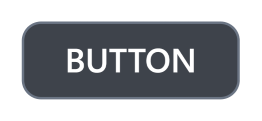 |
|
| Hover | Ex: 10% lighter than rest backplate color | 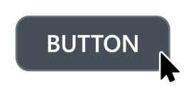 |
| Press | Ex: 10% darker than rest backlpate color |  |
| Focus only | Rest + stroke | 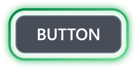 |
| Focus only press | Press + stroke | |
| Focus ad hover | Hover + stroke |  |
| Focus and press | Press + stroke | 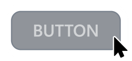 |
| Inactive | 50% darker text and backplate color |  |
Planning for gamepad input
This document refers to the Xbox controller when suggesting available buttons for accelerators. There may be different available buttons for different devices. Additional actions outside of core navigation buttons should be considered with a variety of scenarios in mind, for example when playing a game from a docked handheld device with a 2nd controller.

Core Game Bar and widget content navigation
These buttons are shared across Game Bar for default navigation:
| Icon | Button | Action |
|---|---|---|
 |
Directional pad (D-pad) | Up, down, left, right movement |
 |
Left stick | Up, down, left, right movement |
 |
A button | Select |
 |
B button | Back/Close |
Available accelerators for widget content
These buttons are available for contextual actions. It is recommended to use these buttons as faster ways to accomplish a task faster than navigating with D-pad A, or B.
| Icon | Button | Action |
|---|---|---|
 |
X button | Accelerator action 1 |
 |
Y button | Search/Accelerator action 2 |
 |
Menu | Contextual menu 1 |
 |
View | Contextual menu 2 |
  |
Right and Left triggers | Scroll up and down / zoom in and out |
Reserved buttons
These buttons are reserved for navigating between widgets within Game Bar.
| Icon | Button | Action |
|---|---|---|
  |
Right and Left bumpers | Accelerator for navigating widgets |
Focus

Indicator
The focus visual is the border around the UI element that currently has focus. This helps orient the user so that they can easily navigate your UI without getting lost.
It should always be clearly visible on-screen and move predictably around the XY axis.
A focus treatment is built-in to XAML controls and can be explored further in our documentation.
Behavior
Place the focus on a UI element that makes sense as the first element on which the user would take action. For example, a photo app may place focus on the first item in the gallery, and a music app navigated to a detailed view of a song might place focus on the play button for ease of playing music.