Note
Access to this page requires authorization. You can try signing in or changing directories.
Access to this page requires authorization. You can try changing directories.
You can provide custom implementations to speech-enable controls that Dragon Copilot SDK for JavaScript doesn't support natively.
To do this, implement a custom control type and pass it to the Dragon Copilot SDK.
The custom control API
The main API consists of the following parts:
CustomControlInitializer- the main implementation. This is the function where you add the logic to speech-enable your control using theCustomControl controlandHTMLElement elementparameters.Property Type Description control.newLineString Represents a line break in the control's text. control.paragraphString Represents a paragraph break in the control's text. control.isMultilineBoolean Indicates if the control is multiline capable or not. control.updateFunction Use this to provide the latest state of the HTMLElement element, and synchronize changes to the HTMLElement with the custom control. Make sure you add event listeners for text, selection, and focus changes of theHTMLElement element, so that you can provide those changes using this function.control.capabilitiesObject Indicate if the custom control supports Dragon Copilot features. Available keys/values: undoRedo:true/false- Indicates if undo/redo functionality is available in the custom control.control.handleFunction A higher-order function which accepts a separate callback for the following commands: "text"- replace text at a given selection."selection"- set selection."focus"- focus or defocus the given element."undo"- forwards the undo voice command to the custom control."redo"- forwards the redo voice command to the custom control.
The registered callbacks are invoked after dictation. In these callbacks, you need to synchronize the provided values with theHTMLElement element.CustomControlCollection- use this to inject the differentCustomControlInitializerfunctions. This is a keyed collection (object literal syntax) where each key is a string identifier for a specificCustomControlInitializerfunction.data-dragon-custom-control-typeHTML attribute - specify this in the DOM markup as an attribute of the element. Its value must match the key of the desiredCustomControlInitializerin theCustomControlCollection.
Create a new custom control
Prerequisites
You've speech-enabled your app.
Procedure
Add the
data-dragon-custom-control-typeattribute to the HTML element, with a value you'll use as a key for the custom control implementation.<input type="text" {...props} data-dragon-custom-control-type="customInput" />Implement your custom logic in a
CustomControlInitializerfunction.export const customInputInitializer: CustomControlInitializer = function (element, control) { if (!(element instanceof HTMLInputElement)) { throw new Error("Element must be an input"); } // configure the custom control control.newline = "\n"; control.paragraph = "\n\n"; control.isMultiline = false; const notifyCustomControl = () => { control.update({ text: element.value, selection: { start: element.selectionStart ?? 0, end: element.selectionEnd ?? 0, }, focus: element === element.ownerDocument.activeElement, }); }; // signal initial state notifyCustomControl(); // changes coming as a result of dictation control.handle("text", ({ value, start, length }) => { element.value = element.value.slice(0, start) + value + element.value.slice(start + length); // setting the value does not always trigger an input or change event, so let's do it manually element.dispatchEvent(new Event("change", { bubbles: true })); }); control.handle("selection", ({ start, end }) => { element.setSelectionRange(start, end); }); control.handle("focus", focus => { if (focus) { element.focus(); } else { element.blur(); } }); // changes coming from the html element element.addEventListener("input", notifyCustomControl); element.addEventListener("change", notifyCustomControl); element.addEventListener("select", notifyCustomControl); element.addEventListener("focusin", notifyCustomControl); element.addEventListener("focusout", notifyCustomControl); return function () { element.removeEventListener("input", notifyCustomControl); element.removeEventListener("change", notifyCustomControl); element.removeEventListener("select", notifyCustomControl); element.removeEventListener("focusin", notifyCustomControl); element.removeEventListener("focusout", notifyCustomControl); }; };Provide the value of the
data-dragon-custom-control-typeattribute with the correspondingCustomControlInitializerfunction to the Dragon Copilot SDK.// create a CustomControlCollection const customControls = { customInput: customInputInitializer } as const satisfies CustomControlCollection; // provide the collection when initializing BrowserSDK DragonCopilotSDK.dragon.initialize({ ... // Other initialization parameters customControlOptions: { webCustomControlTypes: customControls, } });
Sequence diagrams
User replaces text by dictation
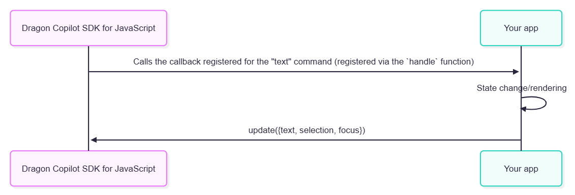
set-selection and set-focus work the same way, by calling the corresponding callback registered using the handle function.
User replaces text by typing
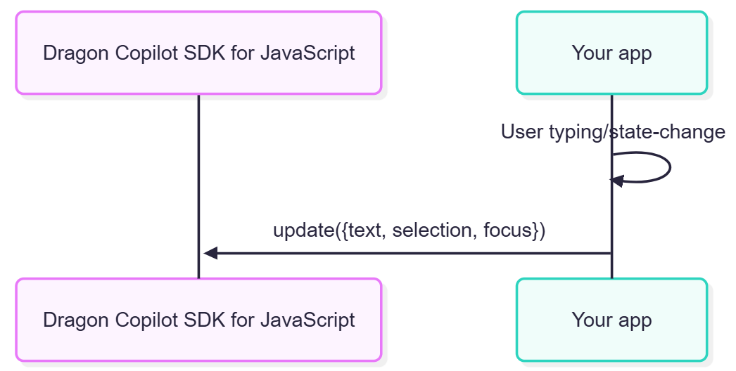
update() always takes text, selection and focus into account; see the code sample above.