Accounts Module References
This guide contains a description of the content featured in all components and recommended sizes for various layouts.
Below you will find descriptions of the main functionality for a given component. For all components, if a strong match is not found for a given set of query parameters, the user will land on a search results page (the matching page) where they can further refine their search or enter new search terms. After a match is selected, the UI will display the component requested.
Note
Due to limitations of the content width displayed here, some recommended sizes are wider than the width allowed on this page. Screenshots larger than the allowed width are presented but scaled down in size, though the aspect ratio remains consistent.
Recommended Sizes
Inline Mode
| Module | 1-Column Thumbnail | 2-Column Thumbnail | 1-Column Small | 2-Column Small |
|---|---|---|---|---|
| Top Card | 300 x 265 px | |||
| Recommended Leads [Deprecated] | 300 x 230 px | 625 x 230 px | ||
| Connections | 300 x 230 px | 625 x 230 px | ||
| News | 300 x 155 px | 625 x 155 px |
Important
Recommended sizing has been updated for classic mode. Find People is not supported in Inline mode and should only be implemented in Classic mode.
Classic Mode
Modules presented in classic mode are responsive and can be best viewed at the following sizes:
| Width & Height | 1-Column Small | 1-Column Medium | 1-Column Large | 2-Column Medium | 3-Column Medium |
|---|---|---|---|---|---|
| Min Width | 380 px | Not Supported | 380 px | 944 px | 1010 px |
| Max Width | 480 px | Not Supported | 944 px | 1010 px | 1300 px |
| Height | 405 px | Not Supported | 870 px | 610 px | 610 px |
Top Card
From the Top Card, users can save an account, view the account in Sales Navigator, and view the company's employees in Sales Navigator.
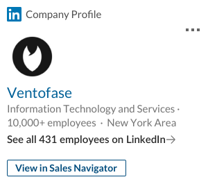
Top Card, 1-Column Small, Inline
Connections
The Connections component presents a list of the user's current 1st and 2nd degree connections at the selected company. This component enables a sales professional to identify valuable connections within their network who may be able to help them reach potential leads within the company.
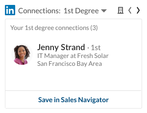
Connections, 1-Column Small, Inline
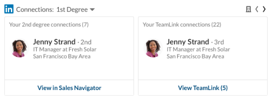
Connections, 2-Column Small, Inline
News
The News component allows sales professionals to stay up-to-date on a company's developments by offering a list of shares published on the company's page.
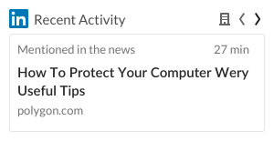
News, 1-Column Thumbnail, Inline

News, 2-Column Thumbnail, Inline
Find People
Note
Module parameter for the Find People features is FindPeople
Find People allows a user to find people based on personas.
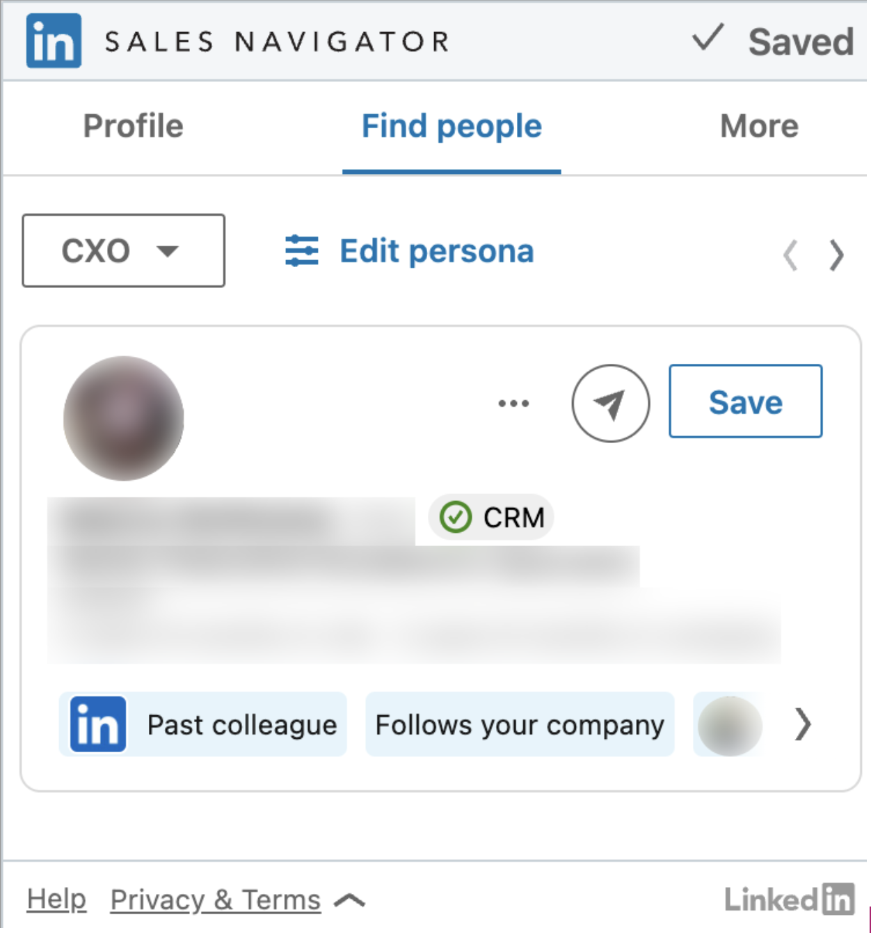
Find People, 1-Column Small, Classic
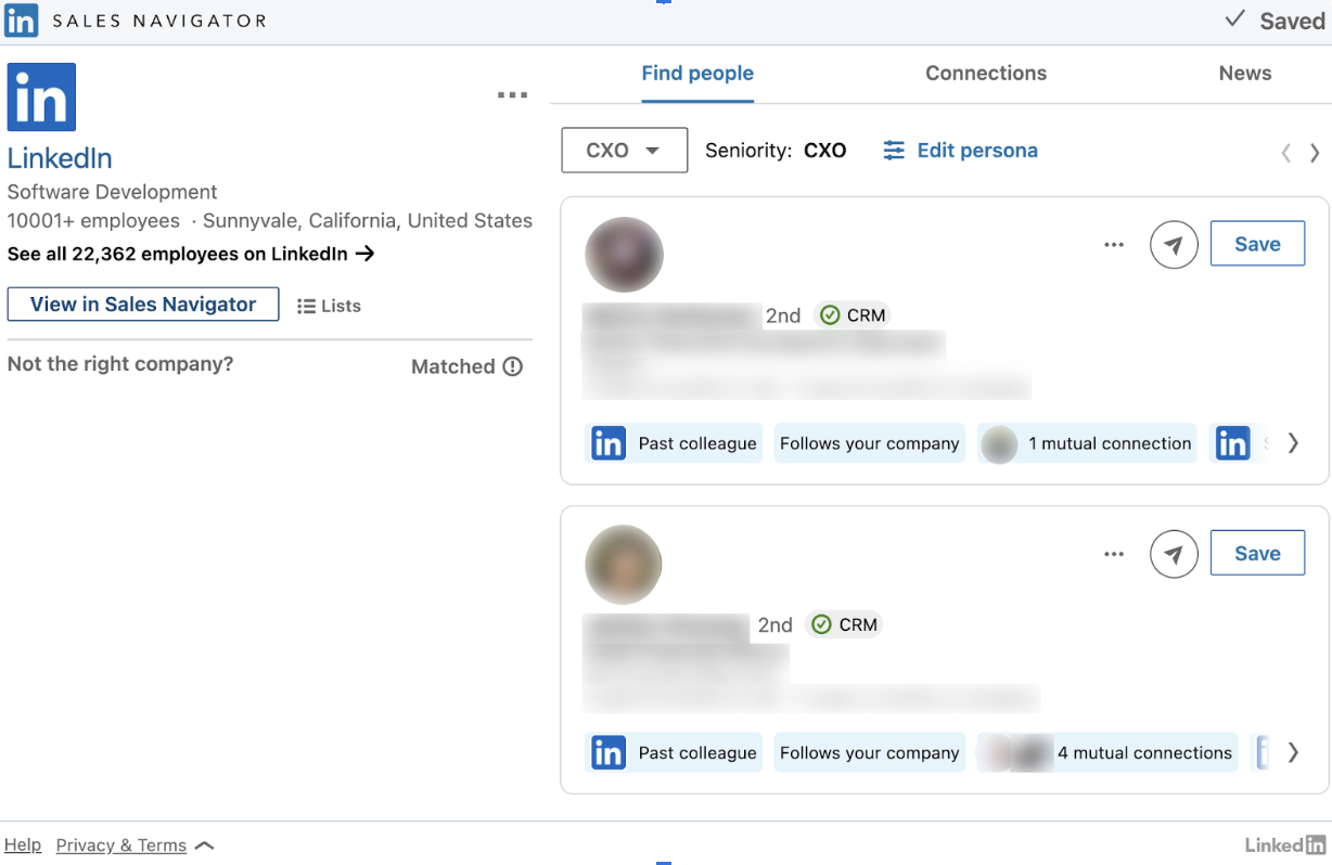
Find People, 2-Column Medium, Classic
Relationship Map
Note
Module parameter for the Relationship Map feature is Maps.
When the new parameter "crmInstanceType" comes with the value of "DEV", you will see `Dev Mode' in the bottom right corner.
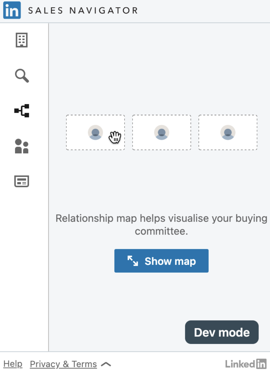
Relationship Map, 1-Column Large, Classic
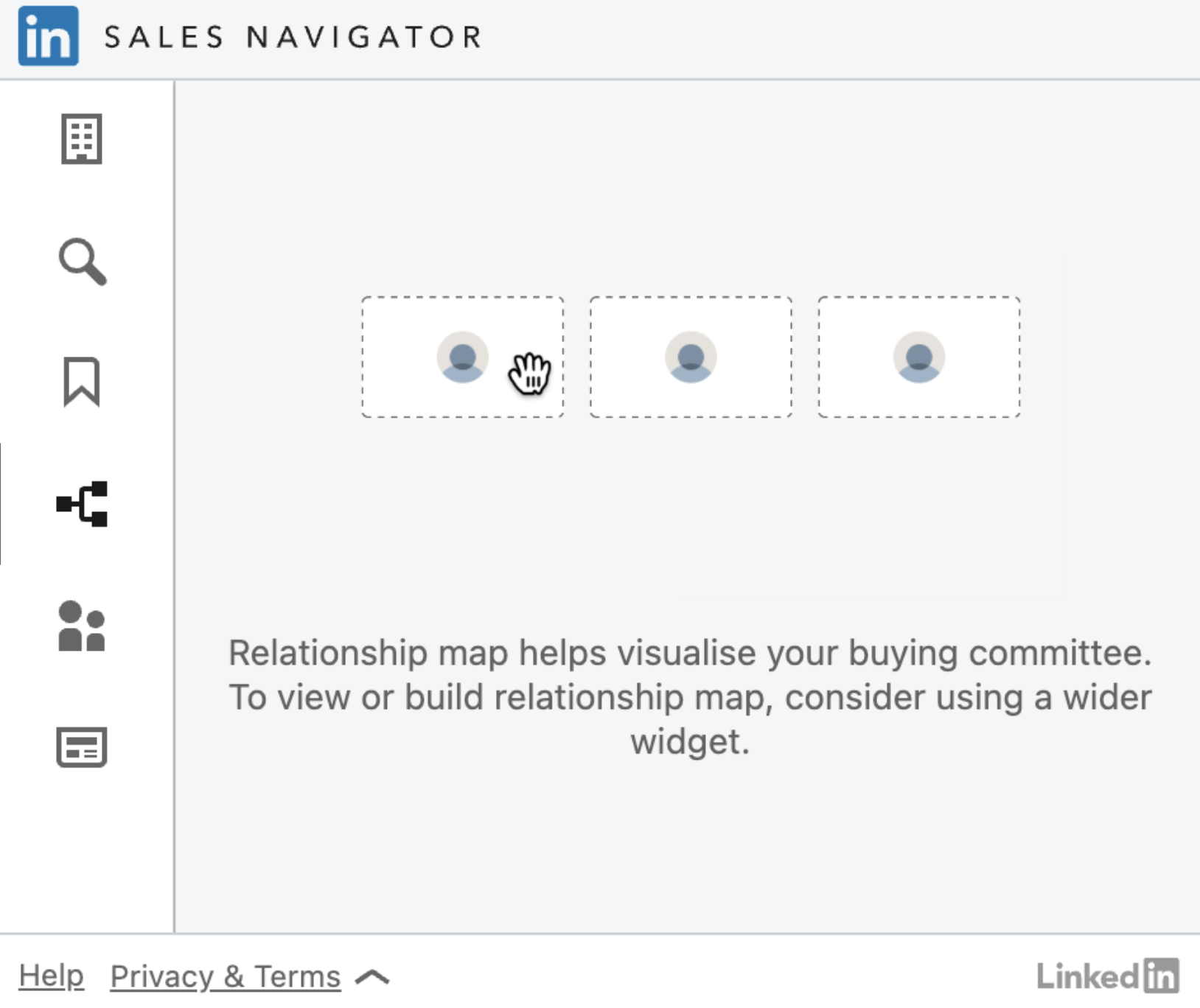
Relationship Map, 1-Column Small, Classic
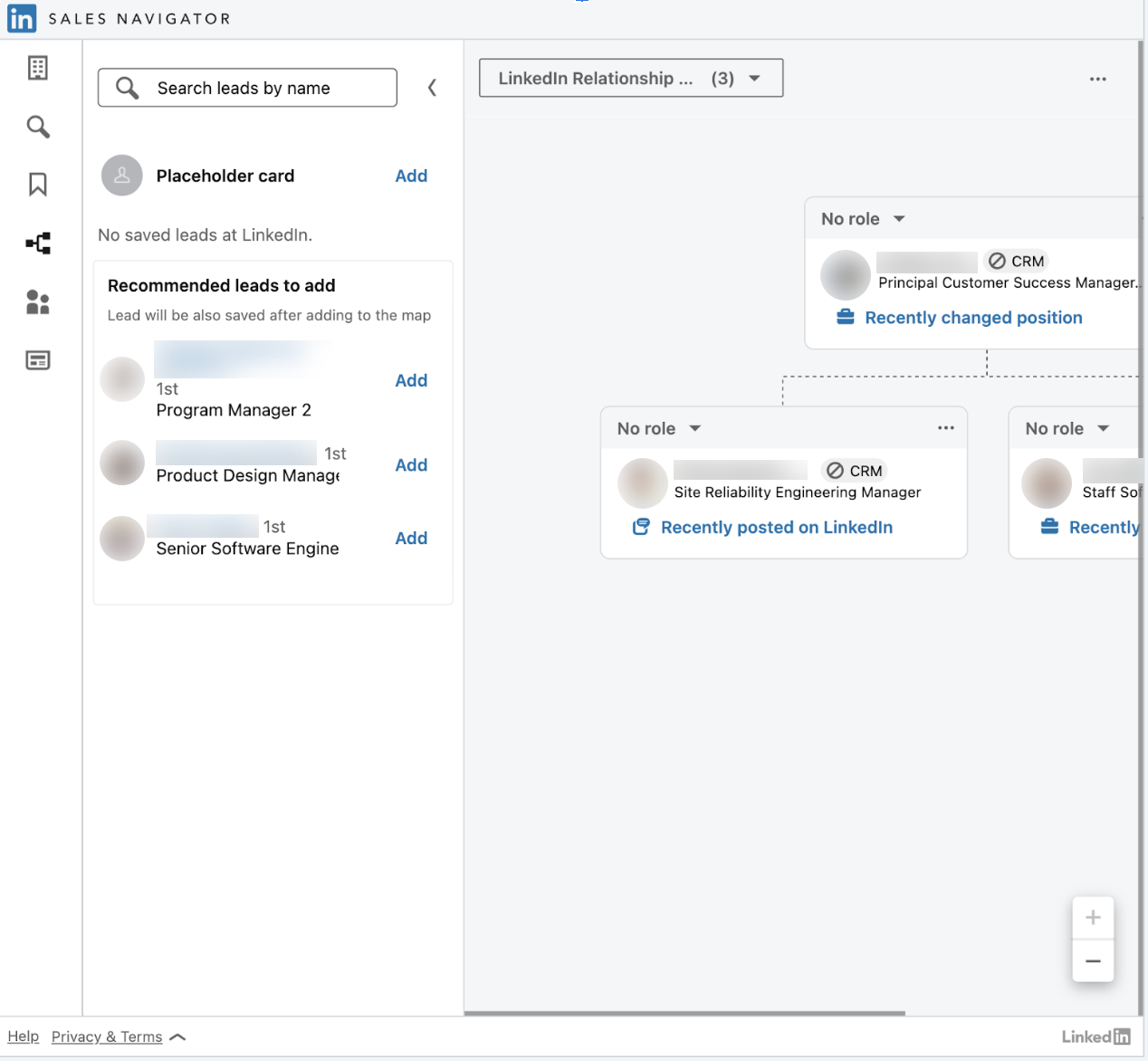
Relationship Map, 1-Column Large, Classic
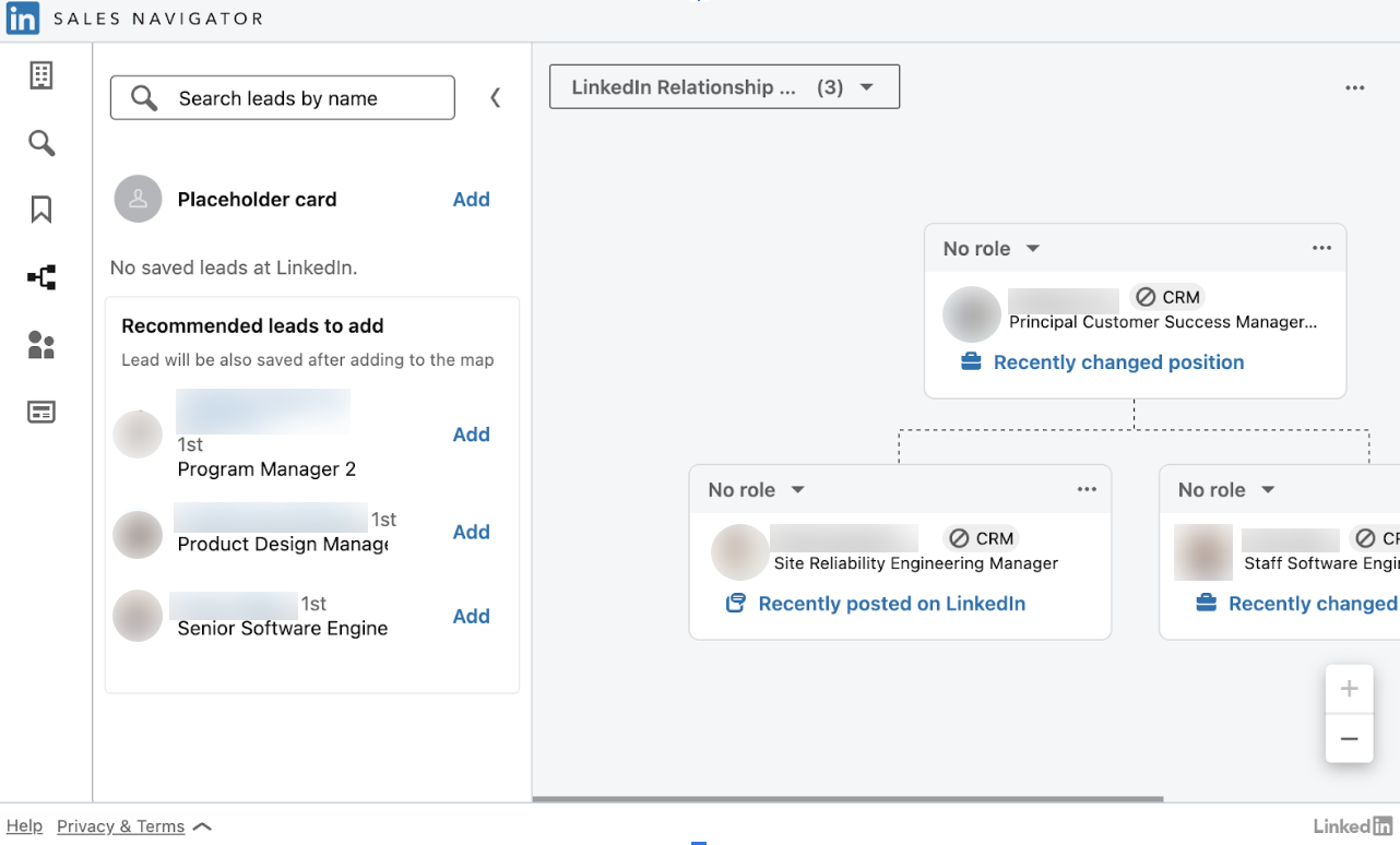
Relationship Map, 2-Column Medium, Classic
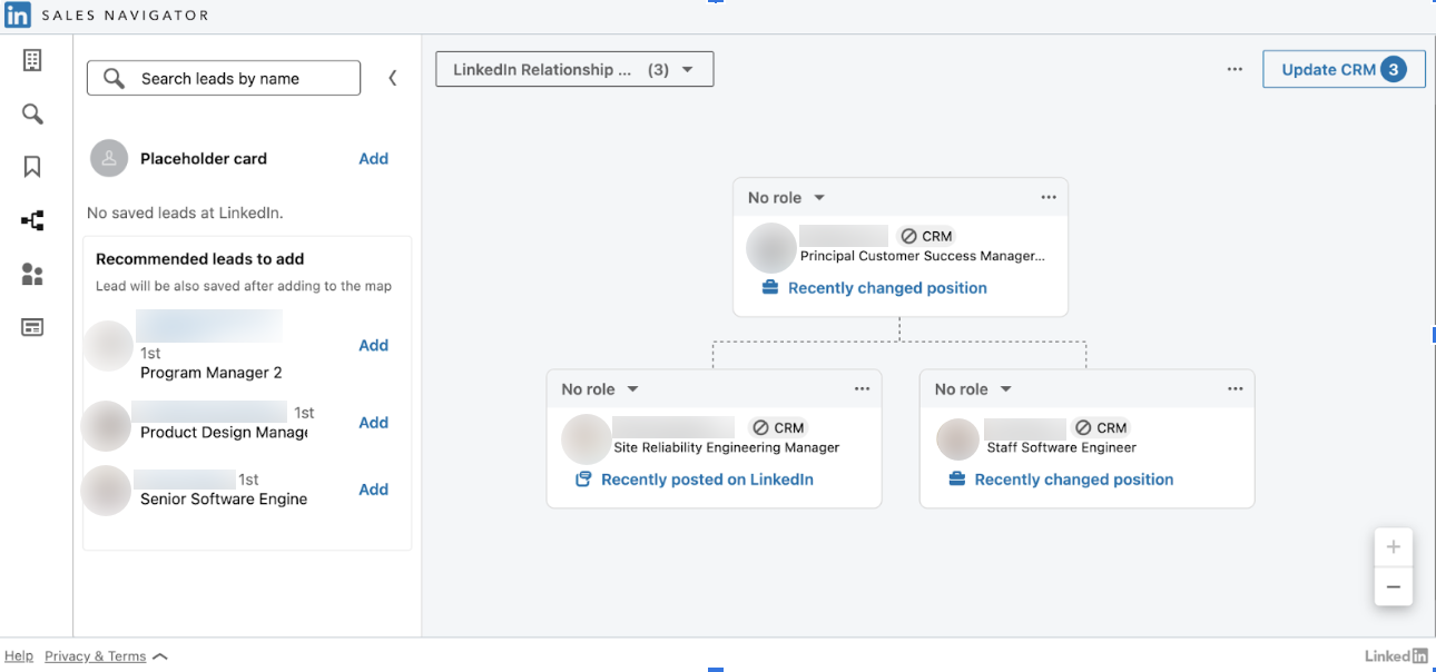
Relationship Map, 3-Column Medium, Classic
Account IQ
Note
AccountIQ is enabled by default for those who are onboarded for new Embedded experience as part of "TopCard" module.
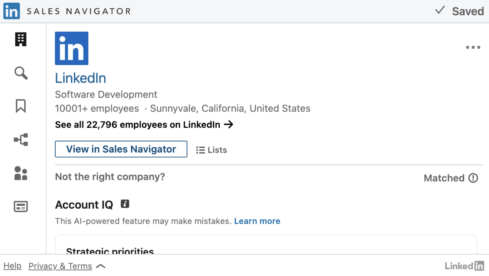
Account IQ, 1-Column Small, Classic
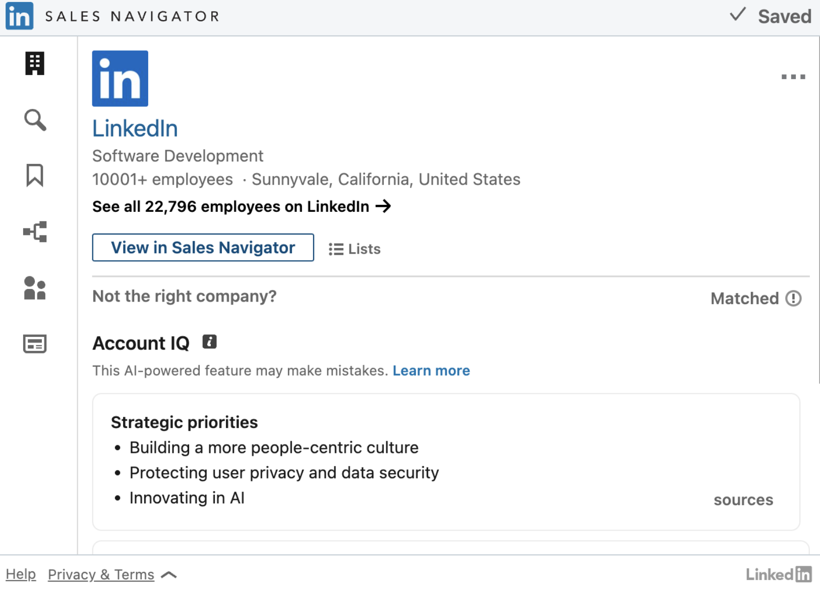
Account IQ, 1-Column Large, Classic
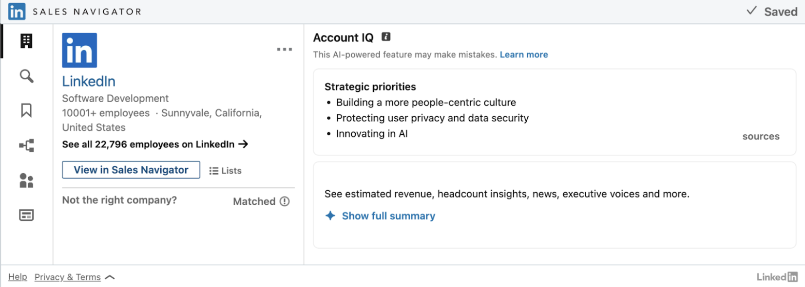
Account IQ, 2-Column Medium, Classic

Account IQ, 3-Column Medium, Classic
Fallback Experience
Note
Fallback experience is applicable for "FindPeople", "Relationship Map" experiences for the Advanced users only.
FindPeople
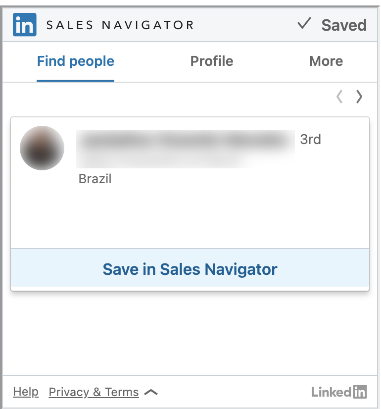
Find People, 1-Column Small, Classic
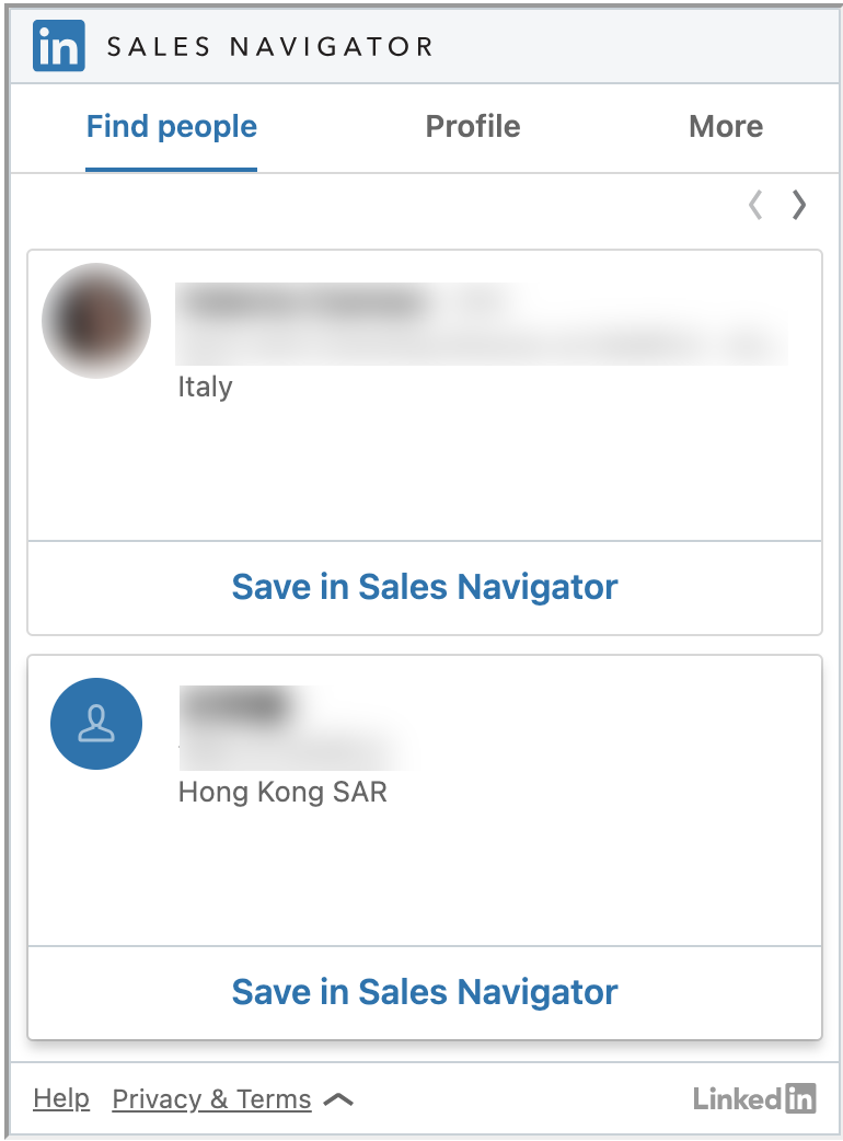
Find People, 2-Column Medium, Classic
Relationship Map
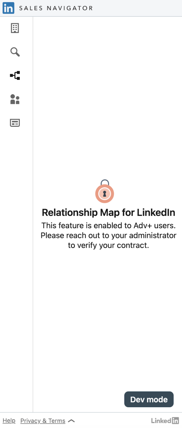
Relationship Map, 1-Column Large, Classic
Classic Mode with All Modules
The classic mode with all modules will allows you to embed just one iframe with all modules sales professionals might need.
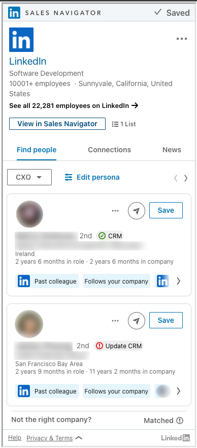
All Modules, 1-Column Large, Classic
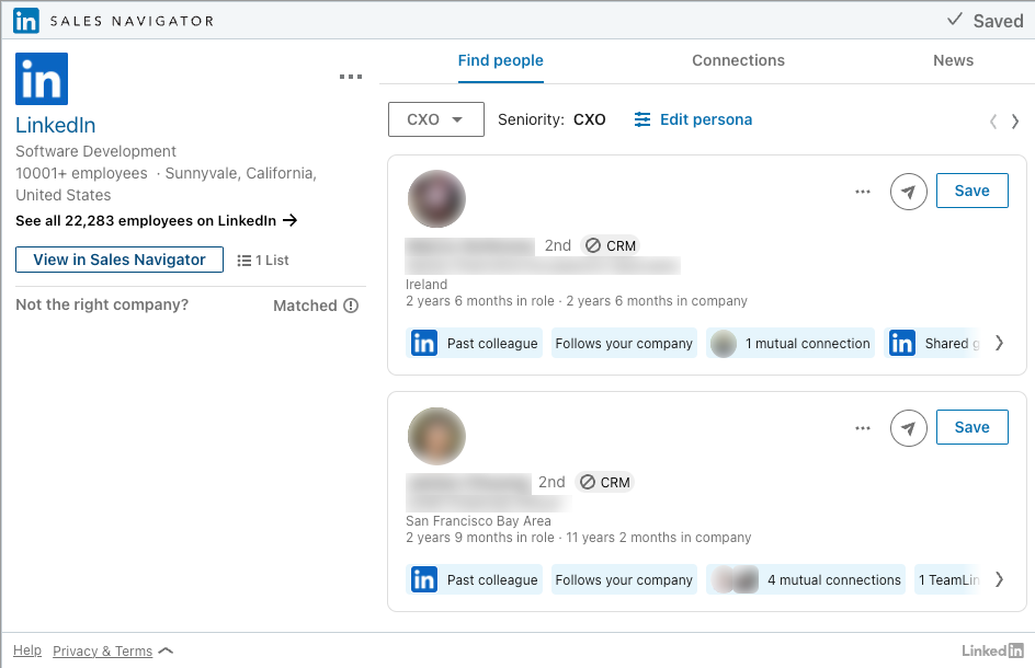
All Modules, 2-Column Medium, Classic
Recommended Leads
Recommended Leads suggests a list of employees for a given company that could be potential leads and allows users to save those leads.
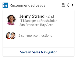
Recommended Leads, 1-Column Small, Inline
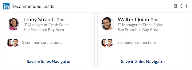
Recommended Leads, 2-Column Small, Inline
1-Column Small
- Min width: 320px
- Max width: 480px
- Height: 405px
1-Column Medium
- Min width: 320px
- Max width: 640px
- Height: 515px
1-Column Large
- Min width: 320px
- Max width: 640px
- Height: 790px
2-Column Medium
- Min width: 640px
- Max width: 944px
- Height: 525px
3-Column Medium
- Min width: 944px
- Max width: dynamic
- Height: 525px
Feedback
Coming soon: Throughout 2024 we will be phasing out GitHub Issues as the feedback mechanism for content and replacing it with a new feedback system. For more information see: https://aka.ms/ContentUserFeedback.
Submit and view feedback for