Note
Access to this page requires authorization. You can try signing in or changing directories.
Access to this page requires authorization. You can try changing directories.
Creating a chart from streaming data helps maximize the visual impact of your data for your audience. Learn below how to create dynamic charts from your streaming data.
In this tutorial, you learn how to:
- Visualize the current value for connected sensors
- Visualize values over time for connected sensors
Prerequisites
- Data Streamer Enabled
- Sensor data streaming into Data In page of Excel
Visualize the Current Value for Connected Sensors
- Go to the Data In worksheet in your workbook.
- Select the current data for the channels you wish to visualize, as found in Row 5.
- Select Insert > Recommended Charts.
- Select a desired chart from either this recommended list or from the All Charts tab. By default, try a column chart.
- Select OK to add the selected chart to your Excel sheet.
- Select Data Streamer > Stop Data to halt streaming data, to allow axis edits.
- Select the value axis and set the bounds for this axis.

Now, when Data Streamer > Start Data has been selected, this chart visualizes the latest sensor values.
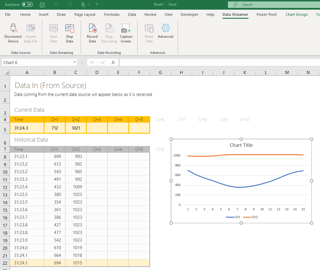
Visualize Values Over Time for Connected Sensors
- Select the full range of historical data for the channels you wish to visualize.
- Select Insert > Recommended Charts.
- Go to All Charts and select a Line or Scatter chart for your visualization.
- The selected chart should shows the same number of unique Series as selected Channels.
- Select OK to add the selected chart to your Excel sheet.
- Select Data Streamer > Stop Data to halt streaming data, to allow axis edits.
- Select the value axis and set the bounds for this axis.
Now, when Data Streamer > Start Data has been selected, this chart visualizes the change in values over time for your sensors.