Note
Access to this page requires authorization. You can try signing in or changing directories.
Access to this page requires authorization. You can try changing directories.
The following components are a combination of basic UI components that you can use for common Teams design situations, such as navigation.
Microsoft Teams UI Kit
Based on Fluent UI, the Microsoft Teams UI Kit includes components and patterns that are designed specifically for building Teams apps. In the UI kit, you can grab and insert the components listed here directly into your design and see more examples of how to use each component.
Breadcrumb
Breadcrumbs are a navigational aid that convey your app’s hierarchy. They help users understand how the page they’re viewing fits into the overall experience and afford one-click access to higher levels in that hierarchy.
Top use cases
- Communicate hierarchy
- Navigation
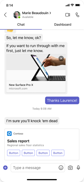
Mobile
Desktop

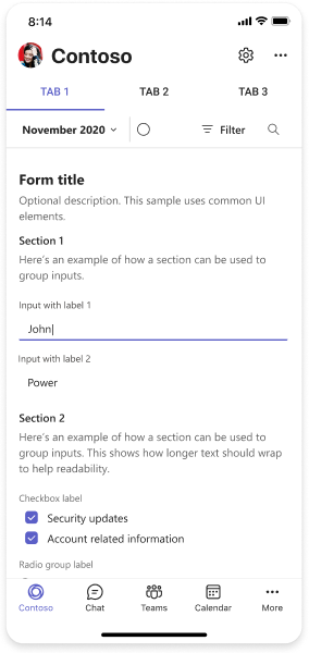
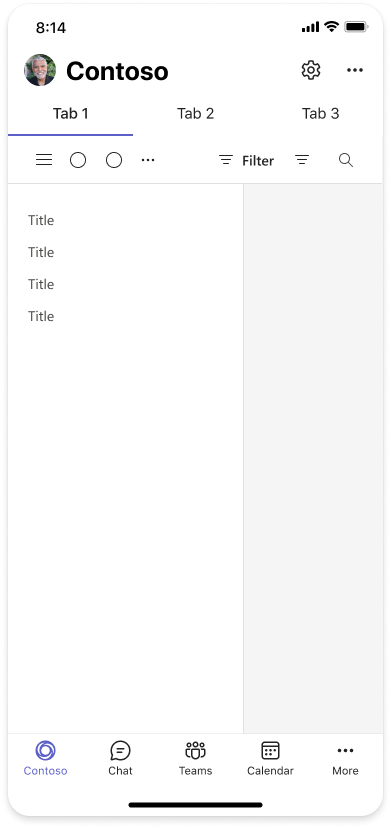
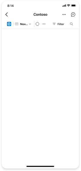
Left nav
Use the left nav to browse multiple pages within your Teams tab. In the following example, the left nav is between the channel list and tab content.
Top use cases
- Browse multiple pages within a Teams tab.
- Break down complex apps into multiple pages.
Mobile
Desktop

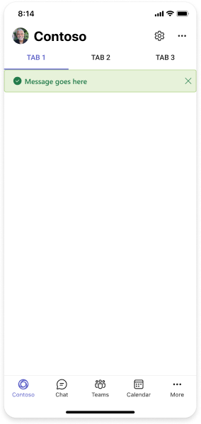
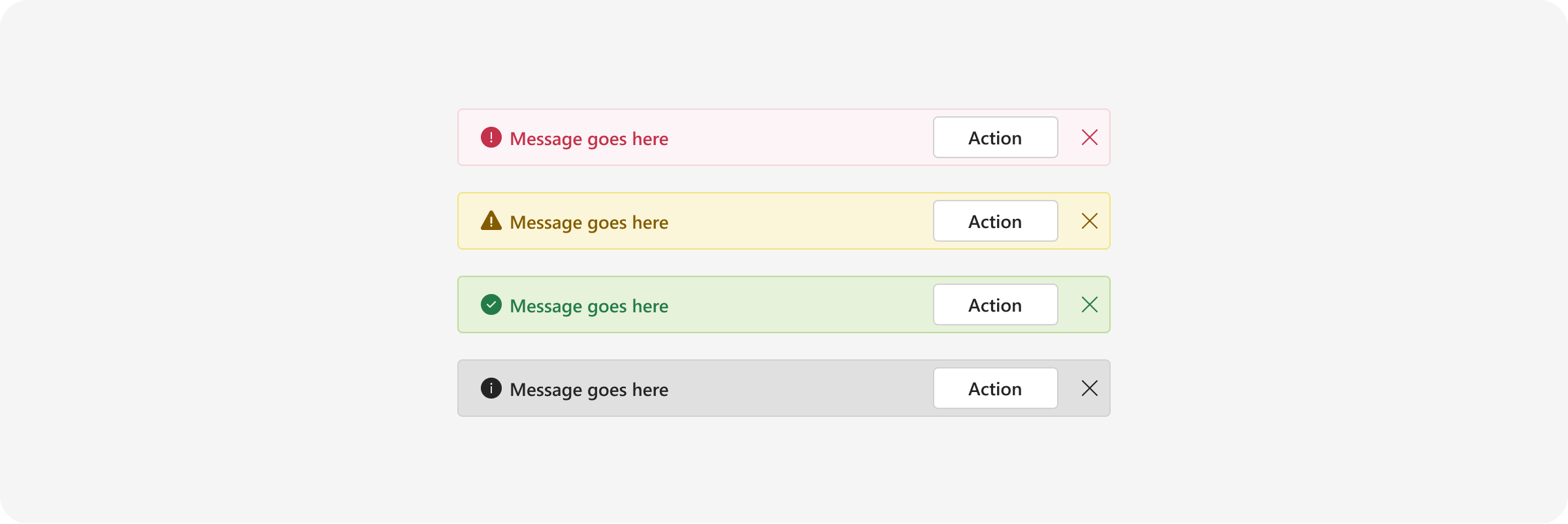
Notification bar
A notification bar is a dedicated area for displaying a brief, important messages that do not require the user to take immediate action. Specific background colors and icons are associated with specific types of messages (see below).
You can implement a notification bar using the Fluent UI alert component.
Top use cases
- Critical messages, errors, and warnings
- Success messages
- Informational or promotional messages
Mobile
Desktop
Stageview
Stageview lets users see content—like an image, file, or website—on a large surface in Teams without switching context. This component is primarily for viewing content. Don't use it for complex interactions.
See how to implement Stageview.
Top use cases
- Display content in a large surface within Teams instead of another app or browser
- Spotlight media or other rich content
Mobile
Your app can launch a stage from an Adaptive Card, shared link, or visual components (such as a chart).
Desktop

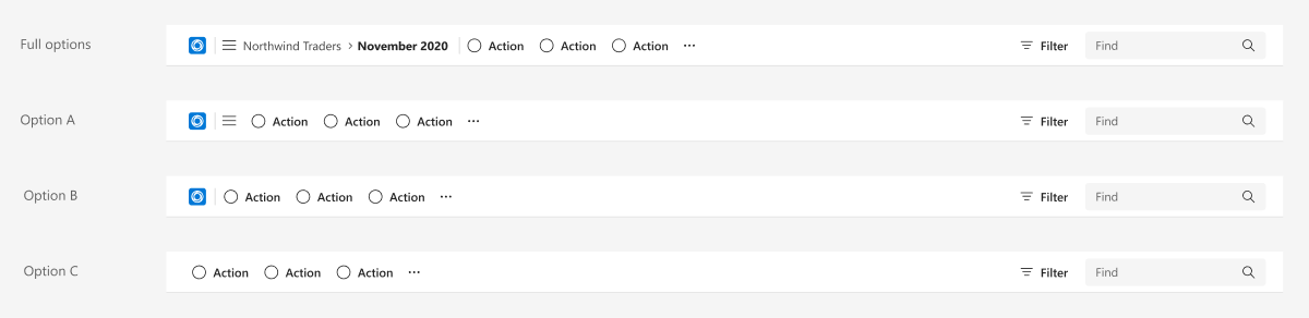
Toolbar
A toolbar is a container for grouping a set of controls.
Top use cases
- Contextual actions on app content.
- Contextual filter and find.
- Navigation and breadcrumbs.
Mobile
Desktop
Collaborate with us on GitHub
The source for this content can be found on GitHub, where you can also create and review issues and pull requests. For more information, see our contributor guide.
Platform Docs