Note
Access to this page requires authorization. You can try signing in or changing directories.
Access to this page requires authorization. You can try changing directories.
Teams web and desktop supports default (light), dark, and high-contrast themes, while Teams mobile supports light and dark themes. Each theme has its own color scheme.
Guidelines
Use standard Teams colors, which are designed to meet Web Content Accessibility Guidelines (WCAG) 2.1 contrast requirements, ensures a consistent and accessible experience across the supported themes.

Add colors when necessary
Start from a white canvas and add colors only if needed. Avoid using colors to paint large surfaces such as cards. Instead, use colors to create hierarchy, for example, highlighting important actions.

Put accessibility first
Always aim to present app content with all user needs and preferences in mind. The color of text and important elements such as icons must be accessible.

Use colors consistently
Don’t confuse by using colors inconsistently. Use Teams core colors and secondary colors, which convey activity, errors, and other common states.
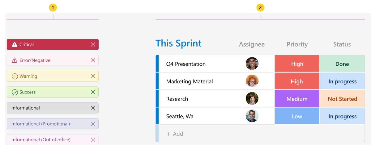
Primary colors and color tokens
Each Teams theme has its own color scheme. To handle theme changes automatically, you can specify color tokens in your design.
Learn how to use color tokens in your Teams app project.
Example for design with tokens

The following token values are for the default (light) theme:
| Counter | Description |
|---|---|
| A | Background 2: Canvas background color |
| B | Default Foreground: Primary text color |
| C | Foreground 1: Secondary text color |
| D | Brand Background: Primary button background color |
| E | Brand Foreground: Link text color |
Integrate your apps color palette with Teams
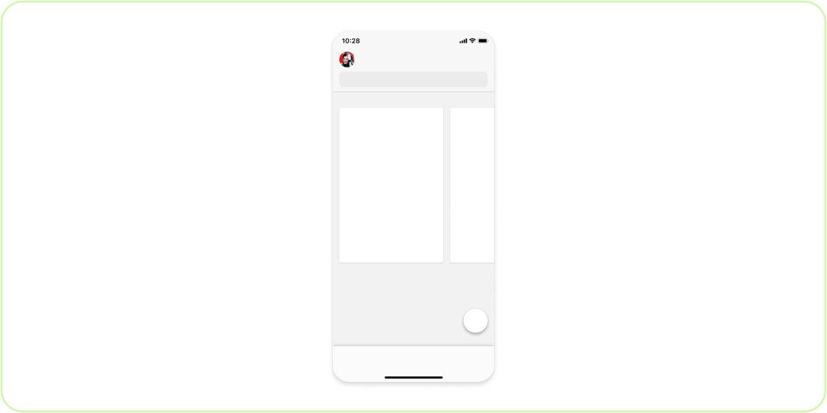
Primary color

| Counter | Description |
|---|---|
| 1 | Action button color in an embedded component |
| 2 | Action button color in a personal app |
Apply the primary color

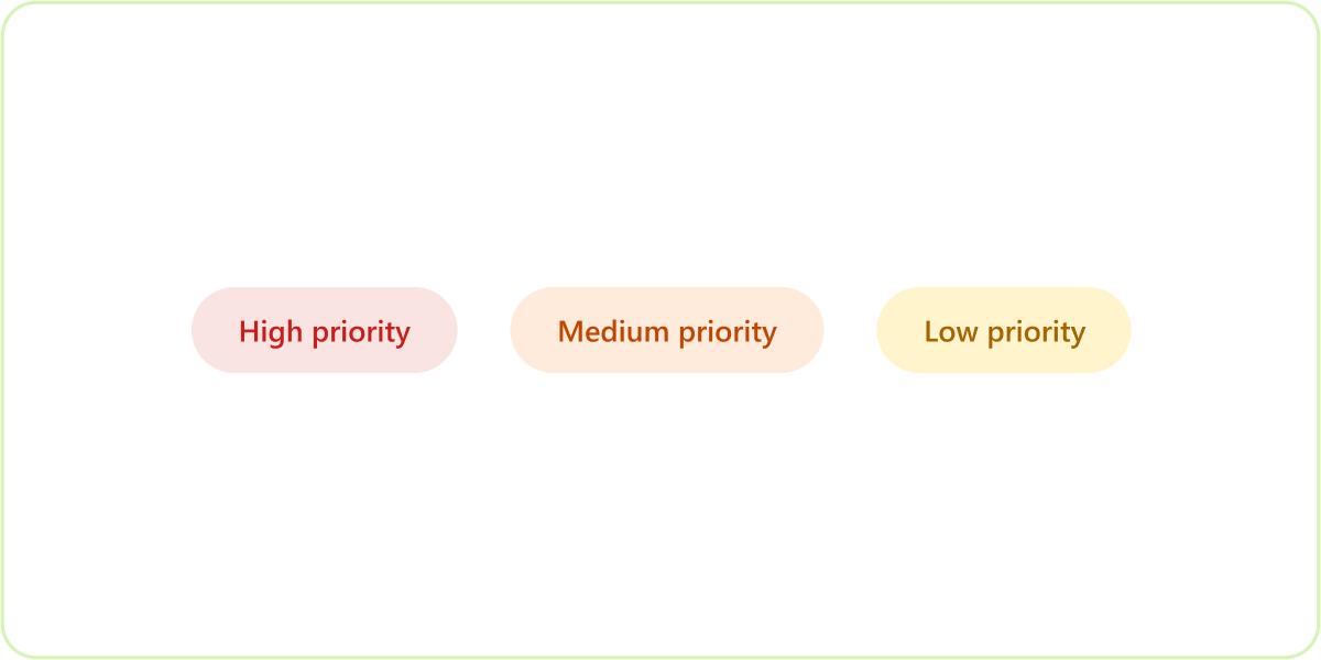
Secondary colors
| Counter | Description |
|---|---|
| 1 | Teams secondary colors |
| 2 | Custom secondary colors in an example app |
Best Practices
Do: Use colors with purpose
Colors must be used for highlighting functionality, defining hierarchy, and conveying different states. Avoid using colors when not tied to any semantic meaning.
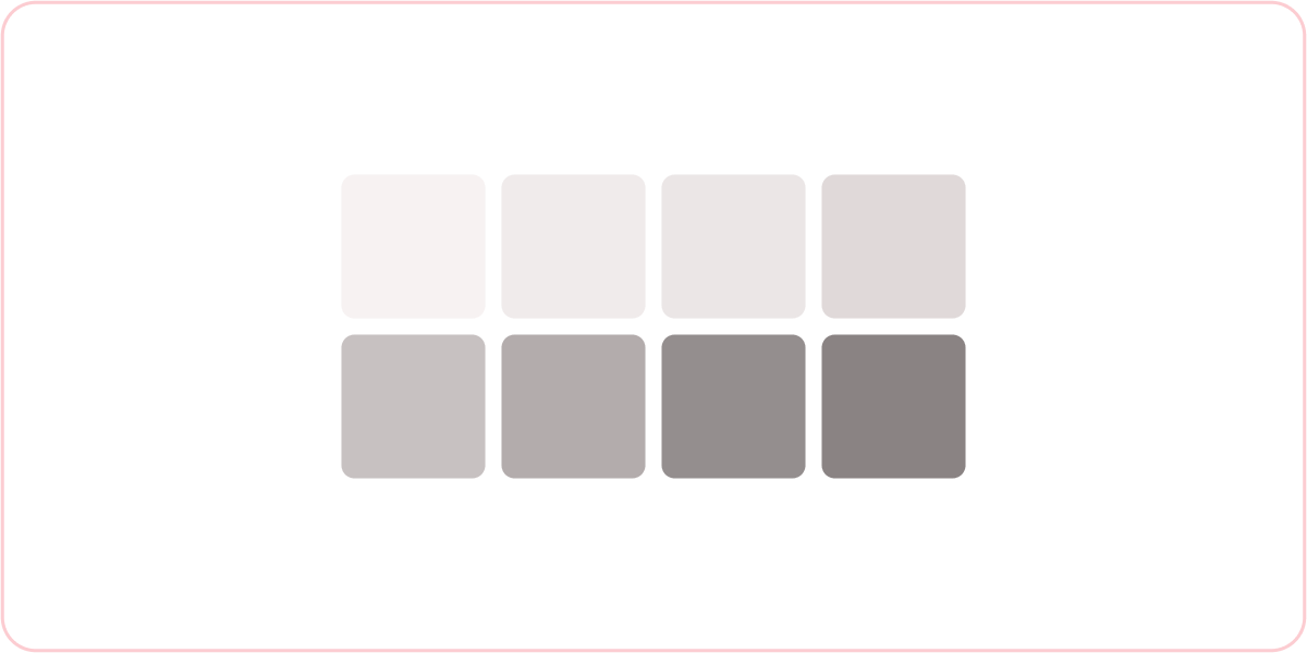
Do: Use the neutral color palette to create depth
Always use the neutral, gray scale color palette provided in this kit as the base of your UI. You can include additional steps of gray to reinforce a sense of depth and hierarchy. Layers must appear brighter as they move up the z-axis.
Don’t: Use color for branding only
Don’t use colors just for branding purposes or visual delight. Avoid using colors on large surfaces, such as the background of cards and headers.
Don’t: Get too complicated
For example, don’t have different shades of gray for light and dark themes. Also, on large surfaces, never use neutral colors that aren’t gray scale.
Collaborate with us on GitHub
The source for this content can be found on GitHub, where you can also create and review issues and pull requests. For more information, see our contributor guide.
Platform Docs