Note
Access to this page requires authorization. You can try signing in or changing directories.
Access to this page requires authorization. You can try changing directories.
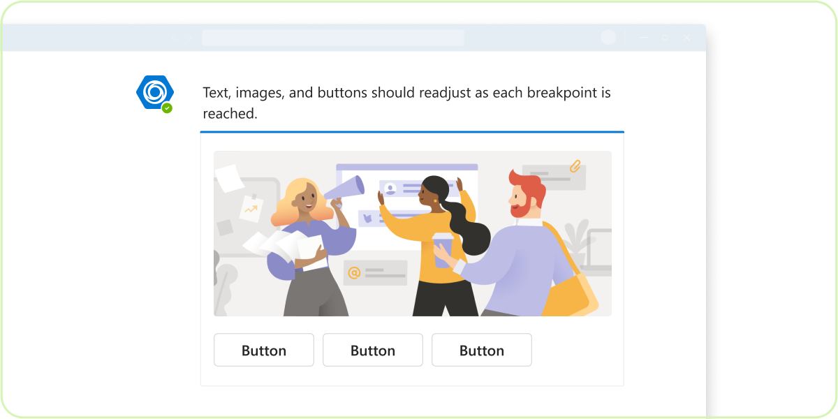
A grid layout allows your app to be consistent and guarantees recognizable relationships between design components. You can learn about your grid system and tips for scaling and zoom levels in your app to pass submission criteria.
Scaling and responsive design are essential to all Teams apps so that users can successfully interact with all interfaces with certainty. In order to pass Microsoft Teams Store review, the entire text must be visible and not truncated.
Layout design
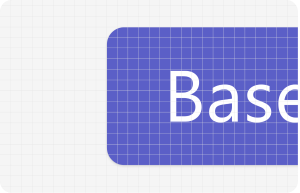
The 4-pixel base unit of grid allows components to scale consistently across all display sizes in Teams. In the following example, the corner radius of each button is 4 pixels.
Always follow the grid
Make it responsive
Use white space
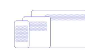
Scaling and responsive
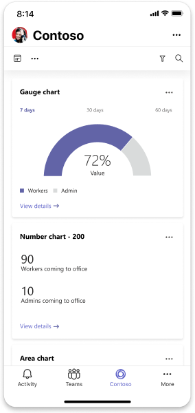
Mobile
Mobile designs must be 320 pixels.
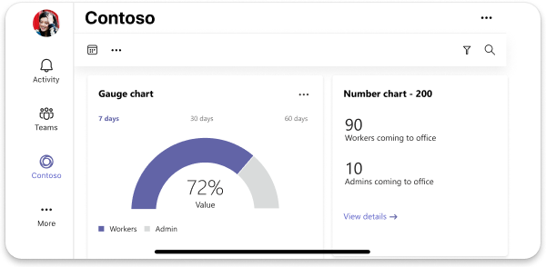
Desktop
The minimum size for desktop is 550 pixels.
Example for 550 pixels
Example for 2560 pixels
Page orientation
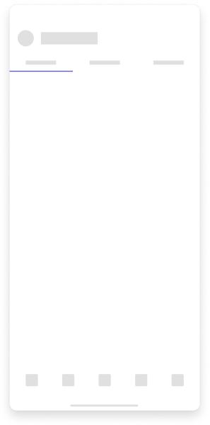
Mobile
Note
Apps in Teams mobile support both landscape and portrait mode.
Portrait mode
Landscape mode
Best practices

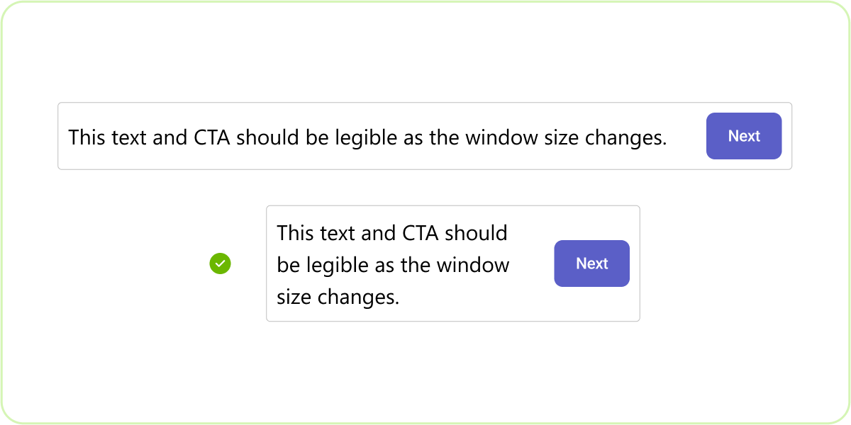
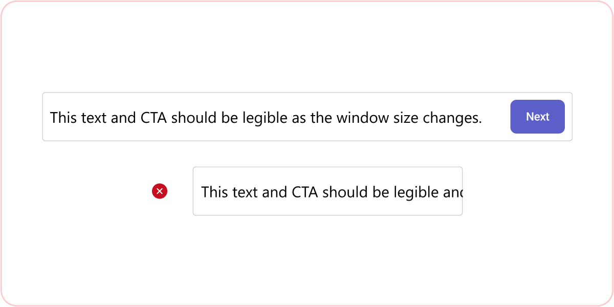
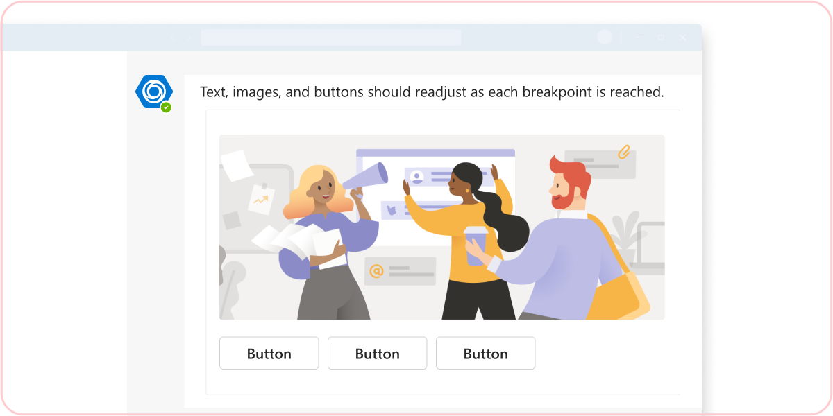
Do: Use word wrap so that text is legible at all zoom levels
Avoid text overlap and truncation.
Don’t: Let text and buttons shift and overlap as zoom level changes
Overlapping text and buttons might not meet our accessibility standards.
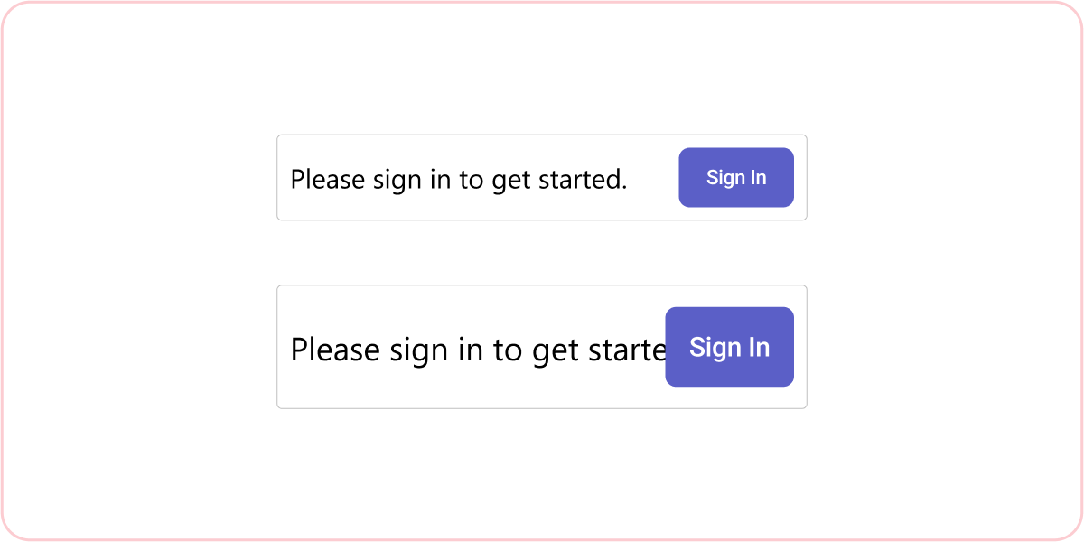
Do: Use word wrap so that text is legible at all widths
Avoid truncation with reflow, prioritizing call to actions (CTAs), and action items.
Don’t: Let text or CTAs get cut off or become illegible as window width changes
Without word wrapping, the text and CTAs aren't usable.
Do: Ensure your app is legible at 200% scale
Use responsive design to avoid text overlap and truncation.
Don’t: Truncate and cut off content at any zoom level
It's recommended to test up to 200% zoom.
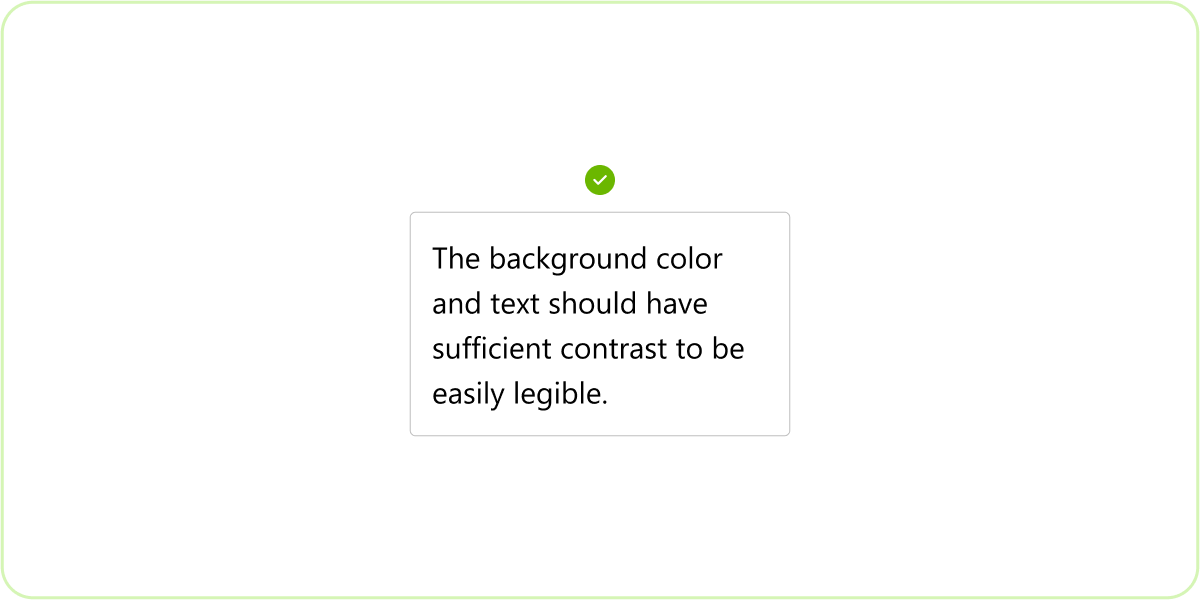
Do: Text and colors for accessibility
The entire text must be visible and used for all users, meaning that it must exceed certain color ratios, depending on its usage. To check your contrast levels, check out the WebAIM contrast checker.
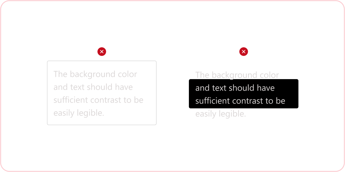
Don’t: Submit your app with text that doesn’t pass contrast standards
Teams apps need to be accessible to all users with any level of visual impairment or disability. Submissions with inaccessible text aren't accepted.
Do: Test your app at 1920 x 1080 resolution
Avoid text overlap and truncation.
Don’t: Submit your app for review without testing at Teams default resolution
Your app might not pass the submission process if there are issues at 1920 x 1080 resolution.
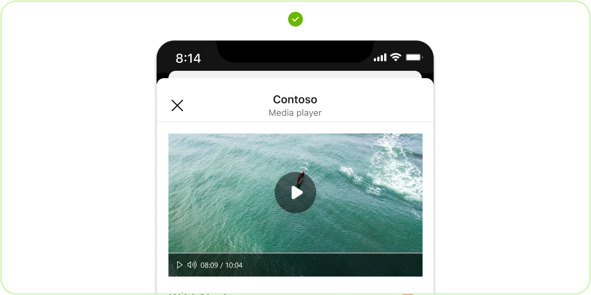
Do: Test mobile app for responsiveness
Mobile view of your app must be responsive, similarly to the narrowest responsive breakpoint of a web app.
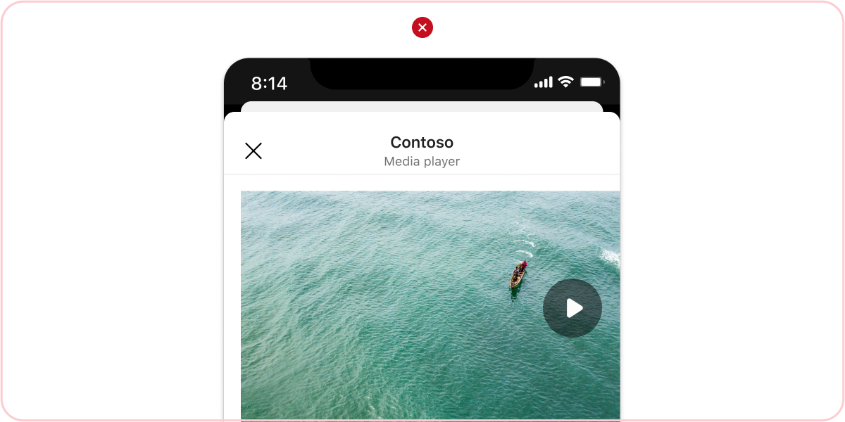
Don’t: Allow truncation on your mobile app
Nothing must be cut off or illegible on your mobile app.
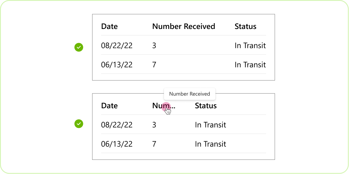
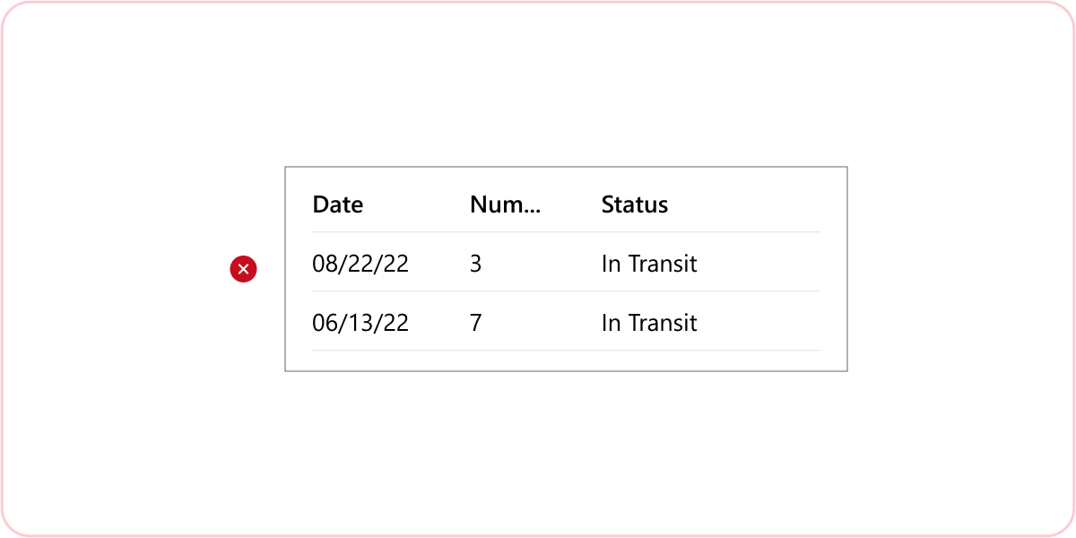
Do: Ensure headers are always legible at all zoom levels
If the headers truncate, use a tooltip so that users can read headers by hovering.
Don’t: Truncate headers without a hover feature
Your app won't pass Teams submission if it has illegible headers without hover functionality.
See also
Collaborate with us on GitHub
The source for this content can be found on GitHub, where you can also create and review issues and pull requests. For more information, see our contributor guide.
Platform Docs