Shape and elevation for designing your Teams app
This article provides how to use shape and elevation to create additional hierarchy in your app.
Shape and form
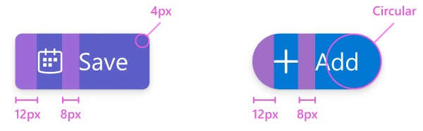
Depending on the component, Teams uses corner radiuses of 0 pixels, 4 pixels, and fully rounded. Most Teams components, including buttons, have a 4-pixel corner radius. Key calls to action might use different shapes, such as rounded floating action buttons. In cases where you must alter a Teams button shape, follow the sizing and spacing guidelines to maintain a consistent experience.
Best practices
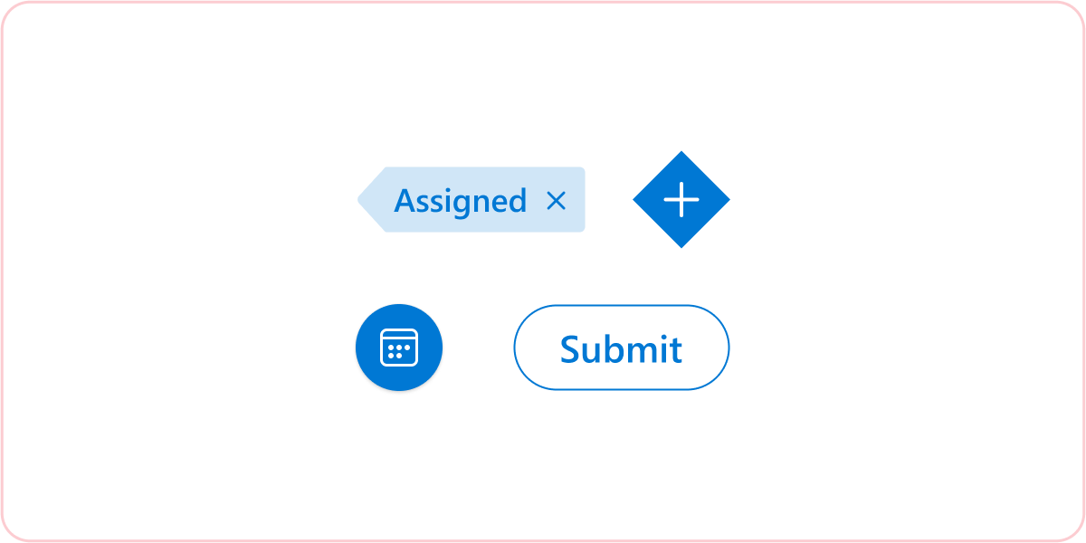
Don’t: Change the shape of basic UI components
Avoid modifying the shape of basic UI components as much as possible. Try following the common sizing and spacing rules of each component even when the shape needs altering.

Don’t: Modifying or adding to the shadow levels
Customizing the shadow values might create a confusing visual hierarchy when your app is rendered in the Teams interface.
Platform Docs