Note
Access to this page requires authorization. You can try signing in or changing directories.
Access to this page requires authorization. You can try changing directories.
This article provides how to incorporate standard Teams typography in your app design.
Font type

Web and desktop app
Teams uses Segoe UI for its type ramp to optimize hierarchy and readability.

Android
The Teams Android app uses Roboto typeface. For more information, see Android guidelines and examples (Fluent UI).

iOS
The Teams iOS app uses the SF Pro typeface. For more information, see iOS guidelines and examples (Fluent UI).
Type scale
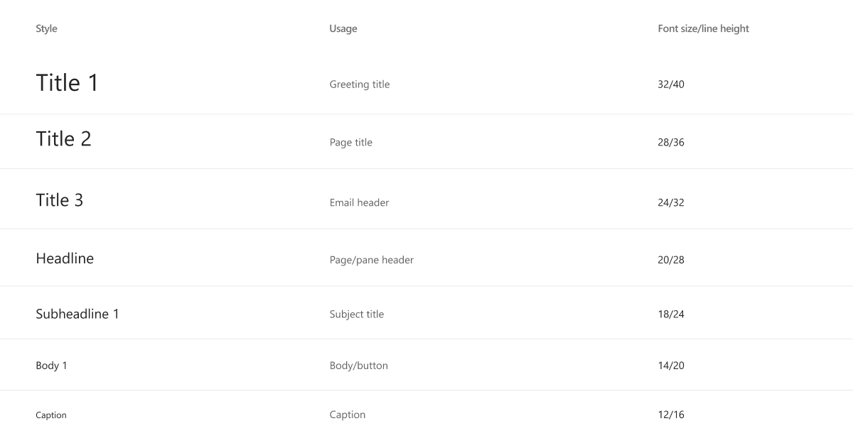
Teams uses seven styles that range from level-one titles to captions.
Font weight
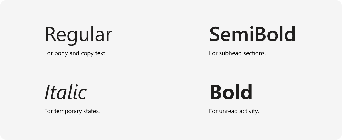
Font weights are for identifying specific elements and conveying states. Don’t use bold to create hierarchy in your text. Instead, use a different shade of grey and the SemiBold weight.

Usage
Using different font sizes and weights help create hierarchy and ensure readability. However, don’t rely on just size and weight. When possible, build your hierarchy with the primary, secondary, and tertiary text colors listed here.
Platform Docs

