Format cards in Teams
Following are the two ways to add rich text formatting to your cards:
Cards support formatting in the text property only, not in the title or subtitle properties. Formatting can be specified using a subset of XML or HTML formatting or Markdown, depending on the card type. For current and future development of Adaptive Cards, Markdown formatting is recommended.
Formatting support differs between card types. Rendering of the card can differ slightly between the desktop and the mobile Microsoft Teams clients, and Teams in the desktop browser.
You can include an inline image with any Teams card. Supported image formats are .png, .jpg, or .gif formats. Keep the dimensions within 1024 x 1024 pixels and file size less than 1 MB. Animated .gif images aren't supported. For more information, see types of cards.
You can format Adaptive Cards and connector cards for Microsoft 365 Groups with Markdown that include certain supported styles.
Format cards with Markdown
The following card types support Markdown formatting in Teams:
- Adaptive Cards: Markdown is supported in Adaptive Card
Textblockfield, andFact.TitleandFact.Value. HTML isn't supported in Adaptive Cards. - Connector cards for Microsoft 365 Groups: Markdown and limited HTML is supported in connector cards for Microsoft 365 Groups in the text fields.
Note
Markdown isn't supported for OAuth sign in cards in bots.
You can use newlines for Adaptive Cards using \r or \n escape sequences for newlines in lists. Formatting is different between the desktop and the mobile versions of Teams for Adaptive Cards. Card-based mentions are supported in web, desktop, and mobile clients. You can use the information masking property to mask specific information, such as password or sensitive information from users within the Adaptive Card Input.Text input element. You can expand the width of an Adaptive Card using the width object. You can enable typeahead support within Adaptive Cards and filter the set of input choices as the user types the input. You can use the msteams property to add the ability to display images in Stageview selectively.
Formatting is different between the desktop and the mobile versions of Teams for Adaptive Cards and connector cards. In this section, you can go through the Markdown format example for Adaptive Cards and connector cards.
The following table provides the supported styles for Textblock, Fact.Title, and Fact.Value:
| Style | Example | Markdown |
|---|---|---|
| Bold | Bold | **Bold** |
| Italic | Italic | _Italic_ |
| Unordered list |
|
- Item 1\r- Item 2\r- Item 3 |
| Ordered list |
|
1. Green\r2. Orange\r3. Blue |
| Hyperlinks | Bing | [Title](url) |
The following Markdown tags aren't supported:
- Headers
- Tables
- Images
- Preformatted text
- Blockquotes
Newlines for Adaptive Cards
You can use the \r or \n escape sequences for newlines in lists. Using \n\n in lists causes the next element in the list to be indented. If you require newlines elsewhere in the TextBlock, use \n\n.
Mobile and desktop differences for Adaptive Cards
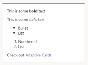
On the desktop, Adaptive Card Markdown formatting appears as shown in the following image in both web browsers and in the Teams client application:
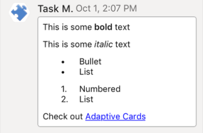
On iOS, Adaptive Card Markdown formatting appears as shown in the following image:
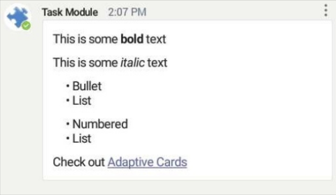
On Android, Adaptive Card Markdown formatting appears as shown in the following image:
For more information, see text features in Adaptive Cards.
Note
The date and localization features mentioned in this section aren't supported in Teams.
Adaptive Cards format sample
The following code shows an example of Adaptive Cards formatting:
{
    "$schema": "https://adaptivecards.io/schemas/adaptive-card.json",
    "type": "AdaptiveCard",
    "version": "1.0",
    "body": [
        {
            "type": "TextBlock",
            "text": "This is some **bold** text"
        },
        {
            "type": "TextBlock",
            "text": "This is some _italic_ text"
        },
        {
            "type": "TextBlock",
            "text": "- Bullet \r- List \r",
            "wrap": true
        },
        {
            "type": "TextBlock",
            "text": "1. Numbered\r2. List\r",
            "wrap": true
        },
        {
            "type": "TextBlock",
            "text": "Check out [Adaptive Cards](https://adaptivecards.io)"
        }
    ]
}
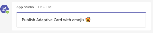
Adaptive Cards support emoji. The following code shows an example of Adaptive Cards with an emoji:
{ "$schema": "http://adaptivecards.io/schemas/adaptive-card.json", "type": "AdaptiveCard", "version": "1.0", "body": [ { "type": "Container", "items": [ { "type": "TextBlock", "text": "Publish Adaptive Card with emojis 🥰 ", "weight": "bolder", "size": "medium" }, ] }, ], }
Note
If you are using REST APIs, then set charset=UTF-8 in your request headers to add emojis in Adaptive Cards.
Mention support within Adaptive Cards
You can add @mentions within an Adaptive Card body for bots and message extension responses. To add @mentions in cards, follow the same notification logic and rendering as that of message based mentions in channel and group chat conversations.
Bots and message extensions can include mentions within the card content in TextBlock and FactSet elements.
Note
- Channel and team mentions aren't supported in bot messages.
- You can @mention multiple users in a single Adaptive Card message, however, ensure that the message size limit doesn't exceed 28 KB for Incoming Webhooks and 40 KB for a bot message.
- Adaptive Cards sent from Incoming Webhooks only support user mentions and don't support bot mentions.
To include a mention in an Adaptive Card, your app needs to include the following elements:
<at>username</at>in the supported Adaptive Card elements.- The
mentionobject inside of anmsteamsproperty in the card content includes the Teams user ID of the user being mentioned. - The
userIdis unique to your bot ID and a particular user. It can be used to @mention a particular user. TheuserIdcan be retrieved using one of the options mentioned in get the user ID.
Sample Adaptive Card with a mention
The following code shows an example of Adaptive Card with a mention:
{
  "contentType": "application/vnd.microsoft.card.adaptive",
  "content": {
    "type": "AdaptiveCard",
    "body": [
      {
        "type": "TextBlock",
        "text": "Hi <at>John Doe</at>"
      }
    ],
    "$schema": "https://adaptivecards.io/schemas/adaptive-card.json",
    "version": "1.0",
    "msteams": {
      "entities": [
        {
          "type": "mention",
          "text": "<at>John Doe</at>",
          "mentioned": {
            "id": "29:123124124124",
            "name": "John Doe"
          }
        }
      ]
    }
  }
}
Microsoft Entra Object ID and UPN in user mention
Teams platform allows you to mention users with their Microsoft Entra Object ID and User Principle Name (UPN), in addition to the existing mention IDs. Bots with Adaptive Cards and Connectors with Incoming Webhooks support the two user mention IDs.
The following table describes the newly supported user mention IDs:
| IDs | Supporting capabilities | Description | Example |
|---|---|---|---|
| Microsoft Entra Object ID | Bot, Connector | Microsoft Entra user’s Object ID | 49c4641c-ab91-4248-aebb-6a7de286397b |
| UPN | Bot, Connector | Microsoft Entra user’s UPN | john.smith@microsoft.com |
User mention in bots with Adaptive Cards
Bots support user mention with the Microsoft Entra Object ID and UPN, in addition to the existing IDs. The support for two new IDs is available in bots for text messages, Adaptive Cards body, and message extension response. Bots support the mention IDs in conversation and invoke scenarios. The user gets activity feed notification when being @mentioned with the IDs.
Note
Schema update and UI/UX changes aren't required for user mentions with Adaptive Cards in Bot.
Example
Example for user mention in bots with Adaptive Cards as follows:
{
  "$schema": "http://adaptivecards.io/schemas/adaptive-card.json",
  "version": "1.0",
  "type": "AdaptiveCard",
  "body": [
    {
      "type": "TextBlock",
      "text": "Hi <at>Adele UPN</at>, <at>Adele Microsoft Entra ID</at>"
    }
  ],
  "msteams": {
    "entities": [
      {
        "type": "mention",
        "text": "<at>Adele UPN</at>",
        "mentioned": {
          "id": "AdeleV@contoso.onmicrosoft.com",
          "name": "Adele Vance"
        }
      },
      {
        "type": "mention",
        "text": "<at>Adele Microsoft Entra ID</at>",
        "mentioned": {
          "id": "87d349ed-44d7-43e1-9a83-5f2406dee5bd",
          "name": "Adele Vance"
        }
      }
    ]
  }
}
Following image illustrates the user mention with Adaptive Card in Bot:

User mention in Incoming Webhook with Adaptive Cards
Incoming webhooks start to support user mention in Adaptive Cards with the Microsoft Entra Object ID and UPN.
Note
- Enable user mention in the schema for Incoming webhooks to support Microsoft Entra Object ID and UPN.
- UI/UX changes aren't required for user mentions with Microsoft Entra Object ID and UPN.
Example
Example for user mention in Incoming Webhook as follows:
{
    "type": "message",
    "attachments": [
        {
        "contentType": "application/vnd.microsoft.card.adaptive",
        "content": {
            "type": "AdaptiveCard",
            "body": [
                {
                    "type": "TextBlock",
                    "size": "Medium",
                    "weight": "Bolder",
                    "text": "Sample Adaptive Card with User Mention"
                },
                {
                    "type": "TextBlock",
                    "text": "Hi <at>Adele UPN</at>, <at>Adele Microsoft Entra ID</at>"
                }
            ],
            "$schema": "http://adaptivecards.io/schemas/adaptive-card.json",
            "version": "1.0",
            "msteams": {
                "entities": [
                    {
                        "type": "mention",
                        "text": "<at>Adele UPN</at>",
                        "mentioned": {
                          "id": "AdeleV@contoso.onmicrosoft.com",
                          "name": "Adele Vance"
                        }
                      },
                      {
                        "type": "mention",
                        "text": "<at>Adele Microsoft Entra ID</at>",
                        "mentioned": {
                          "id": "87d349ed-44d7-43e1-9a83-5f2406dee5bd",
                          "name": "Adele Vance"
                        }
                      }
                ]
            }
        }
    }]
}
Following image illustrates user mention in Incoming Webhook:

People icon in an Adaptive Card
People icon helps users to view the images of users in an Adaptive Card. You can insert an image and apply all the properties supported on images.
There are two types of people icons that are supported in an Adaptive Card:
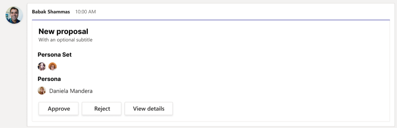
Persona: If you want to show a single user in an Adaptive Card, it displays the people icon and the name of the user.
The following JSON code is an example of a Persona card:
{
  "$schema": "https://adaptivecards.io/schemas/adaptive-card.json",
  "type": "AdaptiveCard",
  "version": "1.0.0",
  "body": [
{
      "type": "TextBlock",
      "text": "Persona",
      "weight": "bolder"
    },
    {
      "type": "Component",
      "name": "graph.microsoft.com/user",
      "view": "compact",
      "properties": {
        "id": "65f50003-e15d-434a-9e14-0fcfeb3d7817",
        "displayName": "Daniela Mandera",
        "userPrincipalName": "damandera@microsoft.com"
      }
    }
  ]
}
Persona Set: If you want to show multiple users in an Adaptive Card, it displays only the people icon of the users.
The following JSON code is an example of a Persona Set:
{
  "$schema": "https://adaptivecards.io/schemas/adaptive-card.json",
  "type": "AdaptiveCard",
  "version": "1.0.0",
  "body": [
    {
      "type": "TextBlock",
      "text": "Persona Set",
      "weight": "bolder"
    },
    {
      "type": "Component",
      "name": "graph.microsoft.com/users",
      "view": "compact",
      "properties": {
        "users": [
          {
            "id": "65f50003-e15d-434a-9e14-0fcfeb3d7817",
            "displayName": "Daniela Mandera",
            "userPrincipalName": "damandera@microsoft.com"
          },
          {
            "id": "65f50003-e15d-434a-9e14-0fcfeb3d7817",
            "displayName": "Daniela Mandera",
            "userPrincipalName": "damandera@microsoft.com"
          }
        ]
      }
    }
  ]
}
Note
You can't customize the style of the Persona and Persona Set in an Adaptive Card.
The following image is an example of the people icon in an Adaptive Card:
Query parameters
The following table lists the query parameters:
| Property name | Description |
|---|---|
type |
component |
name |
Use graph.microsoft.com/users to search all members across the organization |
view |
compact |
properties |
Passed to the component template |
id |
User's MRI |
displayName |
Name of the user |
userPrincipalName |
The user's principal name of the account in Microsoft Entra ID |
Adaptive Components are high-level components powered by templating and native Adaptive Card elements. The type component can be used anywhere inside the card body and the component data is defined in the properties attribute. The component data under properties is passed directly to the component. The properties property defines the format for Persona and Persona Set and all other properties under properties is ignored by component type in the Adaptive Card schema.
Your bot can query for the list of members and their basic user profiles, including Teams user IDs and Microsoft Entra information, such as name, id, and userPrincipalName. For more information, see Fetch the roster or user profile.
The following images show the people icon in an Adaptive Card on Teams desktop and mobile clients:
Desktop client:
When a user hovers on a people icon, the people card of that user is displayed.
Mobile client
When a user selects a people icon, it displays the people card of that user.
Information masking in Adaptive Cards
Use the information masking property to mask specific information, such as password or sensitive information from users within the Adaptive Card Input.Text input element.
Note
The feature only supports client side information masking. The masked input text is sent as clear text to the HTTPS endpoint address that was specified during bot configuration.
To mask information in Adaptive Cards, add the style property to type input.text, and set its value to Password.
Sample Adaptive Card with masking property
The following code shows an example of Adaptive Card with masking property:
{
    "type": "Input.Text",
    "id": "secretThing",
    "style": "password",
},
The following image is an example of masking information in Adaptive Cards:

Full width Adaptive Card
You can use the msteams property to expand the width of an Adaptive Card and make use of extra canvas space. The next section provides information on how to use the property.
Note
Test your full width Adaptive Card in narrow form factors such as mobile and meeting side panels to ensure that content isn't truncated.
Construct full width cards
To make a full width Adaptive Card, the width object in msteams property in the card content must be set to Full.
Sample Adaptive Card with full width
To make a full width Adaptive Card, your app must include the elements from the following code sample:
{
    "type": "AdaptiveCard",
    "body": [{
        "type": "Container",
        "items": [{
            "type": "TextBlock",
            "text": "Digest card",
            "size": "Large",
            "weight": "Bolder"
        }]
    }],

    "msteams": {
        "width": "Full"
    },
    "$schema": "http://adaptivecards.io/schemas/adaptive-card.json",
    "version": "1.2"
}
The following image shows a full width Adaptive Card:
The following image shows the default view of an Adaptive Card when you haven't set the width property to Full:
Adaptive Card responsive layout
Adaptive Cards automatically adapt their look and feel to the host application's style, but have a fixed layout that remains the same across Teams mobile and desktop clients. You must design your Adaptive Cards to look great on any device in order to provide an enhanced user experience across chat, channels, and meeting chat. In this article, you'll learn about designing responsive Adaptive Cards.
Adaptive Card responsive layout helps you to design cards with different layouts that target different card widths.
Design responsive Adaptive Cards
Use the targetWidth property on any element to:
Show or hide any element based on the card's width.
Set different target widths on different elements to create different layouts.
The following table lists the available
targetWidthvalues:Value Description veryNarrowThe element is visible when the Adaptive Card's width is very narrow such as in a meeting chat. narrowThe element is visible when the Adaptive Card's width is narrow such as on a mobile phone in portrait mode. standardThe element is visible when the Adaptive Card's width is standard such as on a mobile phone in landscape mode, on a tablet in portrait mode, or in a chat on desktop. wideThe element is visible when the Adaptive Card's width is wide such as on a tablet in landscape mode, in a channel or chat on desktop when you set your card to be full width. You can also set the
targetWidthproperty to make an element visible for a range of card widths using theatLeastandatMostprefixes. For example, you can make an element visible only when the card width is 'standard or above' or only when the card width is 'narrow or below'. The following table provides guidance on how to make an element visible for a range of card widths:Example Description "targetWidth": "atLeast:standard"The element is visible only when the Adaptive Card's width is at least standard, which means standard or wide. "targetWidth": "atMost:narrow"The element is visible only when the Adaptive Card's width is at most narrow, which means very narrow or narrow. Note
You don't have to set
targetWidthon all elements. If you don't settargetWidthfor an element, the element is always visible irrespective of the card's width.
The following are JSON samples for an Adaptive Card designed without using targetWidth and modified to usetargetWidth:
Adaptive Card designed without using
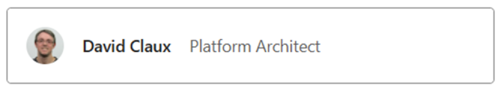
targetWidth:{ "type": "AdaptiveCard", "body": [ { "type": "ColumnSet", "columns": [ { "type": "Column", "items": [ { "type": "Image", "style": "Person", "url": "https://aka.ms/AAp9xo4", "size": "Small" } ], "width": "auto" }, { "type": "Column", "spacing": "medium", "verticalContentAlignment": "center", "items": [ { "type": "TextBlock", "weight": "Bolder", "text": "David Claux", "wrap": true } ], "width": "auto" }, { "type": "Column", "spacing": "medium", "items": [ { "type": "TextBlock", "text": "Platform Architect", "isSubtle": true, "wrap": true } ], "width": "stretch", "verticalContentAlignment": "center" } ] } ], "$schema": "https://adaptivecards.io/schemas/adaptive-card.json", "version": "1.5" }The following images show the rendering of the Adaptive Card for different card widths:
When the card's width is wide, the card looks good.
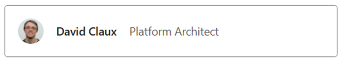
When the card's width is standard or narrow, the role is squeezed.

When the card's width is very narrow, the name and role are significantly squeezed.

Adaptive Card updated to be responsive using
targetWidth:{ "type": "AdaptiveCard", "body": [ { "type": "ColumnSet", "columns": [ { "type": "Column", "targetWidth": "atLeast:narrow", "items": [ { "type": "Image", "style": "Person", "url": "https://aka.ms/AAp9xo4", "size": "Small" } ], "width": "auto" }, { "type": "Column", "spacing": "medium", "verticalContentAlignment": "center", "items": [ { "type": "TextBlock", "weight": "Bolder", "text": "David Claux", "wrap": true }, { "type": "TextBlock", "targetWidth": "atMost:narrow", "spacing": "None", "text": "Platform Architect", "isSubtle": true, "wrap": true } ], "width": "auto" }, { "type": "Column", "targetWidth": "atLeast:standard", "spacing": "medium", "items": [ { "type": "TextBlock", "text": "Platform Architect", "isSubtle": true, "wrap": true } ], "width": "stretch", "verticalContentAlignment": "center" } ] } ], "$schema": "https://adaptivecards.io/schemas/adaptive-card.json", "version": "1.5" }Let's see how the same Adaptive Card renders after using the
targetWidthproperty for different card widths:When the card's width is wide, the card still looks good.
When the card's width is standard or narrow, the role is moved under the name as there's no horizontal space to show them side-by-side.

When the card's width is very narrow, we can hide the image and only keep the most meaningful information.

For more information on how to design an Adaptive Card, see designing Adaptive Cards for your Teams app.
Typeahead support
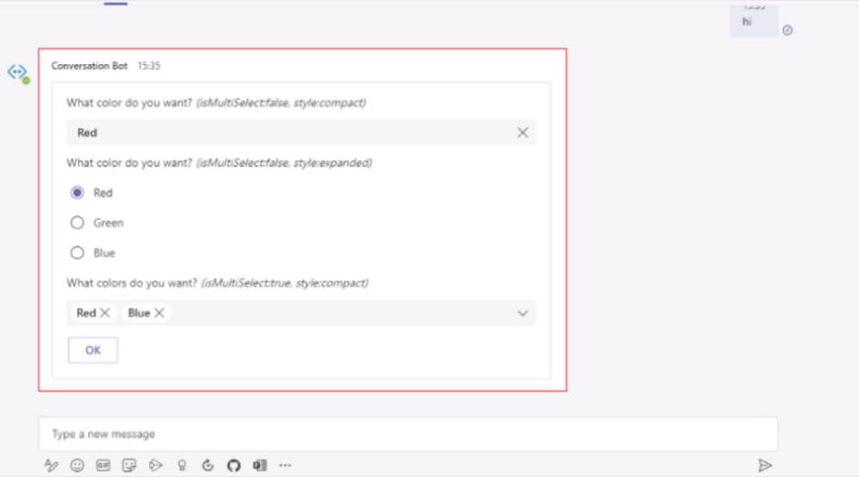
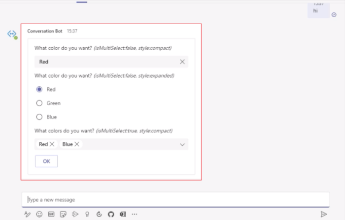
Within the Input.Choiceset schema element, asking users to filter and select a sizeable number of choices can significantly slow down task completion. Typeahead support within Adaptive Cards can simplify input selection by narrowing or filtering the set of input choices as the user types the input.
To enable typeahead within the Input.Choiceset, set style to filtered and ensure isMultiSelect is set to false.
Sample Adaptive Card with typeahead support
The following code shows an example of Adaptive Card with typeahead support:
{
   "type": "Input.ChoiceSet",
   "label": "Select a user",
   "isMultiSelect": false,
   "choices":  [
      { "title": "User 1", "value": "User1" },
      { "title": "User 2", "value": "User2" }
    ],
   "style": "filtered"
}
Stageview for images in Adaptive Cards
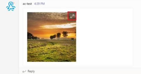
In an Adaptive Card, you can use the msteams property to add the ability to display images in Stageview selectively. When users hover over the images, they can see an expand icon, for which the allowExpand attribute is set to true. The following code is an example of the msteams property:
{
    "type": "AdaptiveCard",
     "body": [
          {
            "type": "Image",
            "url": "https://picsum.photos/200/200?image=110",
            "msTeams": {
              "allowExpand": true
            }
          }
     ],
    "$schema": "http://adaptivecards.io/schemas/adaptive-card.json",
    "version": "1.2"
}
When users hover over the image, an expand icon appears at the upper-right corner as shown in the following image:
The image appears in Stageview when the user selects the expand icon as shown in the following image:
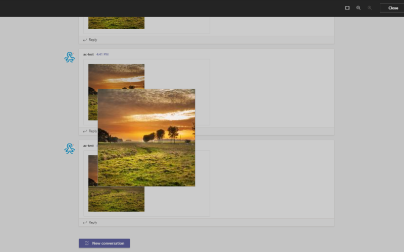
In the Stageview, users can zoom in and zoom out of the image. You can select the images in your Adaptive Card that must have this capability.
Note
- Zoom in and zoom out capability applies only to the image elements that is image type in an Adaptive Card.
- For Teams mobile apps, Stageview functionality for images in Adaptive Cards is available by default. Users can view Adaptive Card images in Stageview by simply tapping on the image, irrespective of whether the
allowExpandattribute is present or not.

CodeBlock in Adaptive Cards
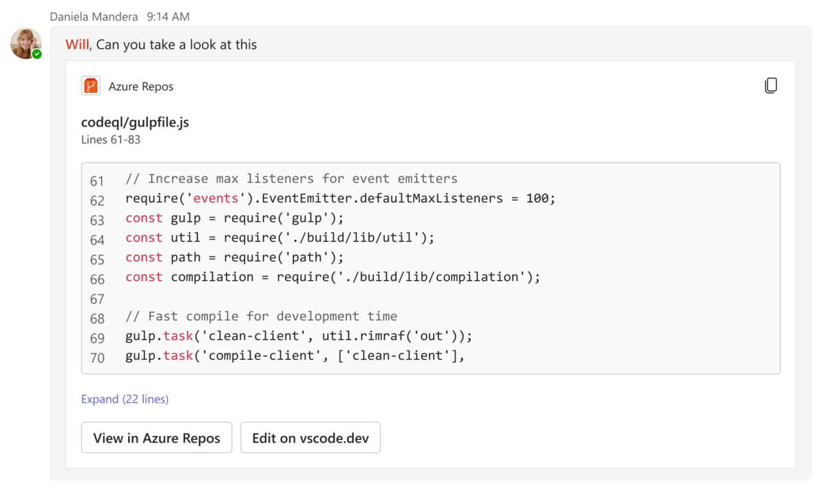
The CodeBlock element enables you to share code snippets as richly formatted Adaptive Cards in Teams chats, channels, and meetings. Adaptive Cards with the CodeBlock element make the code snippet easy to read as the indentation, numbering, and syntax highlighting match the programming language. Additionally, you can add action buttons to view the code at its source or edit the code in integrated development environments (IDEs) such as Microsoft Visual Studio or Microsoft Visual Studio Code.
The following screenshot shows an Adaptive Card with a code snippet:
The CodeBlock element supports the following languages:
| Language | Supported | Language | Supported |
|---|---|---|---|
| Bash | ✔️ | JSON | ✔️ |
| C | ✔️ | Perl | ✔️ |
| C++ | ✔️ | PHP | ✔️ |
| C# | ✔️ | PowerShell | ✔️ |
| CSS | ✔️ | Python | ✔️ |
| DOS | ✔️ | SQL | ✔️ |
| Go | ✔️ | TypeScript | ✔️ |
| GraphQL | ✔️ | Visual Basic | ✔️ |
| HTML | ✔️ | Verilog | ✔️ |
| Java | ✔️ | VHDL | ✔️ |
| JavaScript | ✔️ | XML | ✔️ |
Note
The CodeBlock element recognizes plain text as a language if you set the enum value to PlainText in the language property of the schema.
The following code is an example of an Adaptive Card displaying a code snippet:
{
    "$schema": "https://adaptivecards.io/schemas/adaptive-card.json",
    "type": "AdaptiveCard",
    "version": "1.5",
    "body": [
        {
            "type": "TextBlock",
            "text": "editor.js",
            "style": "heading"
        },
        {
            "type": "TextBlock",
            "text": "Lines 61 - 76"
        },
        {
            "type": "CodeBlock",
            "codeSnippet": "/**\n* @author John Smith <john.smith@example.com>\n*/\npackage l2f.gameserver.model;\n\npublic abstract strictfp class L2Char extends L2Object {\n  public static final Short ERROR = 0x0001;\n\n  public void moveTo(int x, int y, int z) {\n    _ai = null;\n    log(\"Shouldn't be called\");\n    if (1 > 5) { // what!?\n      return;\n    }\n  }\n}",
            "language": "java",
            "startLineNumber": 61
        }
    ],
    "actions": [
        {
            "type": "Action.OpenUrl",
            "title": "View in Azure Repos",
            "url": "https://azure.microsoft.com/en-us/products/devops/repos/"
        },
        {
            "type": "Action.OpenUrl",
            "title": "Edit in vscode.dev",
            "url": "https://vscode.dev/"
        }
    ]
}
The CodeBlock element supports the following properties:
| Property | Type | Required | Description |
|---|---|---|---|
codeSnippet |
String | Yes | The code snippet to be displayed in an Adaptive Card. |
language |
Enum | Yes | The language of the code snippet to be displayed in an Adaptive Card. |
startLineNumber |
Number | No | The line number in the source where the code snippet begins. If left blank, defaults to 1. |
Tip
- Special characters have specific functions in the
codeSnippetproperty. For example, the newline character\ntriggers a line break. - To display the newline character
\nas part of the code snippet in an Adaptive Card, ensure that you escape it as\\nin thecodeSnippetproperty. Else, Teams renders the code after the\nin the next line of the card.
Limitations
- An Adaptive Card with the
CodeBlockelement is supported only in Teams web and desktop clients. - The code snippet in an Adaptive Card is read-only and not editable.
- An Adaptive Card only previews the first 10 lines of the code snippet. If there are more than 10 lines of code, the user must select Expand to see the rest of the code snippet.
Adaptive Cards overflow menu
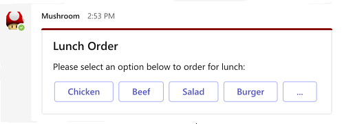
Adaptive Card in Teams supports overflow menu. You can populate an overflow menu for all the secondary actions in an Adaptive Card. An overflow menu in an Adaptive Card can be added to the following:
Actions: In actions, the primary buttons appear on the Adaptive Card and the secondary buttons are inside the overflow menu.
ActionSet: ActionSet is a combination of multiple actions in an Adaptive Card. Each action set can have an overflow menu.
Note
An Adaptive Card supports up to six primary actions to be viewed on the card. Any additional primary action is viewed in the overflow menu.

Enable overflow menu
To enable overflow menu, configure the mode property with the value as primary or secondary in the Adaptive Card schema. The following table describes the mode property:
| Property | Type | Required | Description |
|---|---|---|---|
mode |
Enum (Primary, Secondary) | No | Whether or not the action is a primary or secondary action. Secondary actions are collapsed into an overflow menu. |
The following example shows the mode property in the actions type and the ActionSet element:
Actions
In the following example, there are two primary actions and one secondary action. The secondary action creates an overflow menu.
{
   "type": "AdaptiveCard",
   "actions": [
        {
            "type": "Action.Submit",
            "title": "Set due date"
        },
        {
            "type": "Action.OpenUrl",
            "title": "View",
            "url": "https://adaptivecards.io"
        },
        {
            "type": "Action.Submit",
            "title": "Delete",
            "mode": "secondary"
        }
    ]
}
Note
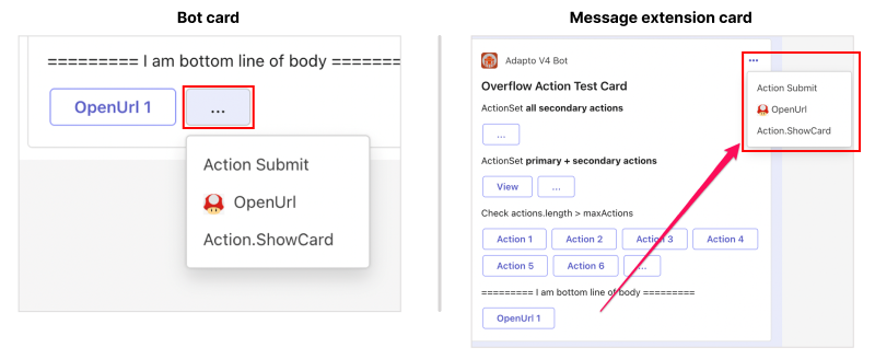
The overflow menu behaves differently on a bot sent card and a message extension card for the root level actions in an Adaptive Card. The overflow menu on a bot sent card appears as a pop-up context menu and on the message extension card it appears at the upper-right corner under the More options (...) icon. The behavior isn't applicable to the ActionSet in an Adaptive Card.
The following image is an example of overflow menu in a bot sent card and a message extension card:
Action set
In the following example, all the actions are marked as secondary, therefore, a single overflow menu appears on the card.
{
    "type": "ActionSet",
     "actions": [

          {

            "type": "Action.Submit",
            "title": "view",
            "mode": "Secondary"
       {
       },
            "type": "Action.submit",
            "title": "Delete",
            "mode": "secondary"

       },
       {
             "type": "Action.submit",
            "title": "Delete",
            "mode": "secondary"
       }
     ]
}
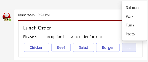
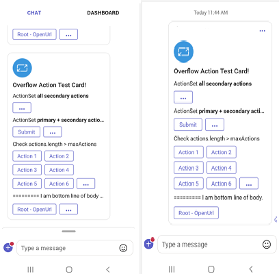
The following example shows the overflow menu experience in Teams desktop and mobile clients:
When a user selects the overflow menu on a desktop, the buttons that are set as secondary appear in the Adaptive Card.

Borders and rounded corners in Adaptive Cards
Adaptive Cards support a wide variety of elements, but having too many elements clutters the card and hinders readability. You can add borders to various elements in an Adaptive Card to delineate them, making it easier for users to distinguish between them.


You can use Adaptive Cards across multiple hosts. Many of these hosts follow contemporary design systems and frameworks. Adaptive Cards support rounded corners for various elements to maintain consistency with these hosts and keep up with latest design trends. Rounded corners make the card design look more modern and visually appealing, creating a softer visual flow.


You can add borders and rounded corners only to the following elements:
| Element | Borders | Rounded Corners |
|---|---|---|
Container |
✔️ | ✔️ |
ColumnSet |
✔️ | ✔️ |
Column |
✔️ | ✔️ |
Table |
✔️ | ✔️ |
Image |
❌ | ✔️ |
Implement borders and rounded corners in Adaptive Cards
To add a border to a Container, ColumnSet, or Column element, set the showBorder property to true for the element in the card’s payload. To add a border to a Table element, set the showGridLines property to true. The border color matches the element’s style, as defined in the HostConfig.json.
| Property | Type | Required | Description |
|---|---|---|---|
showBorder |
Boolean | No | Adds a border to the Container, ColumnSet, or Column elements. |
showGridLines |
Boolean | No | Adds a border to the Table element. Default value: true |
To add rounded corners to a Container, ColumnSet, Column, or Table element, set the roundedCorners property to true for the element in the card’s payload. To add rounded corners to the Image element, set the style property to RoundedCorners within the element.
| Property | Type | Required | Description |
|---|---|---|---|
roundedCorners |
Boolean | No | Adds rounded corners to the Container, ColumnSet, Column, or Table elements. |
style |
String | No | Adds rounded corners to the Image element when you set the value to roundedCorners. |
The following JSON payload shows an Adaptive Card with borders and rounded corners around its elements:
{
    "type": "AdaptiveCard",
    "$schema": "https://adaptivecards.io/schemas/adaptive-card.json",
    "version": "1.5",
    "body": [
        {
            "type": "TextBlock",
            "text": "Below is a **ColumnSet** with borders and rounded corners:",
            "wrap": true
        },
        {
            "type": "ColumnSet",
            "showBorder": true,
            "roundedCorners": true,
            "style": "emphasis",
            "columns": [
                {
                    "type": "Column",
                    "width": "stretch",
                    "showBorder": true,
                    "roundedCorners": true,
                    "style": "accent",
                    "items": [
                        {
                            "type": "TextBlock",
                            "text": "This is a **Column** with borders and rounded corners",
                            "wrap": true
                        }
                    ]
                },
                {
                    "type": "Column",
                    "width": "stretch",
                    "showBorder": true,
                    "roundedCorners": true,
                    "style": "good",
                    "items": [
                        {
                            "type": "TextBlock",
                            "text": "This is another **Column** with borders and rounded corners",
                            "wrap": true
                        }
                    ]
                }
            ]
        },
        {
            "type": "Container",
            "style": "attention",
            "showBorder": true,
            "roundedCorners": true,
            "items": [
                {
                    "type": "TextBlock",
                    "text": "This is a **Container** with borders and rounded corners",
                    "wrap": true
                }
            ]
        },
        {
            "type": "Table",
            "roundedCorners": true,
            "columns": [
                {
                    "width": 1
                },
                {
                    "width": 1
                }
            ],
            "rows": [
                {
                    "type": "TableRow",
                    "cells": [
                        {
                            "type": "TableCell",
                            "items": [
                                {
                                    "type": "TextBlock",
                                    "text": "This **Table**...",
                                    "wrap": true
                                }
                            ]
                        },
                        {
                            "type": "TableCell",
                            "items": [
                                {
                                    "type": "TextBlock",
                                    "text": "...has borders and rounded corners",
                                    "wrap": true
                                }
                            ]
                        }
                    ]
                }
            ]
        },
        {
            "type": "TextBlock",
            "text": "The below **Image** has rounded corners:",
            "wrap": true
        },
        {
            "type": "Image",
            "url": "https://media.licdn.com/dms/image/C4E03AQF5uhIghtPzrA/profile-displayphoto-shrink_400_400/0/1517690039090?e=2147483647&v=beta&t=g1DFilNHZhah2fhaTS9ylBxGGGb2XyPA2C7LZptk4QE",
            "width": "100px",
            "style": "RoundedCorners"
        }
    ]
}
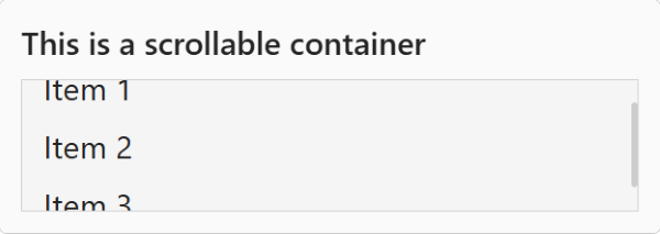
Scrollable containers in Adaptive Cards
A container with many elements might lead to a long, unreadable card. Use the maxHeight property to define the maximum height of the container. When the container has a maximum height and its content exceeds that height, a vertical scrollbar appears.
Here's how the maxHeight property is defined:
| Property | Type | Description |
|---|---|---|
maxHeight |
String | Defines the maximum height of the container. This property is available in Container, Column, TableCell, and in other containers as well.You must define the value in the <number>px format. |
The following card payload shows a container with a scroll bar:
{
    "type": "AdaptiveCard",
    "$schema": "https://adaptivecards.io/schemas/adaptive-card.json",
    "version": "1.5",
    "body": [
        {
            "type": "TextBlock",
            "text": "This is a scrollable container",
            "wrap": true,
            "size": "ExtraLarge",
            "weight": "Bolder"
        },
        {
            "type": "Container",
            "style": "emphasis",
            "showBorder": true,
            "maxHeight": "100px",
            "items": [
                {
                    "type": "TextBlock",
                    "text": "Item 1",
                    "size": "ExtraLarge"
                },
                {
                    "type": "TextBlock",
                    "text": "Item 2",
                    "size": "ExtraLarge"
                },
                {
                    "type": "TextBlock",
                    "text": "Item 3",
                    "size": "ExtraLarge"
                }
            ]
        }
    ]
}
Compound button in Adaptive Cards
Compound button is a special type of button with an icon, title, and description. You can add a Compound button using the CompoundButton element. This element enables you to replicate the appearance of prompt starters in an Adaptive Card.
Here are the properties of the CompoundButton element:
| Property | Required | Type | Description |
|---|---|---|---|
type |
✔️ | String | Must be CompoundButton. |
title |
✔️ | String | Title of the button. Markdown isn't supported. |
id |
String | Unique identifier for the element or action. | |
requires |
Object | A list of capabilities that the element requires the host app to support. If the host app doesn't support at least one of the listed capabilities, either the element isn't rendered or its fallback is rendered, if provided. | |
isVisible |
Boolean | Controls the visibility of the element. | |
separator |
Boolean | Controls whether a separator line must be displayed above the element to visually separate it from the previous element. No separator is displayed for the first element in a container, even if this property is set to true. |
|
height |
String | Height of the element. When set to stretch, the element uses the remaining vertical space in its container. Allowed values: auto, stretch |
|
horizontalAlignment |
String | Controls how the element must be horizontally aligned. Allowed values: Left, Center, Right |
|
Spacing |
String | Controls the amount of space between this element and the previous one. No space is added for the first element in a container. Allowed values: None, Small, Default, Medium, Large, ExtraLarge |
|
targetWidth |
String | Controls the card width for which the element should be displayed. If targetWidth isn't specified, the element is rendered at all card widths. Using targetWidth makes it possible to author responsive cards that adapt their layout to the available horizontal space. For more information, see Adaptive Card responsive layout. Allowed values: VeryNarrow, Narrow, Standard, Wide |
|
icon |
String | Icon shown on the button. | |
badge |
String | Badge shown on the button. Markdown isn't supported. | |
description |
String | Description text of the button. Markdown isn't supported. | |
selectAction |
Action that gets invoked when the button is selected. All Actions are allowed except Action.ShowCard. |
Here are the properties of the icon element:
| Property | Required | Type | Description |
|---|---|---|---|
name |
✔️ | String | Name of the icon, as per the Fluent icon directory. It's same as the name of the new icon element. |
size |
String | Size of the icon. Allowed values: xxSmall, xSmall, Small, Standard, Medium, Large, xLarge, xxLarge |
|
style |
String | Style of the icon. Allowed values: Regular, Filled |
|
color |
String | Color of the icon. Allowed values: Default, Dark, Light, Accent, Good, Warning, Attention |
Here's an Adaptive Card example that uses the CompoundButton element:
{
    "type": "AdaptiveCard",
    "$schema": "https://adaptivecards.io/schemas/adaptive-card.json",
    "version": "1.5",
    "body": [
        {
            "type": "CompoundButton",
            "title": "Photos",
            "icon": {
                "name": "Camera"
            },
            "description": "Add photos",
            "height": "stretch"
        }
    ]
}

Icons in Adaptive Card
Adaptive Cards support adding icons from the Fluent icon library using the Icon element. You can also use Fluent icons on action buttons by setting the action's iconUrl property to a value in the format of icon:<icon name>[,regular|filled].
Here are the properties of the Icon element:
| Property | Description |
|---|---|
type |
Must be Icon. |
name |
Name of the icon to display. For example, calendar. |
size |
Size of the icon. Allowed values: xxSmall, xSmall, Small, Medium, Large, xLarge, and xxLarge Default value: Standard |
color |
Color of the icon. Allowed values: Dark, Light, Accent, Good, Warning, and Attention Default value: Default |
style |
Style of the icon. Allowed values: Filled, Regular |
selectAction |
Action that's invoked when the icon is tapped or selected. All Action types are supported except Action.ShowCard. Allowed values: Action.Execute, Action.OpenUrl, Action.Popover, Action.ResetInputs, Action.Submit, Action.ToggleVisibility |
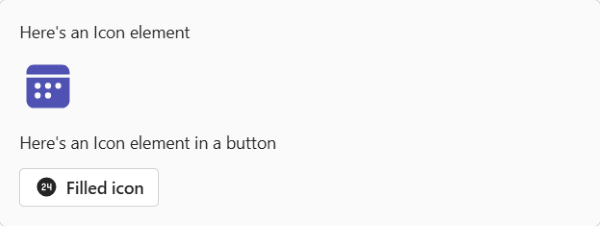
Here's an Adaptive Card example that uses the Icon element and the iconUrl property in an action button:
{
  "type": "AdaptiveCard",
  "$schema": "https://adaptivecards.io/schemas/adaptive-card.json",
  "version": "1.5",
  "body": [
    {
      "type": "TextBlock",
      "text": "Here's an Icon element"
    },
    {
  "type": "Icon",
        "name": "Calendar",
        "size": "Medium",
        "style": "Filled",
        "color": "Accent"
    },
    {
      "type": "TextBlock",
      "text": "Here's an Icon element in a button"
    }
 ],
 "actions": [
        {
            "type": "Action.OpenUrl",
            "title": "Filled icon",
            "url": "https://www.microsoft.com",
            "iconUrl": "icon:AccessTime,filled"
        }
    ]
}
Ratings in Adaptive Cards
You can add a star rating input to your Adaptive Card using the Input.Rating element. You can also include a read-only star rating using the Rating element.
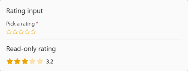
The following payload shows an Adaptive Card with input-enabled and read-only star ratings:
{
    "type": "AdaptiveCard",
    "$schema": "https://adaptivecards.io/schemas/adaptive-card.json",
    "version": "1.5",
    "body": [
        {
            "type": "TextBlock",
            "size": "Large",
            "text": "Rating input"
        },
        {
            "type": "Input.Rating",
            "id": "rating1",
            "label": "Pick a rating",
            "size": "medium",
            "color": "marigold",
            "isRequired": true,
            "errorMessage": "Please pick a rating"
        },
        {
            "type": "TextBlock",
            "size": "large",
            "text": "Read-only rating",
            "separator": true,
            "spacing": "extraLarge"
        },
        {
            "type": "Rating",
            "max": 20,
            "value": 3.2,
            "color": "marigold"
        }
    ]
}
Input.Rating
Here are the properties of the Input.Rating element:
| Property | Required | Type | Description |
|---|---|---|---|
type |
✔️ | String | Must be Input.Rating. |
allowHalfSteps |
Boolean | Controls if the user can select half stars. Default value: false |
|
color |
String | The color of the stars. Allowed values: Neutral, MarigoldDefault value: Neutral |
|
errorMessage |
String | The error message to display when the input fails validation. | |
fallback |
One of Object or String | An alternate element to render if the type of this element is unsupported or if the host application doesn't support all the capabilities specified in the requires property.Allowed values: Container, ActionSet, ColumnSet, Media, RichTextBlock, Table, TextBlock, FactSet, ImageSet, Image, Input.Text, Input.Date, Input.Time, Input.Number, Input.Toggle, Input.ChoiceSet, Input.Rating, Rating, CompoundButton, Icon, Chart.Donut, Chart.Pie, Chart.VerticalBar.Grouped, Chart.VerticalBar, Chart.HorizontalBar, Chart.HorizontalBar.Stacked, Chart.Line, Chart.Gauge, CodeBlock, drop |
|
grid.area |
String | The area of a Layout.AreaGrid layout in which an element must be displayed. |
|
height |
String | Controls the height of the element. When set to stretch, the element uses the remaining vertical space in its container.Allowed values: auto, stretchDefault value: auto |
|
id |
✔️ | String | A unique identifier for the element or action. |
isRequired |
Boolean | Determines whether the input is required. Default value: false |
|
isVisible |
Boolean | Determines the visibility of the element. Default value: true |
|
label |
String | The label of the input. | |
lang |
String | The locale associated with the element. | |
max |
Number | The number of stars to display. The default and maximum supported number of stars is five. | |
requires |
Object | A list of capabilities the element requires the host application to support. If the host application doesn't support at least one of the listed capabilities, the element isn't rendered or its fallback is rendered, if provided. Allowed values: HostCapabilities |
|
separator |
Boolean | Determines whether a separator line should be displayed above the element to visually separate it from the previous element. No separator is displayed for the first element in a container, even if this property is set to true.Default value: false |
|
size |
String | The size of the stars. Allowed values: Medium, LargeDefault value: Large |
|
spacing |
String | Controls the amount of space between this element and the previous one. No space is added for the first element in a container. Allowed values: None, Small, Default, Medium, Large, ExtraLarge, PaddingDefault value: Default |
|
targetWidth |
String | Controls the card width for which the element should be displayed. If targetWidth isn't specified, the element is rendered at all card widths. Using targetWidth makes it possible to author responsive cards that adapt their layout to the available horizontal space. For more information, see Adaptive Card responsive layout.Allowed values: VeryNarrow, Narrow, Standard, Wide, atLeast:VeryNarrow, atMost:VeryNarrow, atLeast:Narrow, atMost:Narrow, atLeast:Standard, atMost:Standard, atLeast:Wide, atMost:Wide |
|
value |
Number | The default value of the input. This value can't exceed max, if max is specified. |
|
valueChangedAction |
Action | An Action.ResetInputs action that will be executed when the value of the input changes.Allowed value: Action.ResetInputs |
Rating
Here are the properties of the Rating element:
| Property | Required | Type | Description |
|---|---|---|---|
type |
✔️ | String | Must be Rating. |
color |
String | The color of the stars. Allowed values: Neutral, MarigoldDefault value: Neutral |
|
count |
Number | The number of "votes" associated with the rating. | |
fallback |
One of Object or String | An alternate element to render if this type of element is unsupported or if the host application doesn't support all the capabilities specified in the requires property.Allowed values: Container, ActionSet, ColumnSet, Media, RichTextBlock, Table, TextBlock, FactSet, ImageSet, Image, Input.Text, Input.Date, Input.Time, Input.Number, Input.Toggle, Input.ChoiceSet, Input.Rating, Rating, CompoundButton, Icon, Chart.Donut, Chart.Pie, Chart.VerticalBar.Grouped, Chart.VerticalBar, Chart.HorizontalBar, Chart.HorizontalBar.Stacked, Chart.Line, Chart.Gauge, CodeBlock, drop |
|
grid.area |
String | The area of a Layout.AreaGrid layout in which an element must be displayed. |
|
height |
String | The height of the element. When set to stretch, the element uses the remaining vertical space in its container.Allowed values: Auto, Stretch |
|
horizontalAlignment |
String | Controls how the element should be horizontally aligned. Allowed values: Left, Center, Right |
|
id |
String | A unique identifier for the element or action. | |
isVisible |
Boolean | Controls the visibility of the element. Default value: true |
|
lang |
String | The locale associated with the element. | |
max |
Number | The number of stars to display. The default and maximum supported number of stars is five. | |
requires |
Object | A list of capabilities the element requires the host application to support. If the host application doesn't support at least one of the listed capabilities, the element isn't rendered or its fallback is rendered, if provided. Allowed value: HostCapabilities |
|
separator |
Boolean | Controls whether a separator line should be displayed above the element to visually separate it from the previous element. No separator is displayed for the first element in a container, even if this property is set to true.Default value: false |
|
size |
String | The size of the stars. Allowed values: Medium, LargeDefault value: Large |
|
spacing |
String | Controls the amount of space between this element and the previous one. No space is added for the first element in a container. Allowed values: None, Small, Default, Medium, Large, ExtraLarge, PaddingDefault value: Default |
|
style |
String | The style of the stars. In compact mode, only one star is displayed. Allowed values: Default, CompactDefault value: Default |
|
targetWidth |
String | Controls the card width for which the element should be displayed. If targetWidth isn't specified, the element is rendered at all card widths. Using targetWidth makes it possible to author responsive cards that adapt their layout to the available horizontal space. For more information, see Adaptive Card responsive layout.Allowed values: VeryNarrow, Narrow, Standard, Wide, atLeast:VeryNarrow, atMost:VeryNarrow, atLeast:Narrow, atMost:Narrow, atLeast:Standard, atMost:Standard, atLeast:Wide, atMost:Wide |
|
value |
Number | The value of the rating. This value must be between zero and max, if max is specified. |
Format cards with HTML
The following card types support HTML formatting in Teams:
- Connector cards for Microsoft 365 Groups: Limited Markdown and HTML formatting are supported in connector card for Microsoft 365 Groups.
- Hero and thumbnail cards: HTML tags are supported for simple cards, such as the hero and thumbnail cards.
Formatting is different between the desktop and the mobile versions of Teams for connector cards for Microsoft 365 Groups and simple cards. In this section, you can go through the HTML format example for connector cards and simple cards.
Connector cards support limited Markdown and HTML formatting.
| Style | Example | HTML |
|---|---|---|
| Bold | text | <strong>text</strong> |
| Italic | text | <em>text</em> |
| Header (levels 1–3) | Text | <h3>Text</h3> |
| Strikethrough | <strike>text</strike> |
|
| Unordered list |
|
<ul><li>text</li><li>text</li></ul> |
| Ordered list |
|
<ol><li>text</li><li>text</li></ol> |
| Preformatted text | text |
<pre>text</pre> |
| Blockquote | text |
<blockquote>text</blockquote> |
| Hyperlink | Bing | <a href="https://www.bing.com/">Bing</a> |
| Image link | <img src="https://aka.ms/Fo983c" alt="Duck on a rock"></img> |
In connector cards, newlines are rendered in HTML using the <p> tag.
Mobile and desktop differences for connector cards
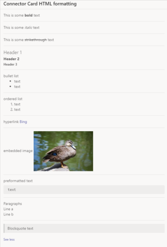
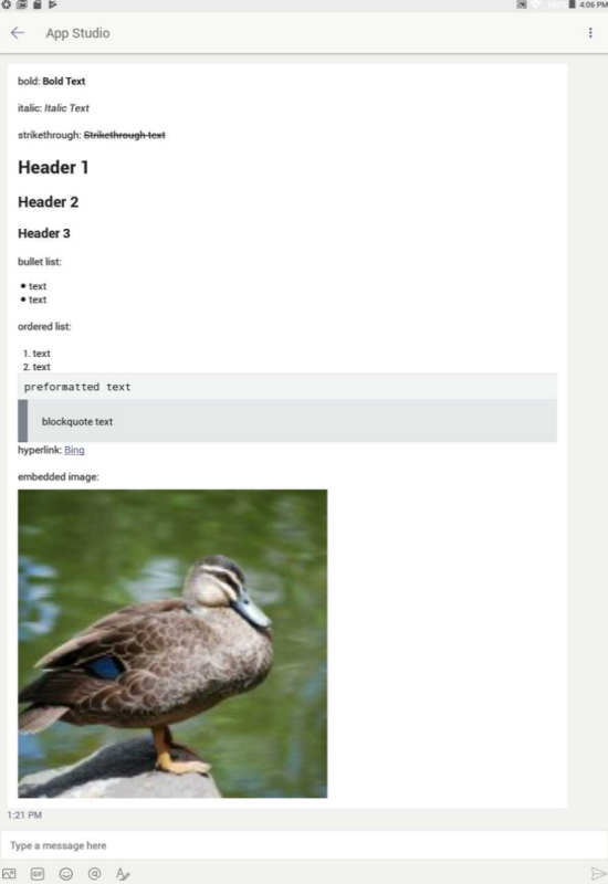
On the desktop, HTML formatting for connector cards appears as shown in the following image:
On iOS, HTML formatting appears as shown in the following image:
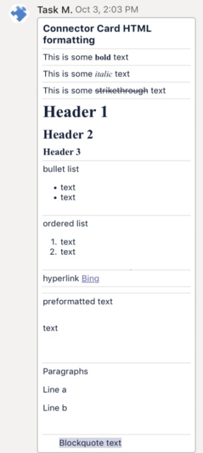
Connector cards using HTML for iOS include the following issues:
- Inline images aren't rendered on iOS using either Markdown or HTML in connector cards.
- Preformatted text is rendered but doesn't have a gray background.
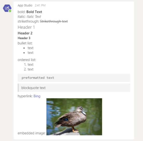
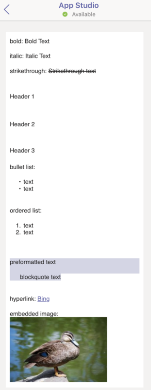
On Android, HTML formatting appears as shown in the following image:

Format sample for HTML connector cards
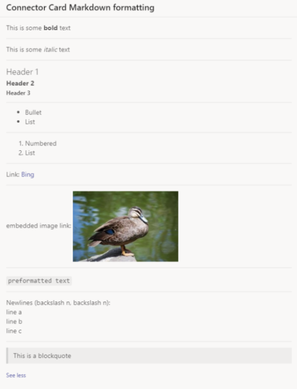
The following code shows an example of formatting for HTML connector cards:
{
  "contentType": "application/vnd.microsoft.teams.card.o365connector",
  "content": {
    "@type": "MessageCard",
    "@context": "https://schema.org/extensions",
    "summary": "Summary",
    "title": "Connector Card HTML formatting",
    "sections": [
        {
            "text": "This is some <strong>bold</strong> text"
        },
        {
            "text": "This is some <em>italic</em> text"
        },
        {
            "text": "This is some <strike>strikethrough</strike> text"
        },
        {
            "text": "<h1>Header 1</h1>\r<h2>Header 2</h2>\r <h3>Header 3</h3>"
        },
        {
            "text": "bullet list <ul><li>text</li><li>text</li></ul>"
        },
        {
            "text": "ordered list <ol><li>text</li><li>text</li></ol>"
        },
        {
            "text": "hyperlink <a href=\"https://www.bing.com/\">Bing</a>"
        },
        {
            "text": "embedded image <img src=\"https://aka.ms/Fo983c\" alt=\"Duck on a rock\"></img>"
        },
        {
            "text": "preformatted text <pre>text</pre>"
        },
        {
            "text": "Paragraphs <p>Line a</p><p>Line b</p>"
        },
        {
            "text": "<blockquote>Blockquote text</blockquote>"
        }
     ]
  }
}
Code samples
| S.No. | Description | .NET | Node.js | Manifest |
|---|---|---|---|---|
| 1 | This sample app shows the various card formats supported in Teams. | View | View | View |
See also
Platform Docs