Note
Access to this page requires authorization. You can try signing in or changing directories.
Access to this page requires authorization. You can try changing directories.
Starting with Visual Studio 2017, you can take advantage of added capabilities for UWP and WPF controls that you deliver in NuGet packages. This guide walks you through these capabilities in context of UWP controls using the ExtensionSDKasNuGetPackage sample. The same applies to WPF controls unless mentioned otherwise.
Prerequisites
- Visual Studio 2017
- Understanding of how to Create UWP Packages
Generate Library Layout
Note
This is applicable only to UWP controls.
Setting the GenerateLibraryLayout property ensures that the project build output is generated in a layout that is ready to be packaged without the need for individual file entries in the nuspec.
From the project properties, go to the build tab and check the "Generate Library Layout" check box. This will modify the project file and set the GenerateLibraryLayout flag to true for your currently selected build configuration and platform.
Alternately, edit the the project file to add <GenerateLibraryLayout>true</GenerateLibraryLayout> to the first unconditional property group. This would apply the property irrespective of the build configuration and platform.
Add toolbox/assets pane support for XAML controls
To have a XAML control appear in the XAML designer’s toolbox in Visual Studio and the Assets pane of Blend, create a VisualStudioToolsManifest.xml file in the root of the tools folder of your package project. This file is not required if you don’t need the control to appear in the toolbox or Assets pane.
\build
\lib
\tools
    VisualStudioToolsManifest.xml
The structure of the file is as follows:
<FileList>
  <File Reference = "your_package_file">
    <ToolboxItems UIFramework="WPF" VSCategory="vs_category" BlendCategory="blend_category">
      <Item Type="type_full_name_1" />

      <!-- Any number of additional Items -->
      <Item Type="type_full_name_2" />
      <Item Type="type_full_name_3" />
    </ToolboxItems>
  </File>
</FileList>
where:
- your_package_file: the name of your control file, such as
ManagedPackage.winmd("ManagedPackage" is an arbitrary named used for this example and has no other meaning). - vs_category: The label for the group in which the control should appear in the Visual Studio designer’s toolbox. A
VSCategoryis necessary for the control to appear in the toolbox. ui_framework: The name of the Framework, such as 'WPF', note thatUIFrameworkattribute is required on ToolboxItems nodes on Visual Studio 16.7 Preview 3 or above for the control to appear in toolbox. - blend_category: The label for the group in which the control should appear in the Blend designer’s Assets pane. A
BlendCategoryis necessary for the control to appear in Assets. - type_full_name_n: The fully-qualified name for each control, including the namespace, such as
ManagedPackage.MyCustomControl. Note that the dot format is used for both managed and native types.
In more advanced scenarios, you can also include multiple <File> elements within <FileList> when a single package contains multiple control assemblies. You can also have multiple <ToolboxItems> nodes within a single <File> if you want to organize your controls into separate categories.
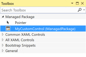
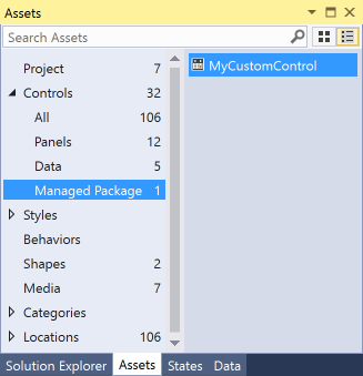
In the following example, the control implemented in ManagedPackage.winmd will appear in Visual Studio and Blend in a group named “Managed Package”, and “MyCustomControl” will appear in that group. All these names are arbitrary.
<FileList>
  <File Reference = "ManagedPackage.winmd">
    <ToolboxItems UIFramework="WPF" VSCategory="Managed Package" BlendCategory="Managed Package">
      <Item Type="ManagedPackage.MyCustomControl" />
    </ToolboxItems>
  </File>
</FileList>


Note
You must explicitly specify every control that you would like to see in the toolbox/assets pane. Ensure you specify them in the format Namespace.ControlName.
Add custom icons to your controls
To display a custom icon in the toolbox/assets pane, add an image to your project or the corresponding design.dll project with the name “Namespace.ControlName.extension” and set the build action to “Embedded Resource”. You must also ensure that the associated AssemblyInfo.cs specifies the ProvideMetadata attribute - [assembly: ProvideMetadata(typeof(RegisterMetadata))]. See this sample.
Supported formats are .png, .jpg, .jpeg, .gif, and .bmp. The recommended format is BMP24 in 16 pixels by 16 pixels.

The pink background is replaced at runtime. The icons are recolored when the Visual Studio theme is changed and that background color is expected. For more information, please reference Images and Icons for Visual Studio.
In the example below, the project contains an image file named “ManagedPackage.MyCustomControl.png”.
![]()
Note
For native controls, you must put the icon as a resource in the design.dll project.
Support specific Windows platform versions
UWP packages have a TargetPlatformVersion (TPV) and TargetPlatformMinVersion (TPMinV) that define the upper and lower bounds of the OS version where the app can be installed. TPV further specifies the version of the SDK against which the app is built. Be mindful of these properties when authoring a UWP package: using APIs outside the bounds of the platform versions defined in the app will cause either the build to fail or the app to fail at runtime.
For example, let’s say you’ve set the TPMinV for your controls package to Windows 10 Anniversary Edition (10.0; Build 14393), so you want to ensure that the package is consumed only by UWP projects that match that lower bound. To allow your package to be consumed by UWP projects, you must package your controls with the following folder names:
\lib\uap10.0.14393\*
\ref\uap10.0.14393\*
NuGet will automatically check the TPMinV of the consuming project, and fail installation if it is lower than Windows 10 Anniversary Edition (10.0; Build 14393)
In case of WPF, let's say you would like your WPF controls package to be consumed by projects targeting .NET Framework v4.6.1 or higher. To enforce that, you must package your controls with the following folder names:
\lib\net461\*
\ref\net461\*
Add design-time support
To configure where the control properties show up in the property inspector, add custom adorners, etc., place your design.dll file inside the lib\uap10.0.14393\Design folder as appropriate to the target platform. Also, to ensure that the Edit Template > Edit a Copy feature works, you must include the Generic.xaml and any resource dictionaries that it merges in the <your_assembly_name>\Themes folder (again, using your actual assembly name). (This file has no impact on the runtime behavior of a control.) The folder structure would thus appear as follows:
\lib
  \uap10.0.14393
    \Design
      \MyControl.design.dll
    \your_assembly_name
      \Themes
        Generic.xaml
For WPF, continuing with the example where you would like your WPF controls package to be consumed by projects targeting .NET Framework v4.6.1 or higher:
\lib
  \net461
    \Design
      \MyControl.design.dll
    \your_assembly_name
      \Themes
        Generic.xaml
Note
By default, control properties will show up under the Miscellaneous category in the property inspector.
Use strings and resources
You can embed string resources (.resw) in your package that can be used by your control or the consuming UWP project, set the Build Action property of the .resw file to PRIResource.
For an example, refer to MyCustomControl.cs in the ExtensionSDKasNuGetPackage sample.
Note
This is applicable only to UWP controls.