Note
Access to this page requires authorization. You can try signing in or changing directories.
Access to this page requires authorization. You can try changing directories.
Perpetual Office 2016 and later use Microsoft's Fresh style iconography. If you would prefer that your icons match the Monoline style of Microsoft 365, see Monoline style icon guidelines for Office Add-ins.
Office Fresh visual style
The Fresh icons include only essential communicative elements. Non-essential elements including perspective, gradients, and light source are removed. The simplified icons support faster parsing of commands and controls. Follow this style to best fit with Office perpetual clients.
Best practices
Follow these guidelines when you create your icons.
| Do | Don't |
|---|---|
| Keep visuals simple and clear, focusing on the key elements of the communication. | Don't use artifacts that make your icon look messy. |
| Use the Office icon language to represent behaviors or concepts. | Don't repurpose Fabric Core glyphs for add-in commands in the Office app ribbon or contextual menus. Fabric Core icons are stylistically different and won't match. |
| Reuse common Office visual metaphors such as paintbrush for format or magnifying glass for find. | Don't reuse visual metaphors for different commands. Using the same icon for different behaviors and concepts can cause confusion. |
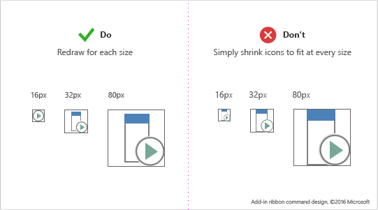
| Redraw your icons to make them small or larger. Take the time to redraw cutouts, corners, and rounded edges to maximize line clarity. | Don't resize your icons by shrinking or enlarging in size. This can lead to poor visual quality and unclear actions. Complex icons created at a larger size may lose clarity if resized to be smaller without redraw. |
| Use a white fill for accessibility. Most objects in your icons will require a white background to be legible across Office UI themes and in high-contrast modes. | Avoid relying on your logo or brand to communicate what an add-in command does. Brand marks aren't always recognizable at smaller icon sizes and when modifiers are applied. Brand marks often conflict with Office app ribbon icon styles, and can compete for user attention in a saturated environment. |
| Use the PNG format with a transparent background. | None |
| Avoid localizable content in your icons, including typographic characters, indications of paragraph rags, and question marks. | None |
Icon size recommendations and requirements
Office desktop icons are bitmap images. Different sizes will render depending on the user's DPI setting and touch mode. Include all eight supported sizes to create the best experience in all supported resolutions and contexts. The following are the supported sizes - three are required.
- 16 px (Required)
- 20 px
- 24 px
- 32 px (Required)
- 40 px
- 48 px
- 64 px (Recommended, best for Mac)
- 80 px (Required)
Important
For an image that is your add-in's representative icon, see Create effective listings in AppSource and within Office for size and other requirements.
Make sure to redraw your icons for each size rather than shrink them to fit.
Icon anatomy and layout
Office icons are typically comprised of a base element with action and conceptual modifiers overlaid. Action modifiers represent concepts such as add, open, new, or close. Conceptual modifiers represent status, alteration, or a description of the icon.
To create commands that align with the Office UI, follow layout guidelines for the base element and modifiers. This ensures that your commands look professional and that your customers will trust your add-in. If you make exceptions to these guidelines, do so intentionally.
The following image shows the layout of base elements and modifiers in an Office icon.
- Center base elements in the pixel frame with empty padding all around.
- Place action modifiers on the top left.
- Place conceptual modifiers on the bottom right.
- Limit the number of elements in your icons. At 32 px, limit the number of modifiers to a maximum of two. At 16 px, limit the number of modifiers to one.
Base element padding
Place base elements consistently across sizes. If base elements can't be centered in the frame, align them to the top left, leaving the extra pixels on the bottom right. For best results, apply the padding guidelines listed in the table in the following section.
Modifiers
All modifiers should have a 1 px transparent cutout between each element, including the background. Elements shouldn't directly overlap. Create whitespace between rules and edges. Modifiers can vary slightly in size, but use these dimensions as a starting point.
| Icon size | Padding around base element | Modifier size |
|---|---|---|
| 16 px | 0 | 9 px |
| 20 px | 1px | 10 px |
| 24 px | 1px | 12 px |
| 32 px | 2px | 14 px |
| 40 px | 2px | 20 px |
| 48 px | 3px | 22 px |
| 64 px | 5px | 29 px |
| 80 px | 5px | 38 px |
Icon colors
Note
These color guidelines are for ribbon icons used in Add-in commands. These icons are not rendered with Fluent UI and the color palette is different from the palette described at Microsoft UI Fabric | Colors | Shared.
Office icons have a limited color palette. Use the colors listed in the following table to guarantee seamless integration with the Office UI. Apply the following guidelines to the use of color.
- Use color to communicate meaning rather than for embellishment. It should highlight or emphasize an action, status, or an element that explicitly differentiates the mark.
- If possible, use only one additional color beyond gray. Limit additional colors to two at the most.
- Colors should have a consistent appearance in all icon sizes. Office icons have slightly different color palettes for different icon sizes. 16 px and smaller icons are slightly darker and more vibrant than 32 px and larger icons. Without these subtle adjustments, colors appear to vary across sizes.
| Color name | RGB | Hex | Color | Category |
|---|---|---|---|---|
| Text Gray (80) | 80, 80, 80 | #505050 |  |
Text |
| Text Gray (95) | 95, 95, 95 | #5F5F5F |  |
Text |
| Text Gray (105) | 105, 105, 105 | #696969 |  |
Text |
| Dark Gray 32 | 128, 128, 128 | #808080 |  |
32 px and above |
| Medium Gray 32 | 158, 158, 158 | #9E9E9E |  |
32 px and above |
| Light Gray ALL | 179, 179, 179 | #B3B3B3 |  |
All sizes |
| Dark Gray 16 | 114, 114, 114 | #727272 |  |
16 px and below |
| Medium Gray 16 | 144, 144, 144 | #909090 |  |
16 and below |
| Blue 32 | 77, 130, 184 | #4d82B8 |  |
32 px and above |
| Blue 16 | 74, 125, 177 | #4A7DB1 |  |
16 px and below |
| Yellow ALL | 234, 194, 130 | #EAC282 |  |
All sizes |
| Orange 32 | 231, 142, 70 | #E78E46 |  |
32 px and above |
| Orange 16 | 227, 142, 70 | #E3751C |  |
16 px and below |
| Pink ALL | 230, 132, 151 | #E68497 |  |
All sizes |
| Green 32 | 118, 167, 151 | #76A797 |  |
32 px and above |
| Green 16 | 104, 164, 144 | #68A490 |  |
16 px and below |
| Red 32 | 216, 99, 68 | #D86344 |  |
32 px and above |
| Red 16 | 214, 85, 50 | #D65532 |  |
16 px and below |
| Purple 32 | 152, 104, 185 | #9868B9 |  |
32 px and above |
| Purple 16 | 137, 89, 171 | #8959AB |  |
16 px and below |
Icons in high contrast modes
Office icons are designed to render well in high contrast modes. Foreground elements are well differentiated from backgrounds to maximize legibility and enable recoloring. In high contrast modes, Office will recolor any pixel of your icon with a red, green, or blue value less than 190 to full black. All other pixels will be white. In other words, each RGB channel is assessed where 0-189 values are black and 190-255 values are white. Other high-contrast themes recolor using the same 190 value threshold but with different rules. For example, the high-contrast white theme will recolor all pixels greater than 190 opaque but all other pixels as transparent. Apply the following guidelines to maximize legibility in high-contrast settings.
- Aim to differentiate foreground and background elements along the 190 value threshold.
- Follow Office icon visual styles.
- Use colors from our icon palette.
- Avoid the use of gradients.
- Avoid large blocks of color with similar values.
See also
Unified manifest reference
Add-in only manifest reference
Collaborate with us on GitHub
The source for this content can be found on GitHub, where you can also create and review issues and pull requests. For more information, see our contributor guide.
Office Add-ins