Note
Access to this page requires authorization. You can try signing in or changing directories.
Access to this page requires authorization. You can try changing directories.
Implement recommended design patterns in your add-in to promote brand visibility while maintaining seamless integration with Office applications.
Best practices
The following table outlines design best practices to enhance your add-in's brand recognition.
| Do | Don't |
|---|---|
| Use familiar UI components with applied branding accents like typography and color. | Don't invent new UI components that contradict established Office UI. |
| Place your add-in branding in a brand bar footer at the bottom of your UI. | Don't repeat your task pane name in an immediately adjacent brand bar at the top of your UI. |
| Use brand elements sparingly. Fit your solution into Office such that is complementary. | Don't insert excessively branded elements into Office UI that distract and confuse customers. |
| Make your solution recognizable and connect your screens together with consistent visual elements. | Don't hide your solution with unrecognizable and inconsistently applied visual elements. |
| Build connection with a parent service or business to ensure that customers know and trust your solution. | Don't make customers learn a new brand concept if there's a useful and understandable relationship that can be leveraged to build trust and value. |
Design patterns and components
Apply the following patterns and components to allow users to embrace the full utility of your add-in.
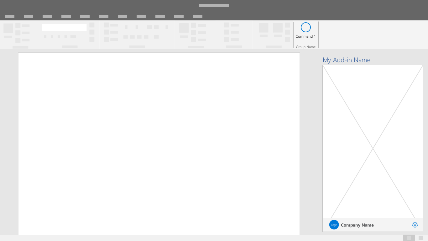
Brand Bar
The brand bar is a space in the footer to include your brand name and logo. It also serves as a link to your brand's website and an optional access location.
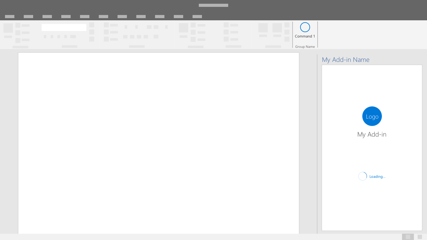
Splash Screen
Use this screen to display your branding while the add-in is loading or transitioning between UI states.
See also
Collaborate with us on GitHub
The source for this content can be found on GitHub, where you can also create and review issues and pull requests. For more information, see our contributor guide.
Office Add-ins