Note
Access to this page requires authorization. You can try signing in or changing directories.
Access to this page requires authorization. You can try changing directories.
You can specify card modal windows in the Excel UI for various cell value data types. Cards can display additional information beyond what's already visible in a cell, such as related images, product category information, and data attributions.
Note
This article expands on information described in the Excel data types core concepts article. We recommend reading that article before learning about cards for cell values.
Cards are supported for the following cell value types.
- EntityCellValue
- LinkedEntityCellValue
- string, double, and Boolean basic types
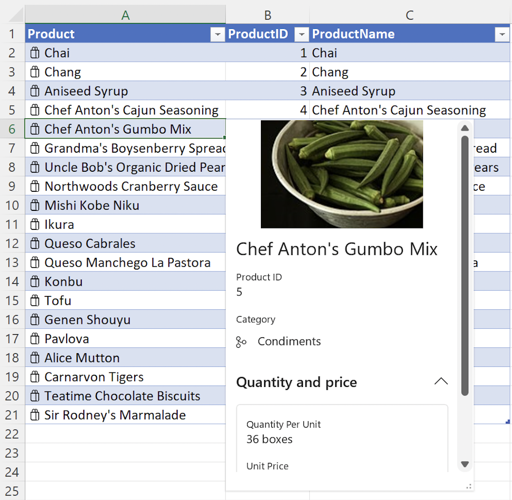
The following screenshot shows an example of an open entity value card, in this case for the Chef Anton's Gumbo Mix product from a list of grocery store products.
Card properties
Use properties to specify all custom information about your data types. The properties key supports nested data types. Each nested property, or data type, must have a type and basicValue setting.
Important
The nested properties data types are used in combination with the Card layout values described in the subsequent article section. After defining a nested data type in properties, it must be assigned in the layouts property to display on the card.
The following code snippet shows the JSON for an entity value with multiple data types nested within properties.
Note
To experiment with this code snippet in a complete sample, open Script Lab in Excel and select Data types: Create entity cards from data in a table in our Samples library.
const entity: Excel.EntityCellValue = {
    type: Excel.CellValueType.entity,
    text: productName,
    properties: {
        "Product ID": {
            type: Excel.CellValueType.string,
            basicValue: productID.toString() || ""
        },
        "Product Name": {
            type: Excel.CellValueType.string,
            basicValue: productName || ""
        },
        "Image": {
            type: Excel.CellValueType.webImage,
            address: product.productImage || ""
        },
        "Quantity Per Unit": {
            type: Excel.CellValueType.string,
            basicValue: product.quantityPerUnit || ""
        },
        "Unit Price": {
            type: Excel.CellValueType.double,
            basicValue: product.unitPrice,
            numberFormat: "$* #,##0.00"
        },
        Discontinued: {
            type: Excel.CellValueType.boolean,
            basicValue: product.discontinued || false
        }
    },
    layouts: {
        // Enter layout settings here.
    }
};
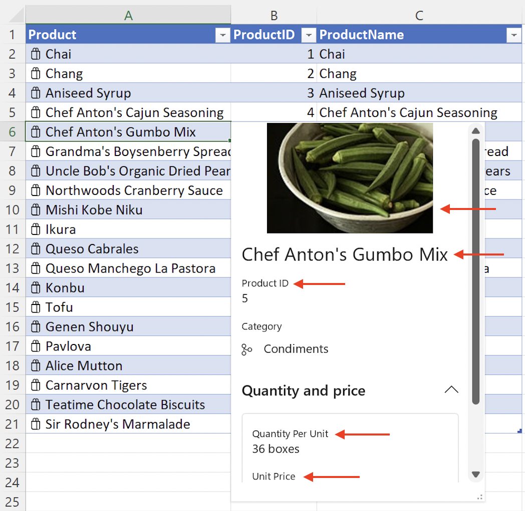
The following screenshot shows an entity value card that uses the preceding code snippet. The screenshot shows the Product ID, Product Name, Image, Quantity Per Unit, and Unit Price information from the preceding code snippet.
Card layout
Cell values have a default data type card that the user can view. Specify a custom card layout to improve the user experience when viewing properties. The layouts property defines the structure and appearance of the card. Use layouts to specify attributes such as an icon, card title, image for a card, and the number of sections to display.
Important
The nested layouts values are used in combination with the Card properties data types described in the preceding article section. A nested data type must be defined in properties before it can be assigned in layouts to display on the card.
The layouts property contains two direct subproperties, compact and card. The card property specifies the appearance of a card when the card is open. The compact property is optional and defines the icon for a value. The icon is shown in the cell value if it's provided. It can also be shown in the card if it's referenced as a subproperty.
See the EntityCompactLayoutIcons enum for a full list of available icons. The next code snippet shows how to display the shoppingBag icon.
Within the card property, use the CardLayoutStandardProperties object to define the components of the card like title, subTitle, and sections.
The entity value JSON in the next code snippet shows a card layout with nested title and mainImage objects, as well as three sections within the card. Note that the title property "Product Name" has a corresponding data type in the preceding Card properties article section. The mainImage property also has a corresponding "Image" data type in the preceding section. The sections property takes a nested array and uses the CardLayoutSectionStandardProperties object to define the appearance of each section.
Within each card section you can specify elements like layout, title, and properties. The layout key uses the CardLayoutListSection object and accepts the value "List". The properties key accepts an array of strings. Note that the properties values, such as "Product ID", have corresponding data types in the preceding Card properties article section. Sections can also be collapsible and can be defined with boolean values as collapsed or not collapsed when the entity card is opened in the Excel UI.
Tip
The layout key also has additional display options available beyond "List" within card sections. Use "Table" for Excel.CardLayoutTableSection and "TwoColumn" for Excel.CardLayoutTwoColumnSection.
Note
To experiment with this code snippet in a complete sample, open Script Lab in Excel and select Data types: Create entity cards from data in a table in our Samples library.
const entity: Excel.EntityCellValue = {
    type: Excel.CellValueType.entity,
    text: productName,
    properties: {
        // Enter property settings here.
    },
    layouts: {
        compact: {
            icon: Excel.EntityCompactLayoutIcons.shoppingBag
        },
        card: {
            title: {
                property: "Product Name"
            },
            mainImage: {
                property: "Image"
            },
            sections: [
                {
                    layout: "List",
                    properties: ["Product ID"]
                },
                {
                    layout: "List",
                    title: "Quantity and price",
                    collapsible: true,
                    collapsed: false, // This section will not be collapsed when the card is opened.
                    properties: ["Quantity Per Unit", "Unit Price"]
                },
                {
                    layout: "List",
                    title: "Additional information",
                    collapsible: true,
                    collapsed: true, // This section will be collapsed when the card is opened.
                    properties: ["Discontinued"]
                }
            ]
        }
    }
};
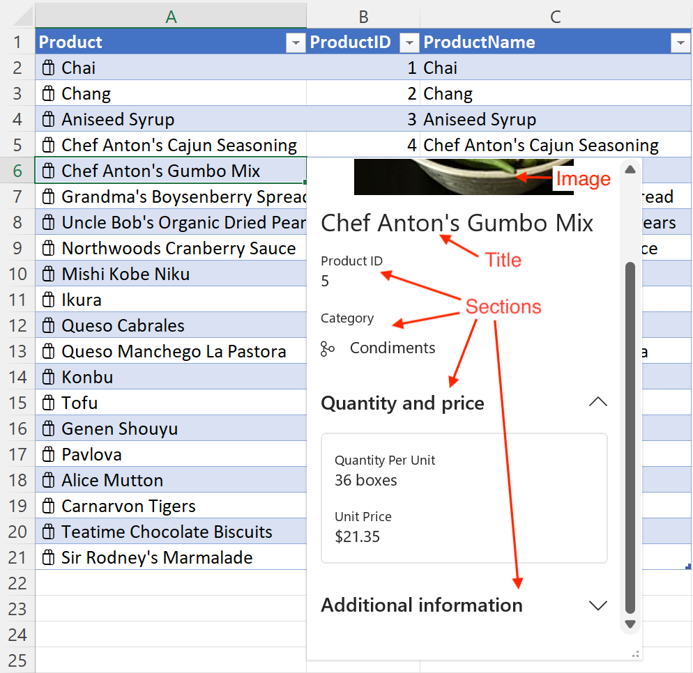
The following screenshot shows an entity value card that uses the preceding code snippets. In the screenshot, the shoppingBag icon displays alongside the product names in the spreadsheet. In the entity card, the mainImage object displays at the top, followed by the title object which uses the Product Name and is set to Chef Anton's Gumbo Mix. The screenshot also shows sections. The Quantity and price section is collapsible and contains Quantity Per Unit and Unit Price. The Additional information field is collapsible and is collapsed when the card is opened.
Note
In the preceding screenshot, the branch icon displays alongside Condiments in the Category section. See the Data types: Create entity cards from data in a table sample to learn how to set nested icons like the Category section icon.
There is a known issue with nested icons in Excel on Mac. In that environment, nested icons will always display as the generic icon, regardless of which icon is selected with the EntityCompactLayoutIcons enum.
Property metadata
Entity properties have an optional propertyMetadata field that uses the CellValuePropertyMetadata object and offers the properties attribution, excludeFrom, and sublabel. The following code snippet shows how to add a sublabel to the "Unit Price" property from the preceding code snippet. In this case, the sublabel identifies the currency type.
Note
The propertyMetadata field is only available on data types that are nested within entity properties.
// This code snippet is an excerpt from the `properties` field of the
// preceding `EntityCellValue` snippet. "Unit Price" is a property of
// an entity value.
    "Unit Price": {
        type: Excel.CellValueType.double,
        basicValue: product.unitPrice,
        numberFormat: "$* #,##0.00",
        propertyMetadata: {
          sublabel: "USD"
        }
    },
Attribution
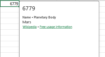
Add attribution for information that comes from third parties to indicate the source and any license information. Use Excel.CellValueAttributionAttributes to add attribution to a cell value. The following code example shows how to add attribution for usage of information about the planet Mars from Wikipedia.
async function createPlanet() {
    await Excel.run(async (context) => {
        const sheet = context.workbook.worksheets.getActiveWorksheet();
        const range = sheet.getRange("A1");
        const attributionObject: Excel.CellValueAttributionAttributes = {
            licenseAddress: "https://en.wikipedia.org/wiki/Wikipedia:Wikipedia_is_free_content",
            licenseText: "Free usage information",
            sourceAddress: "https://en.wikipedia.org/wiki/Mars",
            sourceText: "Wikipedia"
        };

        range.valuesAsJson = [
            [
                {
                    type: Excel.CellValueType.double,
                    basicType: Excel.RangeValueType.double,
                    basicValue: 6779, // kilometers (radius)
                    properties: {
                        Name: {
                            type: Excel.CellValueType.string,
                            basicType: Excel.RangeValueType.string,
                            basicValue: "Mars",
                            propertyMetadata: {
                                sublabel: "Planetary Body",
                                attribution: [attributionObject]
                            }
                        }
                    }
                }
            ]
        ];
        await context.sync();
    });
}
The following image shows how the attribution is displayed in the data type card for the user.
Provider information
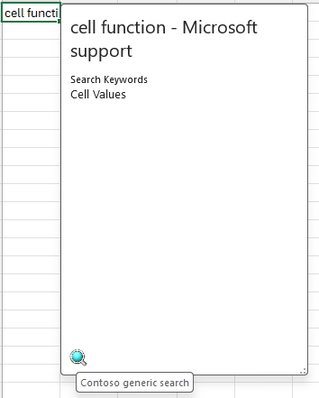
You can add information about your add-in, or service, that is the source for the information in the data type card. Use Excel.CellValueProviderAttributes to add your provider information. The following code sample shows how to add provider information for Contoso generic search as the source of search data for the cell value.
async function createSearchEntry() {
    await Excel.run(async (context) => {
        const sheet = context.workbook.worksheets.getActiveWorksheet();
        const range = sheet.getRange("A1");

        range.valuesAsJson = [
            [
                {
                    type: Excel.CellValueType.string,
                    basicType: Excel.RangeValueType.string,
                    basicValue: "cell function - Microsoft support",
                    properties: {
                        "Search Keywords": {
                            type: Excel.CellValueType.string,
                            basicType: Excel.RangeValueType.string,
                            basicValue: "Cell Values"
                        }
                    },
                    provider: {
                        description: "Contoso generic search",
                        // Image credit: Ignacio javier igjav, Public domain, via Wikimedia Commons
                        logoSourceAddress: "https://upload.wikimedia.org/wikipedia/commons/f/f9/Lupa.png",
                        logoTargetAddress: "https://contoso.com"
                    }
                }
            ]
        ];

        await context.sync();
    });
}
The following image shows how the provider information appears as the logo in the data type card for the user.
Next steps
Try out the Create and explore data types in Excel sample in our OfficeDev/Office-Add-in-samples repository. This sample guides you through building and then sideloading an add-in that creates and edits data types in a workbook.
See also
Collaborate with us on GitHub
The source for this content can be found on GitHub, where you can also create and review issues and pull requests. For more information, see our contributor guide.
Office Add-ins