Designing Outlook Actionable Message cards with the Adaptive Card format
Important
Onboarding of new Actionable Messages providers with a Global scope is temporarily paused until Jun 30th, 2024 due to service upgrades. Existing Global scoped providers and onboarding of Organization and Test scope providers are not impacted. For more details, see Frequently asked questions for Actionable Messages.
Outlook Actionable Messages cards are designed using the Adaptive Card format. The Adaptive Card format is a simple yet powerful declarative layout format that provides a lot of flexibility, allowing for visually rich cards. In this topic we'll cover the Outlook-specific features of the Adaptive Card format.
Important
The Adaptive Card format is only available for Actionable Messages sent via email, and is required to support Outlook on iOS and Android. The MessageCard format is still supported but is now de-emphasized. Office connectors and Microsoft Teams connectors do not currently support the Adaptive Card format. If you are implementing an Office 365 or Microsoft Teams connector, please refer to the MessageCard format reference.
For information on which Outlook versions support the Adaptive Card format, see Outlook version requirements for actionable messages.
Actionable Message Designer
The Actionable Message Designer provides a drag-and-drop experience to quickly build and tweak adaptive cards. There you will find Adaptive Card samples that can help you get started crafting your own cards and also allows you to send those cards to your own Microsoft 365 email account to see how they look in Outlook.
A simple Adaptive Card example

The above card illustrates some of the core and most powerful capabilities of the Adaptive Card format:
- The ability to stack elements of various types in any order
- The ability to control the amount of space between those elements
- The ability to layout elements in multiple columns
- The ability to align elements horizontally and vertically
Here is how this card is crafted:
{
"$schema": "https://adaptivecards.io/schemas/adaptive-card.json",
"version": "1.0",
"type": "AdaptiveCard",
"speak": "<s>Your flight is confirmed for you and 3 other passengers from San Francisco to Amsterdam on Friday, October 10 8:30 AM</s>",
"body": [
{
"type": "ColumnSet",
"columns": [
{
"width": "stretch",
"verticalContentAlignment": "center",
"items": [
{
"type": "TextBlock",
"size": "medium",
"text": "**FLIGHT ITINERARY - CONTOSO AIR**"
},
{
"type": "TextBlock",
"spacing": "none",
"text": "Passenger: David Claux",
"isSubtle": true
}
]
},
{
"width": "auto",
"items": [
{
"type": "Image",
"width": "48px",
"url": "http://lh3.googleusercontent.com/ik5VKcUE5U7qGSpU3XWwAwe_zeOnHU5x_79o-VXf-C_EGrFPHp4-NcKRCtblrJM5iO61=w300"
}
]
}
]
},
{
"type": "TextBlock",
"text": "2 Stops",
"weight": "bolder",
"spacing": "medium"
},
{
"type": "TextBlock",
"text": "Fri, October 10 8:30 AM",
"weight": "bolder",
"spacing": "none"
},
{
"type": "ColumnSet",
"separator": true,
"columns": [
{
"type": "Column",
"width": 1,
"items": [
{
"type": "TextBlock",
"text": "San Francisco",
"isSubtle": true
},
{
"type": "TextBlock",
"size": "extraLarge",
"color": "accent",
"text": "SFO",
"spacing": "none"
}
]
},
{
"type": "Column",
"width": "auto",
"items": [
{
"type": "TextBlock",
"text": " "
},
{
"type": "Image",
"url": "https://messagecardplayground.azurewebsites.net/assets/airplane.png",
"size": "small",
"spacing": "none"
}
]
},
{
"type": "Column",
"width": 1,
"items": [
{
"type": "TextBlock",
"horizontalAlignment": "right",
"text": "Amsterdam",
"isSubtle": true
},
{
"type": "TextBlock",
"horizontalAlignment": "right",
"size": "extraLarge",
"color": "accent",
"text": "AMS",
"spacing": "none"
}
]
}
]
},
{
"type": "TextBlock",
"text": "Non-Stop",
"weight": "bolder",
"spacing": "medium"
},
{
"type": "TextBlock",
"text": "Fri, October 18 9:50 PM",
"weight": "bolder",
"spacing": "none"
},
{
"type": "ColumnSet",
"separator": true,
"columns": [
{
"type": "Column",
"width": 1,
"items": [
{
"type": "TextBlock",
"text": "Amsterdam",
"isSubtle": true
},
{
"type": "TextBlock",
"size": "extraLarge",
"color": "accent",
"text": "AMS",
"spacing": "none"
}
]
},
{
"type": "Column",
"width": "auto",
"items": [
{
"type": "TextBlock",
"text": " "
},
{
"type": "Image",
"url": "https://messagecardplayground.azurewebsites.net/assets/airplane.png",
"size": "small",
"spacing": "none"
}
]
},
{
"type": "Column",
"width": 1,
"items": [
{
"type": "TextBlock",
"horizontalAlignment": "right",
"text": "San Francisco",
"isSubtle": true
},
{
"type": "TextBlock",
"horizontalAlignment": "right",
"size": "extraLarge",
"color": "accent",
"text": "SFO",
"spacing": "none"
}
]
}
]
}
]
}
Adaptive Card design tips
An Adaptive Card can be very simple or quite complex depending on the layout you wish to achieve. It is always a good idea to plan your design ahead of writing the Adaptive Card payload, using a paint tool for instance or even just pen and paper; this will make it a lot easier to translate visuals into the appropriate Adaptive Card constructs. Below are a few design tips to help you get started.
Text formatting
All TextBlock elements in a card can be formatted using Markdown. Outlook supports basic Markdown.
Important
Since all TextBlock elements are processed as Markdown, be sure to escape Markdown special characters (such as * or #) if needed.
| Effect | Markdown syntax |
|---|---|
| Italics | *This text is in italics* |
| Bold | **This text is bold** |
| Bold + italics | ***This text is bold and in italics*** |
| Strike-through | ~~This text is struck through~~ |
| Link | [Microsoft](http://www.microsoft.com) |
| Headings (level 1 through 6) | # Heading through ###### Heading |
| Bulleted list | * List item or - List item |
Tip
- Do use Markdown to format text.
- Don't use HTML markup in your cards. HTML is ignored and treated as plain text.
Design for a narrow screen
Just like when designing the HTML body of an email, you have to assume that your Adaptive Card might be displayed on both wide and narrow screens (e.g. a desktop and a mobile phone.)
Tip
- Do design your Adaptive Card in such a way that it looks great on a narrow screen. Typically, a card designed for a narrow screen will scale well to a wide screen. The opposite is however not true.
- Don't design your Adaptive Card assuming that only users of Outlook on the desktop will see it.
Craft your images with high DPI screens in mind
Not so long ago, most screens had a somewhat low resolution (1024x768 pixels for instance) and were operating at 96 DPI (Dots Per Inch), meaning that 96 pixels would fit within an actual inch of the screen. But in the past few years, screens have grown considerably in terms of resolution and DPI, especially on mobile devices, and it is now very common for a screen to operate at 192 DPI or even more.
When designing your Adaptive Cards, you need to make sure your images will look good on any screen regardless of its DPI.
Tip
- Do design your images assuming they will be displayed on a high DPI screen. An image designed for a low (96) DPI screen will be blown up when displayed on a higher DPI screen and will therefore look pixelated. An image designed for a high DPI screen will be shrunk on a lower DPI screen which usually yields good results. In other words, it is better to design a 100x100 pixels image and display it at 50x50 pixels than to design a 50x50 pixels image and display it at 100x100 pixels.
- Do use the
widthandheightproperties of the Image element if you need to precisely control the actual size of the images in your card. - Don't design your images with a fixed background color, like white, unless that background color is supposed to be visible to the user. In Outlook, your Adaptive Cards will not necessarily be displayed on top of a white background, and your images should be able to superimpose themselves on top of any background color. For that reason, do make the background of your images transparent.
- Don't craft your images with built-in paddings. Such paddings usually interfere with the overall layout by introducing undesirable spacing on the side of your image.
Use of containers
Use the Container element only when necessary. The Container element makes it possible to group a set of elements together.
Tip
- Do use a
Containerto emphasize a group of elements: by setting thestyleproperty of theContainertoemphasisyou can make thatContainer, and the elements it contains, stand out. - Do use a
Containerto associate an action with group of elements: by setting theselectActionproperty of aContainer, theContainerand its content become a single clickable area that triggers the specified action. - Do use a
Containerto make a portion of your card collapsible: by using anAction.ToggleVisibilitytargeted to aContainer, you can easily make a group of elements collapsible. - Don't use
Containerfor any other reason.
Use of columns
Use ColumnSet only when you need to align several elements on a single horizontal line.
Tip
- Do use
ColumnSetfor table-like layouts in general. - Do use
ColumnSetif you need to, for example, display an image of the far left of the card and some text on the same line at the far right of the card. - Do use the appropriate sizing approach for columns:
- Use
"width": "auto"for aColumnto use as much width as is necessary to fit its content. - Use
"width": "stretch"for aColumnto use the remaining width in theColumnSet. When multipleColumnshave"width": "stretch", they all equally share the remaining width. - Use
"width": <number>for aColumnto use a proportion of the available width in theColumnSet. If you have three columns with theirwidthproperty set to1,4and5respectively, they will end up using 10%, 40% and 50% of the available width, respectively. - Use
"width": "<number>px"to have a specific pixel width. This is particularly useful (and necessary) when creating table layouts.
- Use
- Don't use
ColumnSetif all you need is stack elements vertically.
Outlook-specific Adaptive Card properties and features
Outlook introduces a set of additional Adaptive Card properties and features for use in the context of Actionable Messages.
Important
Outlook-specific Adaptive Card properties and features only work in the context of Actionable Messages. They will NOT work in other Adaptive Card enabled applications and are therefore not documented on the official Adaptive Cards site.
Adaptive Card features not supported with Outlook Actionable Messages
Action.Submit
The Action.Submit action type is NOT supported with Outlook Actionable Messages. If you include an Action.Submit in your card, it will not be displayed.
Input.Time
The Input.Time element type is NOT supported with Outlook Actionable Messages. If you include an Input.Time element in your card, it will not be displayed. If you need to allow users to input a time, use an Input.Text instead and validate its value server-side.
Action.Http
Outlook Actionable Messages use an HTTP-based action model via the Action.Http type. Action.Http makes it possible to make a GET or POST request to a specific target url as a result of a user taking an action in a card.
| Property name | Type | Required | Description |
|---|---|---|---|
type |
String | Yes | Must be set to Action.Http. |
title |
String | No | The title of the action as it will appear on screen on a button control, for instance. |
method |
String | Yes | Valid values are GET and POST. When method is set to POST the body property must be specified. |
url |
String | Yes | The url of the request's target endpoint. The url property supports input value substitution. Note: this URL must be accessible from the internet, you cannot use localhost. |
headers |
Array of HttpHeader objects | No | An optional list of headers that should be sent to the target endpoint . |
body |
String | Only if method is set to POST |
The body of the POST request. The body property supports input value substitution. |
HttpHeader
| Property name | Type | Required | Description |
|---|---|---|---|
name |
String | Yes | The name of the HTTP header. For example, Content-Type. |
value |
String | Yes | The value of the HTTP header. For example, application/json. The value property supports input value substitution. |
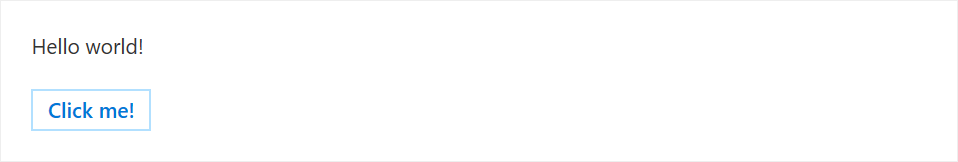
Action.Http example
{
  "type": "AdaptiveCard",
  "version": "1.0",
  "body": [
    {
      "type": "TextBlock",
      "text": "Hello world!"
    }
  ],
  "actions": [
    {
      "type": "Action.Http",
      "title": "Click me!",
      "method": "POST",
      "url": "https://contoso.com/api/...",
      "body": "<body of the POST request>",
      "headers": [
        { "name": "Content-Type", "value": "application/json" }
      ]
    }
  ]
}
Implementing the Web API
The URL specified in the url property must conform to the following requirements.
- The endpoint must accept POST requests.
- The endpoint should accept the contents of the
bodyproperty. - The endpoint should use the JWT sent in the
Authorizationheader to verify that requests come from Microsoft.
Input value substitution
Adaptive Cards may contain inputs, and it may be necessary to pass the values of these inputs to the target endpoint via an Action.Http action. This is done using input value substitution. Consider the following example:
{
  "type": "AdaptiveCard",
  "version": "1.0",
  "body": [
    {
      "type": "TextBlock",
      "text": "What's your name?"
    },
    {
      "type": "Input.Text",
      "id": "nameInput",
      "placeholder": "Type your name"
    }
  ],
  "actions": [
    {
      "type": "Action.Http",
      "title": "Say hello",
      "method": "GET",
      "url": "https://contoso.com/sayhello?name={{nameInput.value}}"
    }
  ]
}
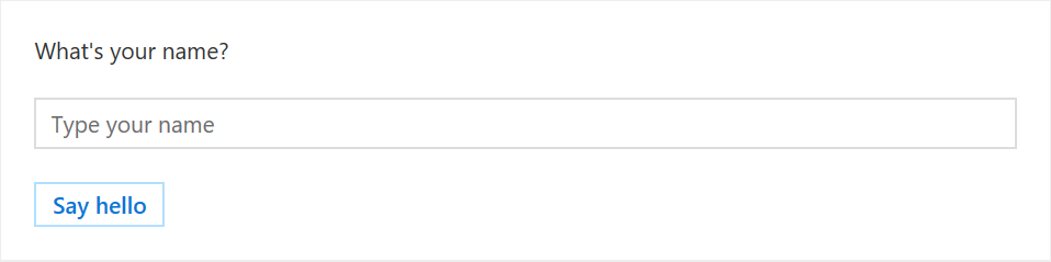
The above card defines a text input and sets it id property to nameInput. It also defines an Action.Http action that makes a GET call to an endpoint on domain contoso.com. With the inclusion of ?name={{nameInput.value}} on the target URL, the value of the input with id nameInput will be dynamically substituted at the time the action is taken by the user. So if the user had entered the name David in the text input, the target URL after substitution would be https://contoso.com/sayhello?name=David
Input value substitution also works in the body property of an Action.Http action. For example:
{
  "type": "AdaptiveCard",
  "version": "1.0",
  "body": [
    {
      "type": "TextBlock",
      "text": "What's your name?"
    },
    {
      "type": "Input.Text",
      "id": "nameInput",
      "placeholder": "Type your name"
    }
  ],
  "actions": [
    {
      "type": "Action.Http",
      "title": "Say hello",
      "method": "POST",
      "url": "https://contoso.com/sayhello",
      "body": "{{nameInput.value}}"
    }
  ]
}
Reporting Action.Http execution success or failure
Your service should return an HTTP 200 status code when it successfully executes an Action.Http action. If the action execution fails, your service should return an HTTP 4xx status code, and it should also include the CARD-ACTION-STATUS HTTP header in its response to specify a custom error message. The value of that header will be displayed to the end-user in case the Action.Http fails to execute.
Tip
Follow these guidelines when returning a response to Action.Http actions.
- Do return the
CARD-ACTION-STATUSheader in your error responses. - Do make the message in that header as informative and meaningful as possible.
- Don't mention either the name of the person taking the action nor the time the action is being taken in your
CARD-ACTION-STATUSheader.
Refresh cards
Refresh cards are a very powerful mechanism that allow Action.Http actions to fully update the card on the fly as the action successfully completes. There are many scenarios that benefit from refresh cards:
- Approval scenario (e.g. expense report)
- Once the request is approved or rejected, the card is refreshed to remove the approve/decline actions and update its content so it reflects the fact that it's been approved or declined.
- Task status
- When an action is taken on a task, such as setting its due date, the card refreshes to include the updated due date in its facts.
- Survey
- Once the question has been answered, the card is refreshed so:
- It no longer allows the user to respond.
- It shows updated status, like "Thanks for responding to this survey" alongside the user's actual response.
- Potentially include a new
Action.OpenUrlaction that allows the user to consult the survey online.
- Once the question has been answered, the card is refreshed so:
To refresh a card as a result of an Action.Http action, a service needs to do the following:
- Include the JSON payload of the new card in the body of the response to the HTTP POST request it received.
- Add the
CARD-UPDATE-IN-BODY: trueHTTP header to the response, in order to let the receiving client know that it should parse the response body and extract a new card (this is to avoid unnecessary processing when no refresh card is included.)
Tip
Follow these guidelines when returning refresh cards.
- Do use refresh cards with actions that can only be taken a single time. In those cases, the refresh card would not include any action that cannot be taken anymore.
- Do use refresh cards with actions that change the state of the entity they are performed on. In those cases, the refresh card should include updated information about the entity, and MAY change the set of actions that can be performed.
- Don't use refresh cards to lead a conversation with the user. For instance, don't use refresh cards for a multi-step "wizard".
- Do include at least an
Action.OpenUrlaction to view the entity in the external app it comes from.
Action.InvokeAddInCommand
The Action.InvokeAddInCommand action opens an Outlook add-in task pane. If the add-in is not installed, the user is prompted to install the add-in with a single click.
When an Action.InvokeAddInCommand action is executed, Outlook first checks if the requested add-in is installed and turned on for the user. If it is not, the user is notified that the action requires the add-in, and is able to install and enable the add-in with a single click. Outlook opens the requested task pane, making any initialization context specified by the action available to the add-in.
For more information, see Invoke an Outlook add-in from an actionable message.
| Property name | Type | Required | Description |
|---|---|---|---|
type |
String | Yes | Must be set to Action.InvokeAddInCommand. |
title |
String | No | The title of the action as it will appear on screen on a button control, for instance. |
addInId |
String | Yes | Specifies the add-in ID of the required add-in. The add-in ID is found in the Id element in the add-in's manifest. |
desktopCommandId |
String | Yes | Specifies the ID of the add-in command button that opens the required task pane. The command button ID is found in the id attribute of the Control element that defines the button in the add-in's manifest. The specified Control element MUST be defined inside a MessageReadCommandSurface extension point, be of type Button, and the control's Action must be of type ShowTaskPane. |
initializationContext |
Object | Yes | Developers may specify any valid JSON object in this field. The value is serialized into a string and made available to the add-in when the action is executed. This allows the action to pass initialization data to the add-in. |
Action.DisplayMessageForm
The Action.DisplayMessageForm action opens the read form of a message given that message's ID. Message IDs can be retrieved via the Outlook REST APIs.
| Property name | Type | Required | Description |
|---|---|---|---|
type |
String | Yes | Must be set to Action.DisplayMessageForm. |
title |
String | No | The title of the action as it will appear on screen on a button control, for instance. |
itemId |
String | Yes | Specifies the ID of the message to open. |
Action.DisplayAppointmentForm
The Action.DisplayAppointmentForm action opens the read form of a calendar item given that calendar item's ID. Calendar item IDs can be retrieved via the Outlook REST APIs.
| Property name | Type | Required | Description |
|---|---|---|---|
type |
String | Yes | Must be set to Action.DisplayAppointmentForm. |
title |
String | No | The title of the action as it will appear on screen on a button control, for instance. |
itemId |
String | Yes | Specifies the ID of the calendar item to open. |
Action.ToggleVisibility
The Action.ToggleVisibility action makes it possible to show and/or hide specific elements of a card as a result of a user clicking on a button or other actionable element. Coupled with the isVisible property, Action.ToggleVisibility allows for an extra degree of interactivity within a single card.
| Property name | Type | Required | Description |
|---|---|---|---|
type |
String | Yes | Must be set to Action.ToggleVisibility. |
title |
String | No | The title of the action as it will appear on screen on a button control, for instance. |
targetElements |
Array of String or TargetElement | Yes | The list of elements that should have their visibility toggled. When elements of the targetElements array are specified as strings, they must represent the Id of an element in the card; when the action is executed, these elements become visible if they were not, and invisible otherwise. When elements of the array are specified as TargetElement objects, the visibility of each targeted element is defined by the isVisible property of the TargetElement object. |
TargetElement
| Property name | Type | Required | Description |
|---|---|---|---|
elementId |
String | Yes | The Id of the target element. |
isVisible |
Boolean | Yes | Specifies whether the target element should be visible once the action has completed. |
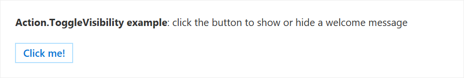
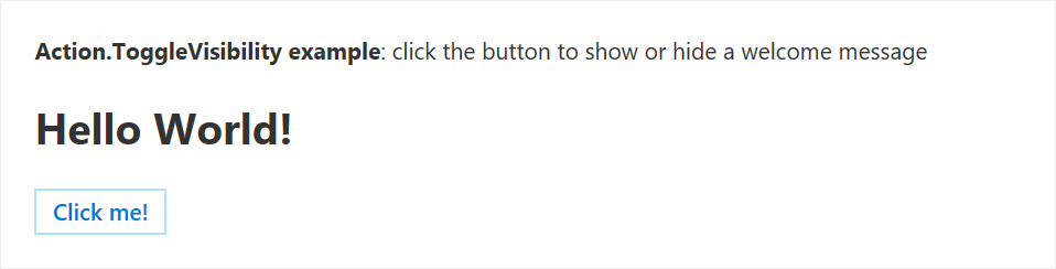
Action.ToggleVisibility example
{
  "type": "AdaptiveCard",
  "version": "1.0",
  "body": [
    {
      "type": "TextBlock",
      "text": "**Action.ToggleVisibility example**: click the button to show or hide a welcome message"
    },
    {
      "type": "TextBlock",
      "id": "helloWorld",
      "isVisible": false,
      "text": "**Hello World!**",
      "size": "extraLarge"
    }
  ],
  "actions": [
    {
      "type": "Action.ToggleVisibility",
      "title": "Click me!",
      "targetElements": [ "helloWorld" ]
    }
  ]
}
The example card renders similar to the following before the button is clicked:
The example card renders similar to the following after the button is clicked:
ActionSet element
Outlook Actionable Messages add support for the ActionSet element that makes it possible to add action buttons anywhere in a card.
| Property name | Type | Required | Description |
|---|---|---|---|
type |
String | Yes | Must be set to ActionSet. |
id |
String | No | The unique ID of the element. |
spacing |
String | No | Controls the amount of spacing between this element and the previous element. |
separator |
Boolean | No | Controls whether or not a separator line should be displayed between this element and the previous element. The separator line is displayed in the middle of the space defined by the spacing property. |
horizontalAlignment |
String | No | Controls the horizontal alignment of this element within its container. |
actions |
Array of Action objects |
No | The actions to be displayed in the set. |
Aside from the fact that ActionSet can be placed anywhere in the card, it behaves exactly like the actions property of an AdaptiveCard.
ActionSet example
{
"type": "AdaptiveCard",
"version": "1.0",
"body": [
{
"type": "ActionSet",
"actions": [
{
"type": "Action.ToggleVisibility",
"title": "Click me!",
"targetElements": [ "helloWorld" ]
}
]
},
{
"type": "TextBlock",
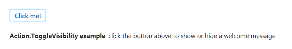
"text": "**Action.ToggleVisibility example**: click the button above to show or hide a welcome message"
},
{
"type": "TextBlock",
"id": "helloWorld",
"isVisible": false,
"text": "**Hello World!**",
"size": "extraLarge"
}
]
}
Additional properties on all Adaptive Card element types
| Property name | Type | Required | Description |
|---|---|---|---|
isVisible |
Boolean | No. Defaults to true. | The initial visibility state of the element. When isVisible is set to false, the element is initially not visible in the card. It can be made visible using an Action.ToggleVisibility action, as documented above. |
Please refer to the previous example for an illustration of how to use isVisible.
Additional properties on the AdaptiveCard type
The following additional properties can be specified on an AdaptiveCard object in the context of Outlook Actionable Messages:
| Property name | Type | Required | Description |
|---|---|---|---|
autoInvokeAction |
Action.Http | No | The autoInvokeAction property specifies a URL that supplies an updated Adaptive Card payload to replace the existing payload in the message. The method of the Action.Http action MUST be POST. This allows your service to supply up-to-date information in the actionable message. For more information, see Refresh an actionable message when the user opens it. |
correlationId |
String | No | The correlationId property simplifies the process of locating logs for troubleshooting issues. We recommend that when sending an actionable card, your service should set and log a unique UUID in this property. When the user invokes an Action.Http action on the card, Office 365 sends the Card-Correlation-Id and Action-Request-Id headers in the POST request to your service. Card-Correlation-Id contains the same value as the correlationId property in the card. Action-Request-Id is a unique UUID generated by Office 365 to help locate specific action performed by a user. Your service should log both of these values when receiving action POST requests. |
expectedActors |
Array of String | No | expectedActors contains a list of expected email addresses of the users that may take Action.Http actions on the card. A user can have multiple email addresses and the Action.Http target endpoint might not be expecting the particular email address presented in the sub claim of the bearer token. For example, a user could have both the john.doe@contoso.com or john@contoso.com email address, but the Action.Http target endpoint expects to receive john@contoso.com in the sub claim of the bearer token. By setting the expectedActors property to ["john@contoso.com"], the sub claim will have the expected email address. |
hideOriginalBody |
Boolean | No. Defaults to false. | When set to true, causes the HTML body of the message to be hidden. This is very useful in scenarios where the card is a better or more useful representation of the content than the HTML body itself, which is especially true when the card contains actions. Consider hiding the original HTML body if the card itself contains all the information a user would need, or if the content of the card is redundant with the content of the body. Do always include a nice, meaningful HTML body, even if it is going to be hidden. The HTML body is the only thing an email client that doesn't support cards will be able to display. Furthermore, cards are not included when replying to or forwarding emails, only the HTML body. Don't hide the body when it is complementary to the information presented in the card. For example, the body of an expense report approval might describe the report in great details while the card just presents a quick summary along with approve/decline actions. |
originator |
String | Yes | For actionable email, MUST be set to the provider ID generated by the Actionable Email Developer Dashboard. |
Additional properties on the Column type
The following additional properties can be specified on a Column object in the context of Outlook Actionable Messages:
| Property name | Type | Required | Description |
|---|---|---|---|
width |
Number or String | No (defaults to auto) |
This property allows for precise control of the width of a Column within its ColumnSet. See Column width values for details. |
verticalContentAlignment |
String. Valid values are top, center and bottom. |
No. Defaults to top. |
The verticalContentAlignment property makes it possible to vertically position the content of the column (e.g. all its elements.) This is particularly useful for table-like layouts. |
backgroundImage |
String | No | The backgroundImage property represents the URL to an image that is to be used as the background of the Column. The background image covers the entirety of the Column's surface and is scaled so as to preserve its original aspect ratio. |
Column width values
If width is expressed as a number, it represents the relative weight of the Column within its ColumnSet. For a weighted Column to really be useful, there should be at least one more weighted Column in the set. For example, if column A has its width set to 1 and column B has its width set to 2, then column A will use a third of the available space in the set, while column B will use the remaining two-thirds.
If width is expressed as a string, it can have the following values:
auto: TheColumnwill use as much of the available space as is required to fit its content.stretch: TheColumnwill use whatever space remains in the set. If multiple columns have theirwidthproperty set tostretch, they all share the remaining space equally.<number>px(ex.50px): The column will spread across the specified number of pixels.<number>*, (ex.1*): This is equivalent to specifyingwidthas a number.
Column example
{
"$schema": "https://adaptivecards.io/schemas/adaptive-card.json",
"type": "AdaptiveCard",
"version": "1.0",
"body": [
{
"type": "ColumnSet",
"columns": [
{
"width": "50px",
"items": [
{
"type": "Image",
"url": "https://adaptivecards.io/content/cats/1.png",
"size": "stretch"
}
]
},
{
"width": "stretch",
"verticalContentAlignment": "center",
"items": [
{
"type": "TextBlock",
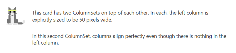
"text": "This card has two ColumnSets on top of each other. In each, the left column is explicitly sized to be 50 pixels wide.",
"wrap": true
}
]
}
]
},
{
"type": "ColumnSet",
"columns": [
{
"width": "50px"
},
{
"width": "stretch",
"verticalContentAlignment": "center",
"items": [
{
"type": "TextBlock",
"text": "In this second ColumnSet, columns align perfectly even though there is nothing in the left column.",
"wrap": true
}
]
}
]
}
]
}
Additional properties on the Container type
The following additional properties can be specified on a Container object in the context of Outlook Actionable Messages:
| Property name | Type | Required | Description |
|---|---|---|---|
verticalContentAlignment |
String. Valid values are top, center and bottom. |
No. Defaults to top. |
The verticalContentAlignment property makes it possible to vertically position the content of the column (e.g. all its elements.) This is particularly useful for table-like layouts. |
backgroundImage |
String | No | The backgroundImage property represents the URL to an image that is to be used as the background of the Container. The background image covers the entirety of the Container's surface and is scaled so as to preserve its original aspect ratio. |
These properties behave exactly like their counterpart on the Column type. Please refer to the above example.
Additional properties on the Image type
The following additional properties can be specified on an Image object in the context of Outlook Actionable Messages:
| Property name | Type | Required | Description |
|---|---|---|---|
width |
String | No | This property allows for precise control over the width of an image, in pixels. The allowed format is <number>px where <number> is an integer. When width is specified, the size property is ignored. If width is specified but height isn't, the height of the image is automatically computed so as to respect its aspect ratio. |
height |
String | No | This property allows for precise control over the height of an image, in pixels. The allowed format is <number>px where <number> is an integer. When height is specified, the size property is ignored. If height is specified but width isn't, the width of the image is automatically computed so as to respect its aspect ratio. |
backgroundColor |
String | No | The backgroundColor property specifies the color the image should be rendered on top of. backgroundColor is particularly useful in cases where a single image should be used on top of a variety of background colors, as it removes the need to craft multiple versions of a single image. The format of the backgroundColor property is #RRGGBB where RR, GG and BB are the hexadecimal values of the red, green and blue components of the color, respectively. |
Image properties example
{
"$schema": "https://adaptivecards.io/schemas/adaptive-card.json",
"type": "AdaptiveCard",
"version": "1.0",
"body": [
{
"type": "TextBlock",
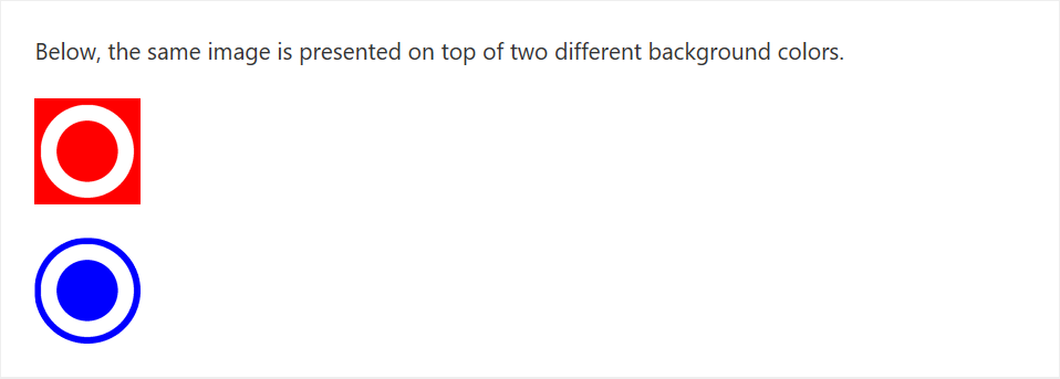
"text": "Below, the same image is presented on top of two different background colors."
},
{
"type": "Image",
"width": "64px",
"url": "https://messagecardplayground.azurewebsites.net/assets/circleontransparentbackground.png",
"backgroundColor": "#FF0000"
},
{
"type": "Image",
"style": "person",
"width": "64px",
"url": "https://messagecardplayground.azurewebsites.net/assets/circleontransparentbackground.png",
"backgroundColor": "#0000FF"
}
]
}
See also
Feedback
Coming soon: Throughout 2024 we will be phasing out GitHub Issues as the feedback mechanism for content and replacing it with a new feedback system. For more information see: https://aka.ms/ContentUserFeedback.
Submit and view feedback for