Usage dashboard for Containers offers in commercial marketplace analytics
This article provides information on the Containers raw usage page under Usage dashboard. This page contains following widgets showing insights:
- Raw Usage
- Offers
- Sales Channels
- Customers
- Geographical spread
- Usage details
Important
The maximum latency between usage event generation and reporting in Partner Center is 48 hours.
Page level filters
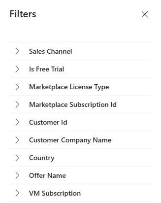
You can apply the following filters on usage page for further analysis. Each filter is expandable with multi select values. Filter options are dynamic and based on the selected range.
- Sales Channel
- Is Free Trial
- Marketplace License Type
- Marketplace Subscription ID
- Customer ID
- Customer Company Name
- Country
- Offer Name
- VM subscription
Raw usage
This widget shows usage against all the pricing options you've configured for container offers. Possible pricing options are:
- Per core
- Per every core in cluster
- Per node
- Per every node in cluster
- Per pod
- Per cluster
Chart provides month over month trend of usage for selected period.
Offers
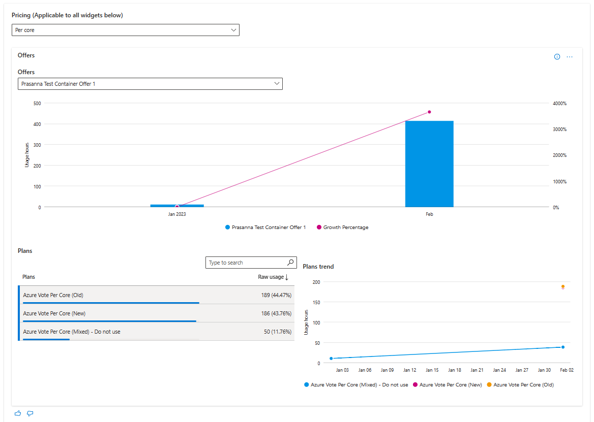
This widget provides the total usage hours and trend for container offers based on Pricing selection in top of the page
- The Offers stacked column chart displays a breakdown of usage hours for the top five offers according to the selected computation period. The top five offers are displayed in a graph, while the rest are grouped in the Rest All category.
- The stacked column chart depicts a month-by-month growth trend for the selected date range. The month columns represent usage hours from the offers with the highest usage hours for the respective month. The line chart depicts the growth percentage trend plotted on the secondary Y-axis.
- You can select specific offers in the legend to display only those offers in the graph.
You can select any offer and a maximum of three plans of that offer to view the month-over-month usage trend for the offer and the selected plans.
Sales channel
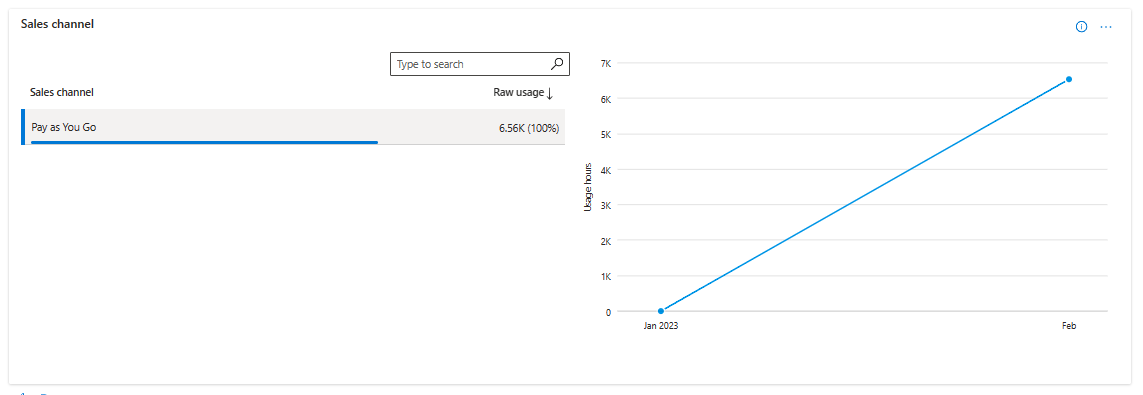
You can see the usage metrics and month-over-month trend for container offers against sales channel. Data in this widget is filtered based on Pricing option selected on top.
Geographical spread
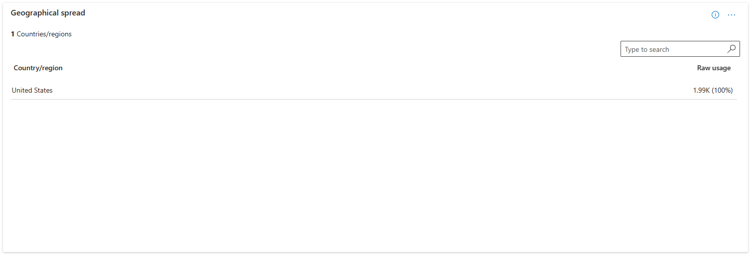
For the selected computation period, the table displays the total usage against geography dimension. Data in this widget is filtered based on Pricing option selected on top.
Customers
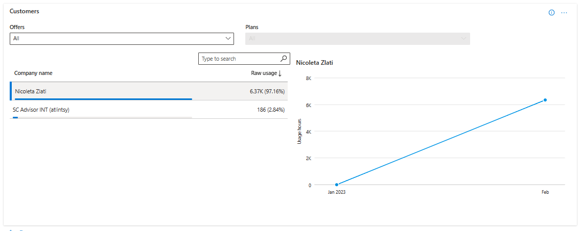
This widget shows the usage for customers based on pricing option selected. You also have the flexibility to further filter the data based on Offers and Plans.
Usage details table
Important
To download the data in CSV, you can use the Download data option, available at the top of the page.
The usage details table displays a numbered list of the top 500 usage records sorted by usage. Note the following:
- Data in this table is displayed based on the page you've selected
- Each column in the grid is sortable.
Select on the ellipsis (three dots '...') to copy the widget image, or download the image as a pdf for sharing purposes.
For more information about fields, see Data dictionary for usage.
Next steps
- Learn about Usage dashboard, see Usage Dashboard in commercial marketplace analytics
- View insights around usage for your Virtual Machine (VM) offers, see Usage Dashboard for VM in commercial marketplace analytics
- View insights around metered usage for your offers, see Metered Usage Dashboard in commercial marketplace analytics
- View insights around metered usage anomalies, see Metered Usage anomalies
- For frequently asked questions about commercial marketplace analytics and for a comprehensive dictionary of data terms, see Commercial marketplace analytics terminology and common questions
Feedback
Coming soon: Throughout 2024 we will be phasing out GitHub Issues as the feedback mechanism for content and replacing it with a new feedback system. For more information see: https://aka.ms/ContentUserFeedback.
Submit and view feedback for
