Card designer overview
The Power Apps card designer is the drag-and-drop interface in which you build cards.
Sign in to Power Apps and select your environment.
In the left pane, select Cards. If the item isn’t in the side panel pane, select …More and then select the item you want.
To open the card designer, select Create, and then select + Create a card.
The card designer interface
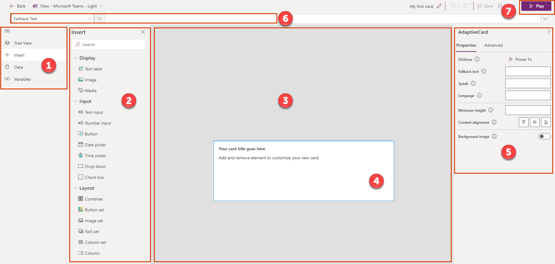
Legend:
- Main menu
- Tool pane
- Card canvas
- Card
- Property pane
- Formula bar
- Play button
Main menu
Use the main menu to switch between the tools available in the card designer.
- Tree View: View card elements as a hierarchy and view the relationships between elements
- Insert: Add controls
- Data: Add connectors to incorporate data from external sources
- Variables: Store and reuse data
Tool pane
Use the tool pane to add and view card elements like controls, connectors, and variables to your card.
Card canvas and card
The card canvas is where you build your card by adding connectors, variables, and controls from the tool pane.
Note
You can't resize a card in the card canvas. Cards automatically fit themselves to the location they're placed in.
Property pane
Use the property pane to modify an element by editing its properties. Each element, and the card itself, has its own property pane. For most of the drag-and-drop elements, you can specify basic properties:
- Name: The name of the element, either the default name or a name you provide. You can refer to an element by name in a Power Fx formula.
- Label or Text: Text that's shown on the card
- Default value: The initial value of an element
- Initially visible: Whether the element is visible when the card is opened
Certain elements have visual properties that you can modify. For text labels and input controls, for example, you can customize the font, color, spacing, and more.
Each element also has advanced properties, such as:
- Repeat for every: Trigger whether or when an element should be repeated
- Show when: Trigger when to show the element
- Requires: Make the element dependent on certain features with a corresponding minimum version
You can also enter Power Fx expressions in some properties, creating low-code solutions that make your card more powerful.
Formula bar and Power Fx editor
Use the formula bar to enter a Power Fx expression as a property of the selected control (for example, to calculate a value when a button is clicked). The formula bar even assists you as you're writing an expression. Learn more about Power FX and the functions and formulas you can use in an expression.
Note
Some expressions that are supported in Power Apps aren't available for cards. For more information, go to Power Fx and cards overview.
Play button
Use the Play button to preview, test, and, if needed, troubleshoot and debug your card.
Next steps
Feedback
Coming soon: Throughout 2024 we will be phasing out GitHub Issues as the feedback mechanism for content and replacing it with a new feedback system. For more information see: https://aka.ms/ContentUserFeedback.
Submit and view feedback for