Chapter 3: Building a low-code prototype
Note
Chapter 2 referenced the mobile app used by the field technicians and engineers, and desktop app used by on-premises staff. The following chapters focus on the design, implementation, and rollout of the mobile apps built with Power Apps. The desktop apps are left as an exercise for the reader.
Kiana is skeptical of low-code solutions and Power Apps. However, Kiana and and Maria decide to build an app together to help the field technicians check inventory (and order parts, if necessary), query the knowledge base, and check their next appointment while they're out of the office on service calls. Kiana and Maria plan to use this experience to explore how to add controls and use formulas in Power Apps.
Although building an initial, low-code prototype is typically a citizen developer task, Kiana decides to pay attention to the process to understand how the app is constructed. Kiana needs this information to help Maria integrate the real-world data sources, Web APIs, and other required services into the app.
Item 1: Field inventory management
Maria's initial aim is to build a canvas app that displays a list of parts and enables the user to view the details of any part. Eventually, the user should also be able to order a part; however, this initial version of the app will simply be a prototype and won't be hooked up to a back end yet. After obtaining feedback from Caleb, the lead field technician, Maria will work with Kiana on integrating the canvas app with the inventory system running on-premises.
Maria is very familiar with the existing inventory management system and understands the information that it contains. Maria starts by creating an Excel workbook that contains tables holding mock data with details for some sample parts. The fields in the table are ID, Name, CategoryID, Price, Overview, NumberInStock, and Image (a URL that references an image of the part). This workbook can be used to build and test the canvas app, to ensure that it displays the required data correctly. Maria stores this workbook in a OneDrive account with the name BoilerParts.xlsx.
Note
You can find a copy of this workbook in the Assets folder in the Git repository for this guide.
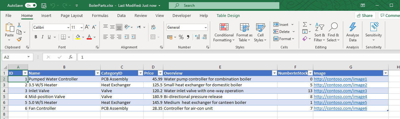
If you're a relational database designer, you'll notice that the Excel workbook presents a denormalized view of the data. For example, in a relational database, CategoryID would most likely be a numeric identifier that references a separate table containing the details of the category, including the name.
Note
The URLs in the Image column are currently just placeholders. In the completed app, these URLs will be replaced with the addresses of real image files.
Follow these steps to create the app with Power Apps.
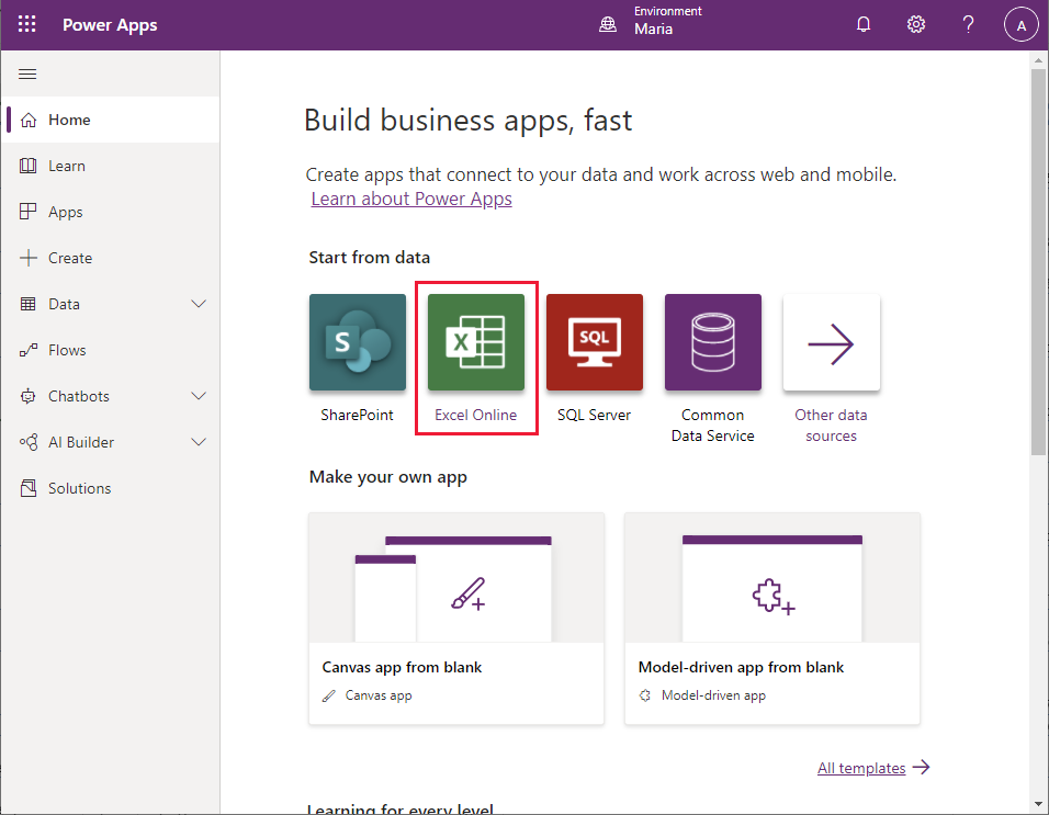
Sign in to Power Apps.
On the Home page, under Start from data, select Excel Online.
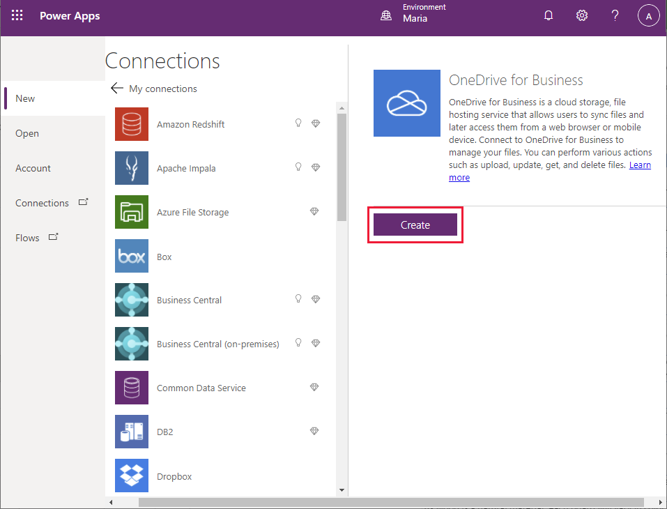
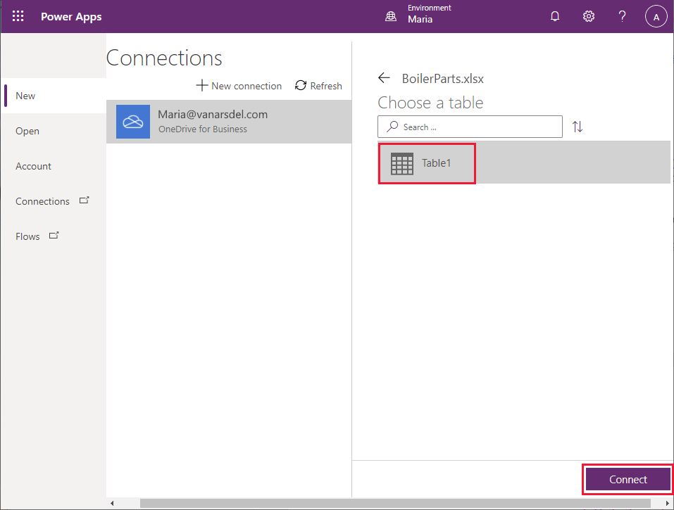
On the Connections page, select OneDrive for Business, and then select Create.
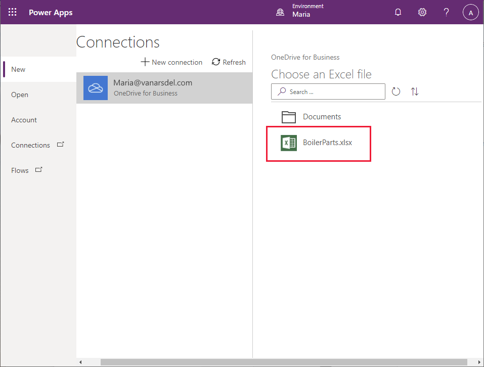
On the OneDrive for Business page, select the BoilerParts.xlsx file.
Select the table in the Excel file (Maria created the table by using the default name, Table1), and then select Connect.
Wait while Power Apps generates the app.
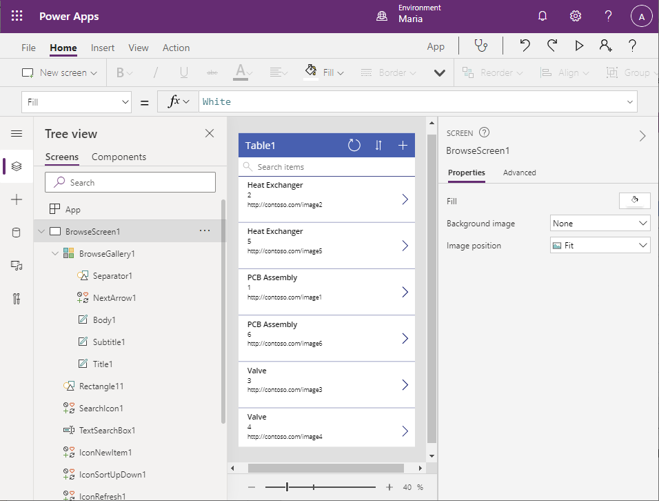
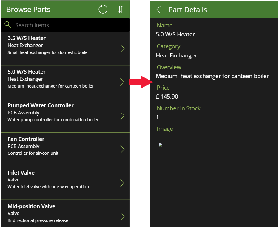
When the app has been generated, you'll see the Browse screen, displaying CategoryID, ID, and Image fields from each row of the parts table in the workbook.
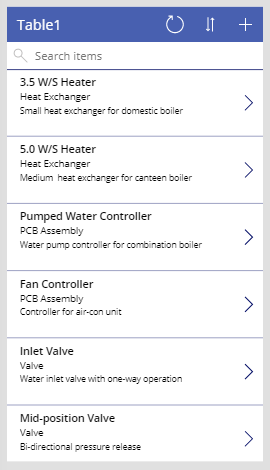
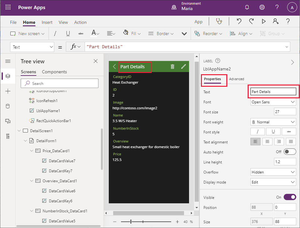
The fields that are currently displayed aren't very useful for helping an engineer select a product. On the pane displaying the Browse screen, select the Heat Exchanger label in the first row of data. In the formula bar, select the Text property from the dropdown list. Change the value of this property to ThisItem.Name. The text in the first field of each row will switch to display the part name.
Note
In the following image, the Heat Exchanger label originally displayed on the form has changed to the product name, 3.5 W/S Heater.
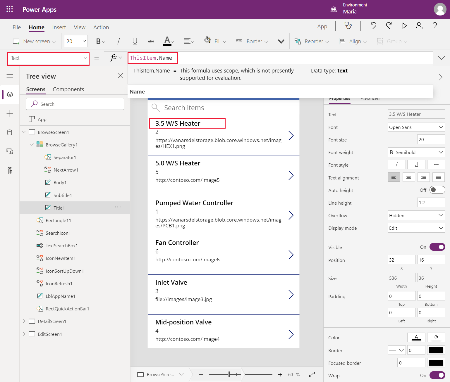
Repeat the previous step for the ID and Image labels. Change the Text property of the ID field to CategoryID, and the Text property of the Image field to Overview. The Browse screen should now look like the following image, which a field engineer is more likely to find useful for selecting parts.
The search feature of the Browse screen defaults to using the fields that were initially selected when the screen was generated—in this case, CategoryID, ID, and Image. The results are sorted by CategoryID. It makes sense to switch this to the Name, CategoryID, and Overview fields, with results sorted by Name. Select the BrowseGallery1 control on the Tree view pane. In the dropdown list on the left side of the formula bar, select the Items property. Drag the lower edge of the formula bar down so the formula is completely visible. The formula contains the following expression:
**SortByColumns(Search([\@Table1], TextSearchBox1.Text, "CategoryID","ID","Image"), "CategoryID", If(SortDescending1, Descending, Ascending))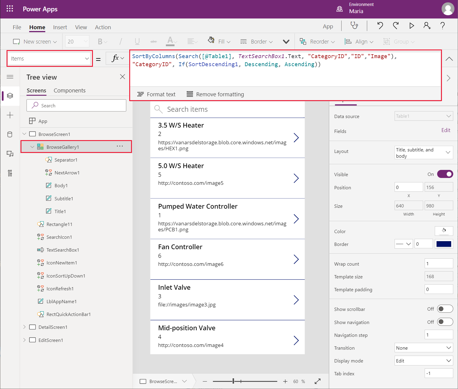
Change the Search expression to reference the Name, CategoryID, and Overview fields by using the following formula:
SortByColumns(Search([\@Table1], TextSearchBox1.Text, "Name", "CategoryID", "Overview"), "Name", If(SortDescending1, Descending, Ascending))The title in the form header isn't helpful, and the default theme doesn't match VanArsdel's corporate look and feel. In the Browse screen, select the Table1 label, and on the Formula bar, change the Text property of the label to "Browse Parts" (include the double quotation marks in the value).
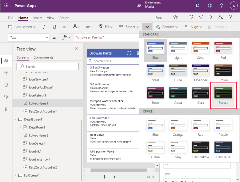
On the toolbar, select Theme (you might have to expand the toolbar to display more items), and then select the Forest theme. The colors and styling for the Browse screen will change to match the theme.
Make the Details screen more useful
You've created the basic app and modified the Browse screen to display fields that an engineer can use to identify a part. The app also contains a Details screen, which shows all the information for a selected part. The fields on this screen aren't currently displayed in a logical sequence, so you should rearrange them. You can also delete the ID field from this screen, because this information is irrelevant to an engineer.
On the Tree view pane, scroll down and select DetailScreen1. This screen displays details about the part that a user selects on the Browse screen.
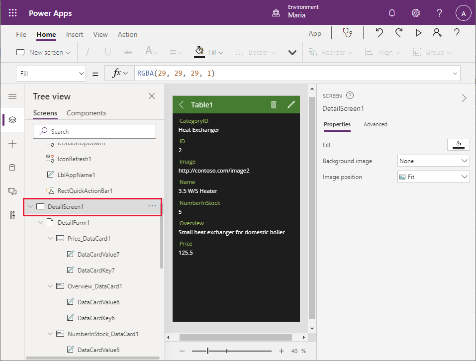
In the header of the Details screen on the middle pane, select the Table1 label. On the right pane, on the Properties tab, change the Text property to Part Details.
Note
In many cases, you can accomplish the same results by using the formula bar as the Properties pane. However, some properties that are only available through the Properties pane.
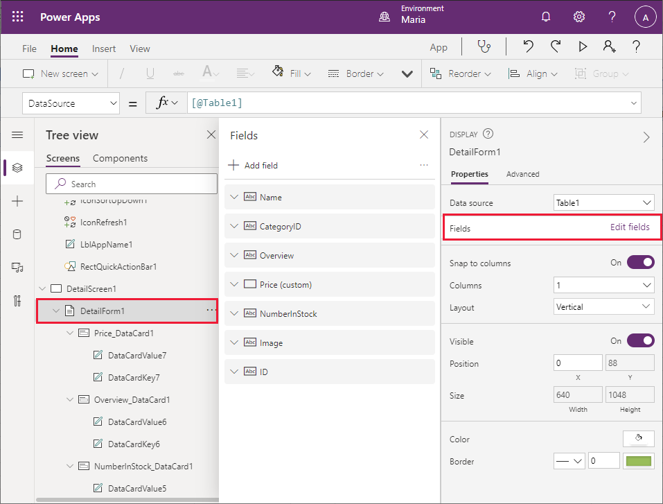
On the Tree view pane, under DetailScreen1, select DetailForm1. On the right pane, on the Properties tab, select Edit fields next to Fields. On the middle pane, select and drag the fields so that they're displayed in the following order, from top to bottom:
- Name
- CategoryID
- Overview
- Price
- NumberInStock
- Image
- ID
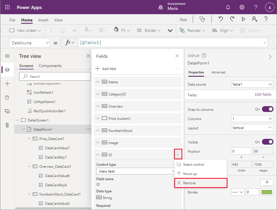
Select the ID field, select the ellipsis that appears on the right side of the field, and then select Remove from the dropdown menu that appears. This action removes the ID field from the form.
On the Tree view pane, under DetailForm1, select CategoryID_DataCard1. This element is a DataCard control that displays the name of a field (called the key) and its value.
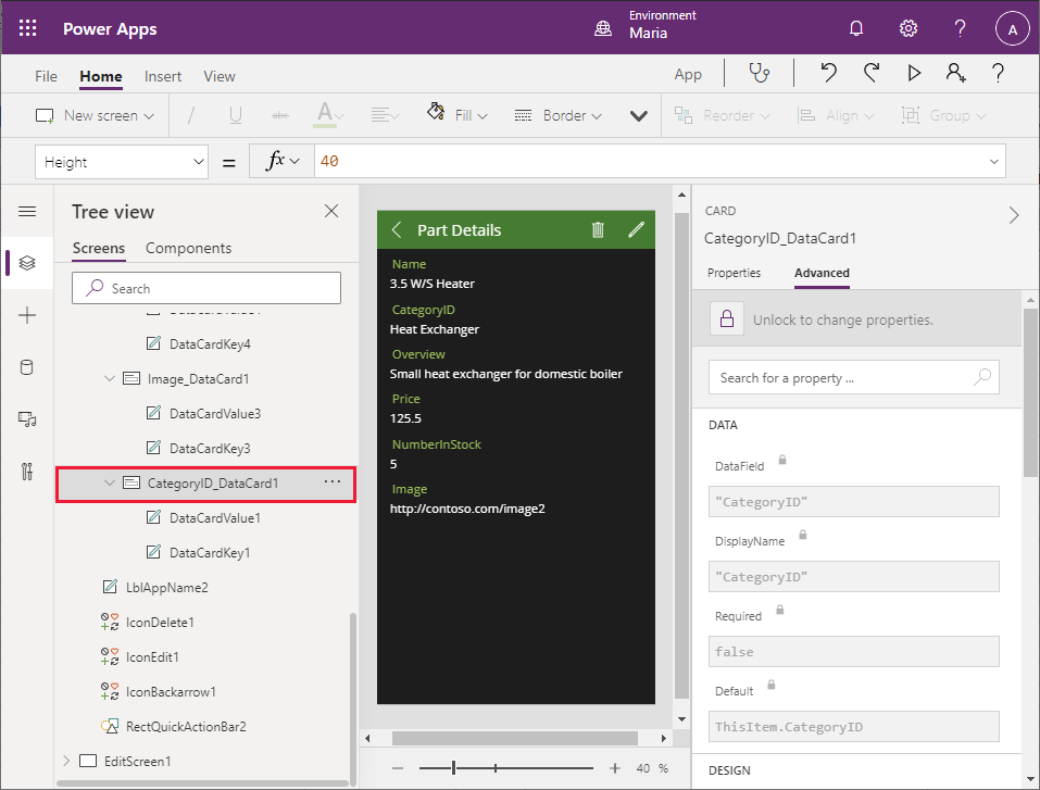
On the right pane, on the Advanced tab, select Unlock to change properties. In the Data section, change the DisplayName field to "Category" (include the quotation marks).
Note
As with the Properties tab, many of the properties on the Advanced tab are also accessible through the formula bar. To set these properties, you can use the formula bar if you prefer.
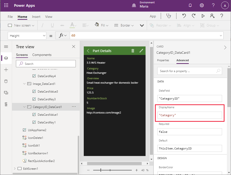
Repeat the previous step to change the key for NumberInStock_DataCard1 to "Number in Stock" (include the quotation marks).
You need to adjust the formatting of the Price field to display the data as a currency value. On the Tree view pane, under DetailForm1, under Price_DataCard1, select DataCardValue7. This is the field that displays the value of the Price field. On the DataCardValue7 pane on the right, on the Advanced tab, change the Text property to Text(Value(Parent.Default), "[$-en-US]$ ###,##0.00")
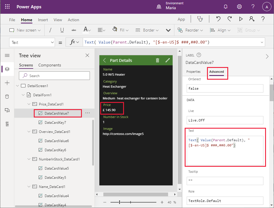
The expression Parent.Default refers to the data item to which the parent control (the DataCard) is bound—in this case, the Price column. The Text function reformats this value by using the format specified as the second argument; in this example, this is the local currency with two decimal places.
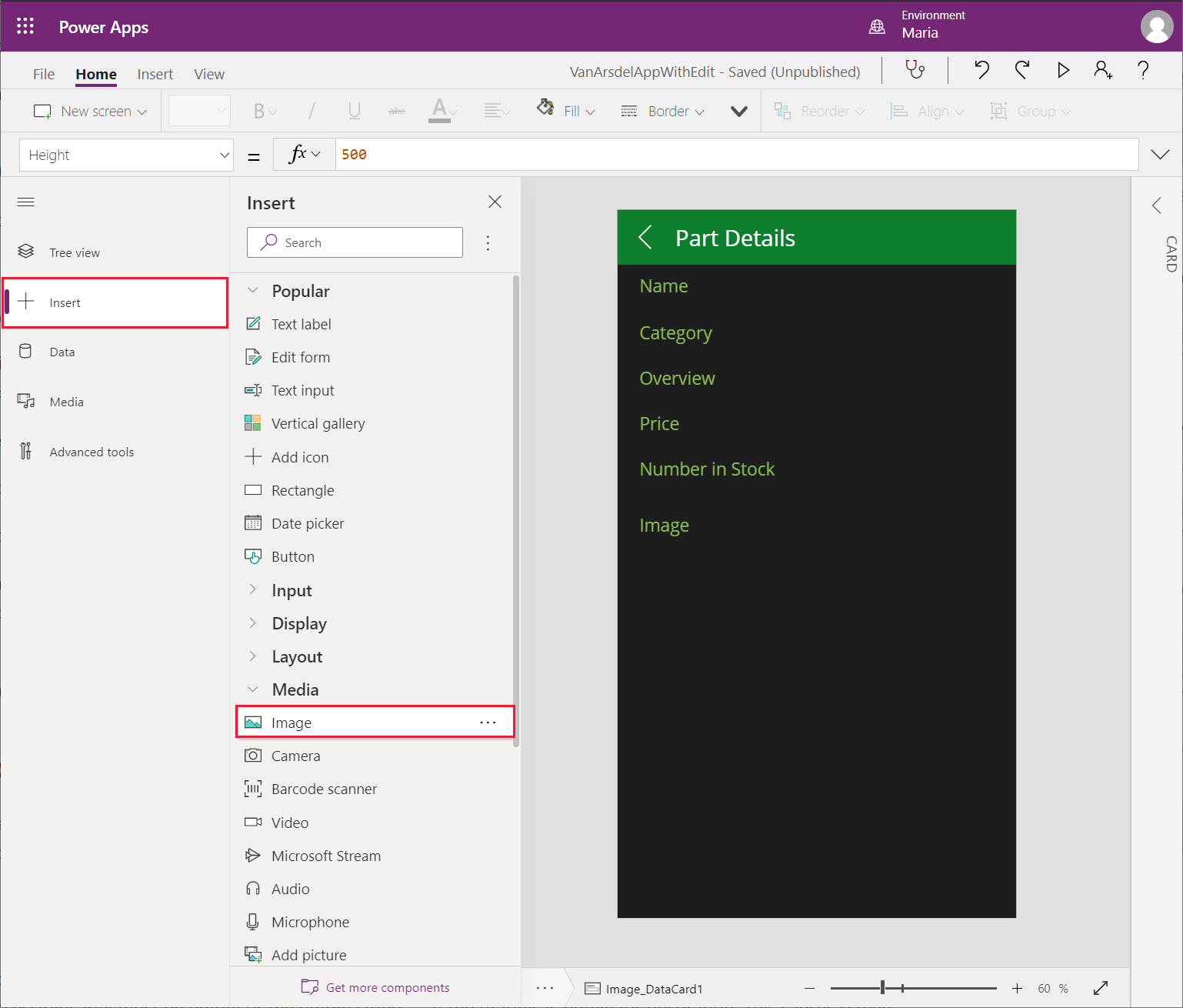
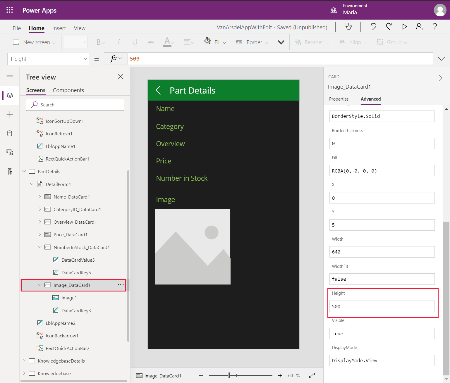
The image data card should display an image of the part rather than the URL of the image file. On the Tree view pane, under DetailForm1, under Image_DataCard1, select DataCardValue3, and then select Delete to remove this control.
Select Image_DataCard1. On the left pane, select + Insert. On the Insert pane, expand Media, and then select Image.
Return to the Tree view pane, and verify that the Image1 text control has been added to the Image_DataCard1 control.
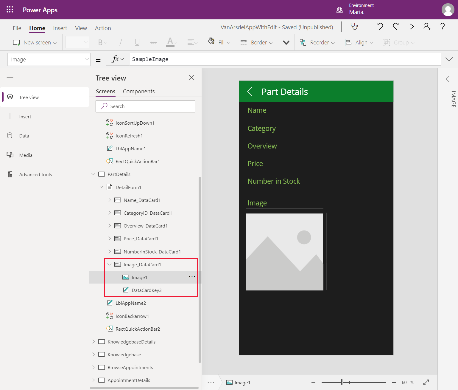
On the Tree view pane, select Image_DataCard1. On the right pane, on the Advanced tab, change Height to 500, to allow sufficient space for an image to be displayed.
On the Tree view pane, select Image1. Set the following properties:
- Image: Parent.Default
- ImagePosition: ImagePosition.Fit
- Width: 550
- Height: 550
Note
The image displayed is currently empty because the URL in the Excel workbook is just a placeholder. You'll address this issue, and fetch a real URL, when you bind the app to a Web API in a later chapter.
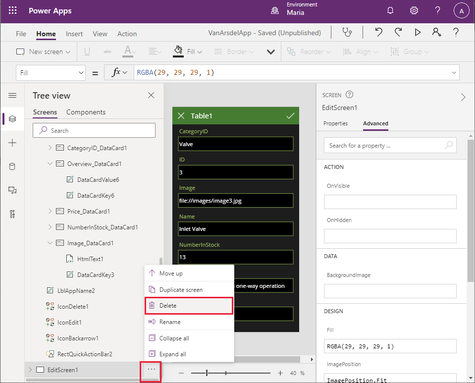
The app also contains an Edit screen, which enables a user to change the information for a part. An engineer shouldn't be able to change the details of a part, create new parts, or delete parts from the catalog.
On the Tree view pane, select EditScreen1. Select the ellipsis button, and then select Delete to remove this screen.
On the Tree view pane, select DetailsScreen1. Notice that Power Apps Studio displays an error message for this screen. This error occurs because the DetailsScreen1 contains expressions that reference the EditScreen1 screen, which no longer exists.
In the header of the DetailsScreen1, select the pencil (IconEdit1) icon. The OnSelect property for this control contains the expression EditForm(EditForm1);Navigate(EditScreen1, ScreenTransition.None). When the Edit icon is selected, this expression runs and attempts to move to the EditScreen1 screen.
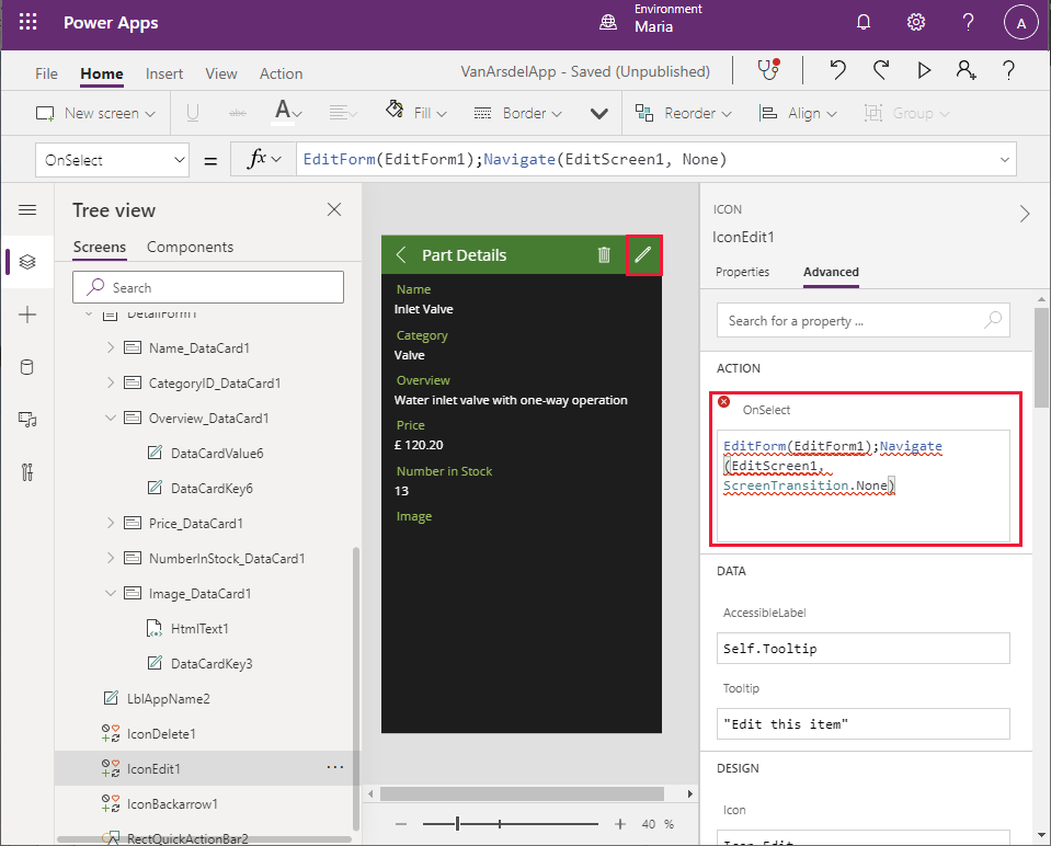
On the Tree view pane, select IconEdit1, and then select Delete. This icon is no longer required.
Select IconDelete1, and then select Delete. This icon is used to delete the current part, and is also not required.
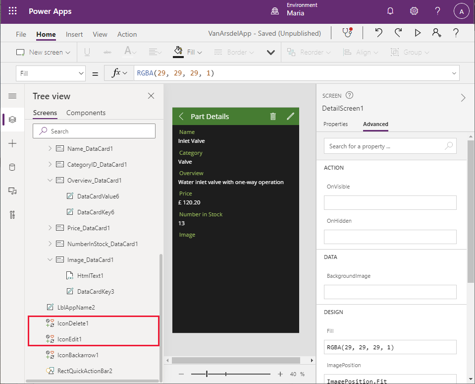
Notice that the Part Details text has disappeared from the screen header, and instead Power Apps Studio displays an error message. This has happened because the width of the label control that displays the text is calculated. On the Tree view pane, select LblAppName2. Examine the Width property. The value of this property is the result of the expression Parent.Width - Self.X - IconDelete1.Width - IconEdit1.Width.
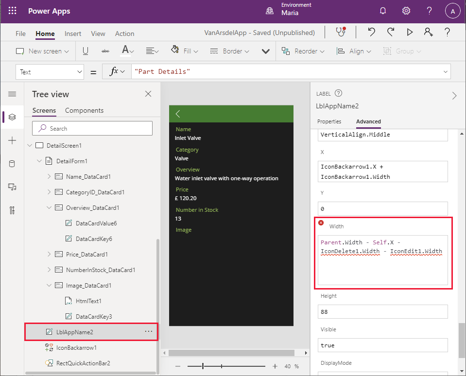
Change the expression for the Width property to Parent.Width - Self.X. The error should disappear, and the Part Details text should reappear in the screen header.
On the Tree view pane, select BrowseScreen1. This screen will also display an error message. The + icon in the toolbar (IconNewItem1) enables the user to add a new part. The OnSelect property for this icon references the EditScreen1 screen.
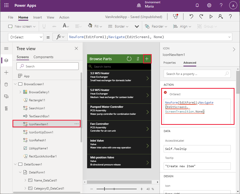
Select IconNewItem1, and then select Delete. As before, the text in the header for the screen disappears and an error message is displayed, and for the same reason.
On the Tree view pane, under BrowseScreen1, select LblAppName1. Modify the expression for the Width property by removing the reference to IconNewItem1.Width. The new expression should be Parent.Width - Self.X - IconSortUpDown1.Width - IconRefresh1.Width.
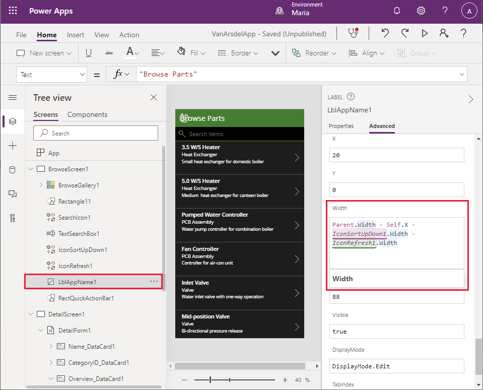
There's still a problem with the header. Although the Browse Parts text has reappeared, an error is being displayed, and the refresh and sort icons are in the wrong place. On the Tree view pane, select IconSortUpDown1. Find the X property for this control. This property determines the horizontal position of the icon in the header. It's currently calculated based on the width of the IconNewItem1 control.
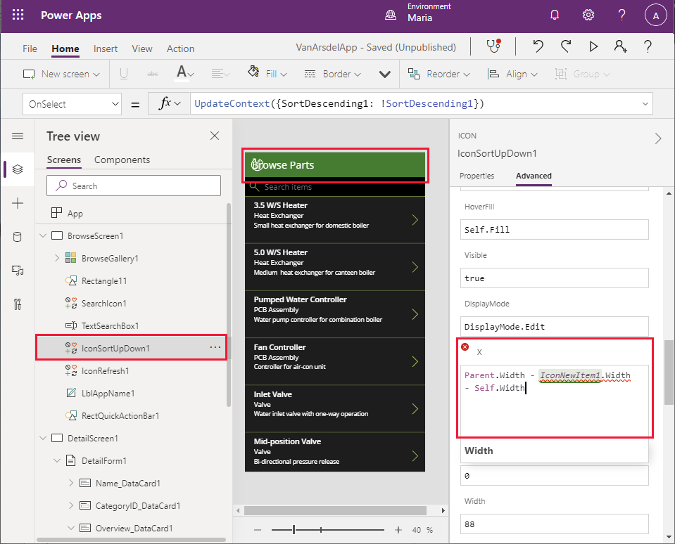
Change the expression for the X property to Parent.Width - Self.Width.
On the Tree view pane, select IconRefresh1. Change the expression for the X property to Parent.Width - IconSortUpDown1.Width - Self.Width. The errors should all disappear.
Save and test the app
Now you can save and test the app.
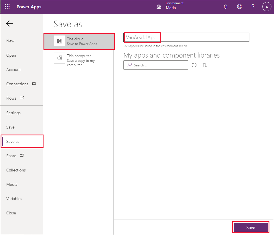
Select File > Save as.
Under Save as, select The cloud, enter the name VanArsdelApp, and then select Save.
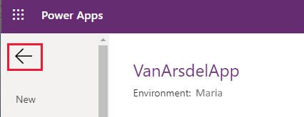
Select the back arrow to return to the Home screen.
Select F5 to preview the app. On the Browse Parts page, select the right angle bracket (>) to the right of any part. The Details screen for the part appears.
Select the left angle bracket (<) in the Details screen header to return to the Browse screen.
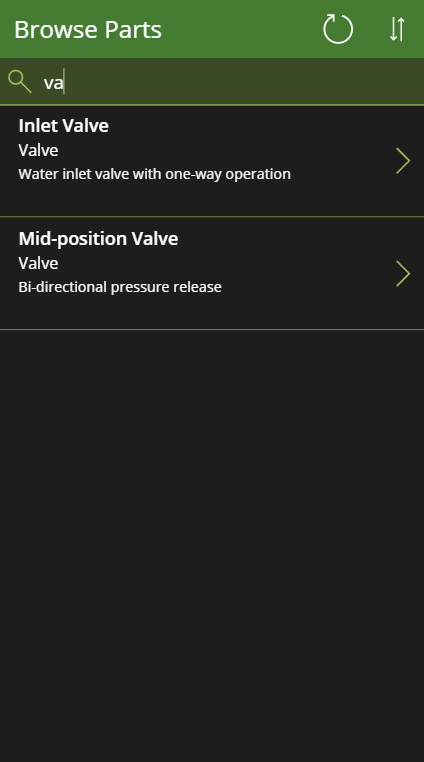
On the Browse Parts screen, enter text in the Search box. As you type, the items will be filtered to only show those that have matching text in the Name, CategoryID, or Overview fields.
Close the preview window and return to Power Apps Studio.
Item 2: Field knowledge base
For access to the knowledge base, Maria and Caleb (the technician) envisage a simple interface where the user enters a search term and the app displays all knowledge base articles that mention the term. Maria knows that this process is going to involve Azure Cognitive Search, but doesn't need—or even want—to understand how it works. Therefore, Maria decides to just provide the basic user interface and work with Kiana later to add the actual functionality.
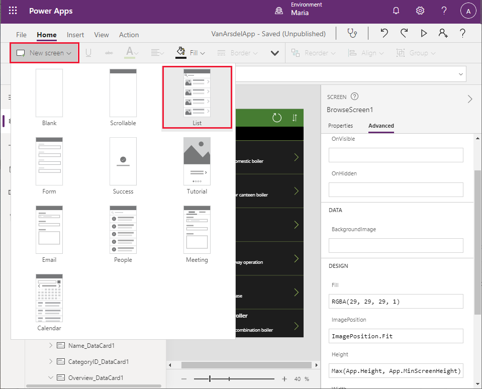
Maria decides to create a new screen based on the List template available in Power Apps Studio.
On the Power Apps Studio Home screen toolbar, select New Screen, and then select List.
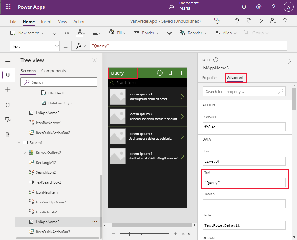
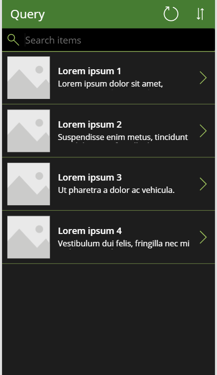
In the screen header, select the label that displays the text [Title]. Change the Text property to "Query" (include the quotation marks).
In the screen header, select the plus sign (+), and then select Delete. The + icon is intended to enable the user to add more items to the list. The knowledge base is query-only, so this feature isn't needed.
Notice that removing this icon causes an error in the header due to the way in which the location and widths of the other items are calculated. You saw this earlier with the inventory management screen, and the solution is the same, as described in the following steps.
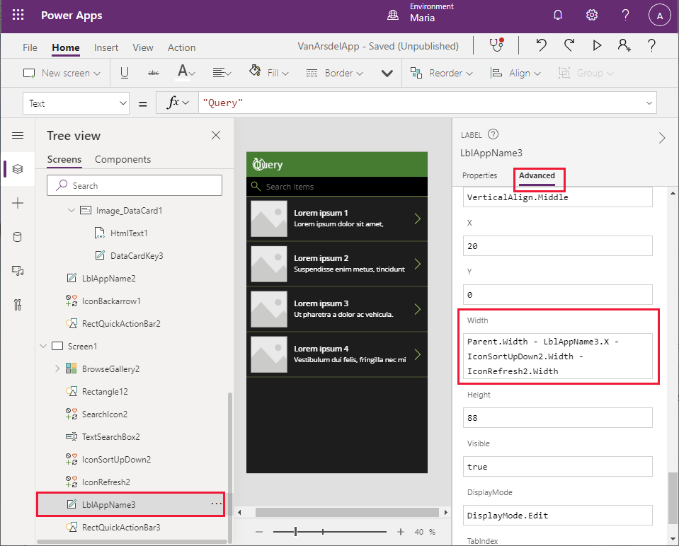
On the Tree view pane, scroll down to the Screen1 section, and select LblAppName3. Change the Width property to the formula Parent.Width - LblAppName3.X - IconSortUpDown2.Width - IconRefresh2.Width.
On the Tree view pane, select IconSortUpDown2. Modify the X property to the formula Parent.Width - IconSortUpDown2.Width.
On the Tree view pane, select IconRefresh2. Modify the X property to Parent.Width - IconSortUpDown2.Width - IconRefresh2.Width. This should resolve all the errors with the screen.
Select File > Save.
In the Version note box, enter the text Added Knowledgebase UI, and then select Save.
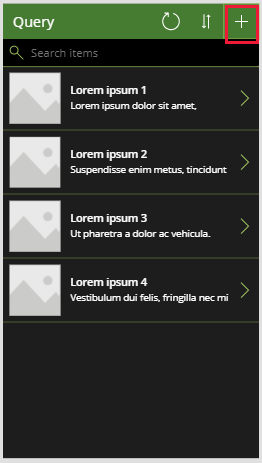
Return to the Home screen and select F5 to preview the new screen. It should look like the following image.
Note that if you select the > icon next to any of the dummy entries, the details functionality doesn't currently work. You'll address this later when you integrate Azure Cognitive Search into the app.
Close the preview window and return to Power Apps Studio.
Item 3: Field scheduling and notes
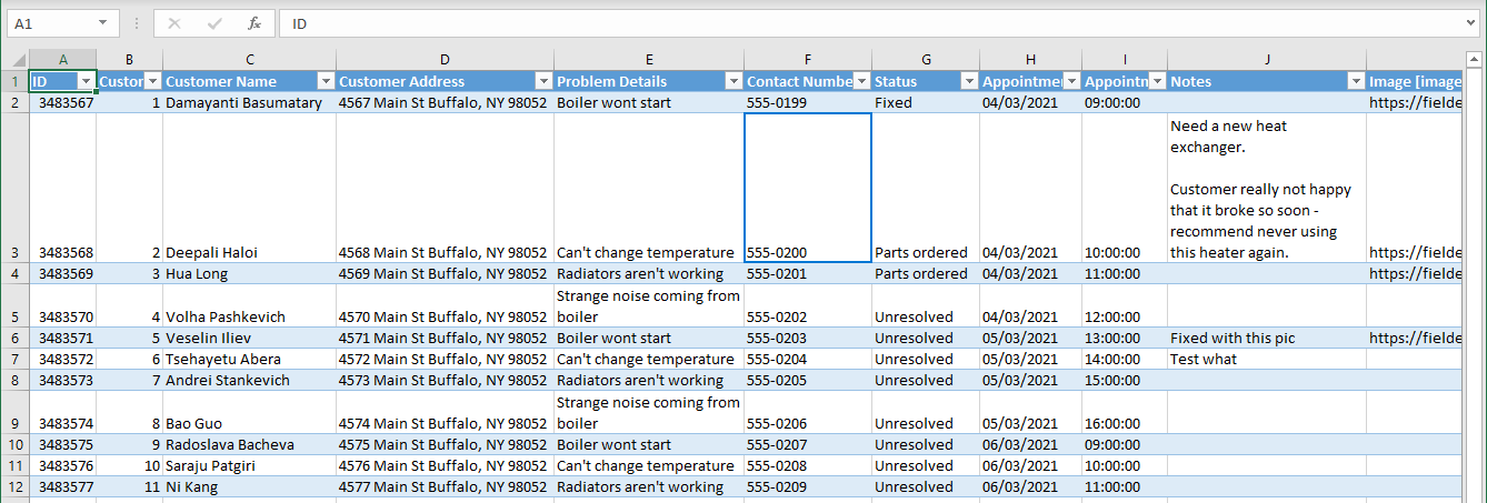
Maria works with Malik, the office receptionist, to design the interface for the field scheduling and appointments part of the app. Malik provides an Excel workbook with some sample data that Maria can use to build the appointments screen. The workbook contains a table with the following columns:
- ID (the appointment ID)
- Customer ID (a unique identifier for the customer)
- Customer Name
- Customer Address
- Problem Details (a text description of the problem the customer is experiencing)
- Contact Number
- Status
- Appointment Date
- Appointment Time
- Notes (a text description with any notes added by the engineer)
- Image (a photograph of the appliance, either in working condition after repair or as a supplementary picture for the engineer's notes)
Note
As with the field inventory management data, this workbook presents a denormalized view of the data. In the existing appointments system, this data is stored in separate tables that hold appointment data and customer data.
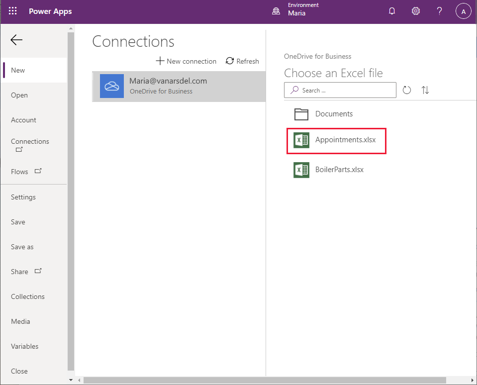
Maria stores this file in a OneDrive account with the name Appointments.xlsx. Remembering that previously the default name for the table was used in the workbook and the title had to be changed in the various screens that were generated, Maria renames the table in the workbook to Appointments.
Note
This workbook is available in the Assets folder of the Git repository for this guide.
Maria wants to build the appointments section of the app directly from the Excel file. Maria decides to follow a similar approach to that of the field inventory management functionality, except that this time the engineer will be allowed to create and edit appointments.
Maria decides to build the appointments screens initially as a separate app. This way, Maria can use Power Apps Studio to generate much of the app automatically. Power Apps Studio doesn't currently let you generate additional screens from a data connection in an existing app. After creating and testing the screens, Maria will copy them to the field inventory and knowledge base app.
Note
An alternative approach is to add the Appointments table in the Excel file as a second data source to the existing app, and then hand-craft the screens for appointments. Maria opted to generate the new screens from the workbook and copy the screens. Currently, Maria is more familiar with the concepts of copy and paste than building screens manually, and will gradually learn how to create screens from scratch as the process of building this app progresses.
To create the appointments app
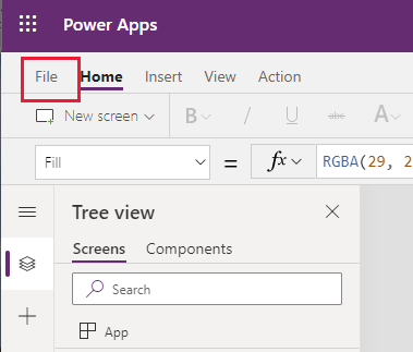
In the Power Apps Studio menu bar, select File.
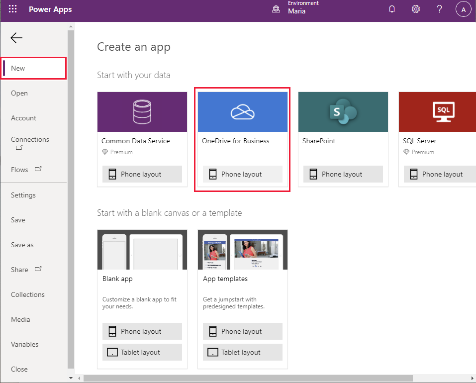
On the left pane, select New. On the main pane, select the OneDrive for Business - Phone layout box.
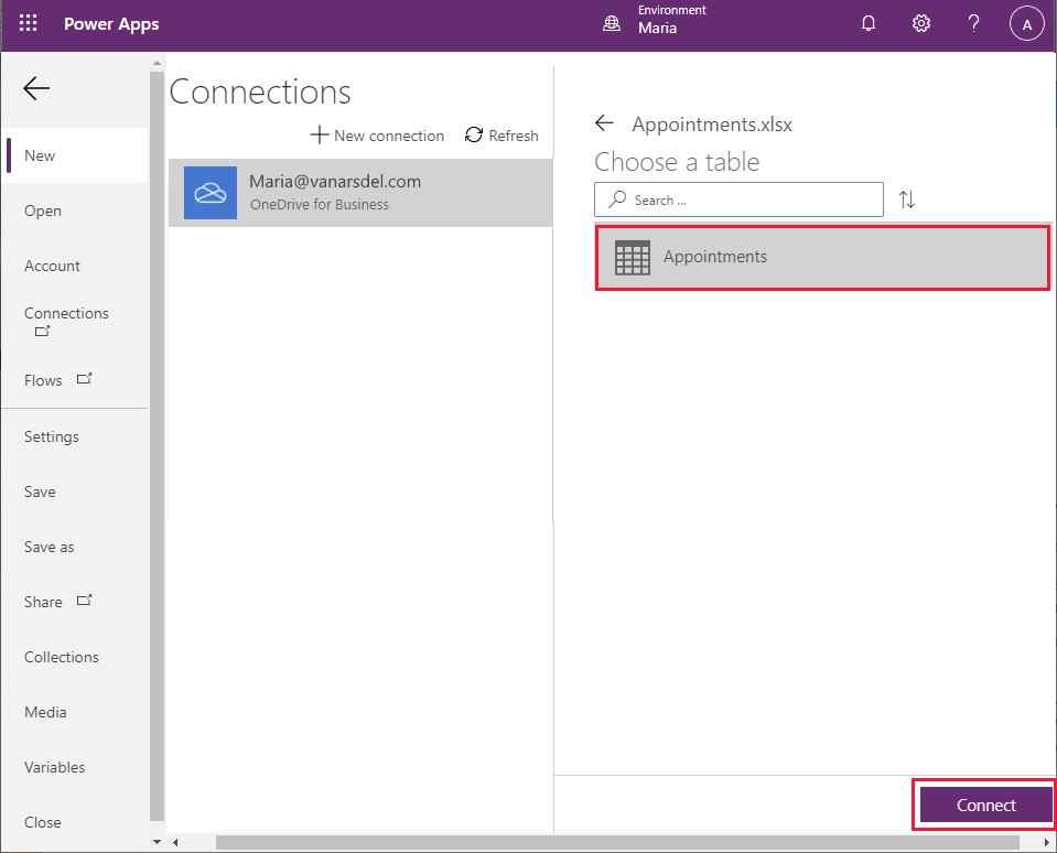
On the Connections pane, select Appointments.xlsx.
In the Excel file, select the Appointments table, and then select Connect.
Wait while the app is generated. When the new app appears, it will contain a Browse screen, a Details screen, and an Edit screen, using the default theme.
On the Tree view pane, in the BrowseScreen1 section under BrowseGallery1, select Image1, and then select Delete. The Browse screen should just list appointments, not any images associated with them.
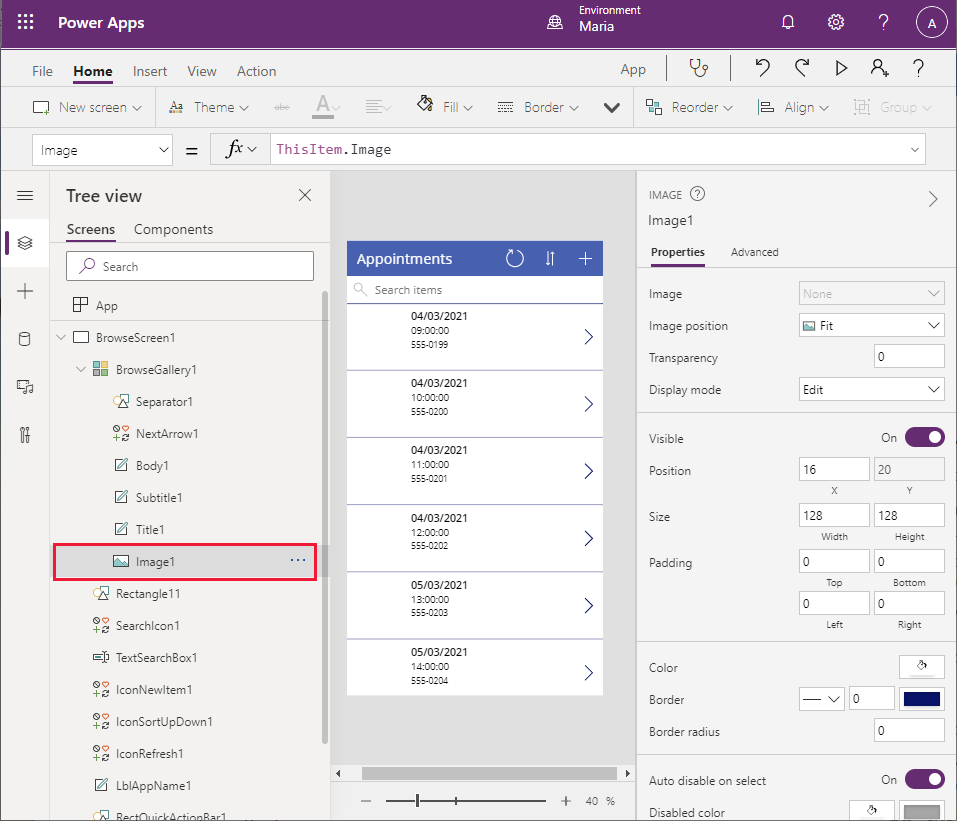
Notice that removing the Image1 control causes several errors on the screen because the widths and location of the Title1 control both reference the Image control. You'll fix these problems in the following step.
On the Tree view pane under BrowseGallery1, select Title1. Change the value in the X property to 16. Change the formula in the Width property to Parent.TemplateWidth - 104. This should resolve the errors for the screen.
On the Tree view pane under BrowseGallery1, select Body1. This control currently displays the contact telephone details for the customer. Change the value in the Text property to ThisItem.'Customer Name' (include the single quotation marks).
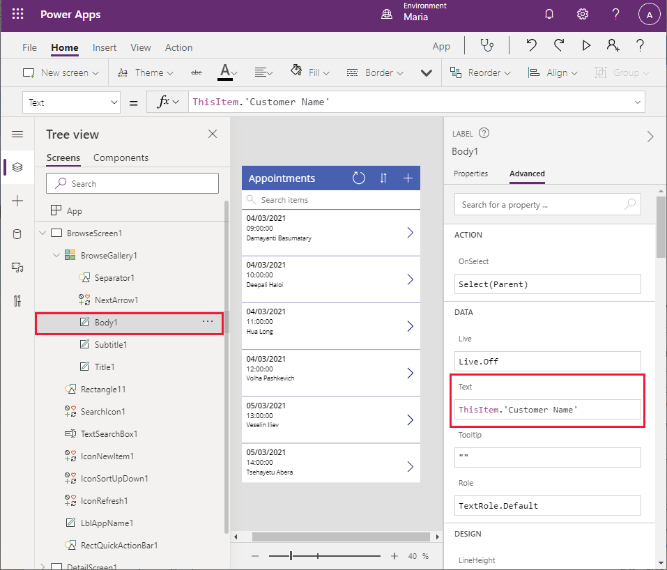
The details on the Browse screen name now display the customer name.
On the Tree view pane, select BrowseGallery1. Using the formula bar, examine the expression in the Items property. The control searches for appointments by using the appointment date, time, and contact number. Change this formula to search the customer name rather than the contact number:
SortByColumns(Search([@Appointments], TextSearchBox1.Text, "Appointment_x0020_Date","Appointment_x0020_Time","Customer_x0020_Name"), "Appointment_x0020_Date", If(SortDescending1, Descending, Ascending)).Notice that the appointments are ordered by date and then time (the first two fields displayed).
On the Tree view pane, delete IconNewItem1. Only on-premises staff can book new appointments for engineers and technicians. Notice that this action results in errors in the form because the width and position of other controls in the header reference the icon you just removed.
On the Tree view pane, select LblAppName1. Change the formula for the Width property. to Parent.Width - Self.X - IconSortUpDown1.Width - IconRefresh1.Width.
On the Tree view pane, select IconRefresh1. Change the value for the X property to Parent.Width - IconSortUpDown1.Width - Self.Width.
On the Tree view pane, select iconSortUpDown1. Change the value for the X property to Parent.Width - Self.Width.
On the Tree view pane, select BrowseScreen1, and then select the ellipsis button (...). On the dropdown menu that appears, select Rename and change the name of the screen to BrowseAppointments.
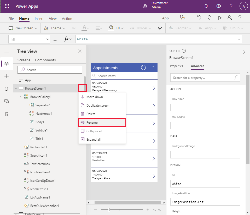
Using the same technique, change the name of the BrowseGallery1 control to BrowseAppointmentsGallery.
That completes the Browse screen.
To create the details screen
You can now turn your attention to the Details screen.
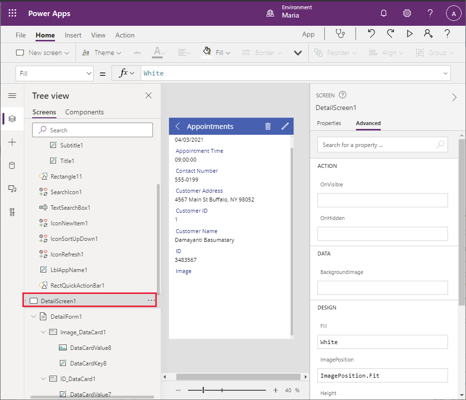
On the Tree view pane, scroll down to the DetailsScreen1 section. You can see that the details are presented in alphabetical order by field names, and some useful bits of information—such as the Notes field—aren't displayed at all.
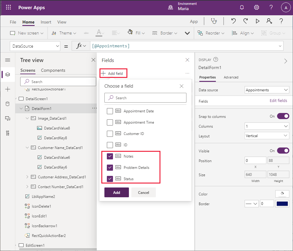
On the Tree view pane, select DetailForm1. On the right pane on the Properties tab, select Edit fields next to Fields. On the middle pane, select each of the following fields, and then select Delete:
- Appointment Date
- Appointment Time
- Customer ID
- ID
Select + Add field, and add the following fields:
- Notes
- Problem Details
- Status
Drag each field so that they're displayed in the following order, from top to bottom:
- Customer Name
- Customer Address
- Contact Number
- Problem Details
- Status
- Notes
- Image
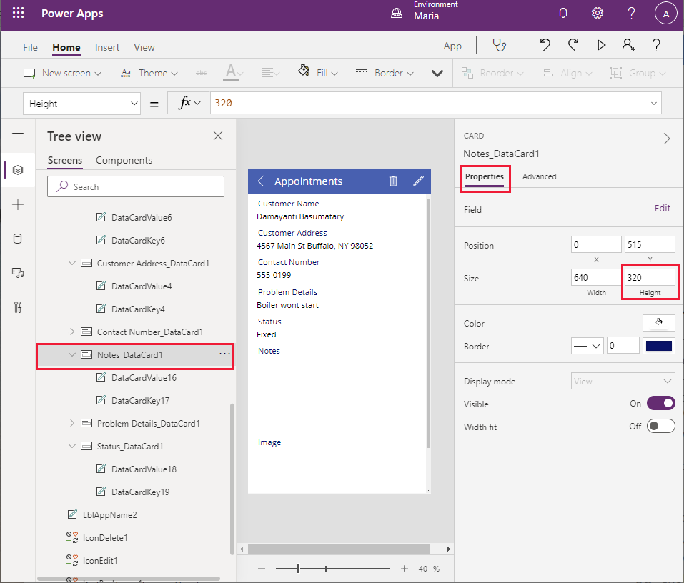
On the Tree view pane, select Notes_DataCard1. Change the Height property to 320.
On the Tree view pane, delete IconDelete1. Engineers shouldn't be able to remove appointments from the system.
Select LblAppName2, and change the Width property to Parent.Width - Self.X - IconEdit1.Width.
Using the technique described earlier, change the name of DetailsScreen1 to AppointmentDetails.
To edt the Edit screen
The final screen to look at, for now, is the Edit screen.
On the Tree view pane, select EditScreen1.
On the Tree view pane, in the EditScreen1 section, select EditForm1. On the right pane, on the Properties tab, select Edit fields next to Fields.
Remove the following fields:
- Customer Address
- ID
- Customer ID
- Appointment Date
- Appointment Time
Add the following fields:
- Problem Details
- Status
- Notes
Drag each field so that they're displayed in the following order, from top to bottom:
- Contact Name
- Customer Number
- Problem Details
- Status
- Notes
- Image
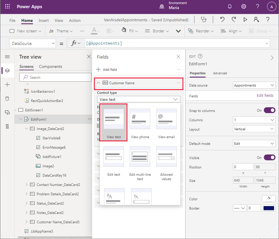
Select the Customer Name field and expand it to view its properties. Change the Control type to View text. This change makes the control read-only; it's useful to see the customer's name on the Edit screen, but an engineer shouldn't be able to change it.
Select the Contact Number field and expand it to view its properties. Change the Control type to View text. This field should also be read-only.
Select the Notes field, expand it, and change the Control type to Edit multi-line text. This setting enables the engineer to add detailed notes that can span several lines.
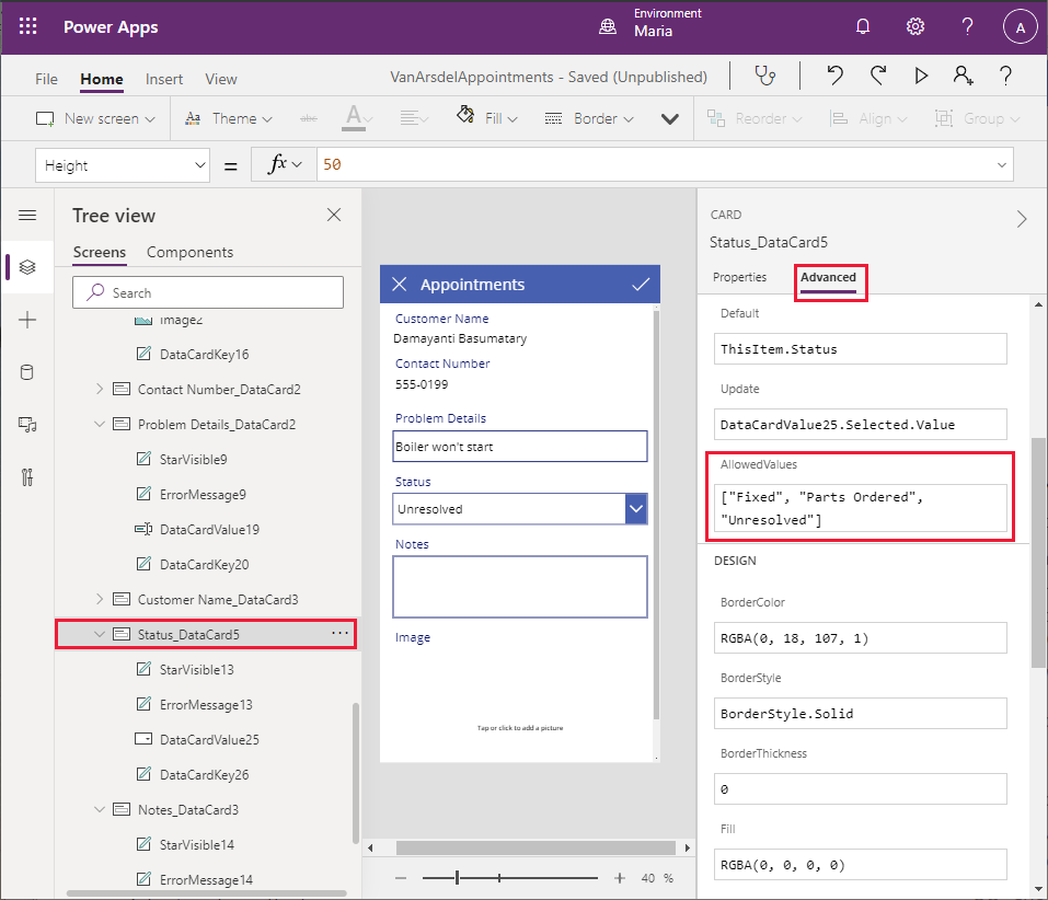
Select the Status field, expand it, and change the Control type to Allowed Values.
On the Tree view pane, select Status_DataCard5. On the right pane, on the Properties tab, select Unlock to change properties. Scroll down to the AllowedValues property, and change the text to ["Fixed", "Parts Ordered", "Unresolved"] (include the square brackets). The field engineer can only set the Status to one of these defined values.
On the Tree view pane, rename EditScreen1 as EditAppointment.
You can now save and test the app.
Select File > Save as.
Under Save as, select The cloud, enter the name VanArsdelAppointments, and then select Save.
Select the back arrow in the Power Apps Studio toolbar to return to the Home screen.
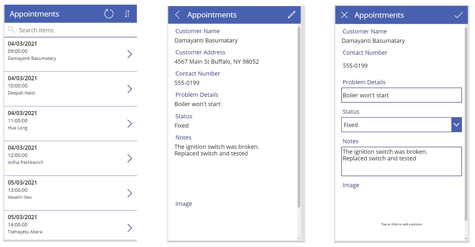
Select F5 to preview the app. On the Appointments page, select the > icon next to any appointment. The Details screen for the appointment should appear. In the header, select Edit to update the appointment. Verify the following:
- The customer name and contact number fields are read-only.
- The status field is limited to the values in the dropdown list.
- You can enter notes that span several lines.
- You can upload an image file to the image field.
Note
An enhancement that you'll add later will allow you to take a picture with your phone from within the app, and add it to the image field.
Combining the screens into a single app
Maria has built two apps, but wants to combine them into a single app. To do this, Maria copies the screens for the appointments app into the field inventory management and knowledge base app, as follows:
Open a new browser window and sign in to Power Apps Studio with your account details.
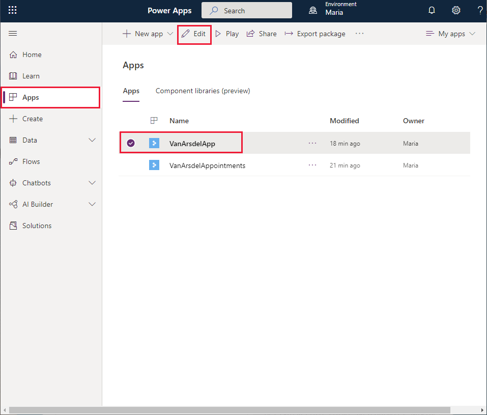
On the left pane, select Apps, select VanArdselApp, and then select Edit.
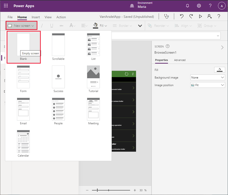
In the toolbar, select New screen, and then select Blank. This action will add a new screen to the app into which you'll copy the controls for the Browse screen for the VanArsdelAppointments app.
The new screen will be named Screen2. On the Tree view pane, rename it as BrowseAppointments.
Repeat the previous step twice more, to add two more blank screens (Screen3 and Screen4).
Rename Screen3 as AppointmentDetails, and rename Screen4 as EditAppointment.
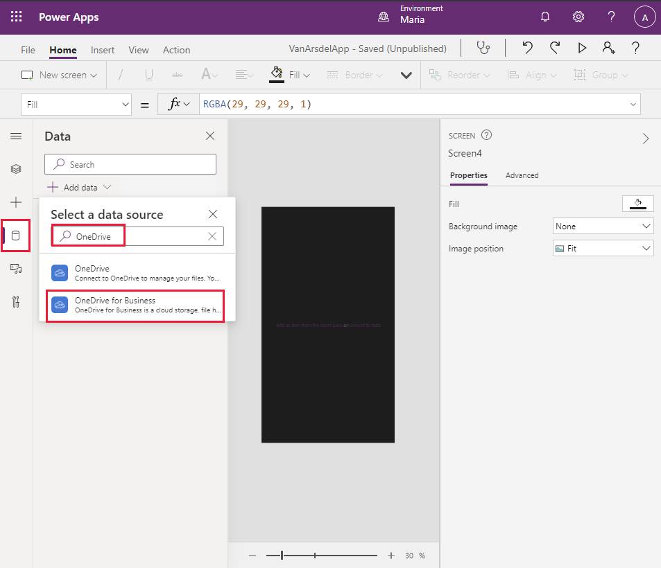
On the left toolbar of Power Apps Studio, select the Data icon. On the Data pane, select Add data. In the Select a data source dropdown list, in the Search field, enter OneDrive, and then select OneDrive for Business.
Select the Appointments.xlsx Excel file, select the Appointments table, and then select Connect.
Switch to the browser window that shows the VanArsdelAppointments app.
On the toolbar, select Theme (you might have to expand the toolbar to display more items), and then select the Forest theme. This is the same theme used by the VanArsdel app.
On the left toolbar, select the Tree view icon, select the BrowseAppointments screen, and then select Ctrl+A. This action selects all the controls in the screen.
Select Ctrl+C to copy these controls to the clipboard.
Return to the browser window that shows the VanArsdelApp app.
On the left toolbar, select the Tree view icon, and then select the BrowseAppointments screen.
Select Ctrl+V to paste the controls onto the screen.
Note
Sometimes the screen header appears slightly too low down. To fix this problem, select the IconSortUpDOwn1_1, IconRefresh1_1, LblAppName1_1, and RectQuickActionBar1_1 controls On the Tree view pane (hold down Shift while clicking to select more than one control at a time), and then use the mouse or arrow keys to move them up in the design view pane.
Switch back to the browser window that shows the VanArsdelAppointments app, and then select and copy the controls in the AppointmentDetails screen to the clipboard (Ctrl+A followed by Ctrl+C).
Return to the browser window that shows the VanArsdelApp app, select the AppointmentDetails screen, and then paste the controls (Ctrl+V). Adjust the position of the controls in the screen header, if necessary.
Note
You'll see an error reported in the header of the AppointmentDetails screen. This error occurs because the screen references controls in the EditAppointment screen, which haven't been copied yet. The next steps should resolve this error.
Switch back to the browser window that shows the VanArsdelAppointments app, and then select and copy the controls on the EditAppointment screen to the clipboard.
Return to the browser window that shows the VanArsdelApp app, select the EditAppointment screen, and then paste the controls. Again, move the controls in the screen header if necessary.
On the Tree view pane, select the AppointmentDetails screen and verify that the error indicated previously has now disappeared.
On the Tree view pane, select the BrowseScreen1 screen. Rename this screen as BrowseParts.
Rename the DetailsScreen1 screen as PartDetails.
Rename the Screen1 screen as Knowledgebase.
Note
It's a good practice to rename screens to reflect their function rather than use the default names generated by Power Apps Studio, especially if an app contains several screens. This can help to avoid confusion later if the app is modified by another developer.
Adding a Home screen to the app
The final stage is to add a Home screen to the app. The Home screen will enable the engineer to move between the different parts of the app (inventory management, knowledge base, and appointments).
In the VanArsdelApp app on the toolbar, select New screen, and then select Blank.
On the Tree view pane, rename Screen2 to Home.
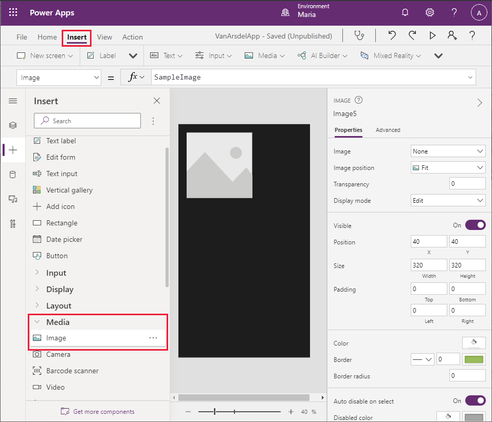
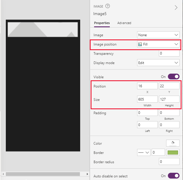
On the toolbar, select Insert. In the list of controls, expand Media, and then select Image. The control will be added to the screen.
Set the X position of the control to 16, and the Y position to 22. Change the Width to 605, and the Height to 127. Change the Image position to Fill.
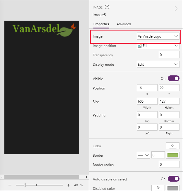
While still on the Properties tab, in the Image dropdown list, select + Add an image file, and then upload the VanArsdelLogo.png image to the control.
Note
The image file is available in the Assets folder in the Git repository for this guide.
From the list of controls, add four Text label controls to the form and position them so they're stacked under the VanArsdel logo.
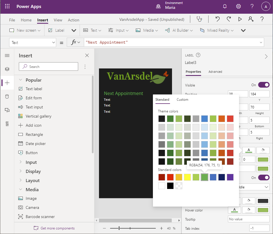
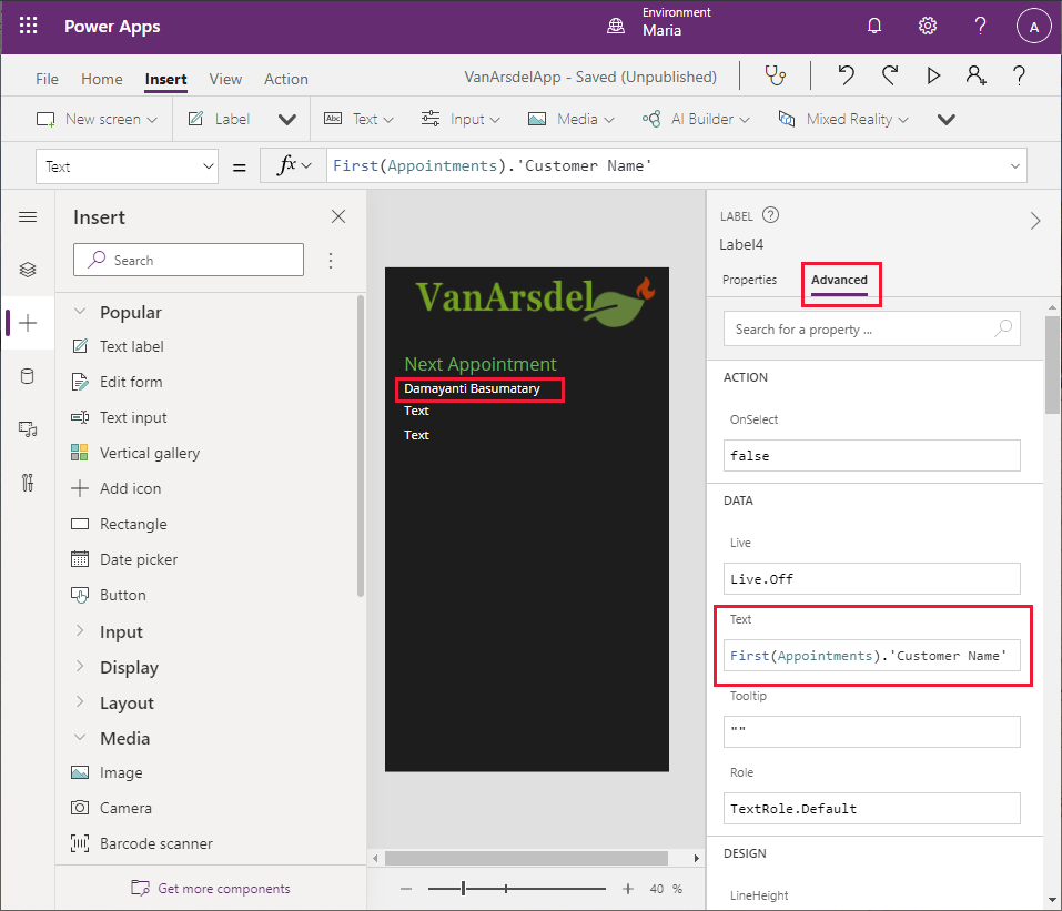
Select the uppermost Text label control. On the right pane, on the Properties tab, set the Text property to Next Appointment. Set the Font Size to 30, and use the color picker to set the font color to green (to match the logo).
Select the second Text label control. Change the value of the Text property to First(Appointments).'Customer Name' (include the quotation marks). This formula retrieves the customer name from the first row in the appointments table.
Note
Currently, this formula just acts as a placeholder. You'll modify the label later to retrieve the next appointment for the engineer, rather than always display the first one.
Select the third Text label control, and set the Text property to First(Appointments).'Appointment Date'.
Set the Text property of the fourth label control to First(Appointments).'Appointment Time'. Set the Font size property to 30.
From the list of controls, add a Rectangle control. Set the following properties for this control:
- Display mode: View
- X: 0
- Y: 632
- Width: 635
- Height: 1
This control acts as a visual separator across the middle of the screen.
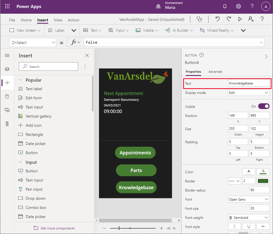
Add three Button controls to the screen, arranged vertically and spaced evenly below the separator. Set the Text property for the top button to Appointments, the Text property for the middle button to Parts, and the Text property for the lower button to Knowledgebase.
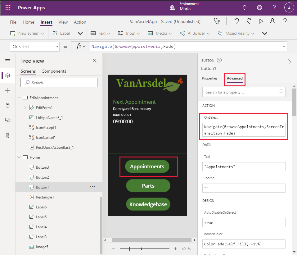
Select the Appointments button. Change the expression in the OnSelect action to the formula Navigate(BrowseAppointments, ScreenTransition.Fade). This action switches the display to the appointments screen when the user selects the button.
Set the OnSelect action for the Parts button to Navigate(BrowseParts, ScreenTransition.Fade).
Set the OnSelect action for the Knowledgebase button to Navigate(Knowledgebase, ScreenTransition.Fade).
In addition to navigating from the Home screen to the other screens in the system, the Appointments, Parts, and Knowledgebase screens need a way to enable the user to return to the Home screen. Maria decides to add back buttons to these screens.
On the Tree view pane, select the BrowseParts screen.
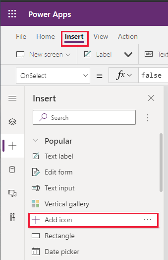
Select the RectQuickActionBar1 control to give it the focus.
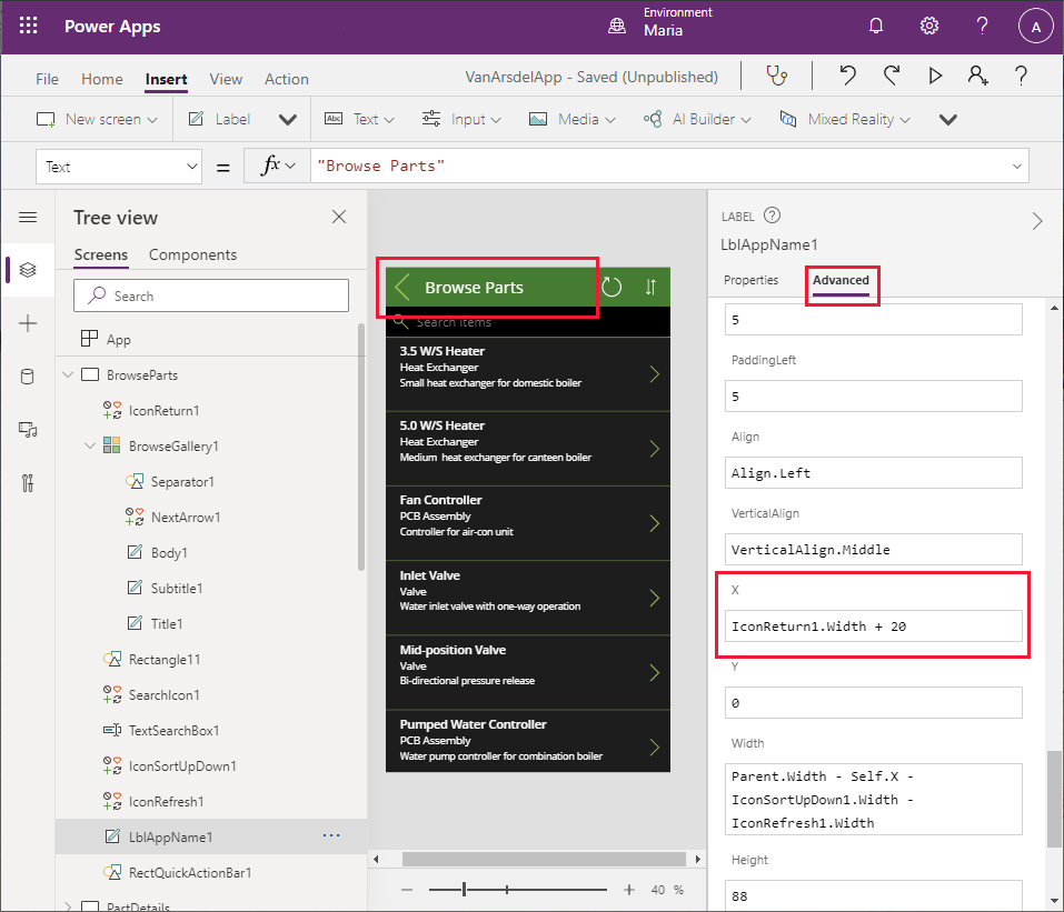
Select the Insert menu, and select Add icon. Move the icon to the left of the RectQuickActionBar1 control. Note that the icon will obscure part of the Browse Parts label.
On the Tree view menu, change the name of the new icon control to IconReturn1.
Change the formula for the OnSelect action to the expression Back(ScreenTransition.Fade). The Back function navigates the user to the previous screen they visited.
On the Properties tab, change the Icon property to < Left.
In the screen header, select the Browse Parts label. Change the X property to IconReturn1.Width + 20. The Browse parts label should no longer be partially obscured.
Following the process described in steps 16 to 22, add an icon named IconReturn2 to the RectQuickActionBar3 control in the Knowledgebase screen.
Similarly, add an icon named IconReturn3 to the RectQuickActionBar1_1 control in the BrowseAppointments screen.
On the Tree view pane, select the App object. Change the StartScreen property to the expression Home. This ensures that the Home screen is displayed whenever the app starts:
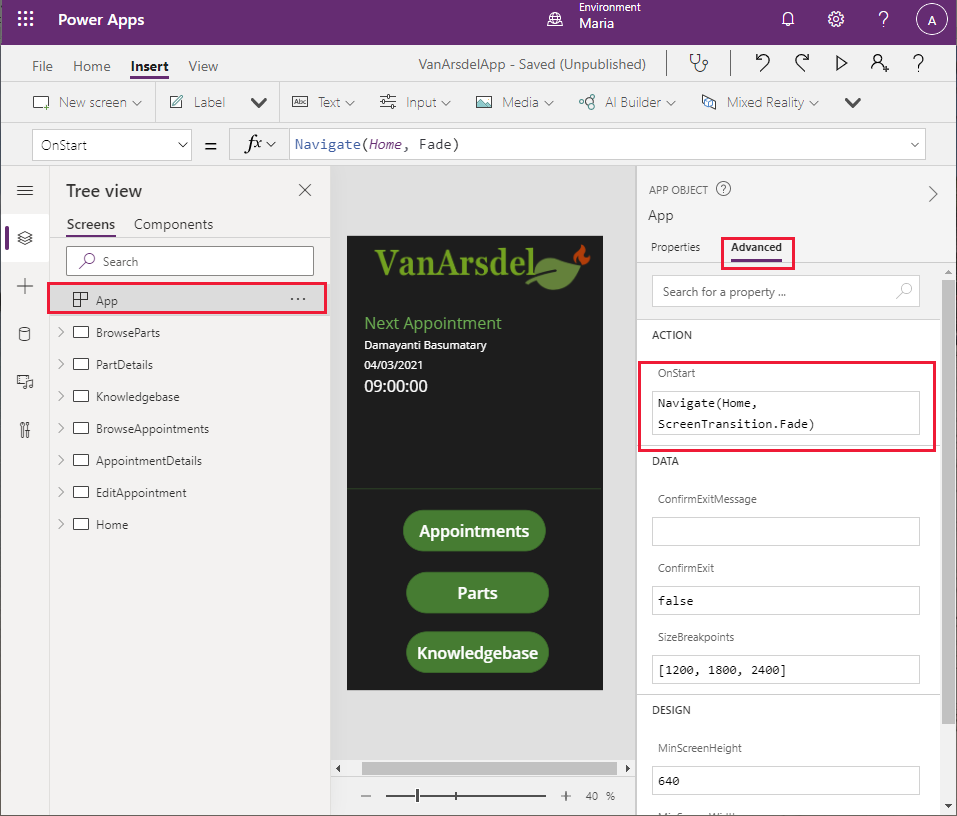
Note
If you don't specify which screen to display when the app starts, the screen that appears at the top of the Tree view pane will be used. To move a screen to the start of the list, right-click the screen on the Tree view pane and select Move up until it's at the top.
Finally, you can test the app.
Select File > Save. In the Version notes box, enter Complete version with Home screen, and then select Save.
Select the back arrow to return to the Home screen, and then select F5 to run the app.
Verify that the Home screen for the app appears.
Select Appointments. The appointments screen should appear.
Select the back arrow to return to the Home screen.
Select Parts. The parts browser should appear.
Select the back arrow to return to the Home screen.
Select Knowledgebase. The knowledge base query screen should appear.
Select the back arrow to return to the Home screen.
Close the preview window and return to Power Apps Studio.
The prototype app is now complete.
Feedback
Coming soon: Throughout 2024 we will be phasing out GitHub Issues as the feedback mechanism for content and replacing it with a new feedback system. For more information see: https://aka.ms/ContentUserFeedback.
Submit and view feedback for