Note
Access to this page requires authorization. You can try signing in or changing directories.
Access to this page requires authorization. You can try changing directories.
Entering addresses can be frustrating and error-prone, particularly in mobile apps. Use the address input control to make address entry easier. The control uses fuzzy logic to suggest potential matches as you type. Select the one you want to quickly and easily enter an accurate address.
The control returns the address as structured data. Your app can extract information such as city, street, municipality, and even latitude and longitude coordinates. The data is in a format that's friendly to many locales and international address formats.
Prerequisites
Before you can use the control in your apps, you'll need to enable geospatial features for the environment. Make sure you also review the prerequisites for using geospatial controls. Refer to the privacy and security table for more details on the address input control's data usage.
Add an address input control to your app
With your app open for editing in Power Apps Studio:
- Open the Insert tab and expand Input.
- Select Address input to place an address input box in the app screen, or drag the control to the screen to position it more precisely. You must enter at least three characters including one number for the address input control.
Set a default search radius
By default, the control will search around the user's location. You can refine the default search area to help narrow the initial results.
- On the address input control's Properties tab, turn on the Search within radius property.
- Enter a longitude, latitude, and radius in meters.
The control will start searching at the given latitude and longitude, out to the distance specified.
Use the map control with the address input control
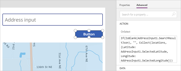
You can add a button to your app to save entered addresses as a data collection. Then you can retrieve the addresses and display them in the map control.
Add a map control and an address input control to your app.
Insert and place a Button control.
Change the OnSelect property of the button control as follows. (Hint: Copy the formula and paste it in the formula bar or on the Advanced properties tab, whichever you prefer.)
Enter a longitude, latitude, and radius (in meters).
The control will start searching at the latitude and longitude, out to the distance specified in the radius field.
If(IsBlank(AddressInput1.SearchResultJson), "", Collect(locations, {Latitude: AddressInput1.SelectedLatitude, Longitude: AddressInput1.SelectedLongitude}))The formula saves the current latitude and longitude to a collection named locations, as long as the search results aren't blank.
Select the map control. Change its properties as follows:
Property name Value Where Items "Locations" Properties tab ItemsLatitudes "Latitude" Advanced tab ItemsLongitudes "Longitude" Advanced tab
When the user selects the button, the result from the address input control is added to the map as a new pin.
Properties
Change an address input control's behavior and appearance using properties. Some properties are only available on the Advanced tab.
| Property | Description | Type | Tab |
|---|---|---|---|
| Default | Sets the initial value of the control. | String | Properties; Advanced: Default |
| Hint text | Sets the hint that appears in the control before the user enters text. | String | Properties; Advanced: HintText |
| Font | Sets the name of the family of fonts used for the control text. | Dropdown list | Properties; Advanced: Font |
| Font size | Sets the size of the control text. | Floating point number | Properties; Advanced: FontSize |
| Font weight | Sets the weight of the control text, either Bold, Lighter, Normal, or Semibold. | Dropdown list | Properties; Advanced: FontWeight |
| Text alignment | Sets the horizontal alignment of the control text, either Center, Justify, Left, or Right. | Dropdown list | Properties; Advanced: TextAlignment |
| Line height | Sets the vertical distance between lines of text in the control. | Floating point number | Properties; Advanced: LineHeight |
| Display mode | Determines whether the control allows user input (Edit), only displays data (View), or is disabled (Disabled). | Dropdown list | Properties; Advanced: DisplayMode |
| Font style | Sets the style of the control text, either Italic, Underline, Strikethrough, or none. | Dropdown list | Properties; Advanced: Italic, Underline, Strikethrough |
| Search result limit | Sets the number of suggested addresses the control displays. | Integer | Properties; Advanced: SearchResultLimit |
| Search within radius | Determines whether the control should suggest addresses within the Radius of the Latitude and Longitude. | Boolean | Properties; Advanced: SearchWithinRadius |
| Latitude | Sets the latitude coordinate of the center point used for address suggestions. Requires Search within radius to be on. | Floating point number from -90 to 90 | Properties; Advanced: Latitude |
| Longitude | Sets the longitude coordinate of the center point used for address suggestions. Requires Search within radius to be on. | Floating point number from -180 to 180 | Properties; Advanced: Longitude |
| Radius | Sets the radius, in meters, around Latitude and Longitude to constrain address suggestions. Requires Search within radius to be on. | Floating point number | Properties; Advanced: Radius |
| Language | Sets the language that address suggestions are returned in. | String | Properties; Advanced: Language |
| Country set | Identifies a comma-separated list of countries/regions to constrain address suggestions to, in ISO 3166 alpha-2 format; for example, US,CA,MX. | String | Properties; Advanced: CountrySet |
| Visible | Shows or hides the control. | Boolean | Properties; Advanced: Visible |
| Padding top | Sets the distance between the control text and the top of the control. | Floating point number | Properties; Advanced: PaddingTop |
| Padding bottom | Sets the distance between the control text and the bottom of the control. | Floating point number | Properties; Advanced: PaddingBottom |
| Padding left | Sets the distance between the control text and the left edge of the control. | Floating point number | Properties; Advanced: PaddingLeft |
| Padding right | Sets the distance between the control text and the right edge of the control. | Floating point number | Properties; Advanced: PaddingRight |
| Position | Places the upper-left corner of the control at the screen coordinates specified in X and Y. | Integer | Properties; Advanced: X, Y |
| Size | Determines the size of the control using the pixel values provided in Width and Height. | Integer | Properties; Advanced: Width, Height |
| Border radius | Determines the corner radius of the control border. | Floating point number | Properties; Advanced: BorderRadius |
| Color | Sets the colors of the control text and the control background. | Not applicable | Properties; Advanced: FillColor, TextColor |
| Border | Determines the style, width, and color of the control border. | Not applicable | Properties; Advanced: BorderStyle, BorderThickness, BorderColor |
| Tab index | Specifies the order the control is selected if the user navigates the app using the Tab key. | Integer | Properties; Advanced: TabIndex |
| Tooltip | Determines the text to display when the user hovers over the control. | String | Properties; Advanced: Tooltip |
| Hover color | Sets the colors of the control text, the control background, and the control border when the user hovers the mouse pointer over it. | Not applicable | Properties; Advanced: HoverFontColor, HoverFillColor, HoverBorderColor |
| Disabled color | Sets the colors of the control text, the control background, and the control border if DisplayMode is Disabled. | Not applicable | Properties; Advanced: DisabledFontColor, DisabledFillColor, DisabledBorderColor |
| Pressed color | Sets the colors of the control text, the control background, and the control border when the user selects the control. | Not applicable | Properties; Advanced: PressedFontColor, PressedFillColor, PressedBorderColor |
| ContentLanguage | Determines the display language of the control, if it's different from the language that's used in the app. | String | Advanced |
| OnAddressSelect | Contains code that runs when the user selects a suggested address. | Event | Advanced |
| OnChange | Contains code that runs when a control property is changed. | Event | Advanced |
Output properties
Other properties become available when a user interacts with the address input control. You can use these output properties in other controls or to customize the app experience.
| Property | Description |
|---|---|
| UserInput | The text the user typed in the input box |
| SelectedLatitude | The latitude of the address that the user selected |
| SelectedLongitude | The longitude of the address that the user selected |
| SearchResultJson | The search result, based on UserInput, displayed as a string in JSON format |
| FreeformAddress | The address that the user selected from the list of suggested addresses |
| LocalName | The name of a geographic area or locality that groups a number of addressable objects for addressing purposes, without being an administrative unit |
| PostalCode | The postal code |
| ExtendedPostalCode | The extended postal code |
| CountryCode | The country code |
| Country | The country/region name |
| CountryCodeISO3 | The country code in ISO alpha-3 format |
| CountrySubdivisionName | The country/region subdivision name |
| StreetName | The street name |
| StreetNumber | The street number |
| Municipality | The municipality |
| MunicipalitySubdivision | The municipality subdivision |
| CountryTertiarySubdivision | The country/region tertiary subdivision |
| CountrySecondarySubdivision | The country/region secondary subdivision |
| CountrySubdivision | The country/region subdivision |
Other geospatial controls
To visualize and interpret location data, use the interactive map control.