Note
Access to this page requires authorization. You can try signing in or changing directories.
Access to this page requires authorization. You can try changing directories.
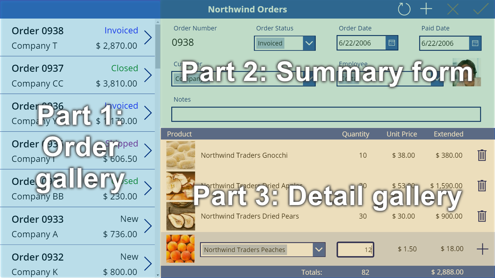
Follow step-by-step instructions to create a detail gallery in a canvas app for managing fictitious data in the Northwind Traders database. This topic is part of a series that explains how to build a business app on relational data in Microsoft Dataverse. For best results, explore these topics in this sequence:
- Create an order gallery.
- Create a summary form.
- Create a detail gallery (this topic).
Prerequisites
Before you start this topic, you must install the database as described earlier in this topic. You must then either create the order gallery and the summary form or open the Northwind Orders (Canvas) - Begin Part 3 app, which already contains that gallery and that form.
Create another title bar
At the top of the screen, select the Label control that acts as a title bar, copy it by pressing Ctrl-C, and then paste it by pressing Ctrl-V:
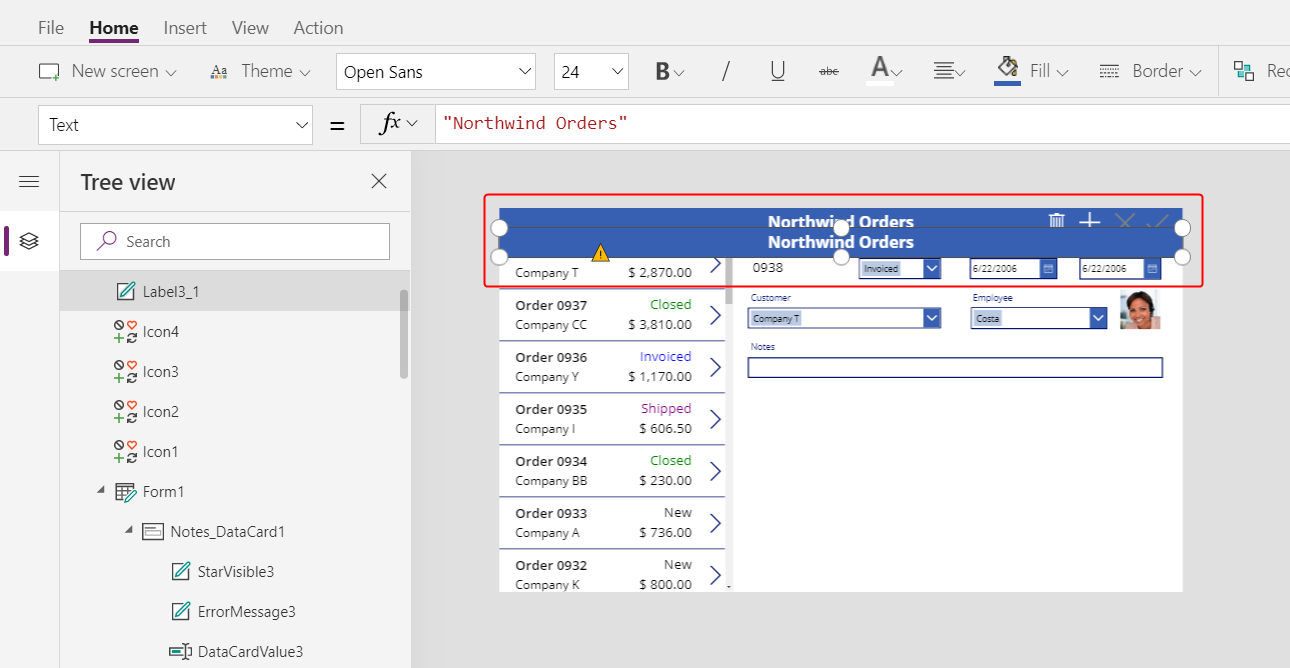
Resize and move the copy so that it appears just under the summary form.
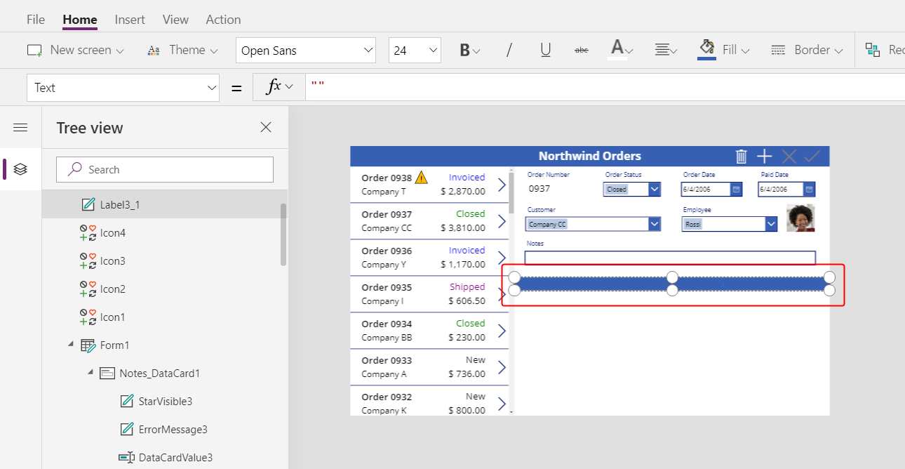
Remove the text from the copy in either of these ways:
- Double-click the text to select it, and then press Delete.
- Set the label's Text property to an empty string ("").
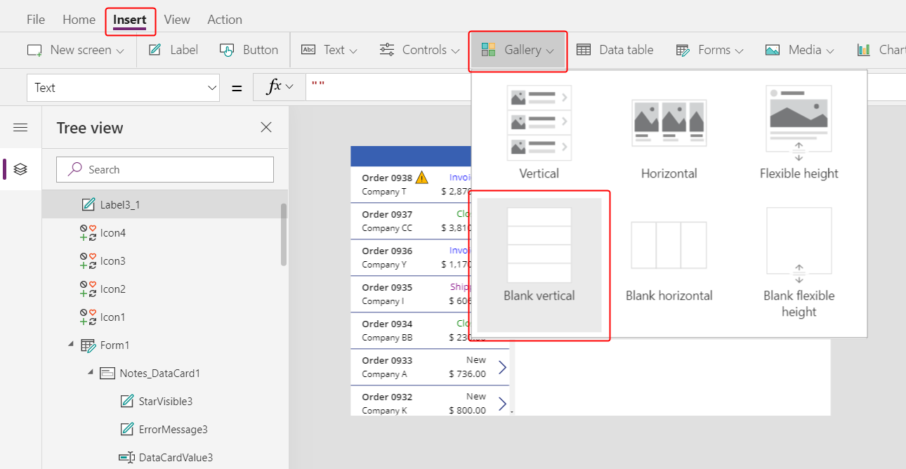
Add a gallery
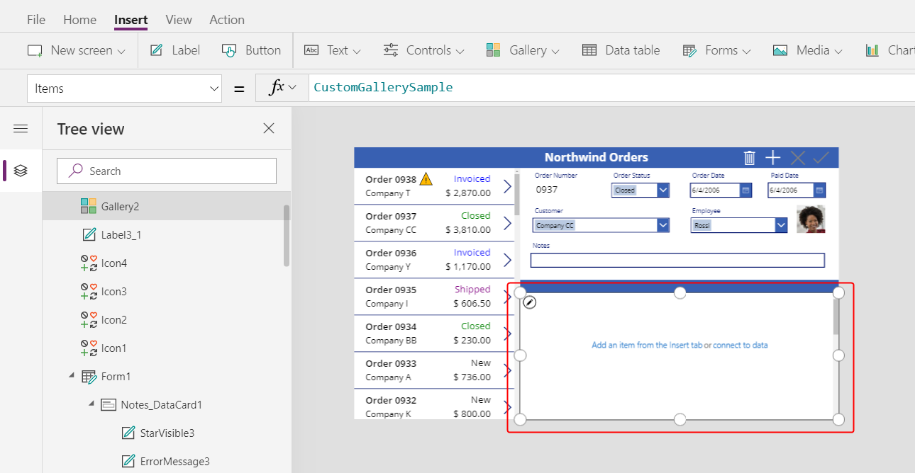
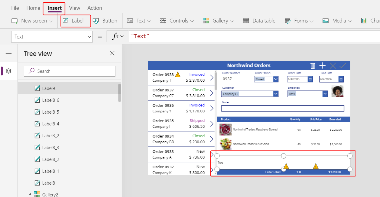
Insert a Gallery control with a Blank vertical layout:
The new gallery, which will show order details, appears in the upper-left corner.
Close the fly out data source dialog, and then resize and move the detail gallery to the lower-right corner, below the new title bar:
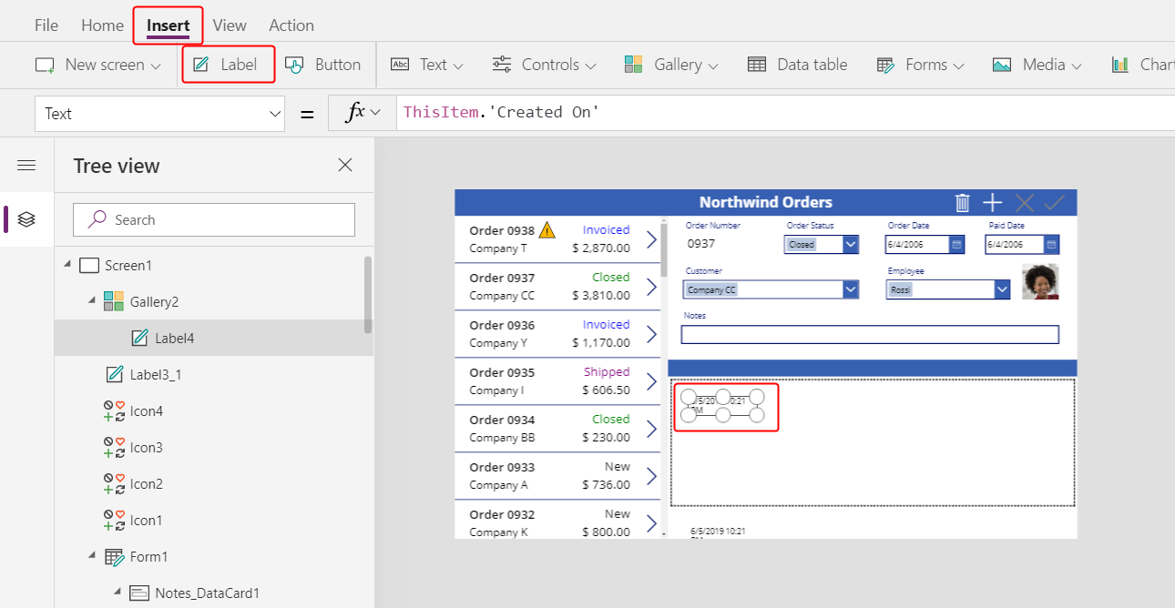
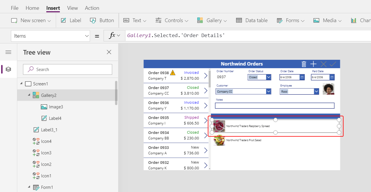
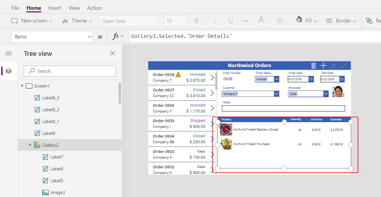
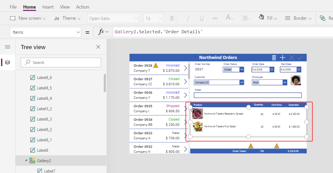
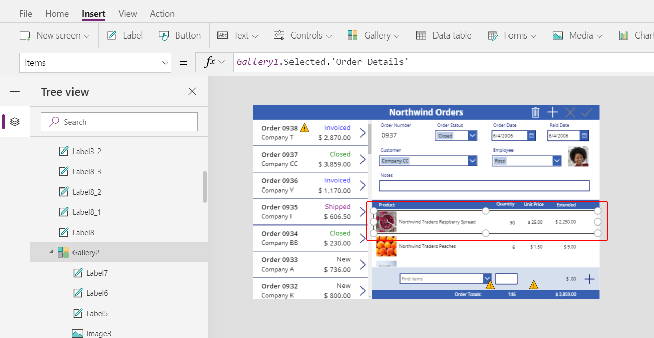
Set the Items property of the detail gallery to this formula:
Gallery1.Selected.'Order Details'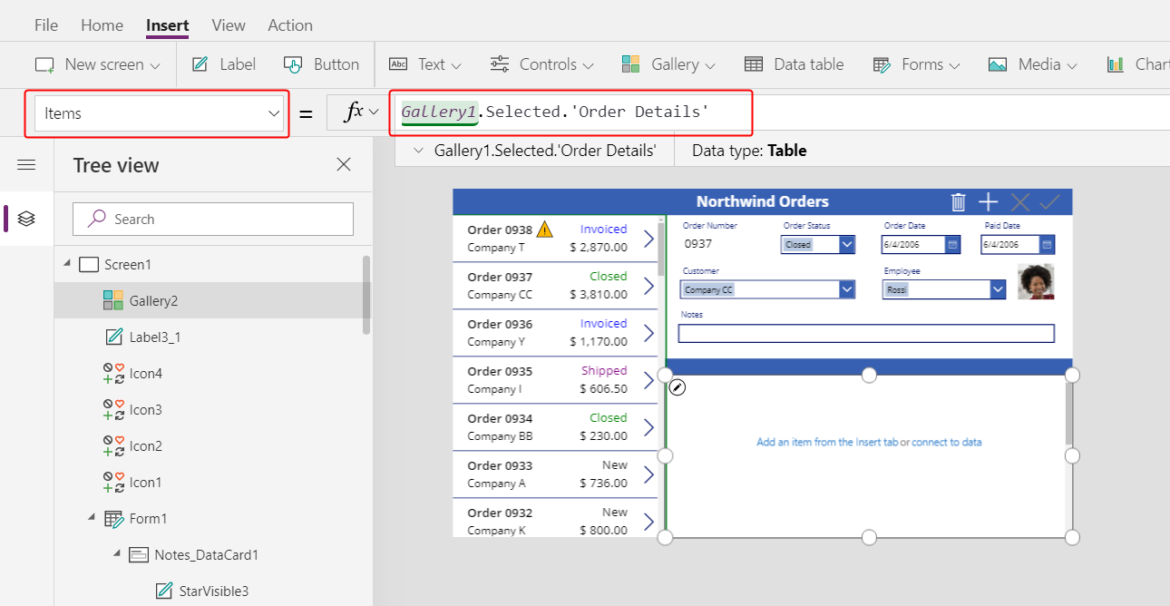
If an error appears, confirm that the order gallery is named Gallery1 (in the Tree view pane near the left edge). If that gallery has a different name, rename it Gallery1.
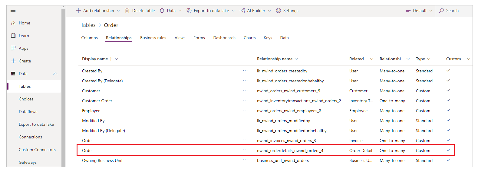
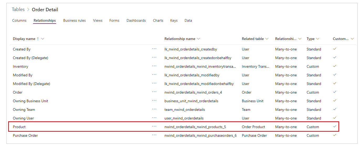
You've just linked the two galleries. When the user selects an order in the order gallery, that selection identifies a record in the Orders table. If that order contains one or more line items, the record in the Orders table is linked to one or more records in the Order details table, and data from those records appears in the detail gallery. This behavior reflects the one-to-many relationship that was created for you between the Orders and Order Details tables. The formula that you specified "walks" that relationship by using dot notation:
Show product names
In the detail gallery, select Add an item from the Insert tab to select the gallery template:
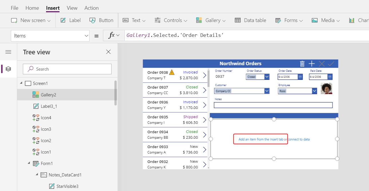
Ensure that you've selected the gallery template instead of the gallery itself. The bounding box should be slightly inside the gallery's boundary and probably shorter than the gallery's height. As you insert controls into this template, they are repeated for each item in the gallery.
On the Insert tab, insert a label into the detail gallery.
The label should appear within the gallery; if it doesn't, try again, but make sure to select the gallery's template before you insert the label.
Set the new label's Text property to this formula:
ThisItem.Product.'Product Name'If no text appears, select the arrow for Order 0901 near the bottom of the order gallery.
Resize the label so that the full text appears:
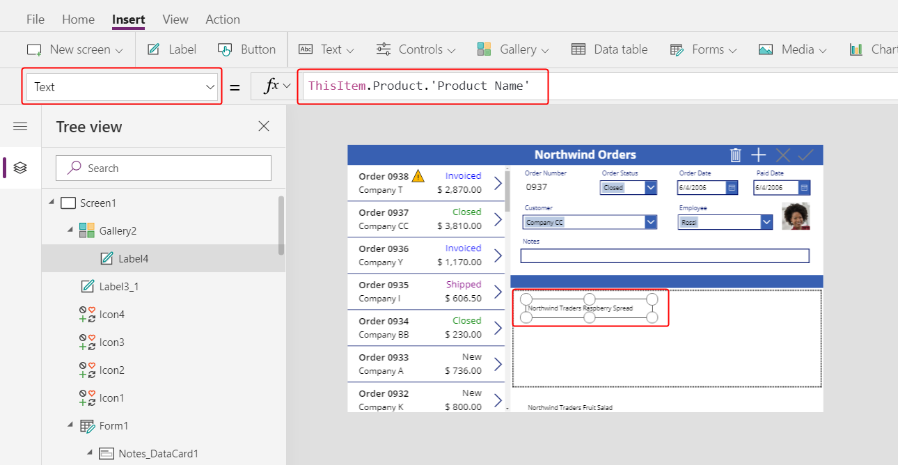
This expression walks from a record in the Order Details table. The record is held in ThisItem over to the Order Products table through a many-to-one relationship:
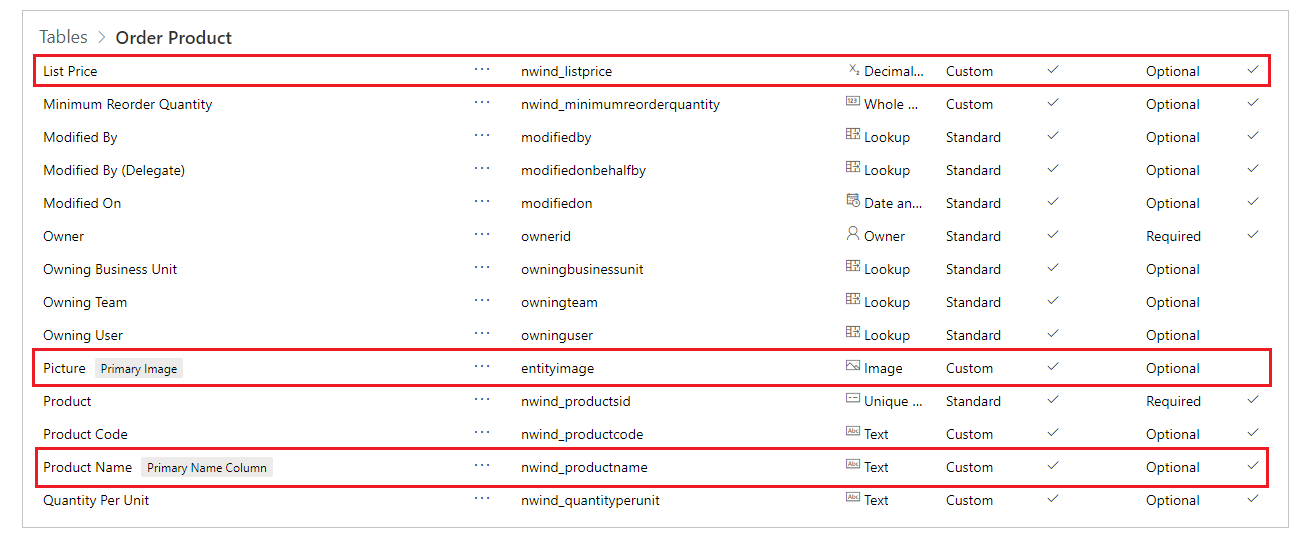
The Product Name column (and other columns that you're about to use) are extracted:
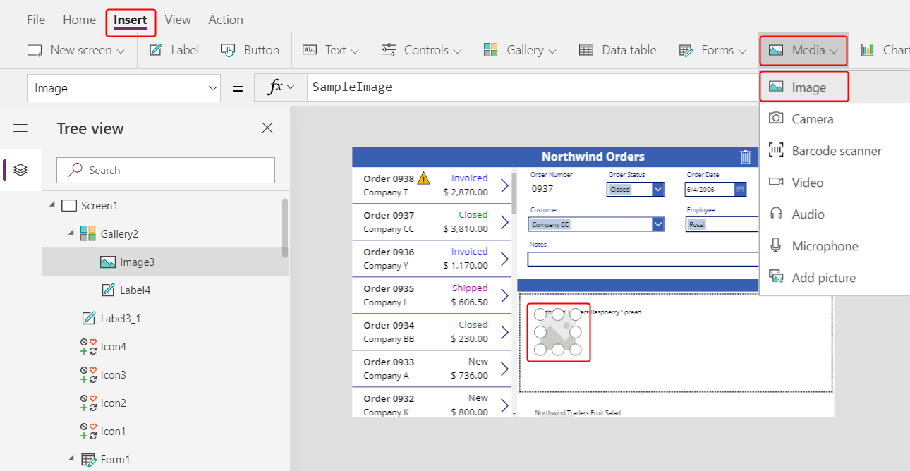
Show product images
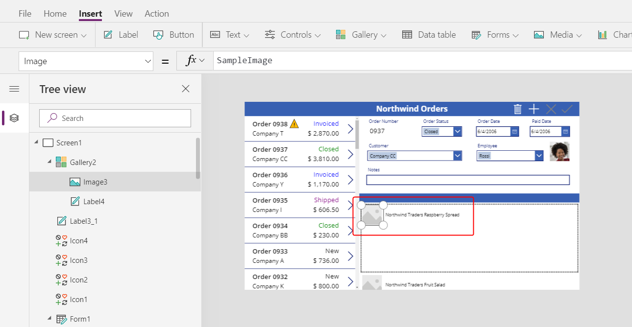
On the Insert tab, insert an Image control into the detail gallery:
Resize and move the image and the label to be side by side.
Tip
For fine-grained control over the size and the position of a control, start to resize or move it without pressing the Alt key, and then continue to resize or move the control while you hold down the Alt key:
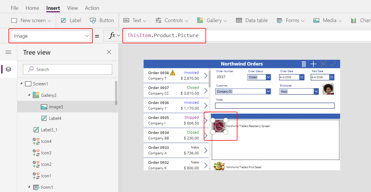
Set the image's Image property to this formula:
ThisItem.Product.PictureAgain, the expression references a product that's associated with this order detail and extracting the Picture field to display.
Reduce the height of the gallery's template so that more than one Order Detail record appears at a time:
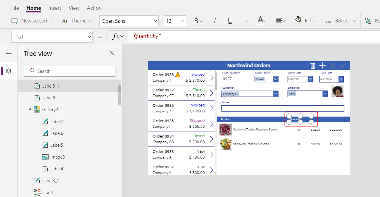
Show product quantity and cost
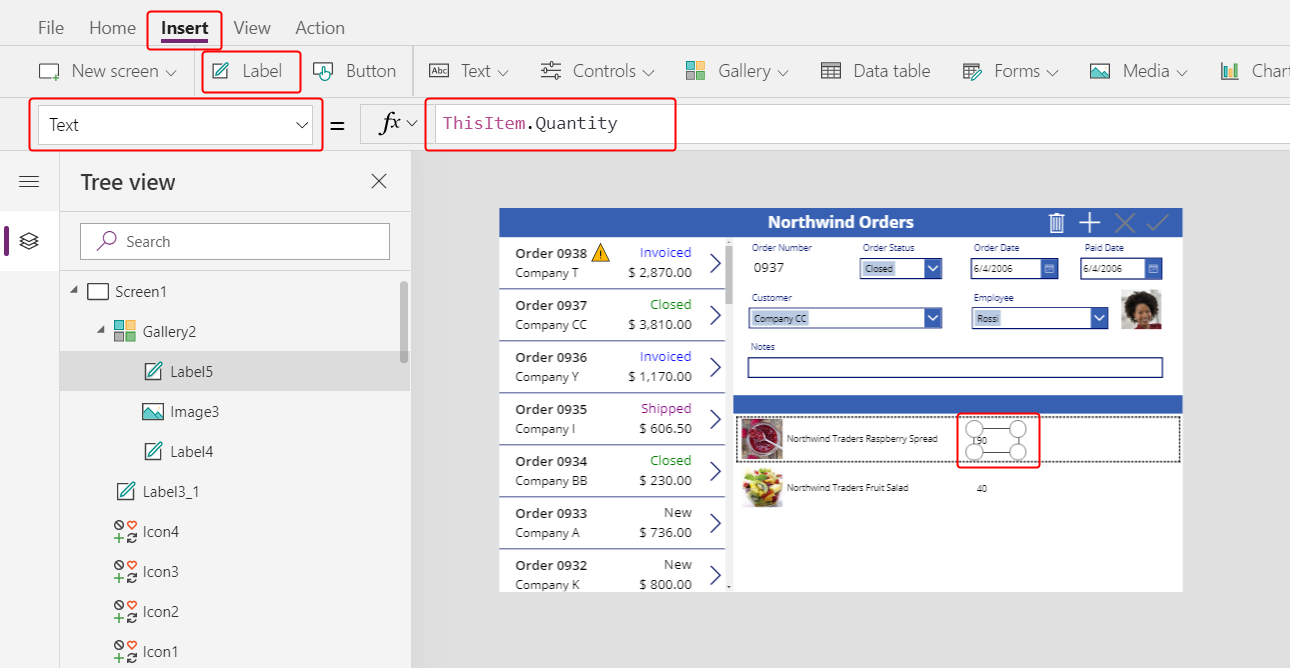
On the Insert tab, insert another label into the detail gallery, and then resize and move the new label to the right of the product information.
Set the new label's Text property to this expression:
ThisItem.QuantityThis formula pulls information directly from the Order Details table (no relationship required).
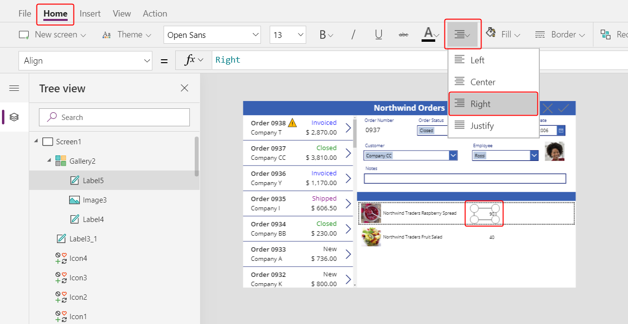
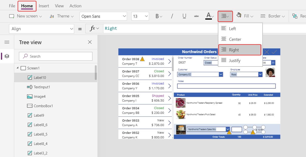
On the Home tab, change the alignment of this control to Right:
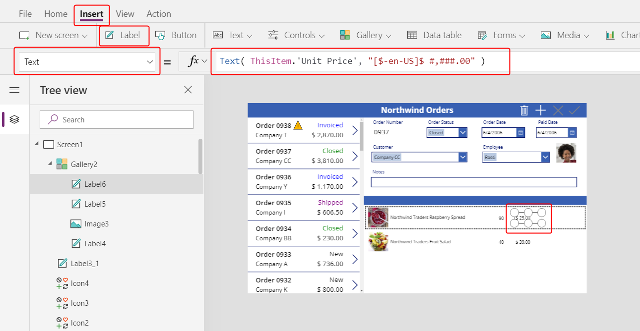
On the Insert tab, insert another label into the detail gallery, and then resize and move the label to the right of the quantity label.
Set the new label's Text property to this formula:
Text( ThisItem.'Unit Price', "[$-en-US]$ #,###.00" )If you don't include the language tag ([$-en-US]), it will be added for you based on your language and region. If you use a different language tag, you'll want to remove the $ just after the close square bracket (]), and then add your own currency symbol in that position.
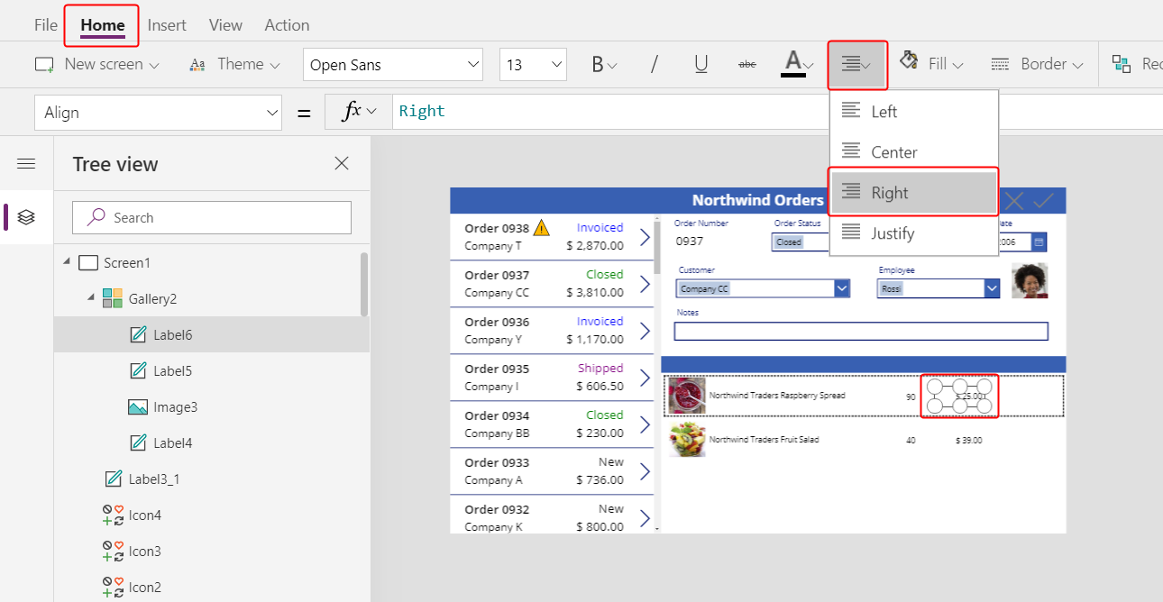
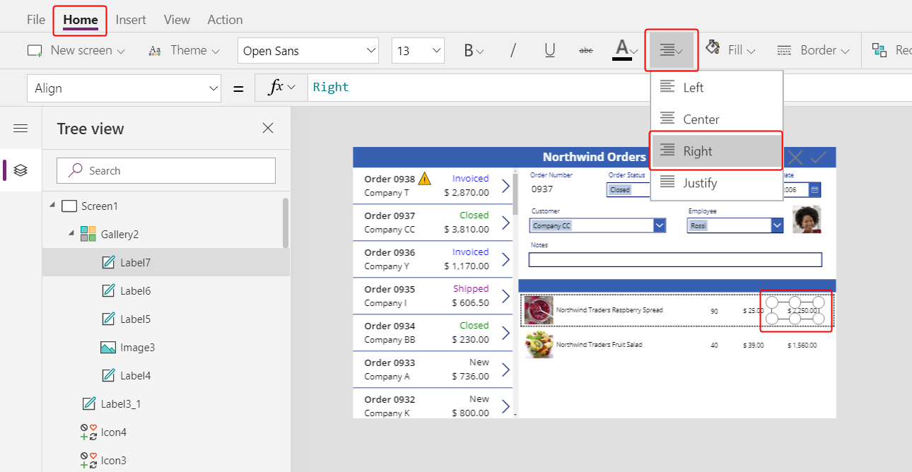
On the Home tab, change the alignment of this control to Right:
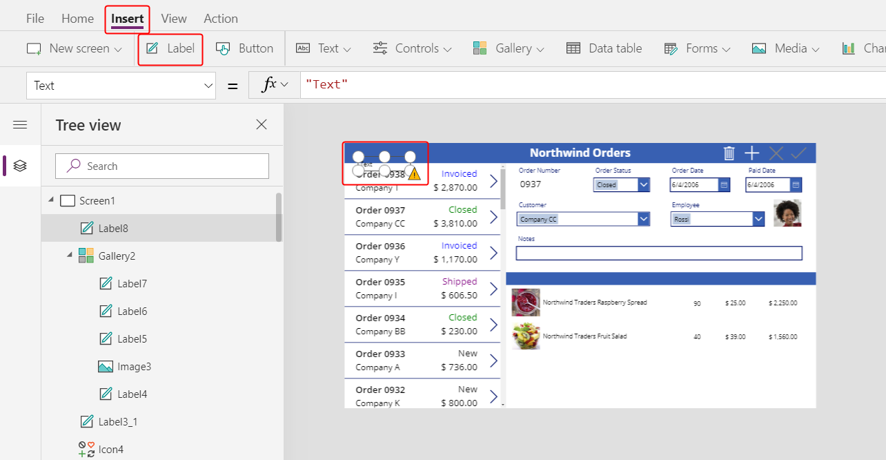
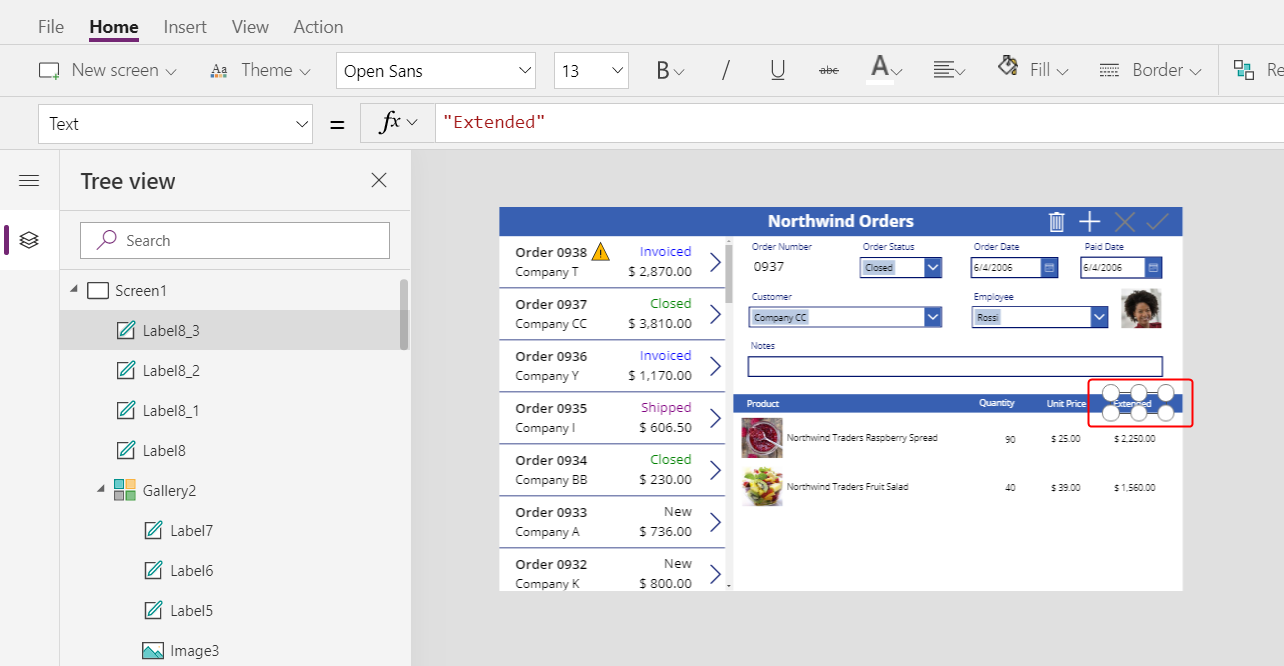
On the Insert tab, insert another label control into the detail gallery, and then resize and move the new label to the right of the unit price.
Set the new label's Text property to this formula:
Text( ThisItem.Quantity * ThisItem.'Unit Price', "[$-en-US]$ #,###.00" )Again, if you don't include the language tag ([$-en-US]), it will be added for you based on your language and region. If the tag is different, you'll want to use your own currency symbol instead of the $ just after the close square bracket (]).
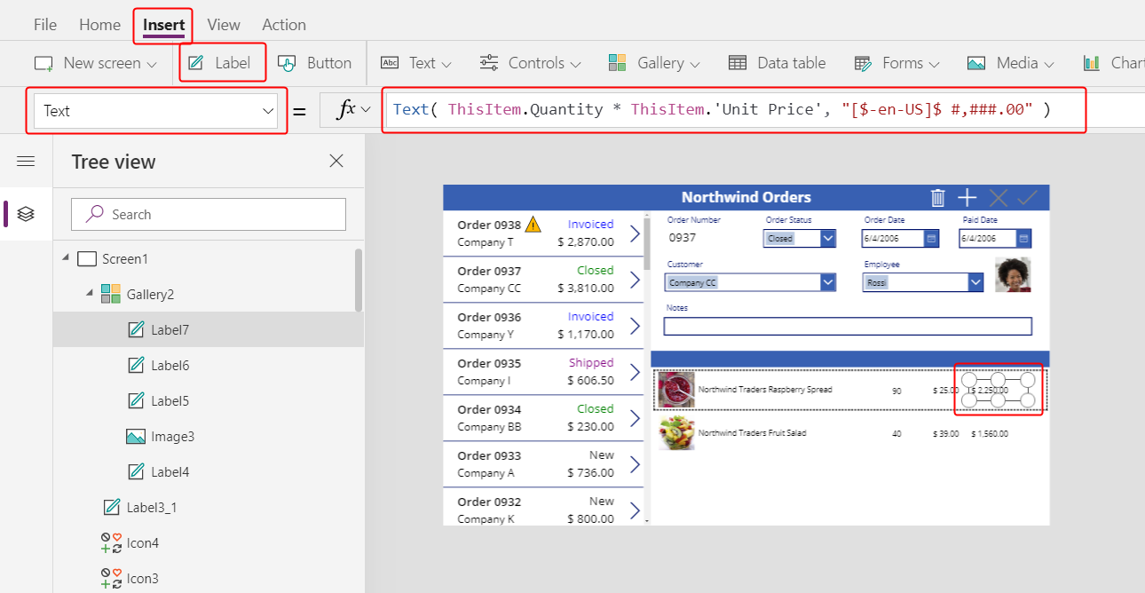
On the Home tab, change the alignment of this control to Right:
You're done adding controls to the detail gallery for now.
In the Tree view pane, select Screen1 to ensure that the detail gallery is no longer selected.
Add text to the new title bar
On the Insert tab, insert another label on to the screen:
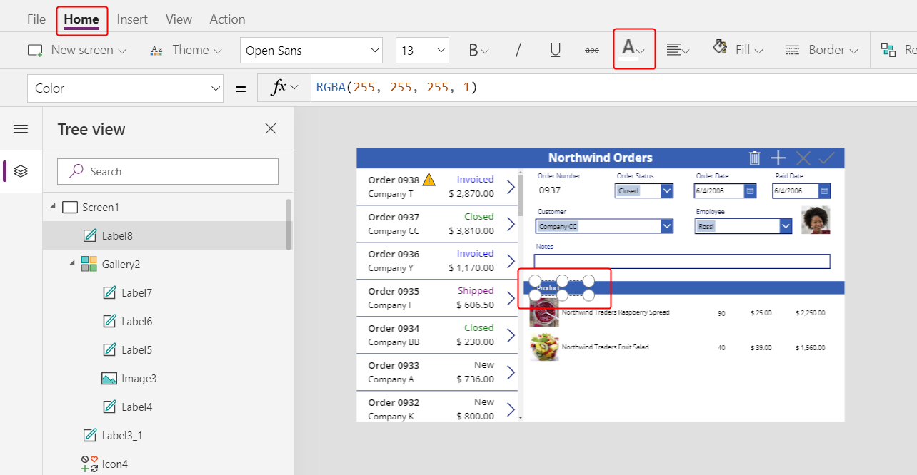
Resize and move the new label above the pictures of the products in the second title bar, and then change the text's color to white on the Home tab.
Double-click the label's text, and then type Product:
Copy and paste the product label, and then resize and move the copy above the quantity column.
Double-click the new label's text, and then type Quantity:
Copy and paste the quantity label, and then resize and move the copy above the unit-price column.
Double-click the new label's text, and then type Unit Price:

Copy and paste the unit-price label, and then resize and move the copy above the extended-price column.
Double-click the text of the new label, and then type Extended:
Display order totals
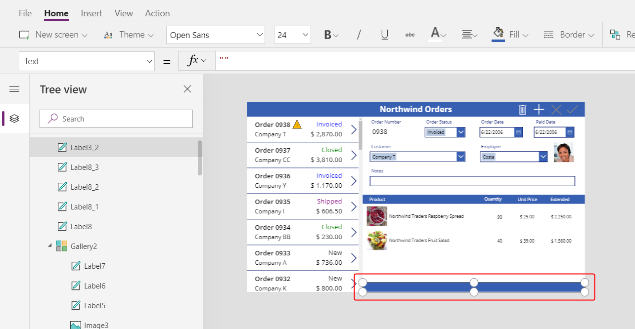
Reduce the height of the detail gallery to make room for the order totals at the bottom of the screen:
Copy and paste the title bar in the middle of the screen, and then move the copy to the bottom of the screen:
Copy and paste the product label from the middle title bar, and then move the copy to the bottom title bar, just to the left of the Quantity column.
Double-click the new label's text, and then type this text:
Order Totals: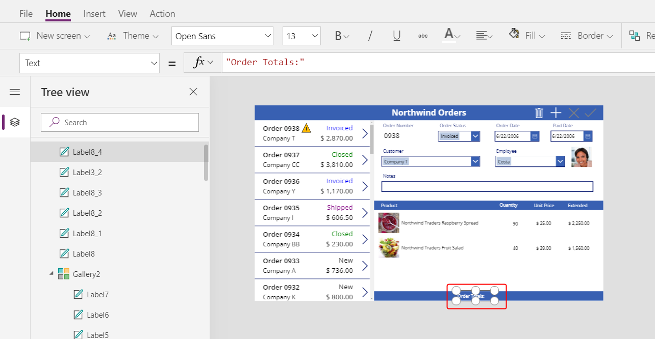
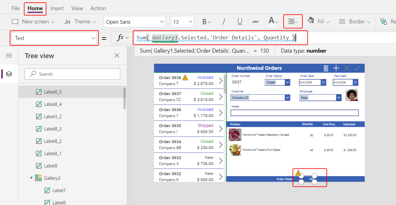
Copy and paste the order-totals label, and then resize and move the copy to the right of the order-totals label.
Set the new label's Text property to this formula:
Sum( Gallery1.Selected.'Order Details', Quantity )This formula shows a delegation warning, but you can ignore it because no single order will contain more than 500 products.
On the Home tab, set the new label's text alignment to Right:
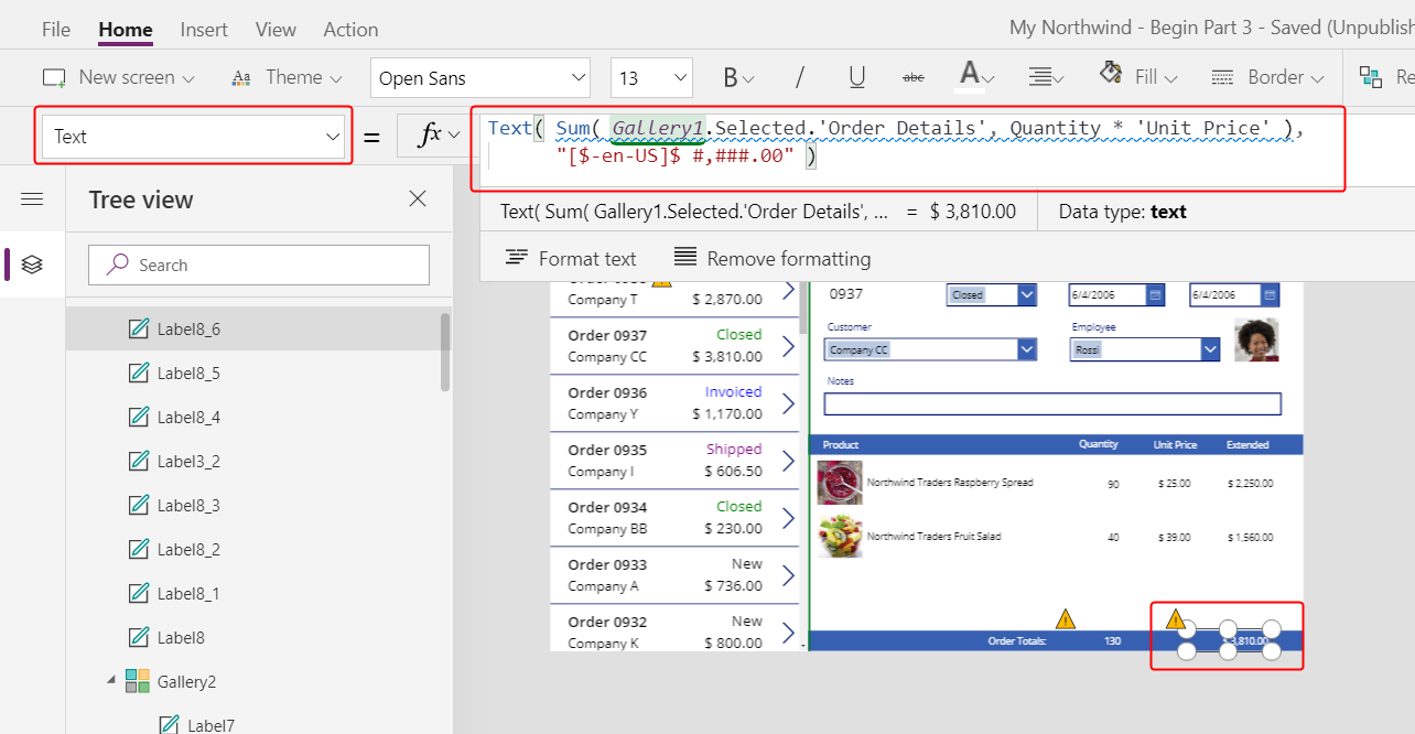
Copy and paste this label control, and then resize and move the copy under the Extended column.
Set the copy's Text property to this formula:
Text( Sum( Gallery1.Selected.'Order Details', Quantity * 'Unit Price' ), "[$-en-US]$ #,###.00" )This formula shows a delegation warning, but you can ignore it because no single order will contain more than 500 products.
Add space for new details
In any gallery, you can show data but you can't update it or add records. Under the detail gallery, you'll add an area where the user can configure a record in the Order Details table and insert that record into an order.
Reduce the height of the detail gallery enough to make room for a single-item editing space under that gallery.
In this space, you'll add controls so that the user can add an order detail:
On the Insert tab, insert a label, and then resize and move it under the detail gallery.
Double-click the text of the new label, and then press Delete.
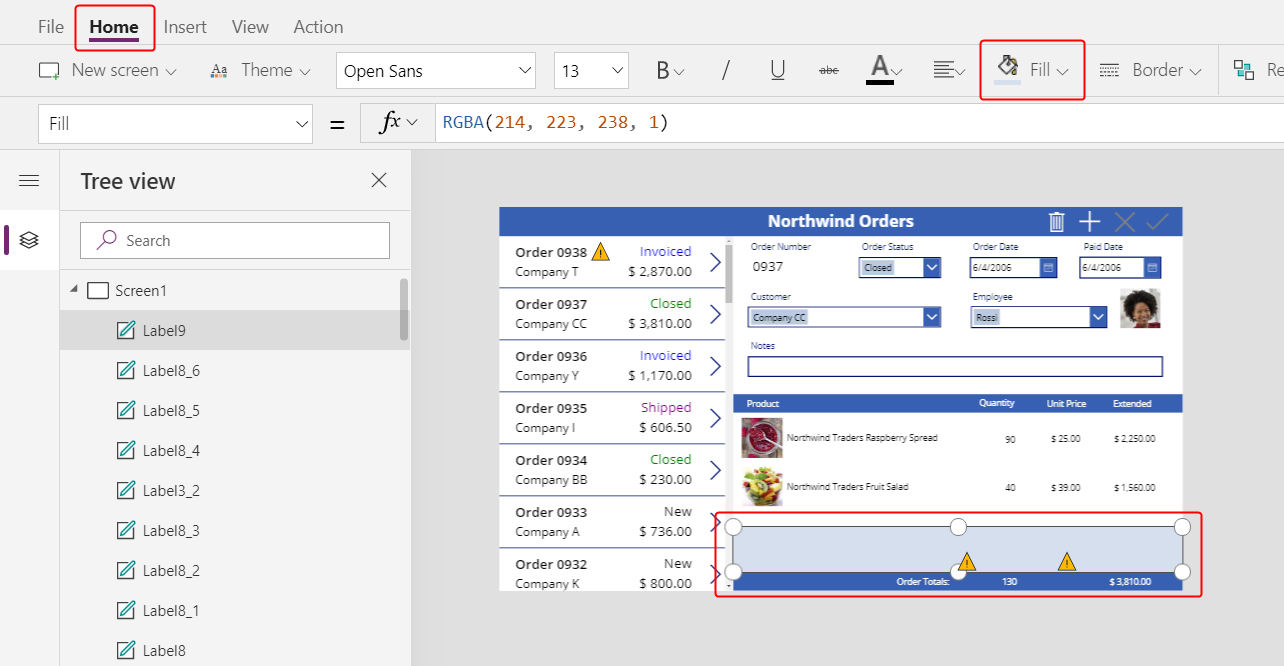
On the Home tab, set the new label's Fill color to LightBlue:
Select a product
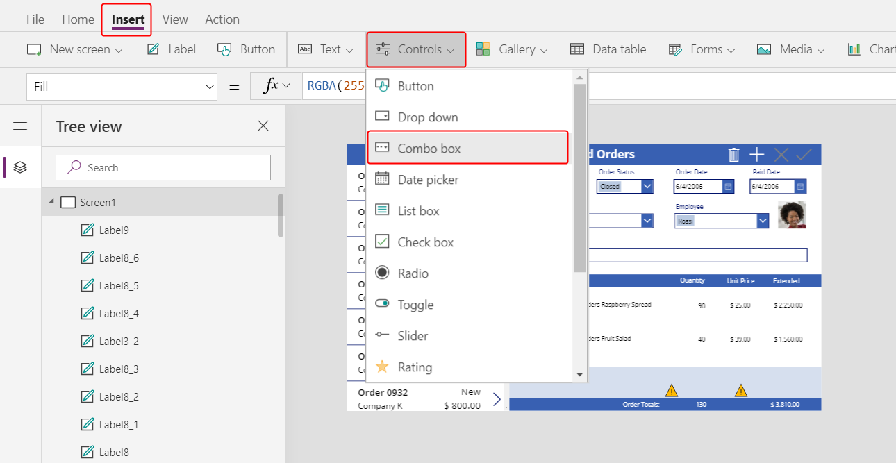
On the Insert tab, select Controls > Combo box:
The Combo box control appears in the upper-left corner.
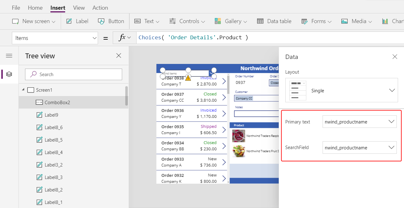
In the fly out dialog, select the Order Products data source.
In the Properties tab for the combo box, select Edit (next to Fields) to open the Data pane. Ensure that the Primary text and SearchField are set to nwind_productname.
You specify the logical name because the Data pane doesn't support display names in this case yet:
Close the Data pane.
In the Properties tab near the right edge, scroll down, turn off Allow multiple selection, and ensure that Allow searching is turned on:
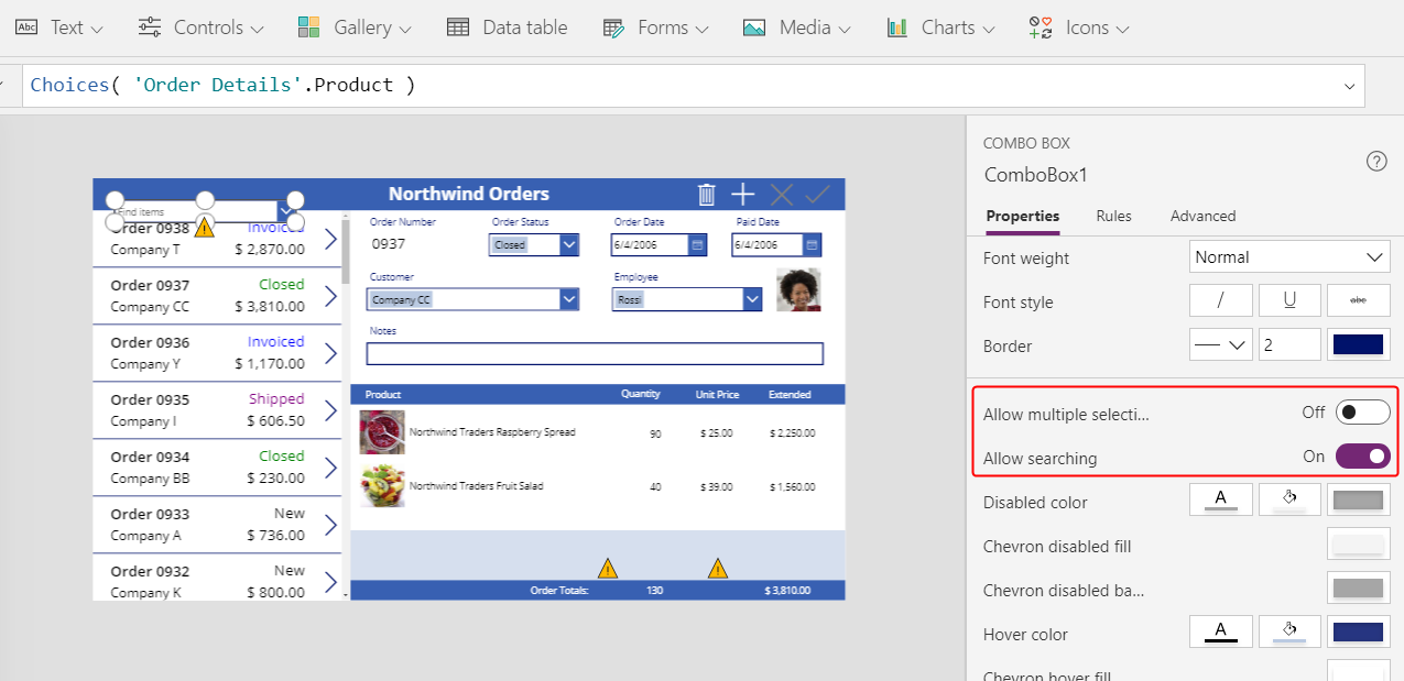
Resize and move the combo box to the light-blue area, just under the product-name column in the detail gallery:
In this combo box, the user will specify a record in the Product table for the Order Details record that the app will create.
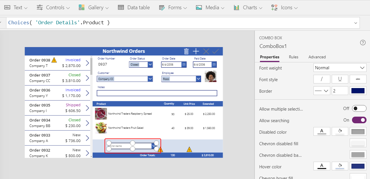
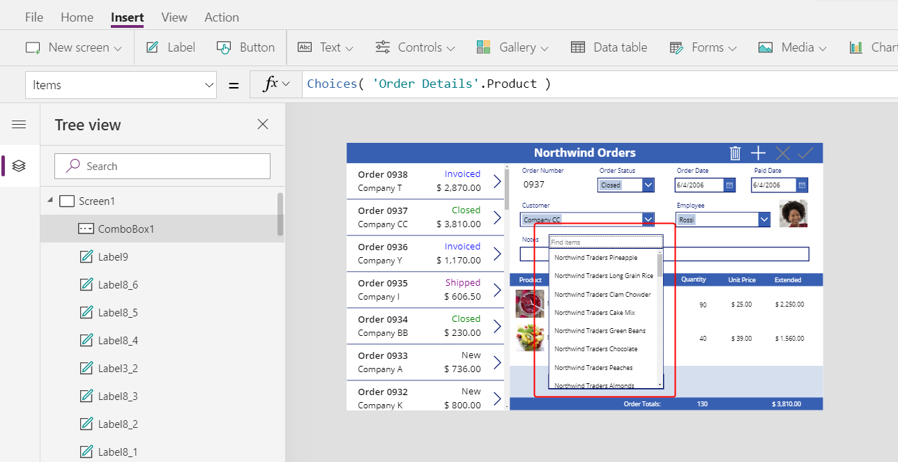
While holding down the Alt key, select the combo box's down arrow.
Tip
By holding down the Alt key, you can interact with controls in Power Apps Studio without opening Preview mode.
In the list of products that appears, select a product:
Add a product image
On the Insert tab, select Media > Image:
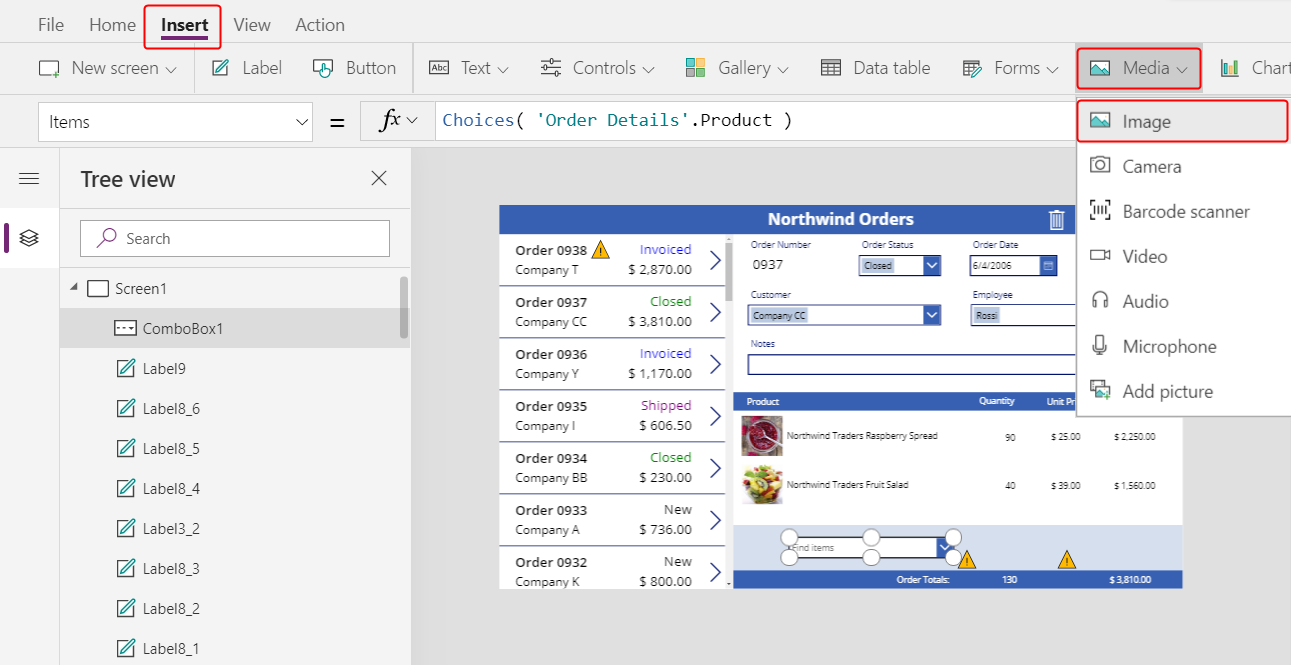
The Image control appears in the upper-left corner:
Resize and move the image to the light-blue area under the other product images and next to the combo box.
Set the Image property of the image to:
ComboBox1.Selected.Picture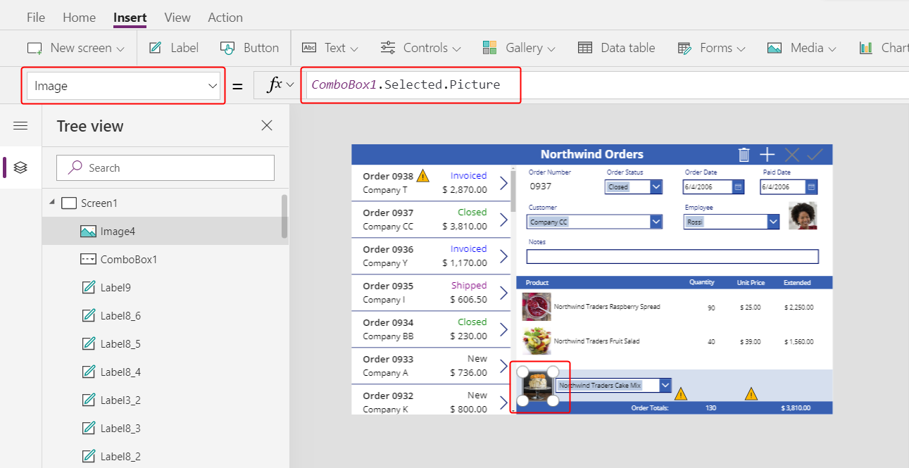
You're using the same trick as you used to show the employee picture in the summary form. The Selected property of the combo box returns the entire record of whatever product the user selects, including the Picture field.
Add a quantity box
On the Insert tab, select Text > Text input:
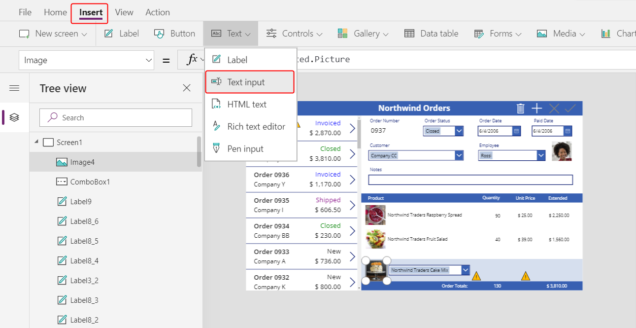
The Text input control appears in the upper-left corner:
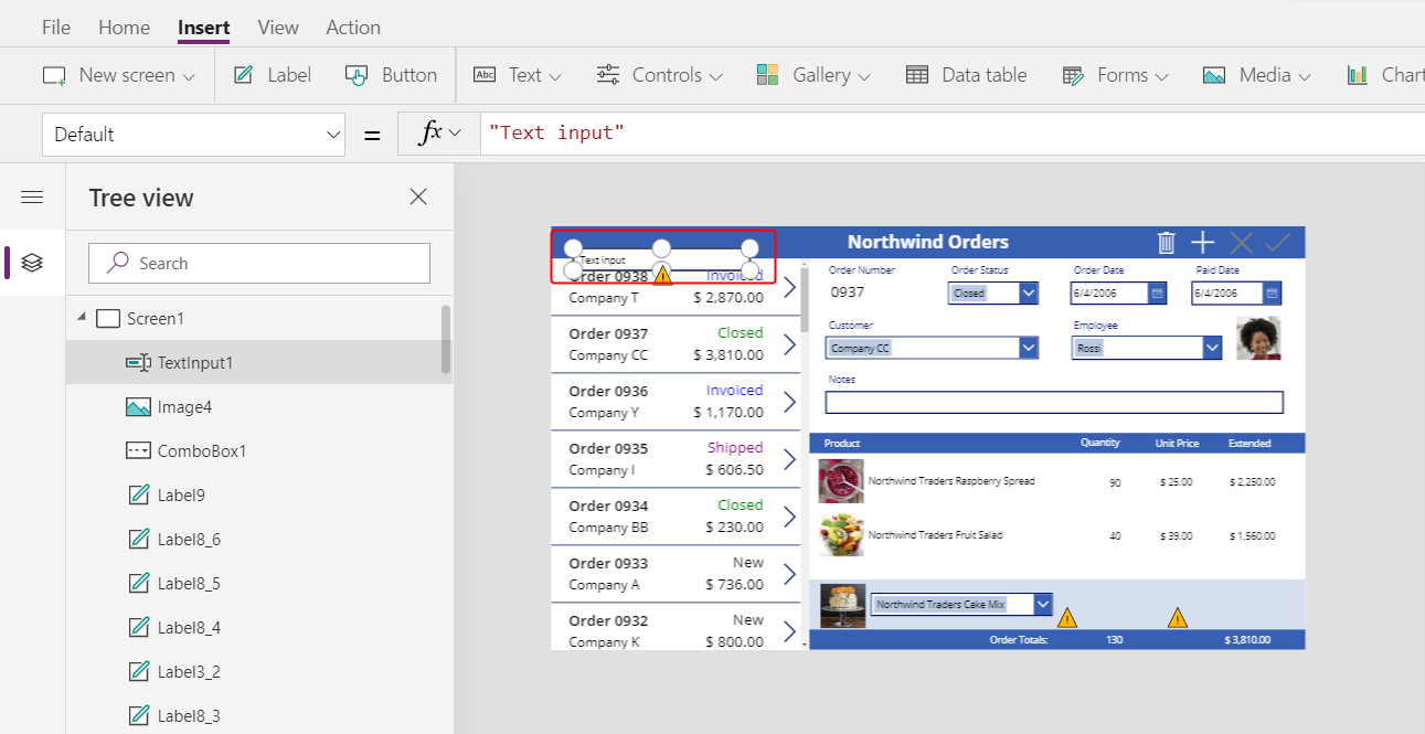
Resize and move the text-input box to the right of the combo box, under the quantity column in the detail gallery:
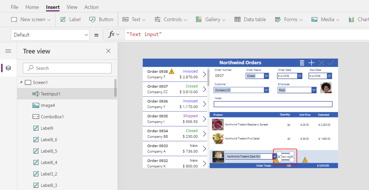
By using this text-input box, the user will specify the Quantity field of the Order Details record.
Set the Default property of this control to "":
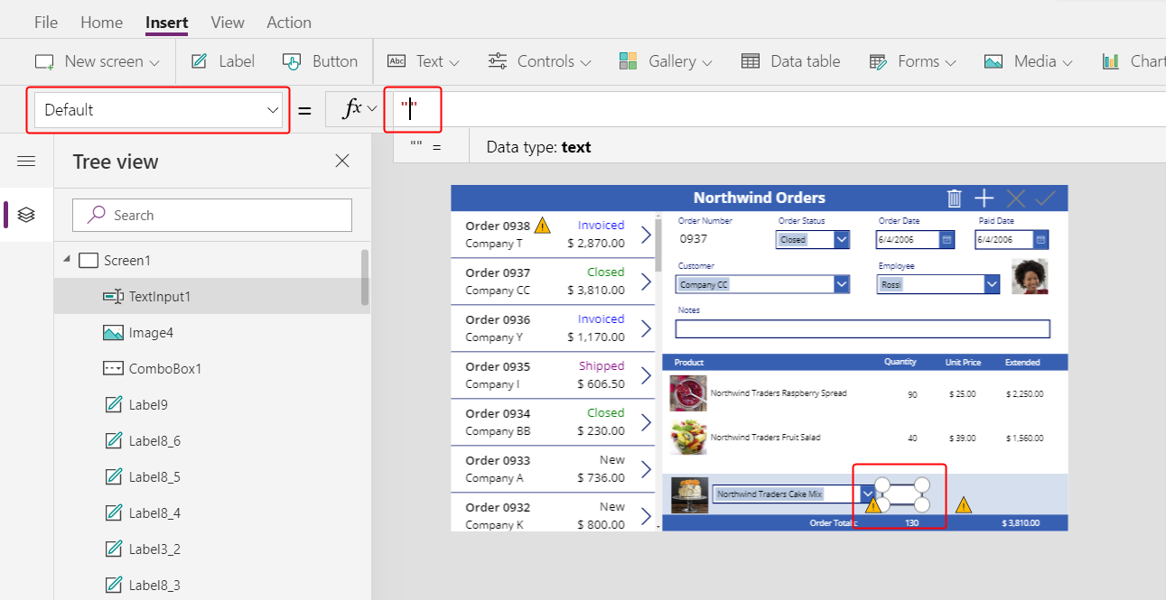
On the Home tab, set the text alignment of this control to Right:

Show the unit and extended prices
On the Insert tab, insert a Label control.
The label appears in the upper-left corner of the screen:
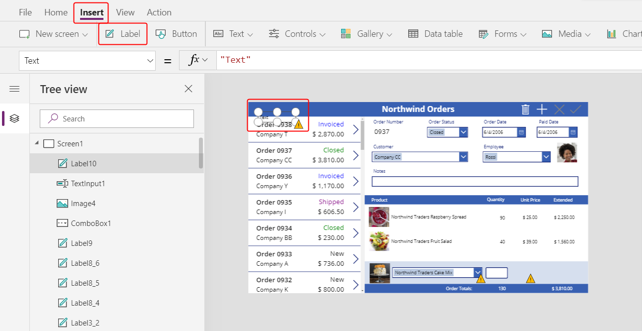
Resize and move the label to the right of the text-input control, and set the label's Text property to this formula:
Text( ComboBox1.Selected.'List Price', "[$-en-US]$ #,###.00" )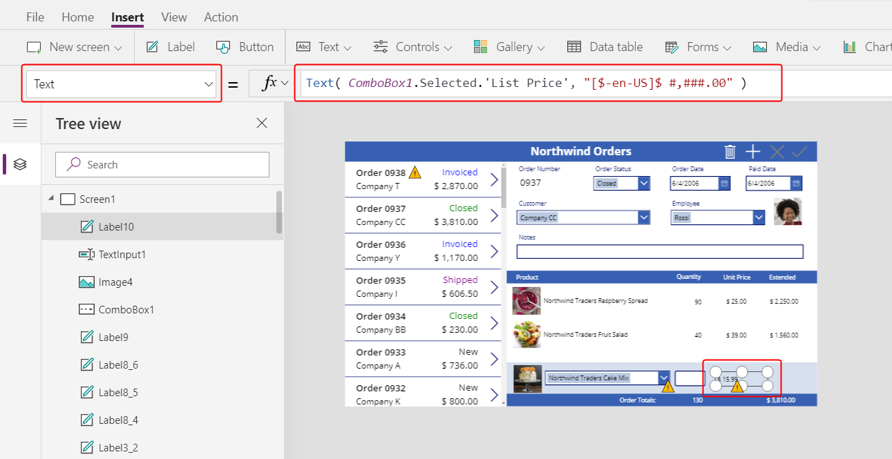
This control shows the List Price from the Order Products table. This value will determine the Unit Price field in the Order Details record.
Note
For this scenario, the value is read-only, but other scenarios might call for the app user to modify it. In that case, use a Text input control, and set its Default property to List Price.
On the Home tab, set the text alignment of the list-price label to Right:
Copy and paste the list-price label, and then resize and move the copy to the right of the list-price label.
Set the new label's Text property to this formula:
Text( Value(TextInput1.Text) * ComboBox1.Selected.'List Price', "[$-en-US]$ #,###.00" )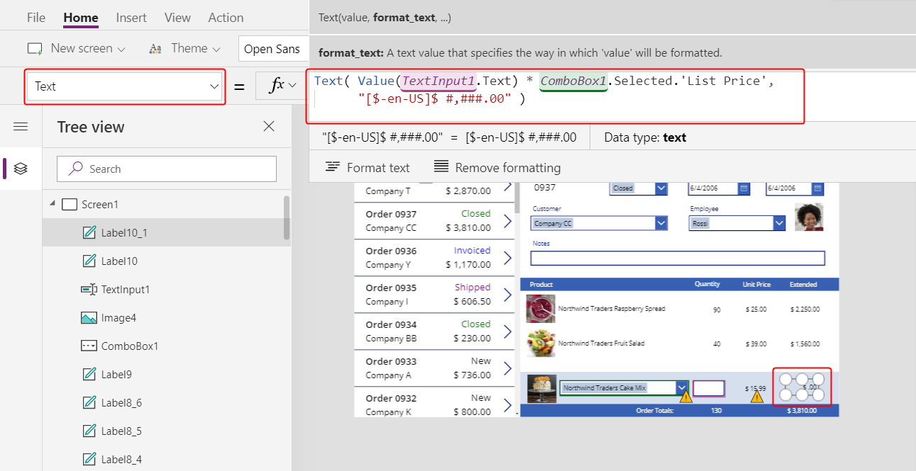
This control shows the extended price based on the quantity that the app user specified and the list price of the product that the app user selected. It's purely informational for the app user.
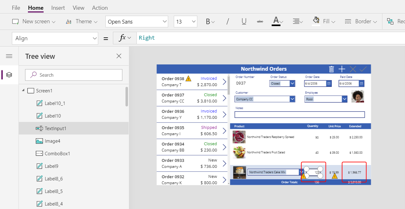
Double-click the text-input control for quantity, and then type a number.
The Extended price label recalculates to show the new value:
Add an Add icon
On the Insert tab, select Icons > Add:
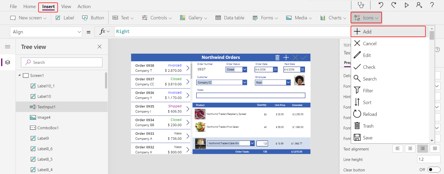
The icon appears in the upper-left corner of the screen.
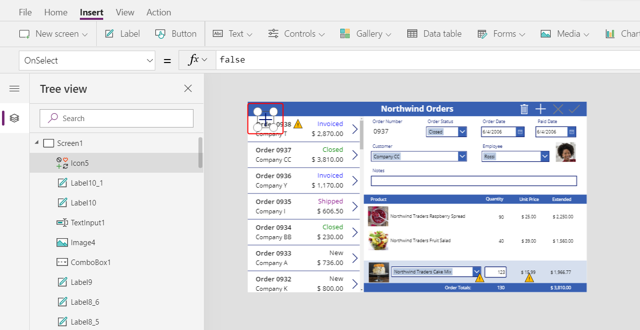
Resize and move this icon to the right edge of the light-blue area, and then set the icon's OnSelect property to this formula:
Patch( 'Order Details',
    Defaults('Order Details'),
    {
        Order: Gallery1.Selected,
        Product: ComboBox1.Selected,
        Quantity: Value(TextInput1.Text),
        'Unit Price': ComboBox1.Selected.'List Price'
    }
);
Refresh( Orders );
Reset( ComboBox1 );
Reset( TextInput1 )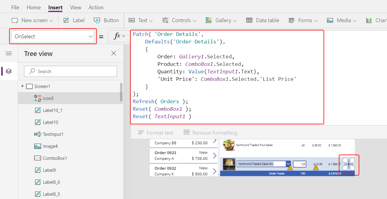
In general, the Patch function updates and creates records, and the specific arguments in this formula determine the exact changes that the function will make.
The first argument specifies the data source (in this case, the Order Details table) in which the function will update or create a record.
The second argument specifies that the function will create a record with the default values for the Order Details table unless otherwise specified in the third argument.
The third argument specifies that four columns in the new record will contain values from the user.
- The Order column will contain the number of the order that the user selected in order gallery.
- The Product column will contain the name of the product that the user selected in the combo box that shows products.
- The Quantity column will contain the value that the user specified in the text-input box.
- The Unit Price column will contain the list price of the product that the user selected for this order detail.
Note
You can build formulas that use data from any column (in the Order Products table) for whatever product the app user selects in the combo box that shows products. When the user selects a record in the Order Products table, not only does the product’s name appear in that combo box but also the product’s unit price appears in a label. Each lookup value in a canvas app references an entire record, not just a primary key.
The Refresh function ensures that the Orders table reflects the record that you’ve just added to the Order Details table. The Reset function clears the product, quantity, and unit-price data so that the user can more easily create another order detail for the same order.
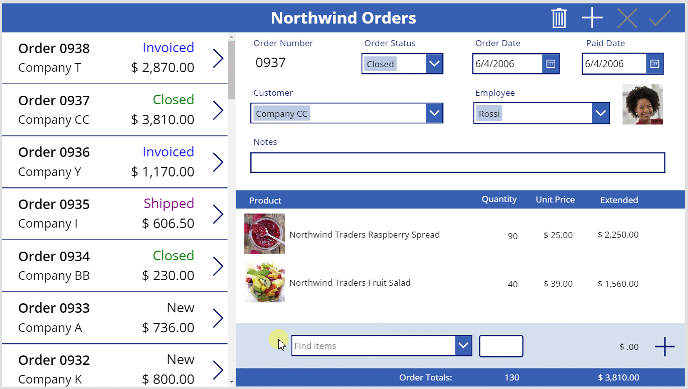
Press F5, and then select the Add icon.
The order reflects the information that you specified:
(optional) Add another item to the order.
Press Esc to close Preview mode.
Remove an order detail
In the center of the screen, select the template of the detail gallery:
On the Insert tab, select Icons > Trash:
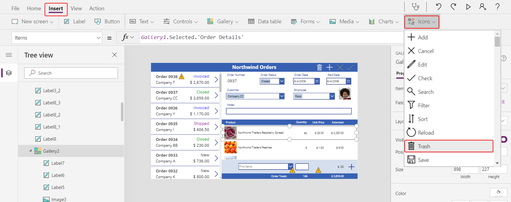
The Trash icon appears in the upper-left corner of gallery's template.
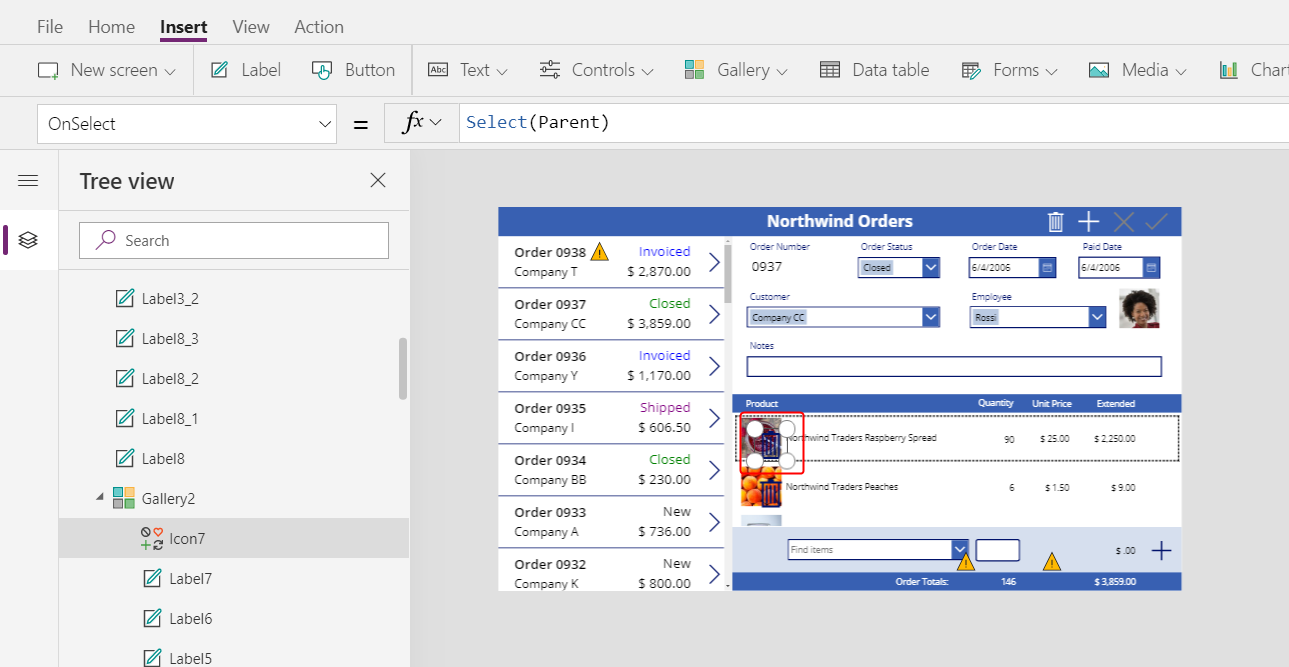
Resize and move the Trash icon to the right side of the detail gallery's template, and set the icon's OnSelect property to this formula:
Remove( 'Order Details', ThisItem ); Refresh( Orders )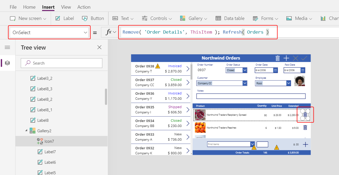
As of this writing, you can't remove a record directly from a relationship, so the Remove function removes a record directly from the related table. ThisItem specifies the record to remove, taken from the same record in the detail gallery where the Trash icon appears.
Again, the operation uses cached data, so the Refresh function informs the Orders table that the app has changed one of its related tables.
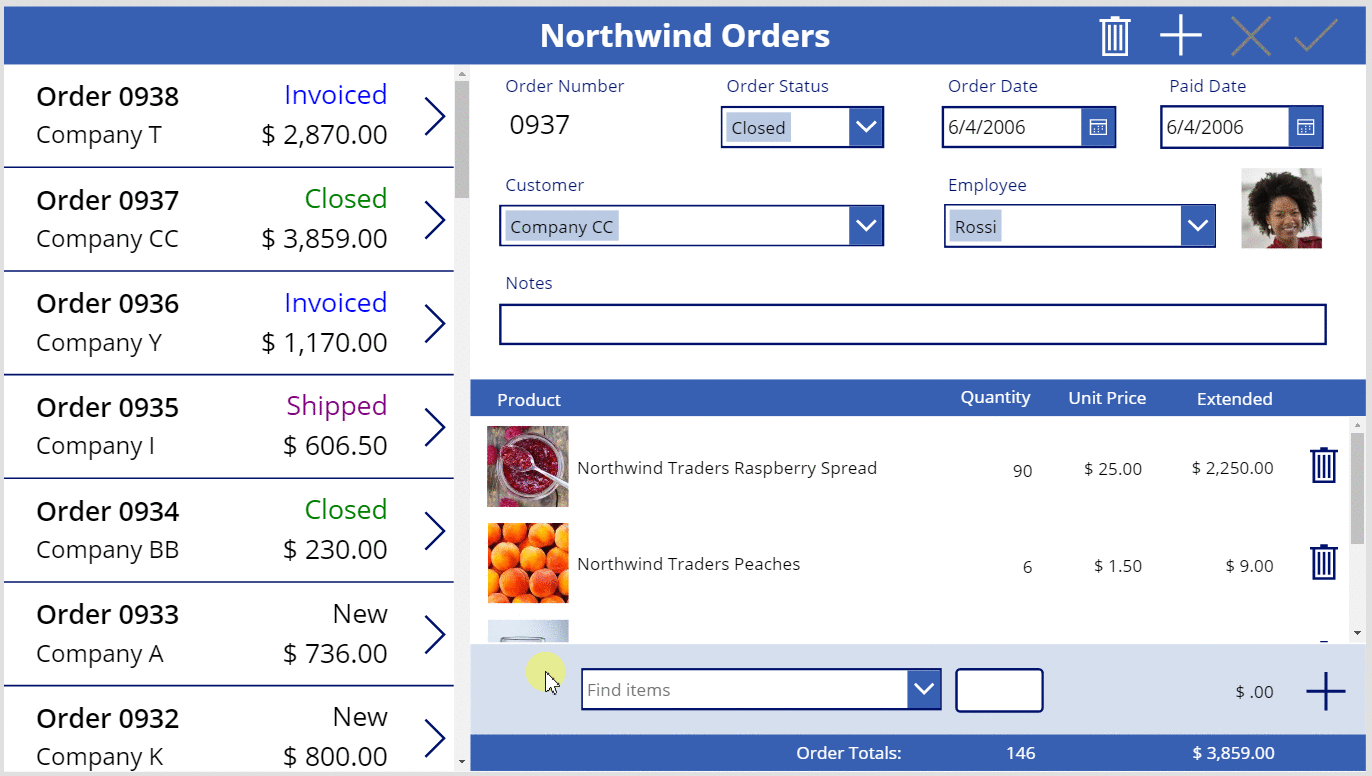
Press F5 to open Preview mode, and then select the Trash icon next to each Order Details record that you want to remove from the order.
Try adding and removing various order details from your orders:
In conclusion
To recap, you added another gallery to show order details and controls adding and removing an order detail in the app. You used these elements:
- A second gallery control, linked to the order gallery through a one-to-many relationship: Gallery2.Items =
Gallery1.Selected.'Order Details' - A many-to-one relationship from the Order Details table to the Order Products table:
ThisItem.Product.'Product Name'andThisItem.Product.Picture - The Choices function to get a list of products:
Choices( 'Order Details'.Product' ) - The Selected property of a combo box as the complete many-to-one related record:
ComboBox1.Selected.PictureandComboBox1.Selected.'List Price' - The Patch function to create an Order Details record:
Patch( 'Order Details', Defaults( 'Order Details' ), ... ) - The Remove function to delete an Order Details record:
Remove( 'Order Details', ThisItem )
This series of topics has been a quick walkthrough of using Dataverse relationships and choices in a canvas app for educational purposes. Before you release any app to production, you should consider field validation, error handling, and many other factors.