Note
Access to this page requires authorization. You can try signing in or changing directories.
Access to this page requires authorization. You can try changing directories.
You can use Power Apps Studio to design, build, and manage your canvas app.
Overview of Power Apps Studio

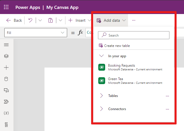
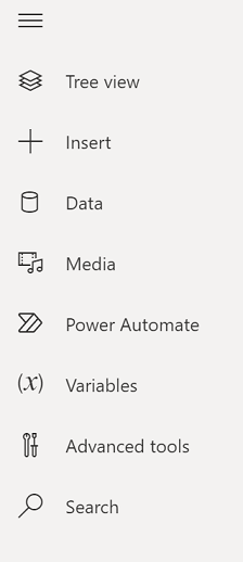
Power Apps Studio modern command bar: Dynamic command bar that shows a different set of commands based on the control selected.
App actions: Options to view properties, add comments, run the app checker, share, preview, save, or publish the app.
Properties list: List of properties for the selected object, such as fill or height.
Formula bar: Compose or edit a formula for the selected property with one or more functions.
App authoring menu: Selection pane to switch between data sources and allows you to insert options.
App authoring options: This pane reveals the corresonding authoring feature when a feature is selected from the app authoring menu.
Canvas/screen: Primary canvas for composing the app structure.
Properties pane: Properties list for the selected object in Tree view.
Settings: Configure your app in settings.
Screen selector: Switch between different screens in your app. Tree view selections display here.
Change canvas screen size: Change the display size of the canvas as you author your app.
Let's understand each option in Power Apps Studio in detail.
1 – Power Apps Studio modern command bar
Power Apps Studio options are available on the command bar. The options are relevant to the current session and app-related settings.

Modern command bar
The modern command bar displays the relevant set of commands depending on the control that is selected. For example, if you select an item to insert like a text label, you see the modern command bar change to accommodate your selection. The bar now has font type, size, color, and other text label controls.

The command bar changes when one of the following controls or objects is selected:
- App object
- Screen
- Button
- Shape
- Icon
- Blank form
- Form with data
- Blank gallery
- Gallery with data
- Label
- Text input
- Date picker
When more than one type of control is selected, the command bar shows the common commands between the selected controls.
Back
Takes you back to the build hub, closing the current Power Apps Studio session.
Undo and redo
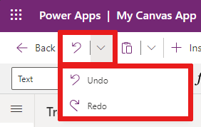
- Undo: Undo the last action.
- Redo: Repeat the last action.
Note
You can't undo or redo data operations, such as insert or delete a datasource.
Cut, copy, and paste
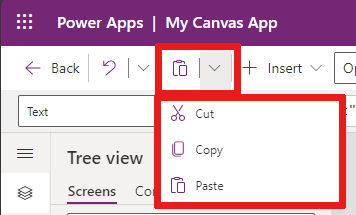
- Cut: Cut the selection, and store it in the clipboard.
- Copy: Copy the selection, and store it in the clipboard.
- Paste: Paste the last cut or copied selection from the clipboard.
Insert
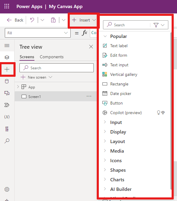
The Insert menu is available from the command bar and from the app authoring menu.
Insert shows all the popular objects or controls that you can add on the selected screen in your canvas app. You can also expand other choices or use the components option to insert controls from a component library.
To insert controls on the canvas, you can drag the control to the canvas or select the control.
Popular controls to insert
| Name | Description |
|---|---|
| Form | Display, edit, or create a record in a data source. |
| Input > Button | A control that the user can select to interact with the app. |
| Input > Date picker | A control that the user can select to specify a date. |
| Input > Text input | A text box that allows user input |
| Shapes > Rectangle | A rectangular shape to configure the canvas appearance. |
| Text | A box that displays data such as text, numbers, dates, or currency. |
| Vertical gallery | A control that allows you to add other controls and display a set of data. For example, list items made up of an image, title, and description is contained within a vertical gallery. 
|
For more information about the controls you can insert, including their properties and definitions, go to Controls and properties in canvas apps.
Add data
Add, refresh, or remove data sources from your canvas app. You can add one or more connections by using data sources.
From the Add data menu, you can:
- Select any other existing tables from the current environment.
- Search and select a connector, such as SharePoint or SQL Server.
Connectors
In addition to data stored within tables, there are many connectors available to interact with data in popular software as a service (SaaS), services, and systems.
To choose other connectors such as SharePoint, OneDrive, or SQL Server, you can enter text in the data source search box or select from the list of connectors.
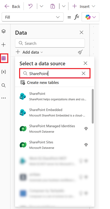
For more information, see List of all Power Apps connectors.
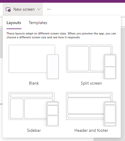
New screen layouts
You can add a new screen to your app from the New screen option in the command bar or the + New screen option in Tree view.
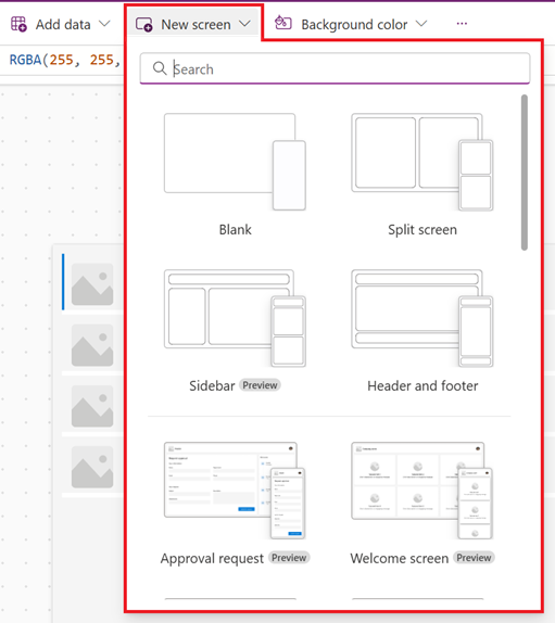
Select from the list of available screen layouts such as Sidebar, new layouts in preview such as Header and form, or templates like Email.
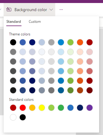
Background color
Select a background color for a screen. You can select from the list of standard colors or select the Custom tab and choose your own color.
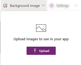
Background image
Select Upload to upload images to set as the background image.
Settings
Configure the app's settings from the General, Display, Copilot, Updates, or Support tab.

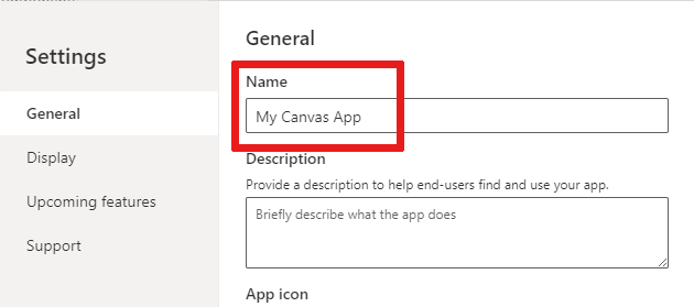
General
- Edit the app Name and Description.
- Add or update the App icon. Add a custom icon with + Add image.
- Select an Icon background fill or Icon fill color.
- Toggle Auto save to save every two minutes automatically.
- Configure offline use.
- Set your Data row limit.
- Include debug information when you publish.
- Enable autocreation of environment variables.
- Enable the
App.OnStartproperty.
For example, to edit the app Name, go to the General tab of Settings.
Display
- Select the Orientation and screen Size.
- Scale to fit: Scales the app to fit available space.
- Lock aspect ratio: Locks the height and width ratio.
- Lock orientation: Maintains app orientation when device rotates.
- Show mobile device notifications area: Displays notifications at the top of the screen.
For more information, see Change screen size and orientation.
Copilot
You can add a custom Copilot to a canvas app (preview).
Updates
Allows you to configure advanced settings for the app that include features under preview, experimental or retired features.
For more information, see Understand experimental, preview, and retired features in Power Apps.
Support
Access current Power Apps Studio information such as environment, authoring version, session ID, and session details. This information is useful for Microsoft Support sessions.
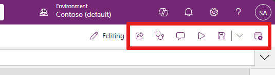
2 – App actions
To perform app-specific actions, use the options such as Properties, Comments, App checker, Share, Preview the app, Save, and Publish.
Share
When you select the Share app action, you see a new tab or window open where you can share the app. You can share with other users or add them as co-owners of your app.

Tip
You must save the app before you can share it.
App checker
Select App checker to run a check.
For more information, see PowerApps checker now includes App checker results for Canvas apps in solutions.

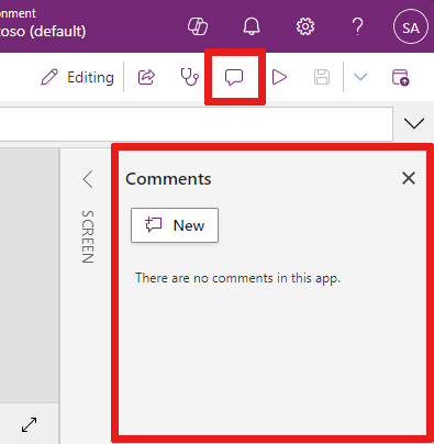
Comments
Comments are notes associated with items in your app. Use comments to help your team review the app and provide feedback, or provide additional information on implementation details in your app.
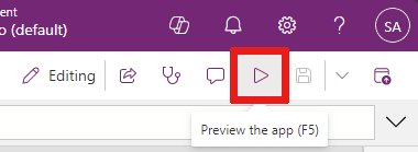
Preview
Select Preview the app to go into preview mode. Here you can view and interact with the current version of the app.
Save
You can save your app in different ways, such as Save, Save with version notes, Save as, or Download a copy. The save options dropdown is located next to the Save app action.
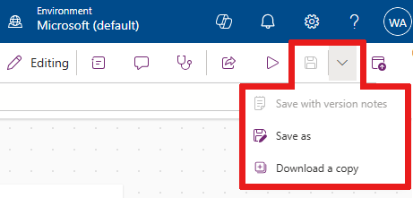
Save options include:
- Save: Saves recent and unsaved changes you made to the app. Each time you save changes, a new version is created.
- Save with version notes: Save and add notes about your updates.
- Save as: Duplicate the app by saving it with a different name.
- Download a copy: Download a local copy of the app.
Publish
Select Publish to publish the app’s current version. For more information, see Save and publish canvas apps.

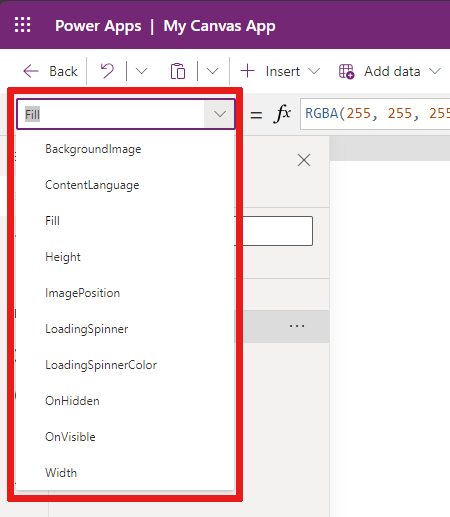
3 – Properties list
When you select an object in your canvas, you can choose one of the object's properties from its properties list. For a complete list of all possible properties, see All properties.
4 – Formula bar
The formula bar lets you add, edit, or remove functions of a property from your selected object. For example, select the app screen to update the background color by using the RGBA function.

The formula bar is IntelliSense-enabled. When you start entering text that matches one or more functions, the formula bar shows a list of functions.

When you select a function, the formula bar shows inline function help and highlights help text relevant to the cursor position.

If a formula returns an error, you can view the error details in App checker or directly from the app view in the canvas.

Similarly, you find help when working with complex functions, nested functions, or when correcting a formula syntax.
For a complete list of all canvas app functions, see Formula reference - Power Apps.
5 – App authoring menu
Switch between various authoring options while working with the app.
- Tree view: Shows a tree view of all screens and controls in the current app.
- Insert: Allows you to add different controls to the screen.
- Data: Add data and other connectors, such as tables that connect to your app.
- Variables: Work with variables and collections while editing your app.
- Search: Select to search for media, formulas, text, and more in your app.
- Themes: Choose a colored theme for the Power Apps UI.
- Media: Insert or remove media from the app.
- Power Automate: Add a flow using the Power Automate pane.
- Advanced tools: Allows you to access the Monitor and Test tools to debug and test your app.
The options for working with canvas apps change depending on your selection from the authoring menu. For example, when you select the Tree view menu option, you see a Tree view pane appear.
6 – App authoring options
Tree view
Select the tree view to show the screens available in the app.
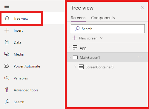
Tip
Select App in the tree view to work with app-specific controls. You can change app behavior, such as adding a formula for the OnStart event of the app.
Switch to the Components tab of Tree view to work with component library features. You can add new components or reuse ones from the published component libraries. For more information, see Component library.
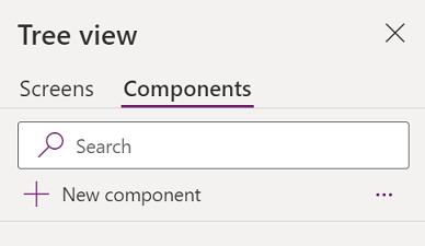
For more information on adding components by selecting + New component, see the Insert section.
Variables
You can save data such as resulting values from a data set into temporary storage by using variables. This section lists variables used by the current app. For more information, see Variables in canvas apps.
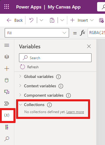
A collection is a group of items that are similar, such as products in a product list. For more information, see Collections in canvas apps.
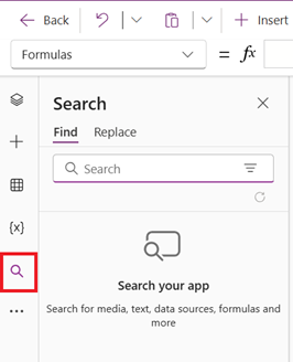
Search
You can find components in your app or find and replace them.
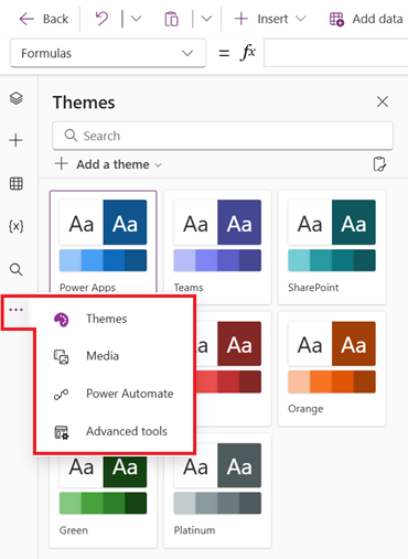
Themes
You can choose a premade colored theme or custom-make your own colored theme by selecting + Add a theme.
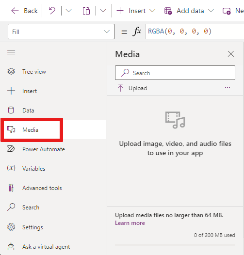
Media
Select Media to add images, video, or audio files to your app. Adding media directly to your app uploads the files to the app and uses the app storage.
Tip
- Each file uploaded to the app as media must be 64 MB or smaller.
- The size of all media files uploaded to an app can't exceed 200 MB.
If you want to reference more media, consider using audio and video controls with URLs, media from Azure Media Services, or from Microsoft Stream.
For more information, see Using multimedia files in Power Apps.
Power Automate
Create a new flow with Power Automate, or select a flow you added previously.
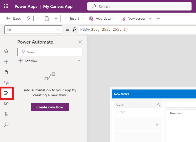
For more information, see Use Power Automate pane.
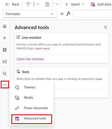
Advanced tools
Advanced tools include Monitor and Tests where you can track and test your app.
7 – Canvas/screen
The canvas shows the currently selected screen in the Tree view from the authoring menu.
You can Use inline actions in Power Apps Studio when you're editing a canvas app so you don't have to leave your current view. Inline actions help the development process to be more efficient.
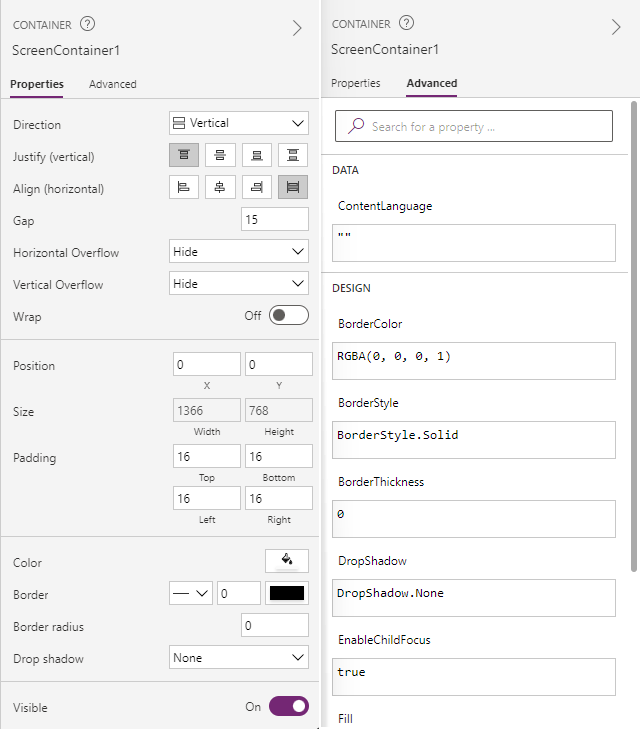
8 – Properties pane
The properties pane shows properties and options available for the currently selected object on the canvas.
The Display tab shows generic options such as the name, description, exit or exit message, and more.
The Advanced tab shows options for customization with key value pairs in areas of action, data, and design in your app.
Tip
The advanced properties might be locked for editing, such as when working with data cards. You can select Unlock to change properties in such situations.
9 – Settings
You can access Settings at the bottom of the app authoring menu or from the command bar as previously described.
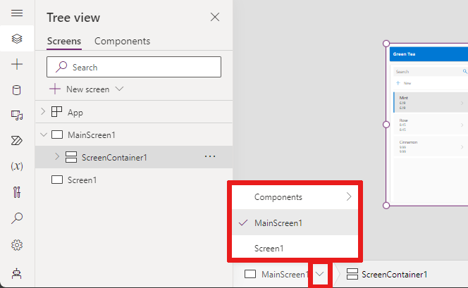
10 – Screen selector
Use the screen selector to switch between screens when your canvas app has multiple screens. You can also select a screen from the authoring menu by selecting the tree view. If the current selection is inside a container, or inside an individual cell in a gallery, the selector shows the breadcrumbs for the parent elements at each level.
11 – Change canvas screen size
You can zoom in or out while authoring the canvas app. Select Ctrl+0 (zero) to fit to window, which fits the canvas to the current authoring window size.
The following image shows what the canvas looks like when fit to window. You can also use the controls to zoom further in or out to view your canvas.

Note
The zoom percentage or screen size used in authoring a canvas app has no effect on the aspect ratio configured for the app. When you preview your app or play a published app, your screen size is temporary.