Note
Access to this page requires authorization. You can try signing in or changing directories.
Access to this page requires authorization. You can try changing directories.
[This article is prerelease documentation and is subject to change.]
Custom column visualizations are a display option that render a column's data as a small graphic - such as a gauge, trend line, colored bar, or set of stars - directly inside the cells of a grid, instead of plain text. This option makes it easier to scan a column and compare values across many rows at a glance.
Choose a visualization once, on the column, from a dropdown in Power Apps. Every grid or view that shows that column then automatically displays the graphic. This article explains the available visualizations, the data each one expects, common data issues, and how to prepare your data.
Important
- This is a preview feature.
- Preview features aren’t meant for production use and might have restricted functionality. These features are available before an official release so that customers can get early access and provide feedback.
Available visualizations
Custom column visualizations offer four graphical display types, plus the standard text display when you select None. Each visualization is suited to a specific shape of data.
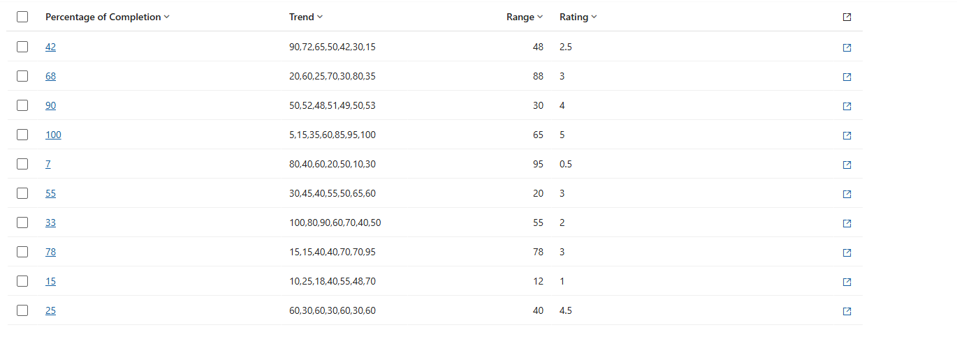
The following image shows a grid displaying columns as plain text, without visualizations applied:
The same data with visualizations applied is easier to compare across rows:
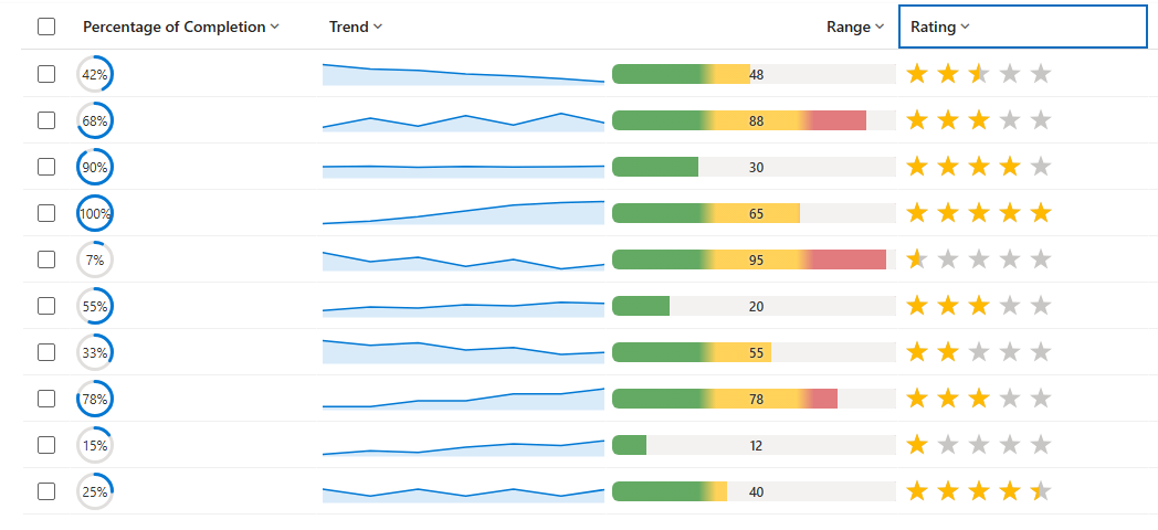
The following table and image provide details on the different kinds of visualization you can use with a column to display in a view or grid.
| Visualization | Name | What it shows | Best-fit column data |
|---|---|---|---|

|
Radial Dial | A circular gauge filled to a percentage, with the value shown in the center. | A single number on a 0–100 scale (a percentage). More information: Radial dial |

|
Line Chart | A small trend line (sparkline) across several points. | A text column holding several numbers separated by commas. More information: Line chart |

|
Heat Map | A horizontal bar whose color changes with the value (for example green → amber → red). | A single number within a defined range (0–100 by default). More information: Heat map |

|
Star Rating | A row of stars filled to match the value. | A whole number from 0 up to the number of stars (0–5 by default). More information: Star rating |
Configure visualization for a column
Sign in to Power Apps (make.powerapps.com), go to Solutions, and then open the table you want.
On a table's Columns area, open a column to edit its properties or create a new one.
Expand Advanced options, and then next to Choose how this column's data will be visualized in the application select from these options: None, Heat Map, Line Chart, Radial Dial, and Star Rating. Selecting None returns the column to its standard text display. For more information, see Visualizations for columns details.
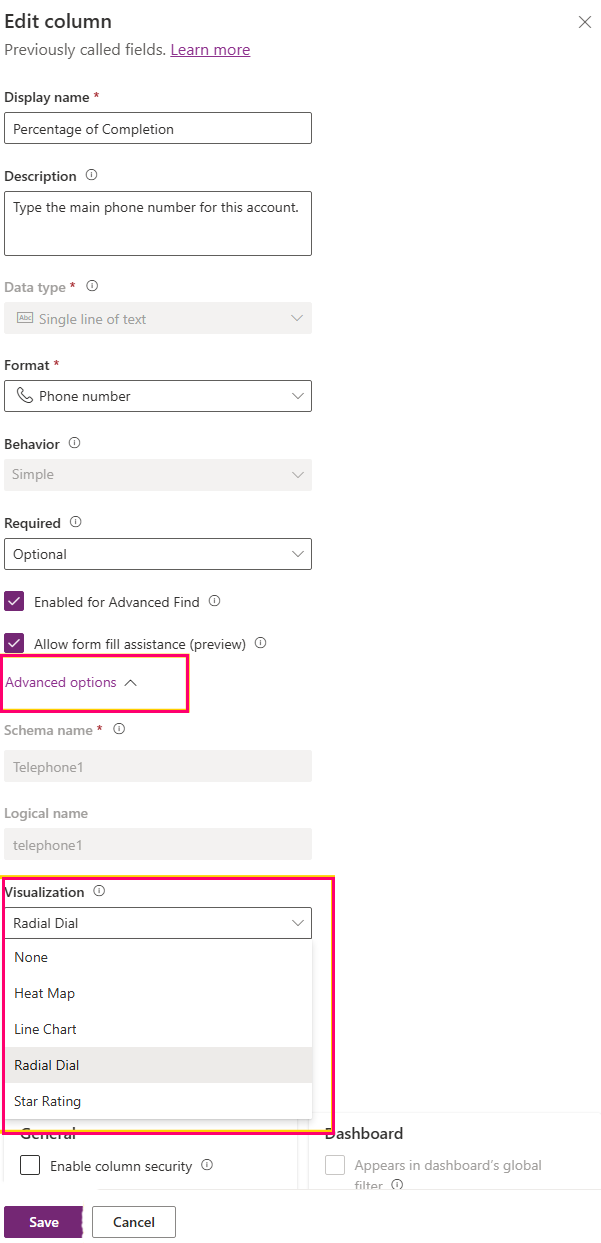
Select Save. When you save the column, any grid or view that displays that column automatically shows the graphic.
Visualizations for columns details
Radial dial
The radial dial is a circular ring gauge. The filled part (blue by default) grows clockwise to represent the value over a light gray track, and the rounded percentage is shown in the middle of the ring.
Data format: A single numeric value, read as a percentage on a 0 to 100 scale. Whole numbers or decimals are accepted, and a trailing percent sign is allowed, such as 60%. Values are automatically limited to the 0–100 range.
Example values:
| Column value | Result |
|---|---|
| 0 | Empty ring, "0%" in the center. |
| 60 (or "60%") | Ring a little past half full, "60%" in the center. |
| 100 | Completely full ring, "100%" in the center. |
| A word such as "High." | Not a number – shows 0%. |
Best practices:
- Store the value on a 0–100 scale. If your data is a fraction from 0 to 1, multiply it by 100 first.
- Use a numeric column type (whole number or decimal).
- Keep the cell free of units, currency symbols, and thousands separators.
Known data-format issues:
- Values above 100 appear completely full, and values below 0 appear empty, because the gauge is capped to 0–100.
- Text such as "High," or values with units or currency. For example, "$60" or "60 pts," might not be read as a number and can show 0%.
- A value written as a ratio, such as 0.6, is treated as 0.6%, so the ring looks almost empty.
Line chart
The line chart is a compact sparkline: a trend line (blue by default) with a light shaded area beneath it, tracing a sequence of numbers from left to right inside the cell.
Data format: A single text value that contains several numbers separated by commas, such as 10,20,30,45. Each number is one point on the line, in order. Spaces around the numbers are fine.
Example values:
| Column value | Result |
|---|---|
| 10,20,30,45 | A rising line across four points. |
| 5, 8, 6, 9, 12 | A line across five points (spaces are ignored). |
| 42 | A single dot (only one point). |
| (empty) | A blank cell. |
Best practices:
- Use a text column (single line or multiline) to hold the comma-separated series.
- Keep all points on a consistent scale. Use 0–100 where possible.
- Provide at least two points. More points show a clearer trend.
- Leave the cell blank when there's no data, rather than typing words like none.
Known data-format issues:
- The chart needs more than one number to draw a line; a single number appears as just a dot.
- The chart doesn't recognize separators other than commas, such as semicolons, pipes, or spaces only.
- Any entry in the list that isn't a number. For example, n/a becomes a gap in the line.
- A completely empty or unreadable value shows a blank cell.
- By default, the points are plotted on a 0–100 scale. Values outside that range are flattened to the top or bottom edge.
Heat map
The heat map is a horizontal colored bar with the value shown as a label. The bar's color changes depending on where the value falls in its range. For example, the default colors are green for low, amber for the middle, and red for high.
Data format: A single number. By default, the range is 0 to 100, and the value's position in that range decides the color. For choice (option set) columns, the numeric value behind the selected choice is used, and the choice's text is shown as the label.
Example values:
| Column value | Result |
|---|---|
| 12 | Bar near the low end, colored for "low." |
| 55 | Bar around the middle, colored for "medium." |
| 90 | Bar near the high end, colored for "high." |
| A choice such as "High." | Colored by the choice's value; label shows "High." |
Best practices:
- Store a single numeric value within the expected range.
- Use a numeric column type, or a choice column whose values are assigned in a logical low-to-high order.
- Keep values free of units and symbols.
Known data-format issues:
- Values outside the range are pulled to the nearest end of the range (0 or 100 by default).
- Non-numeric text renders as a blank cell.
- For choice columns, the color follows the number assigned to each choice, which might not match the visible list order if those numbers aren't in low-to-high sequence.
Star rating
The star rating is a row of stars. Filled stars (gold by default) represent the value, and the remaining stars show in a light "empty" color. There are five stars by default.
Data format: A whole number from 0 up to the number of stars (0 to 5 by default). A value of 3 fills three stars. Whole numbers or numeric text are accepted.
Example values:
| Column value | Result |
|---|---|
| 0 | No stars filled. |
| 3 | Three stars filled, two empty. |
| 5 | All five stars filled. |
| A word such as "Great." | Not a number – no stars filled. |
Best practices:
- Store a whole number between 0 and the number of stars (0–5 by default).
- If your rating uses a different maximum, such as 0–10, keep values within that maximum and note that the default display is five stars.
- Use a numeric (whole number) column type.
Known data-format issues:
- The value is measured against the number of stars, so on a five-star display a value of 5 fills every star. Any value above the number of stars also fills every star.
- Decimal values produce a partially filled star.
- Text values. For example, Great render as no stars filled.
Data preparation guidance
The visualizations render reliably when the underlying column data matches the shape each visualization expects.
- Match the column type to the visualization: use numeric columns for radial dial, heat map, and star rating, and a text column for the line chart series.
- Store clean numbers – avoid units, currency symbols, percent signs (except the trailing % that radial dial accepts), and thousands separators.
- Keep values within the expected range for each visualization.
- Empty cells are fine – they display an empty visual rather than an error.
- After changing a column's visualization, refresh the grid or view to see the update.
Common display outcomes
Certain visual outcomes indicate a mismatch between the data and the visualization's expected format.
| What you see | Likely cause | What to do |
|---|---|---|
| A blank cell. | The value is empty or isn't in the expected format. | Confirm the cell contains data in the correct format (a number, or comma-separated numbers for line chart). |
| Radial dial always full or always empty. | The value is above 100, below 0, or stored as a ratio (0–1). | Convert the value to a 0–100 scale. |
| Star rating shows every star filled. | The value equals or exceeds the number of stars (5 by default). | Store a value between 0 and 5. |
| Line chart shows a single dot. | Only one number is present. | Provide two or more comma-separated numbers. |
| Line chart has gaps. | Some entries in the list are not numbers. | Remove or replace the non-numeric entries. |
| Heat map color looks wrong for a choice. | The choice values are not in low-to-high order. | Reassign the choice values in a logical order. |