Note
Access to this page requires authorization. You can try signing in or changing directories.
Access to this page requires authorization. You can try changing directories.
[This article is prerelease documentation and is subject to change.]
In this article you learn how to create a system chart. System charts are organization-owned charts, which makes them available to anyone with access to read the data running the app. System charts can't be assigned or shared with specific app users.
Important
- This is a preview feature.
- Preview features aren’t meant for production use and might have restricted functionality. These features are subject to supplemental terms of use, and are available before an official release so that customers can get early access and provide feedback.
Note
Model-driven apps not configured to display All charts for a table need newly created charts selected for the table within the app designer. More information: Add table assets
Create a chart
- Sign in to Power Apps, and then on the left navigation pane, select Solutions.
- Open the solution that has the table that requires a chart, open the table, and then select Charts under Data experiences.
- Select New chart.
- Specify the type of chart, and how the data is displayed in the chart.
- The chart designer opens. In the dialog choose from the following legend entries:
- In the Column dropdown list, select a column, such as Number of Employees. The column determines the vertical axis for the chart.
- In the Aggregate dropdown list dialog, select the option by which you want to group the column you selected for the Column, such as Sum in this example. For non-numeric fields, you can select only Count: All or Count: Non-empty. For numeric fields, you can select one of the these aggregation options: Count: All, Count: Non-empty, Average, Max, Min, or Sum. NULL values aren't considered when calculating minimum, maximum, or average values. However, zero (0) values are included. More information: Additional chart configuration
- In the Chart type dropdown list, select a type of chart to display, such as Column, Bar, Pie, or Doughnut.
- To configure additional options to display the chart, such as multiple series, stack items, display only top items, see Additional chart configuration.
- Select Next.
- Select a column for the category The category determines the horizontal axis for the chart, such as account name in this example. Select Apply.
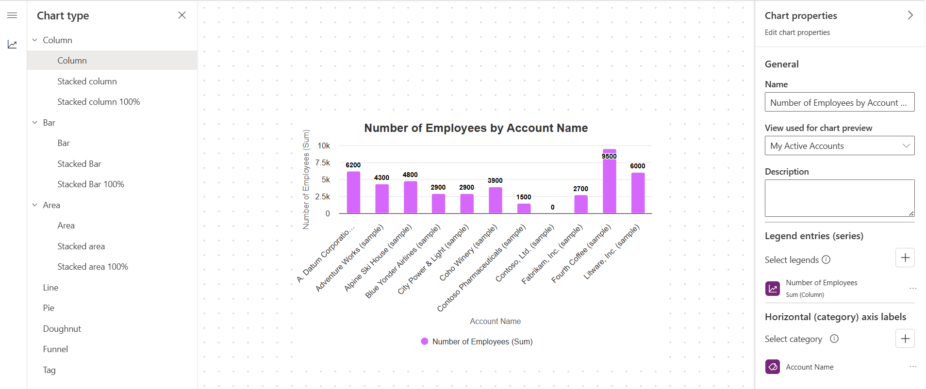
- To save the chart, in the chart designer, select Save.
- Select Publish to make the chart available to others.

Edit a chart
- Sign in to Power Apps, and then on the left navigation pane, select Solutions.
- Open the solution that has the table that includes the chart you want to edit, open the table, and then select Charts under Data experiences.
- In the list of charts, open the chart that you want to edit.
- Make the changes you want for the chart in the chart designer. More information: Create a chart and Additional chart configuration
Additional chart configuration
There are several different ways to display a chart.
- To determine how data is summarized in the chart, select the appropriate Aggregate option. Count shows the number of records, Sum shows the total, Average shows the average, Max shows the highest value, and Min shows the lowest value. For example to get total revenue per account select max, or average deal size select average, or smallest deal size select min.
- To create a chart with multiple series, select Add a series, select another column to display on the series axis, and then select an aggregate option for that series.
- To change the chart type for a series, select the series, select the Current chart type icon for that series, and then select a chart type.
- To stack items in a chart, select the chart type, and then select Stacked or 100% Stacked. You can stack items only in a bar, column, or an area chart.
- To display only top items on the chart, you can optionally select the Set minimum and maximum values, then select Top or Bottom in the Top/Bottom list and then select the Count numeric value. Top/Bottom rules filter the chart to show only the highest or lowest results based on the selected aggregation. For example, selecting Bottom = 1 with Sum of revenue displays only the single account with the lowest total revenue (even when other record column values go up significantly beyond that amount).
- To display a different horizontal category, from the list under Horizontal (Category), select the column to display.
- To create a comparison chart with multiple categories, select Add a category, and then select another column to display on the category axis. You can add up to two category items and one series item to a comparison chart.
- For columns that are of the
datetimetype, select the option by which you want to group the field you selected as the category. The chart is named based on the columns you chose for the series and category axes.
Export and import a chart
You can export a chart and import the chart into another environment or the same environment to serve as a backup. The export chart command only includes the chart configuration and doesn't include any table, columns, views, or records.
Important
When you import a chart into another environment the target environment must have the table, columns, and views required by the chart. For example, you can import the number of employees by account name example chart used in this article into another Dataverse environment because it only includes the standard views and columns included with the account table.
Export a chart
While in the chart designer, select Export chart on the command bar.
The chart is saved in XML format in your browser's download folder.
Import a chart
- While in the chart designer, select Import chart on the command bar.
- Select Choose File, browse to and select the XML file that is the chart you want, and then select Open.
- Select Import.
The imported chart loads in the chart designer.
Switch to classic experience
While in the chart designer, select Switch to Classic to open the chart in the classic chart designer.
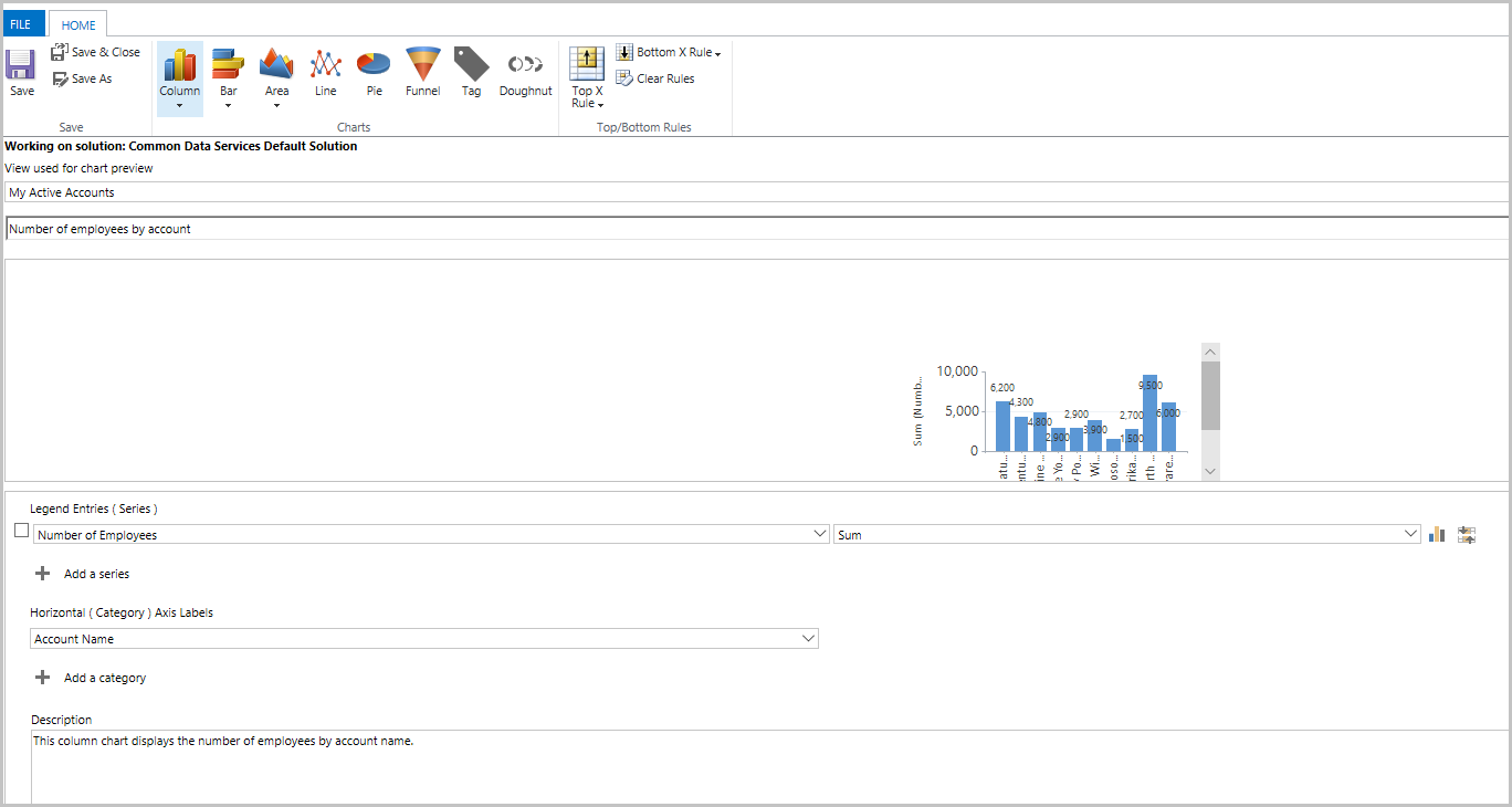
Edit a chart using the classic experience
Edit the chart, such as specifying the type of chart, and how the data is displayed in the chart.
- In the Select Column dropdowns:
- In the Legend Entries (Series) dropdown list select a column, such as Number of Employees.
- In the Horizontal (Category) Axis dropdown list select a column, such as Account Name.
- Make additional changes as needed.
- In the Select Column dropdowns:
Select Save and Close.
Note
When creating a chart, you can preview it with a selected view. The view isn't permanently associated with the chart. The next time you open the chart, the chart displays using the configured default view. You can change the view to display the chart for the data from a different view.
Maximum number of records displayed in a chart
Charts display views that return up to 50,000 records. Views that exceed 50,000 records display the message: The maximum record limit is exceeded. Reduce the number of records. More information: Reporting infrastructure
Known chart issues
In the chart designer, adding an order by on certain calculated columns isn't supported and cause an error. The calculated columns causing the issue are using another calculated column, a related table column, or a local column on the table.
If the chart isn't visible in the dropdown chart list, then the model-driven app has been created with specific charts associated with it. To resolve this, open the model-driven app in design mode, select charts, and then select your newly created chart.
Then save and publish your app.