Note
Access to this page requires authorization. You can try signing in or changing directories.
Access to this page requires authorization. You can try changing directories.
Users of model-driven apps with the modern, refreshed look for model-driven apps enabled experience updated styling aligned to the Microsoft Fluent 2 design system. Because this modern refreshed look comes with a new theming system, classic theming isn't honored; however, makers can modify the colors used by the app to help align with their organizational branding for users who have enabled the modern, refreshed look. In this article, you learn about the styling overrides available with the modern, refreshed look and how to implement them for your organization.
Note
- Modern themes currently support providing a custom theme for the entire app, overriding the app header colors, and setting a custom app logo. Other customizations like customizing the business process flow control aren't available.
- For modern themes to work, the model-driven app must be using the New look. More information: Modern, refreshed look for model-driven apps
Modify the app theme
With the modern, refreshed look enabled in the app, makers can create a custom theme that helps align to their organizational branding. With a custom theme you can change the app header, hyperlinks, lookups, primary buttons, active tab indicators, row selection, and hover effects. The custom theme also lets you change the font that is used in the application. To accomplish this, you encapsulate the desired theme information into an XML resource, use an app setting to point to this web resource, and then verify the new modern theme matches your expectations.
Note
Most of the UI uses your custom theme. However, some areas don’t use modern theming yet for example, legacy grids, row summaries, focus view, and the sales pipeline.
Overview of the custom theme XML resource
The first step to creating a custom modern theme is to create an XML file with your desired theme parameters, with one or more of the following attributes defined inside a CustomTheme tag.
BasePaletteColor– The seed color (HEX code) used as a basis to generate a 16-slot color palette for the theme.LockPrimary– A boolean that determines how the selected seed color is used to generate the 16-slot color palette.- False (Default): The palette is optimized for accessibility, but doesn't guarantee the seed color will appear in any slot of the generated palette. This is the default setting. Use the Fluent theme generator to preview the generated palette based on your selections for
basePaletteColor,vibrancy, andhueTorsion. - True: The seed color is placed in primary (middle) slot of the palette. The remaining colors are generated by making the colors incrementally lighter on one side and darker on the other side. The generated palette might not meet contrast ratio accessibility requirements.
- False (Default): The palette is optimized for accessibility, but doesn't guarantee the seed color will appear in any slot of the generated palette. This is the default setting. Use the Fluent theme generator to preview the generated palette based on your selections for
Font– The font for your custom theme. The font that the custom theme renders depends on the browser and target machine's ability to show that font.Vibrancy– An optional parameter that impacts the muteness or brightness of the palette, especially the lighter colors. The allowed values are between -100 and 100, with a default value of 0. This option is only applicable whenlockPrimary="true".HueTorsion– An optional parameter that impacts the tint, shade, or tone of the palette, especially the lighter colors. The allowed values are between -100 and 100, with a default value of 0. This option is only applicable whenlockPrimary="true".LogoWebResource– The logical name of the image web resource to use as the logo in the app header. Logos that are too large don't display. The recommended image size is 156 pixels wide × 48 pixels high.LogoTooltip– The tooltip text displayed when a user hovers over the app logo. Defaults to Dynamics 365 if not specified.
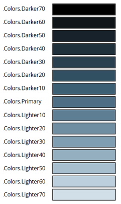
Override the palette
Overriding individual slots in the theme palette provides the creator with full control over the slot colors, which is particularly useful when additional modifications are required beyond the standard theme parameters mentioned above. To override a specific slot, assign a value to the desired slot by its name. For instance, you can specify the HEX code for darker70, primary, or lighter10 to tailor the appearance precisely to your preference. Setting values for all 16 slots completely overrides all the palette options described in the previous section, allowing for a highly customized and unique color scheme.
The slot names for the palette from darkest to lightest are: darker70, darker60, … <>, darker10, primary, lighter10, lighter20, …, lighter80. Refer to the Fluent theme designer to find out how these slots are generally used in Fluent controls.
Example XML for a custom theme
As an example, this XML specifies a custom theme that is green with a different font and a custom logo.
<CustomTheme
    basePaletteColor="#00FF00"
    vibrancy="0"
    hueTorsion="-50"
    font="'GreatVibes', cursive"
    logoWebResource="contoso_company-logo"
    logoTooltip="Contoso"
/>
This XML specifies a custom theme using the alternate palette generation algorithm with an override for a single slot.
<CustomTheme
    basePaletteColor="#00FF00"
    lockPrimary="false"
    font="'GreatVibes', cursive"

    lighter70="#FFFFFF"
/>
Modify the app header colors
Makers can customize the styling of the app header to deviate from the app theme. To make these customizations, extend the XML created for the custom modern theme by adding one or more of the following attributes inside an AppHeaderColors tag.
Background– The background color of the app header. This element must be defined for any changes to take effect.Foreground– The text color of the app header. If this isn't specified, the system attempts to calculate an appropriate color that has sufficient contrast to the provided background color.BackgroundHover– The background color of buttons on the app header when they're hovered over. If no value is specified, the system calculates a color based on the background color.ForegroundHover– The text color of buttons on the app header when they're hovered over. If no value is specified, the system attempts to calculate an appropriate color that has sufficient contrast to thebackgroundHovercolor.BackgroundPressed– The background color of buttons on the app header when they're pressed. The defaulting logic is the same asbackgroundHover.ForegroundPressed– The text color of buttons on the app header when they're pressed. The defaulting logic is the same asforegroundHover.BackgroundSelected– The background color of buttons on the app header when they're selected. The defaulting logic is the same asbackgroundHover.ForegroundSelected– The text color of buttons on the app header when they're selected. The defaulting logic is the same asbackgroundHover.
Example XML for a modern theme
As an example, this XML extends the green custom theme with a black app header. For optimal usability, we recommend specifying different color values for each interaction state.
<CustomTheme
    basePaletteColor="#00FF00"
    vibrancy="0"
    hueTorsion="-50"
    font="'GreatVibes', cursive"
>
  <AppHeaderColors
    background="#000000"
    foreground="#FFFFFF"
    backgroundHover="#313131"
    foregroundHover="#FFFFFF"
    backgroundPressed="#494949"
    foregroundPressed="#FFFFFF"
    backgroundSelected="#717171"
    foregroundSelected="#FFFFFF"
  />
</CustomTheme>
Note
These settings cause any colors specified in the Override app header color setting to be ignored.
Create the web resource
Using a text or XML editor, save the XML that is used to create the web resource. Example XML for a modern theme
Sign into Power Apps.
Select Solutions on the left navigation pane, and then create a New solution.
Select New > More > Web resource.
Select Choose file, browse to and select the XML text file you created earlier.
In the New web resource property pane, enter the following values:
- Display name: Enter a display name, such as Green custom theme.
- Name. Accept the automatically generated or enter a unique name for the web resource.
- Type: Data (XML)
Select Save. You publish this customization with the steps in the next section.
Apply the custom theme to apps in your environment
After you select your colors and create the web resource, follow these steps to enable this app header styling for all the apps in your environment that have the New look enabled.
- In the solution you used to create the web resource, select Add existing > More > Setting.
- Type custom theme in the Search box, select Custom theme definition, select Next, and then select Add.
- In the solution, select Custom theme definition, and then select Edit on the command bar.
- On the right Edit Custom theme definition properties pane, select New environment value under Setting environment value and enter the unique name of your web resource you created earlier (observe the Name column in the solution for the unique name). Remove the double quotes and make sure to add the publisher prefix for the web resource. For example, the name might appear as contoso_green-custom-theme as in this example.

- Select Save.
- Select Settings on the left Objects pane, and then select Publish all customizations on the command bar. (This command appears when no components in the solution are selected).

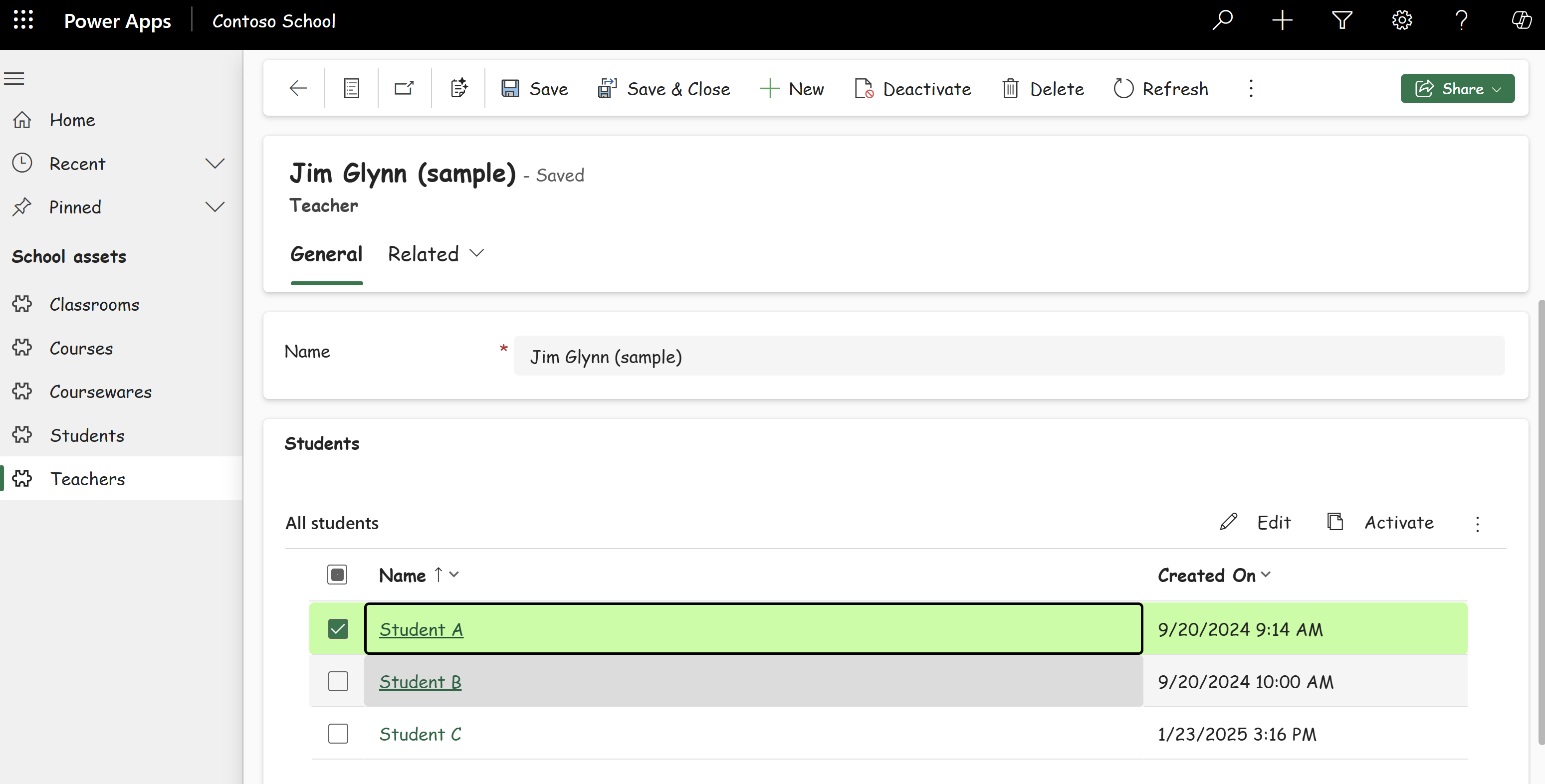
Custom model-driven app using the extended green theme sample.
Verifying new app header colors
After publishing your custom theme, validate the application of the theme in the app to ensure everything appears as you expect.
Modify the app header colors only
Makers can choose to only customize the styling of the app header to deviate from the default app theme. This can be done by following these steps:
- Create an XML file with your various color selections, with one or more of the attributes from app header color overrides section defined inside an
AppHeaderColorstag. - Create a web resource using the same process described for custom themes, but be sure to give the XML resource an appropriate descriptive display name, such as Green app header XML.
- Apply custom app header colors to apps in your environment by assigning this web resource to the environment or app in the Override app header color setting. Follow the steps from Applying custom themes to your environment but use the Override app header color setting instead.
Note
The Override app header color setting is ignored if the Custom theme definition setting is defined.
- Verify your custom app header visuals, including all button states, to ensure everything appears as you expect and there are sufficient contrast ratios for accessibility. Verify the following color choices:
- The desired colors are shown for the app header at rest and for each button interaction state.
- There's a minimum of a 4.5:1 contrast ratio between foreground and background colors for the rest state and each button interaction state.
Example XML for app header color override
As an example, this XML specifies a green background color for the app header with white text, with darker background colors for the various button interaction states. For optimal usability, we recommend specifying different color values for each state.
<AppHeaderColors
  background="#12783F"
  foreground="#FFFFFF"
  backgroundHover="#165A31"
  foregroundHover="#FFFFFF"
  backgroundPressed="#0F1C12"
  foregroundPressed="#FFFFFF"
  backgroundSelected="#153D23"
  foregroundSelected="#FFFFFF"
/>
When you play the app, the app header looks like the following image. You might need to refresh the browser tab to display the theme.
