Note
Access to this page requires authorization. You can try signing in or changing directories.
Access to this page requires authorization. You can try changing directories.
The most attractive feature about canvas apps is the ability to customize the user interface per the user or organization’s branding and liking. Theming strategy provides us with the ability to create apps that match the organizational brand. A theme contains a collection of styles that define multiple design properties for controls and components such as colors, fonts, and borders.
In this article, we'll learn how to use global variables to define themes, and how the colors and properties can be easily changed throughout the app by just updating the global variables.
Watch this video to learn about theming in sample app templates:
Prerequisites
To complete this lesson, we'd need the ability to create apps within Microsoft Teams that will be available as part of select Microsoft 365 subscriptions. You'll also need the Milestones sample app template for Microsoft Teams installed in your Team. You can install it in your team at https://aka.ms/TeamsMilestones.
Defining the theming strategy
In this example, we'll see how global variables have been used to define colors and styles for theming in the Milestones app. The following global variables have been defined in the OnVisible property of the Loading screen.
- gblAppColors to define colors so they can be referenced easily
- gblAppSizes to define different sizes of fonts for mobile and web apps
- gblAppStyles properties of every single control using gblAppColors
- gblThemeDark set to true when the Teams theme is dark so all controls adapt to the dark theme
- gblThemeHiCo set to true when the Teams theme is high contrast so all controls adapt to the high contrast high contrast
Testing the theming Strategy
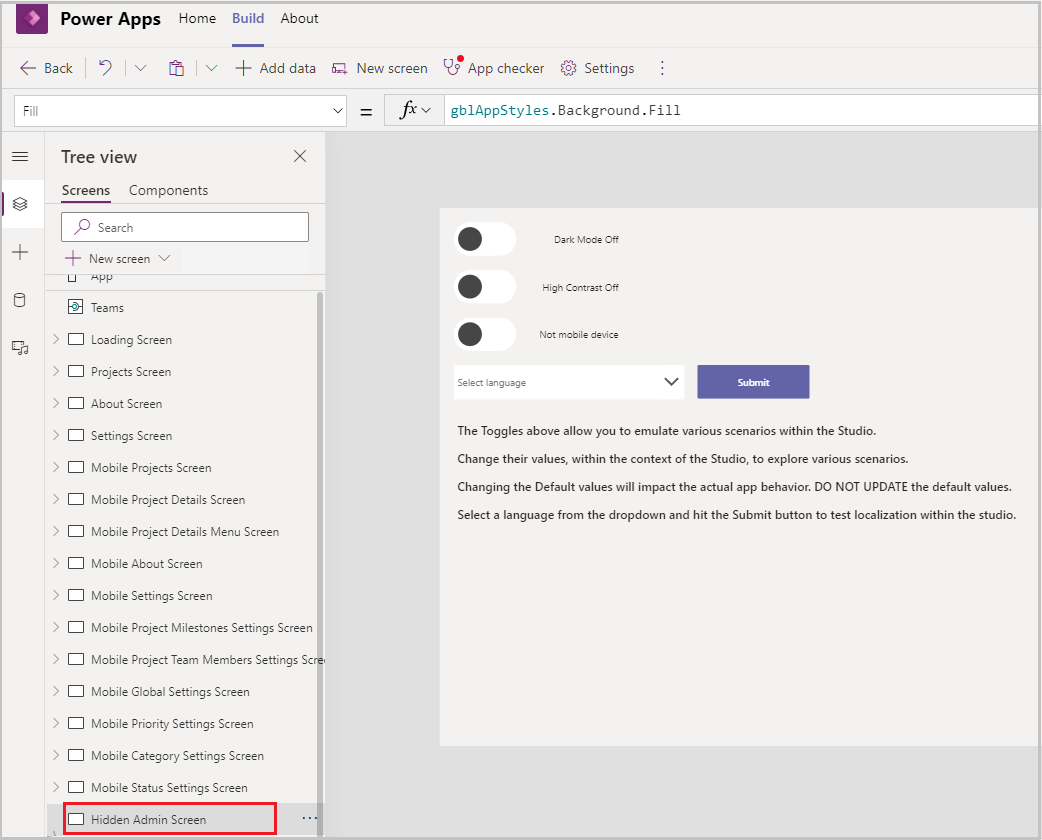
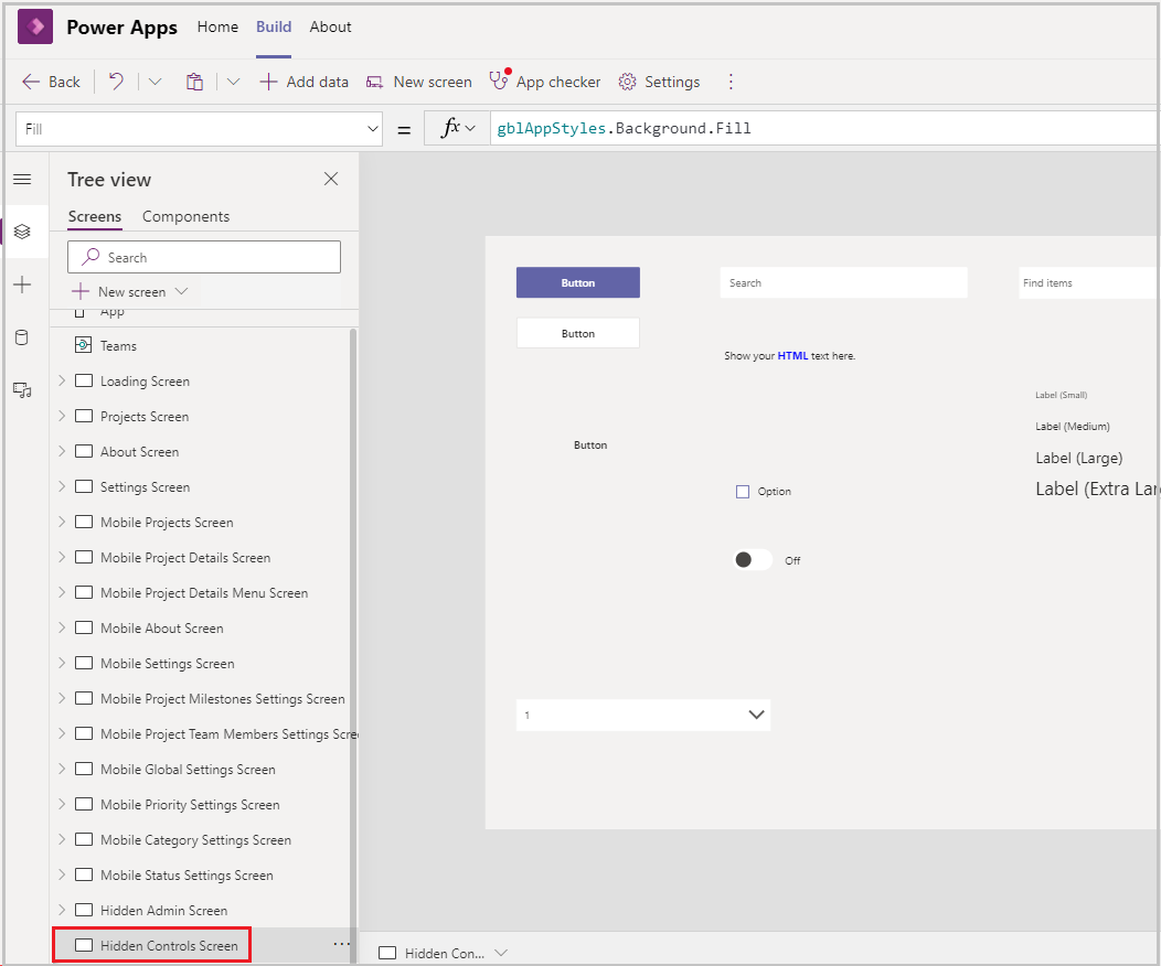
Two hidden screens have been defined for testing the theming strategy:
Hidden Admin Screen – This screen has two toggles defined tglAdmin_DarkMode and tglAdmin_ContrastMode. This screen helps with quick testing of dark and contrast modes without having to change the theme of teams for testing
Hidden Controls Screen – This screen has every single control with properties set using gblAppStyles.
Helps in testing out theme changes.
Helps in copying a particular control and pasting it on the required screen so that the formula for the control doesn't need to be typed repeatedly.
Using the theming variables for a sample app templates
To understand the usage of theming in the Milestones app, select Projects Screen in the Tree view to open the screen and then select +New Project.
Select the Color property of +New Project.
Notice that the formula references gblAppStyles > ButtonTransparent > Color formula from the OnVisible property of the Loading screen.
So now, if the theme of the app is High Contrast, then the color defined in gblAppColors > HighContrastHyperlinks formula will be used.
Another example would be to look at the Primary and Secondary buttons.
Select the Project Screen in the editor.
Hold down the Alt key and select the Filter icon on the Projects Screen.
The Filter work items pop-up opens up. Notice the two buttons: Clear and Apply.
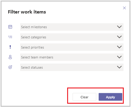
Apply is an example of a primary button and Clear is an example of a secondary button.
Select the Apply button, and select any Border/Thickness/Color related property and notice the formula defined.
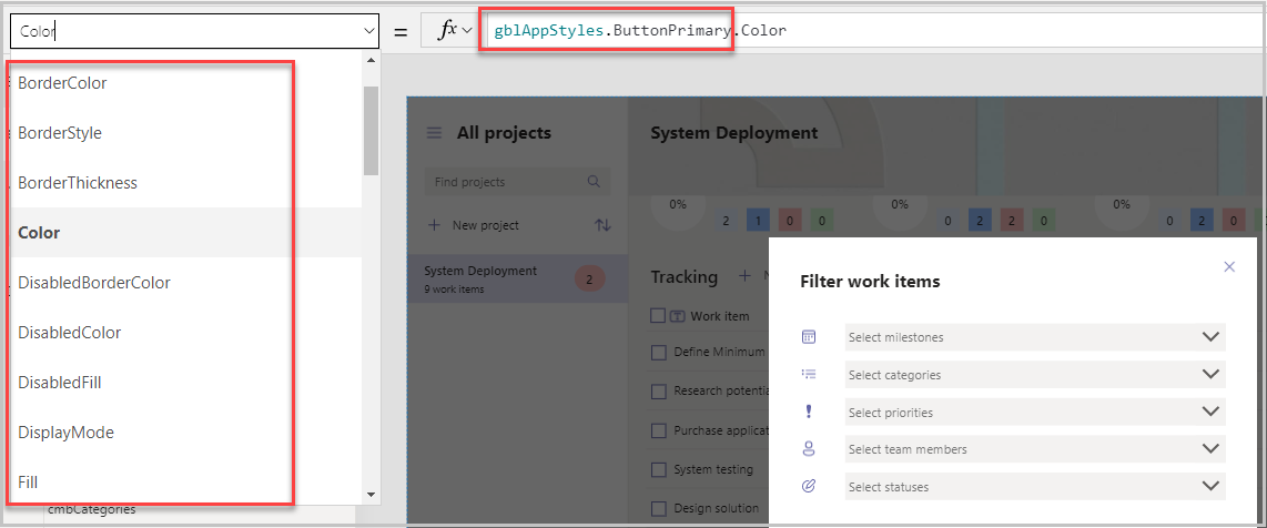
The Apply button is defined as the Primary button and uses all the properties defined on Loading Screen > OnVisible> ButtonPrimary formula.
Depending on the theme and color variables selected in the ButtonPrimary formula, the styling properties of the button will get updated.
Similarly, Clear is defined as a Secondary button and uses all properties defined under gblAppStyles > ButtonSecondary.
Note
Another possible extension to the app would be to add Font as a Property, either as one variable to be used across all controls, or once per control (like how the other styling properties are defined separately for primary buttons, or secondary buttons). The font throughout the Milestones app is Segoe UI and there was no need identified for theming of the font.
Updating the theme in the sample app template
In this section, we'll see how we can change a property of a particular control and how the control gets updated across various screens. In our example, we'll update the Fill property of the Primary button and see how the button color changes in the Dark mode, and the Default mode.
Go to the Loading Screen and select the OnVisible property in the dropdown.
Expand the formula bar and scroll down to the ButtonPrimary > Fill function.
Update the last two parameters to Red and DarkRed.
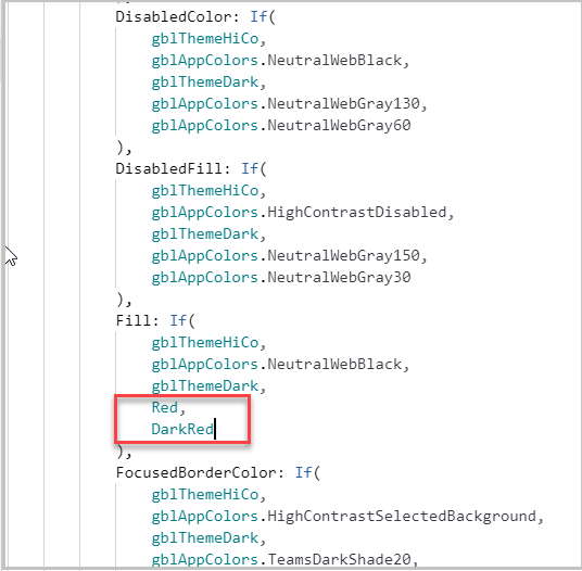
Go to another screen and then back to Loading Screen for the OnVisible function to run.
Go to the Projects screen, select the Filter button to open the Filter pop-up and notice the color of the Apply button is now DarkRed.
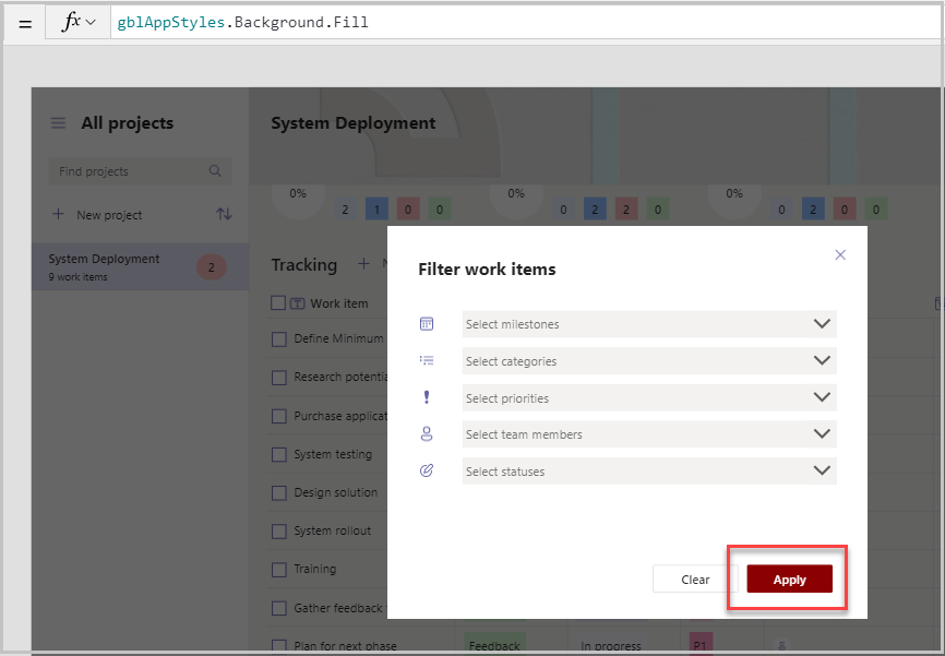
Go to the Hidden Admin Screen, hold Alt key on the keyboard, and select the Dark Mode On toggle.
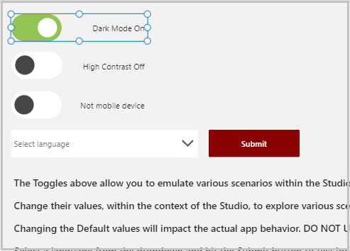
Go to the Loading Screen again for the function to load and then come back to the Projects screen. Notice the screen is now in dark mode (with the background dark), and the Apply button color has now changed to Red.
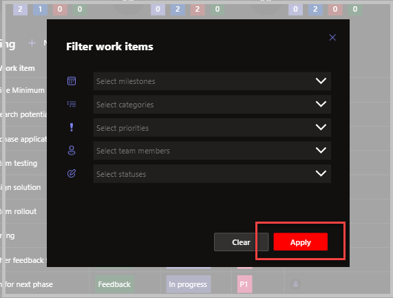
Similarly, changing properties of the SecondaryButton would have changed colors for the secondary button, such as the Clear button.
Note
Updating the fill function directly is a quick way of testing theming as shown earlier. If the color needs to be changed for not just the Primary Button control but for all other controls where it is being used as well, then the color palette under the variable gblAppColors should be updated with the formula of the desired colors and names that makes the most sense to your organization. For example,
companynameDefaultHeader: ColorValue("#30D5C8")would be the formula for turquoise blue.