Note
Access to this page requires authorization. You can try signing in or changing directories.
Access to this page requires authorization. You can try changing directories.
This article explains metrics and visuals, and what they can tell you about your process.
Some of the metrics and visuals are only available in setup with your own Power BI workspace or Fabric workspace (preview). These metrics and visuals are clearly marked in the text as Premium. To be able to access them and gain full insights, make sure you complete the steps in the following articles.
For Power BI workspace:
- Connect your Power BI workspace to the process mining capability
- Create your own custom Power BI workspace
- Load your process analytics in Power BI
For Fabric workspace (preview):
- Connect your Fabric workspace to the process mining capability
- Create your own custom Fabric workspace
- Load your process analytics in Fabric
Once you complete the steps, return to the analytics page of your process in the process mining capability.
Note
The standard report applies the Power BI report filter set to ViewID = 1, which usually is the view named Default. All report pages and visualisations reflect this filter by default, unless changed.
Process map
The process map empowers you to visualize and gain insights from processes. By looking at a graphical representation of how your business processes are performed, you can glean insights about where opportunities exist.
Activities describe tasks or actions, the sequence of which makes up a business process. Activities can be performed by humans or machines, in an automation scenario. In the process map, different activities appear as nodes, and transitions between activities appear as edges. Each process sequence has a start and an end.
Different activity combinations and variants are shown separately on the process map. A process variant is a unique sequence from start to finish of the process. Each variant differs from the others by at least one activity.
You can easily switch between different layers and associated metrics on the process map using the controls on the top left of the process map visual.
The metrics for following layers visualize the same metric on both nodes and transitions. You can switch between the absolute value and relative ratio to the process level metric by clicking the % icon next to the selected metric.
Frequency layer
Total count: The total frequency of an activity/transition captured in the process data.
Case count: The number of process instances in which an activity/transition occurred.
Maximum occurrence in case: The maximum number of times an activity/transition is repeated in one process instance.
Performance layer
Total duration: The total duration of an activity/transition captured in the data. Value can also be displayed as a ratio (percentage) between the total duration of an activity/transition captured in the data and the total duration of all cases.
Mean duration: Mean duration of an activity/transition captured in the data. Value can also be displayed as a ratio (percentage) between the mean duration of an activity/transition captured in the data and the mean case duration.
Maximum duration: Maximum duration of an activity/transition captured in the data.
Minimum duration: Minimum duration of an activity/transition captured in the data.
Rework layer
Select different metrics to be visualized on nodes and on transitions to get better insights. If you select the link icon between them, the selection to the same metrics both for nodes and transitions is locked. You can switch between the absolute value and relative ratio to the process level metric by selecting the % icon next to the metric.
Rework count: Rework count represents the sum of all self-loops and loops.
Self-loop count: Self-loop represents a specific repetition where an activity is directly followed by the same activity. In terms of edges/transitions, the starting and ending activity of edge is the same.
Loop inflow: Loop inflow represents the repetitions of an activity's predecessors.
Loop outflow: Loop outflow represents the repetitions of an activity's successors.
Loop count: Loop represents specific repetition where activity is followed by the same activity, but not directly. For example, at least one more activity is always involved.
Net loop gain: Available for activities only. This activity metric represents the difference between Loop outflow and Loop inflow. If the value is positive, the activity is directly followed by more repeated activities than it was preceded. Such activities start new loops in processes. If the value is negative, the activity is directly followed by less repeated activities than it was preceded. Such activities end, close, or exit loops in processes. The halo effect color also helps us see positive and negative trends in the process - red color represents a problem (start of new loops); the blue color represents a favorable change (end of loops).
To learn more about the process map visual, go to Process map overview.
Use KPIs and visualizations for analytics
You get several prebuilt KPIs and visualizations to help you to understand your process. You can filter by selectors, such as Activity and Case Id (Premium), and custom filters (Premium) if you added the custom attributes (data columns) when you uploaded your data for analysis.
The following screenshot is an example of visualizations and analytics you see in the premium version.
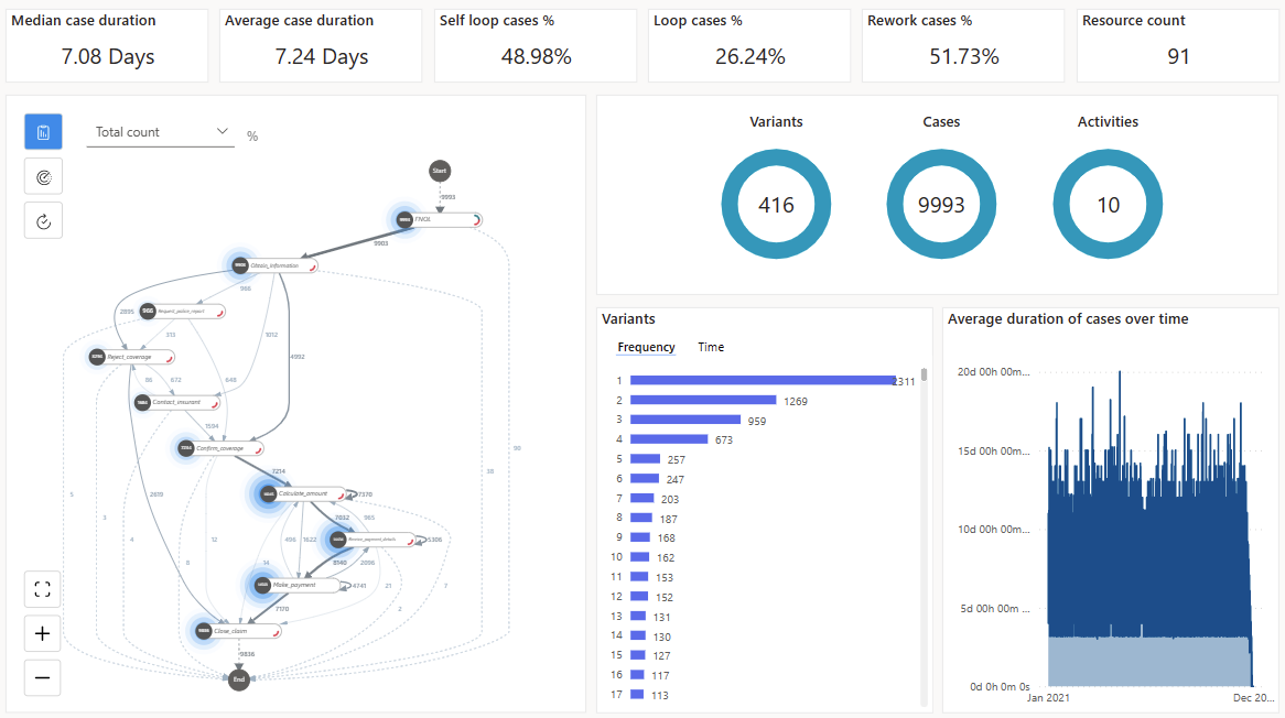
If you didn't purchase the premium version, you have access to the default version. The top of the default version shows only the four KPIs listed in the KPIs section in this article and not the two KPIs with (Premium) in the title. Also, you won't see the Average duration of cases over time chart.
KPIs
These KPIs are the same metrics that you see at the top of your report.
Median case duration (Premium): The median case duration shows the center of all the case durations that are more resistant to outliers in the data.
Average Case Duration: Shows the average case duration, which can be greatly affected by outliers in the data.
Self-Loop Cases %: Percentage of cases that have an activity that repeats itself.
Loop Cases %: Percentage of cases that have a sequence of activities that has at least one activity that is repeated.
Rework Cases %: Percentage of cases that have either a Self-Loop or Loop.
Resource Count (Premium): Count of how many resources are in the process.
To enlarge the view so you can dig deeper into your process, select the Map tab.
Filters pane
To drill down into the process, use the filters in the filters dialog. To see the filters, select Filters in the upper-right side of the Summary tab.
The filters dialog contains the following filters:
Activity selector: Allows you to select cases that contain the selected activity.
Case filter (Premium): Allows you to see the process visualization and analytics filtered to the case.
Start date filter (Premium): Allows you to see the process visualization in a particular period.
Custom attribute filters (Premium): Allows you to filter on both your event and case level custom attributes for your process.
To select multiple activities or cases, you can use Ctrl + click .
If you didn't purchase the premium version, you have access to the default version. The Filters pane shows only the activity selector. You don't have access to the other filters listed in this section with (Premium) in the title.
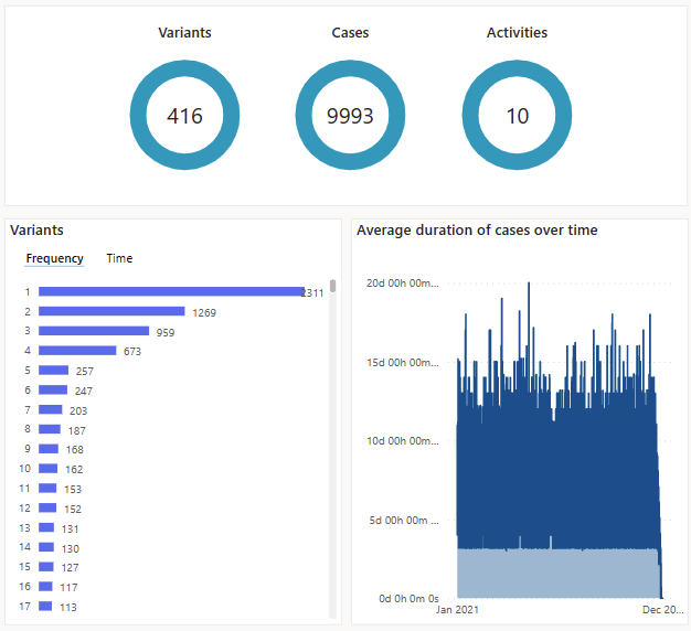
Visualizations
Variants by frequency: Shows which variants are the most common, sorted by the most common to the least common. You can select one or multiple variants in the bar chart to analyze details of the variants by filtering for them. This would update the process map, KPIs, and other visualizations. To select multiple variants, press Ctrl and select the desired variants.
Variants by time: Shows a bar chart of the longest duration variant to the shortest one. Filtering on specific variant updates the process map and KPIs so you could get insights into the behavior of the selected variants.
Average duration of cases over time (Premium): Shows how duration of the process changes over time.
Cases, Activities, and Variants: Shows number of cases, activities, and variants based on the current filter settings.
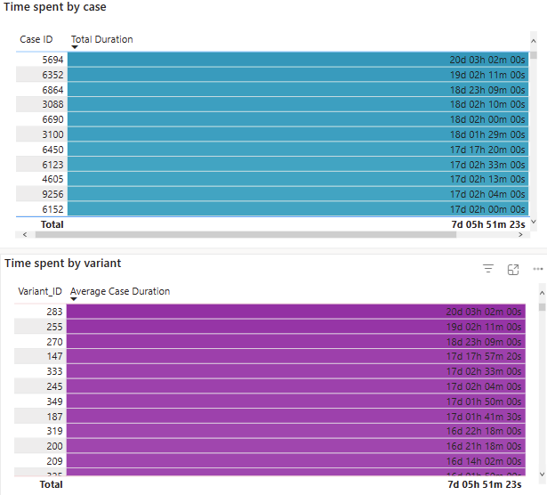
Time Analysis (Premium)
The Time Analysis (Premium) doesn't have an alternative default view. It allows you to drill down into time bottlenecks by cases, variants, and activity. The Time Analysis (Premium) also shows you average time spent per case and per variants ordered by the time spent.
The analysis view appears on the right and the corresponding map appears on the left.
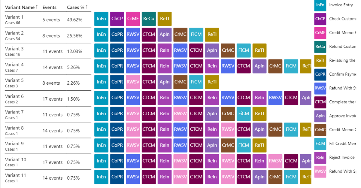
Variant DNA
The Variant DNA view is available in both the default and premium views. To show the order of all the activities in each variant sorted based on the variants that happen the most often, select the Variant DNA tab. The activities are color coded and abbreviated to quickly show a high-level view of the order of the activities that occur. This also helps identify noncompliant processes, self-loops, and loops quickly.