Note
Access to this page requires authorization. You can try signing in or changing directories.
Access to this page requires authorization. You can try changing directories.
APPLIES TO: ![]() Power BI Desktop
Power BI Desktop ![]() Power BI service
Power BI service
Power BI has many built-in features to help people with disabilities more easily consume and interact with Power BI reports. These tools help users get the same information from a report as users who don’t use assistive technology.
 There are a couple terms to know as you read through this article:
- Focus is where your mouse is on the page. Focus is usually indicated by a blue border surrounding an object.
- Canvas is the page area of your report.
The following sections describe the accessibility tools available for consuming Power BI reports.
Keyboard navigation
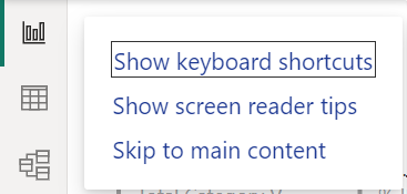
When you launch Power BI Desktop or the Power BI service, as soon as you press Tab, a tooltip appears in the upper-right hand corner. The link titled Show screen reader tips directs you to this article, providing information on how to consume a report with accessibility tools. Clicking on the Skip to main content link takes you to the report canvas.
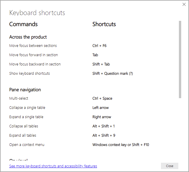
Pressing ? opens a dialog with the most frequently used keyboard shortcuts in Power BI. To see a full list of keyboard shortcuts available in Power BI, you can navigate to the link at the bottom of the dialog, which takes you to the Power BI documentation on keyboard shortcuts.
You can switch focus between the report page tabs or objects on a given report page by using Ctrl + F6. When focus is on a loaded report page, use the Tab key to shift focus to each object on the page, which includes all textboxes, images, shapes, and charts.
In general, using Enter to select or enter and using Esc to exit are common commands in Power BI.
Keyboard navigation for visuals
Many Power BI report creators are building reports that contain a large amount of data. As you move through a visual, it can be annoying to tab through every element in a visual. Keyboard navigation for visuals is designed as a hierarchy with three levels. Those three levels are described in the following paragraphs.
To navigate through the first level when you navigate to a visual, press Ctrl + right arrow to enter that visual. Once you enter that visual, you can press Tab to cycle through the main areas of the visual. Those main areas you can cycle through are the data plot area, the axis categories (if applicable to the visual), and the legend if the visual has one.
The following animation shows how a user cycles through the first level of a visual:
The second level of the hierarchy is entering one of the main areas (data plot area, x-axis categories, legend) of the visual. As you consume a report, you can move into one of these main areas and cycle through the data points or categories in that section of the visual. Once you decide which area you’d like to explore further, you can press Enter to cycle through that specific area.
If you’d like to select all the data points in a series, navigate to the legend and press Enter. Once in the legend, you can press Tab to navigate through the different categories in the legend. Press Enter to select a specific series.
If you’d like to select specific data points, navigate to the data plot area and press Enter. Once in the data plot area you can press Tab to navigate through the data points. If your visual has multiple series, you can press the Up arrow or Down arrow to jump to the data points in a different series.
If you’d like to select all the data points in a categorical axis, navigate to the axis labels and press Enter. Once in the axis labels, you can press Tab to navigate through the label names. Press Enter to select a label name.
If you navigate into a layer, you can press Esc to come out of that layer. The following animation shows how a user can enter and exit the levels of a visual and select data points, x-axis category labels, jump to a different series, and select all the data points in a series.

If you're unable to navigate to an object or visual while using a keyboard, the report author might decide to hide that object from the tab order. Report authors commonly hide decorative objects from the tab order. If you find that you can't tab through a report in a logical manner, you should contact the report author. Report authors can set the tab order for objects and visuals.
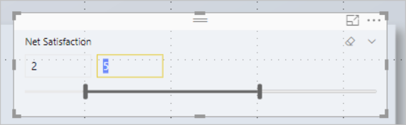
Keyboard navigation for slicers
Slicers also have accessibility functionality built in. When you select a slicer, to adjust the value of a slicer use Ctrl + Right arrow to move through the various controls within the slicer. For example, when you initially press Ctrl + Right arrow, the focus is on the eraser. Then, pressing the spacebar is equivalent to clicking the eraser button, which erases all values on the slicer.
You can move through the controls in a slicer by pressing Tab. Pressing Tab when on the eraser moves to the dropdown button. Another Tab then moves to the first slicer value if there are multiple values for the slicer, such as a range.
Switch pages
When focus is on report page tabs, use the Tab or Arrow keys to move focus from one report page to the next. The screen reader reads out the title of the report page and whether the report page is selected. To load the report page currently under focus, use the Enter key or spacebar.
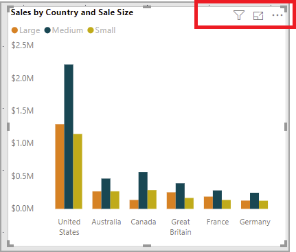
Access the visual header
As you navigate between visuals, you can press Alt + Shift + F10 to move focus to the visual header. The visual header contains various options including sorting, exporting the data behind the chart, and Focuses mode. The icons you see in the visual header depends on the options the report author shows.
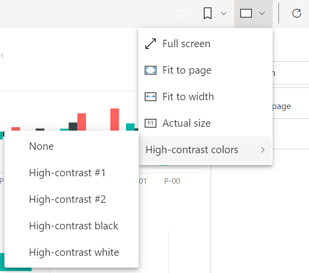
High contrast modes
The Power BI service attempts to detect the high contrast settings selected for Windows. The effectiveness and accuracy of that detection depends on the browser showing the Power BI service. If you want to set the theme manually in the Power BI service, you can select View > High contrast colors and then select the theme you would like to apply to the report.
Screen reader
When viewing a report, it's best to leave scan mode off. Power BI should be treated more like an application and less like a document, so it's setup with custom navigation to make it easier to navigate. When using a screen reader with Power BI Desktop, you should also make sure your screen reader is open before you open Power BI Desktop.
When readers navigate around objects, the screen reader reads the type of object and the object's title if the object has one. The screen reader also reads a description of that object, the alt text, if it's provided by the report author.
Show data
You can press Alt + Shift + F11 to present an accessible version of the Show data window. This window lets you explore the data used in the visual in an HTML table by using the same keyboard shortcuts you normally use with your screen reader.
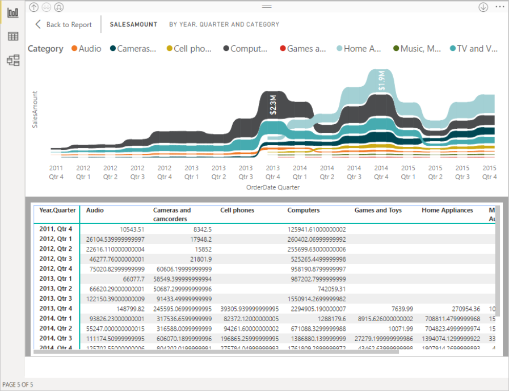
The Show data feature is an HTML table that's only accessible to a screen reader through this keyboard shortcut. If you open Show data from the option in the visual header, a table that's not screen reader compatible is displayed. When using Show data through keyboard shortcuts, turn on scan mode to take advantage of all the hot keys your screen reader provides.
To exit the Show data view and return to a report, press Esc.
Show visuals as tables (preview)
Some users might prefer to consume data in a tabular format depending on their different learning styles and usage of assistive technologies. If you'd like to present your report in tabular format, you can press Ctrl + Shift + F11 to switch to Show Visuals as Table view mode. With a single action, all pages in your report display most visuals in a table or matrix format, while still allowing interaction and cross-filtering capabilities.
To activate, select View > Show visuals as tables. To revert back to original visuals, select View > Show original visuals. Or, use the keyboard shortcut Ctrl + Shift + F11 to toggle between the two views.
Limitations & notes
- Show Visuals as Tables doesn't apply to dashboards
- Show Visuals as Tables only applies to the current report you're viewing (each new report needs activated)
- Show Visuals as Tables doesn't apply to the following visuals: slicers, cards, smart narrative, Power Apps, Paginated Report, Key Influencers, Q&A
Related content
A collection of articles for Power BI accessibility: