Note
Access to this page requires authorization. You can try signing in or changing directories.
Access to this page requires authorization. You can try changing directories.
APPLIES TO: ![]() Power BI Desktop
Power BI Desktop ![]() Power BI service
Power BI service
Visual tooltips display contextual information when consumers hover over data points in a visual. They help consumers understand the data without leaving the report. This article describes how to add fields to a tooltip, format the tooltip in Power BI Desktop and the Power BI service, and use drill actions from the tooltip.
For an introduction to all tooltip types, see Tooltips overview. For richer hover content, see Create report page tooltips in Power BI.
By default, the tooltip shows:
- The field name and value for each field used in the visual.
- Additional fields that you add in the Tooltip field well.
- Optional actions, such as Drill down, Drill up, and Drill through, when the visual supports them.
Add fields to the Tooltip field well
Use the Tooltip field well to show extra data points in the tooltip without changing the visual itself.
Select the visual you want to customize.
In the Build visual pane, drag a field into the Tooltip field well. You can add multiple fields.
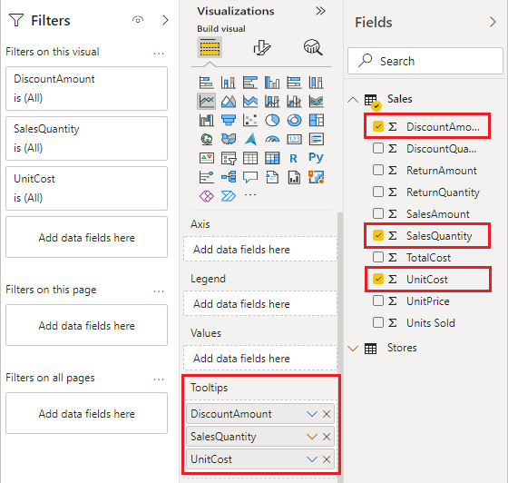
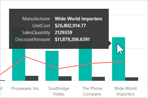
Hover over a data point on the visual to see the values for the fields you added.
Apply aggregation functions
Apply aggregation functions to the fields in the Tooltip field well to show summarized values.
In the Tooltip field well, select the arrow beside the field you want to aggregate.
Select an aggregation, such as Sum, Average, or Count.
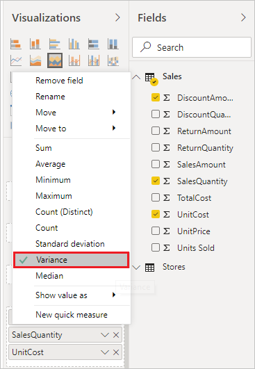
You can also use quick measures to create common calculations to add to your tooltip.
Configure tooltip settings
Tooltip formatting lives in the Format visual pane under General > Tooltips. Select a visual on the report canvas, and then select the Format visual icon in the Visualizations pane.
Available settings include:
- Tooltip visibility: Toggle the Tooltips card on or off to show or hide tooltips for the visual.
- Tooltip type: Choose Default to use the standard tooltip, or Report page to use a report page tooltip.
- Text: Set the Font, Label color, Value color, and Drill text and icon color.
- Background: Set the Color and Transparency.
- Actions: Turn on or off the actions footer, which exposes drill behavior in supported visuals.
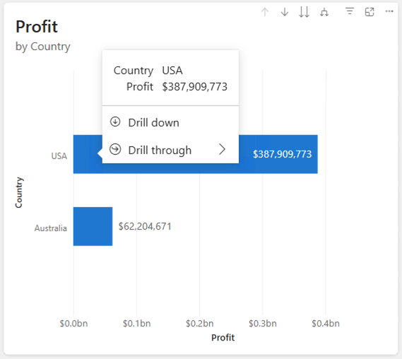
Use drill actions in the tooltip
When you turn on the Actions footer, supported visuals show drill controls in the tooltip:
- Drill down: Goes to the next level in a hierarchy.
- Drill up: Returns to the previous hierarchy level.
- Drill through: Opens a drillthrough page filtered to that data point.
Using drill actions from the tooltip means consumers don't need to use right-click menus or header icons.
Style tooltips by using a report theme
Tooltips inherit colors from the report theme so the experience stays consistent across visuals.
To adjust tooltip styling for the entire report:
In Power BI Desktop, select the View tab.
Select Customize current theme > Visuals.
Select Tooltip to set the Label text color, Value text color, Drill text and icon color, and Background color.
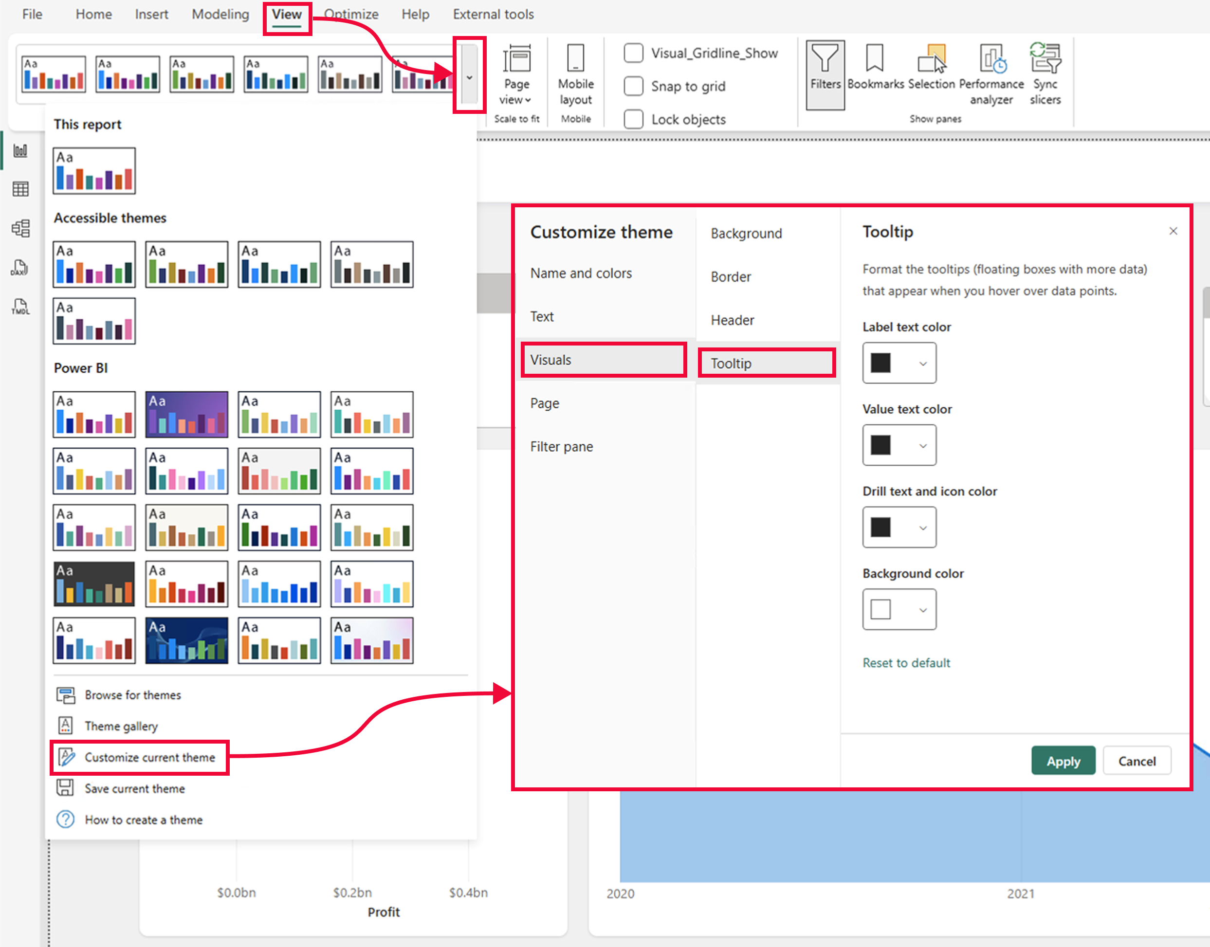
Theme elements map to tooltip elements as follows:
- Background color maps to the tooltip background.
- Text and icon color maps to first-level text and icons.
- Separator and hover color maps to secondary background elements.
To override the theme for a single visual, use General > Tooltips in the Format visual pane.
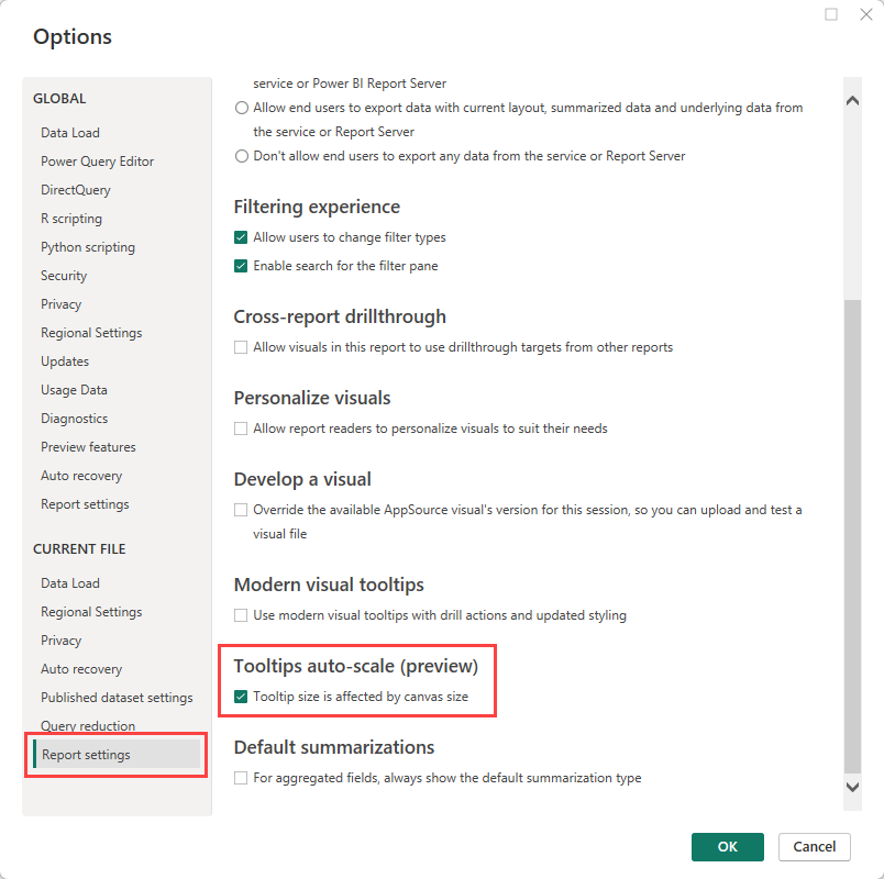
Enable tooltip autoscale
Tooltip autoscale resizes tooltips based on the canvas size so they look right on different screen sizes.
Select File > Options and settings > Options.
Under Current file, select Report settings.
Select Tooltip size is affected by canvas size.
Troubleshoot tooltip problems
- Tooltip doesn't appear: The visual might not support standard tooltips, or the Tooltips toggle might be off. Visuals that support the full tooltip experience, including a Tooltip field well, include bar and column charts, line and area charts, treemaps, scatter and bubble charts, pie and donut charts, and ribbon, funnel, and waterfall charts.
- Report page tooltip doesn't appear: Confirm the page has Allow use as tooltip turned on, and that the visual's Tooltip type is set to Report page. For more information, see Create report page tooltips.
- Actions footer is missing: Only visuals with drillable hierarchies or a drillthrough mapping show the actions footer.
- Can't add fields to the Tooltip well: Tables, matrices, and some other visuals don't expose a Tooltip field in the Build visual pane.
- Tooltip text is too small: Too many fields force the font to shrink. Reduce the number of fields for better readability.
Considerations and limitations
- Default tooltips aren't designed to hold large amounts of content. For more control, use a report page tooltip.
- Tooltip styling and the actions footer might differ for some visual types:
- Key influencers show their own explanation panels instead of standard tooltips.
- Tables and matrices show the cell value on hover. Tooltip formatting options are available, but these visuals don't expose a Tooltip field well.
- Decomposition trees, report page tooltips, and AppSource custom visuals show standard tooltips where supported but don't expose the actions footer.
- Existing reports keep their original tooltip appearance and actions footer state. Power BI might prompt you to upgrade older reports to modern tooltip defaults.
- You can turn off tooltips for a visual in a Power BI report. However, when you pin that visual to a dashboard, the basic tooltip still appears.