Note
Access to this page requires authorization. You can try signing in or changing directories.
Access to this page requires authorization. You can try changing directories.
APPLIES TO: ![]() Power BI Desktop
Power BI Desktop ![]() Power BI service
Power BI service
With grouping in Power BI Desktop, you can group visuals together in your report, such as buttons, textboxes, shapes, images, and any visual you create, just like you group items in PowerPoint. Grouping visuals in a report lets you treat the group like a single object, making moving, resizing, and working with layers in your report easier, faster, and more intuitive.
Create groups
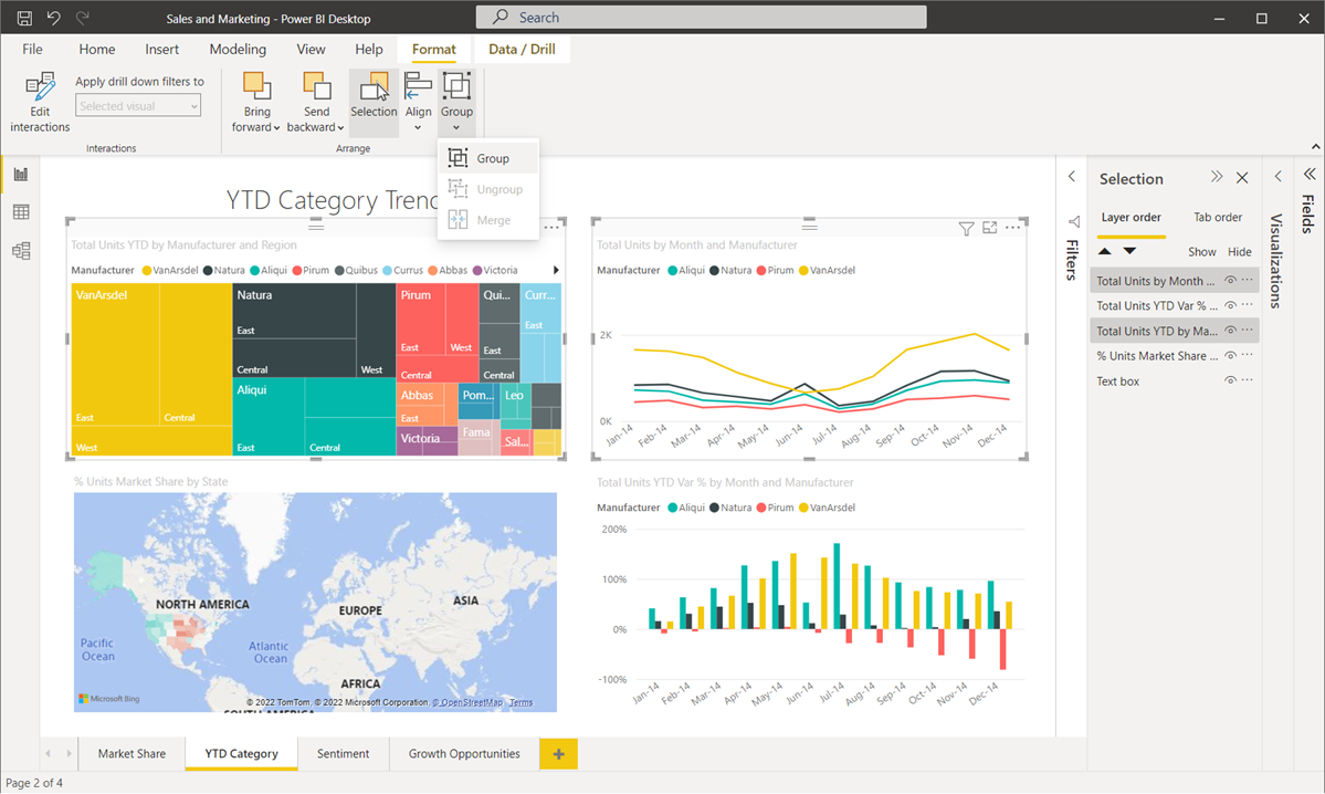
To create a group of visuals in Power BI Desktop, select the first visual from the canvas, then holding the CTRL button, select one or more additional visuals that you want in the group. In the Format menu, select Group, and from the submenu select Group.

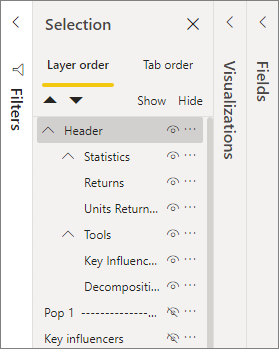
Groups are displayed in the Selection pane. You can have as many groups of visuals as your report needs, and you can also nest groups of visuals. In the following image, the Statistics and Tools groups are nested under the Header group. You can expand a group by selecting the caret beside the group name, and collapse it by selecting the caret again.
Within the Selection pane, you can also drag and drop individual visuals to include them in a group, remove them from a group, nest a group, or remove a group or individual visual from a nest. Simply drag the visual you want to adjust, and place it where you want. When you layer visuals, if there's overlap, their order is determined by their order in the Layer order list.
Renaming a group is easy: just double-click the group name in the Selection pane, and then type in the new name of your group.
To ungroup, just select the group, right-click, and select ungroup from the menu that appears.
Hide and show visuals or groups
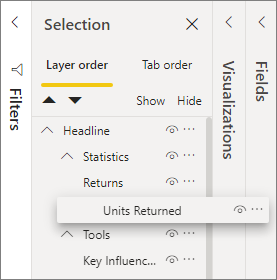
You can easily hide or show groups using the Selection pane. To hide a group, select the eye button beside the group name (or any individual visual) to toggle whether the visual or group is hidden or displayed. In the following image, the Statistics group is hidden, and the rest of the items and groups nested in the Headline group are displayed.
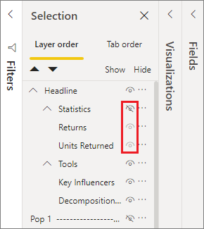
When you hide a group, all visuals within that group are hidden, indicated by their eye button being grayed out (unavailable to toggle on or off, because the entire group is hidden). To hide only certain visuals within a group, toggle the eye button beside that visual, and only that visual in the group is hidden.
Select visuals within a group
There are a few ways to navigate and select items within a group of visuals. The following list describes the behavior:
- When you select an empty space within a group, such as white space between visuals, it doesn't select anything.
- When you select a visual within a group, it selects the entire group. A second click selects the individual visual.
- When you select a group, select another object on the report canvas, then right-click and select Group, you create a nested group.
- When you select two groups, then right-click, it displays an option to merge the selected groups, rather than nesting them.
Apply background color
You can also apply a background color to a group using the Formatting section of the Visualizations pane, as shown in the following image.
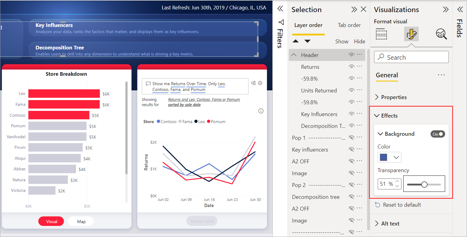
Once you apply a background color, clicking on the space between visuals in the group selects the group (compare this to clicking on the white space between visuals in a group, which doesn't select the group).
Considerations and limitations
- Grouping is only available with the modern visual header style. Ensure that the Options > Current file > Report settings > Visual options > Use the modern visual header with updated styling options setting is checked to use grouping.