Note
Access to this page requires authorization. You can try signing in or changing directories.
Access to this page requires authorization. You can try changing directories.
APPLIES TO: ![]() Power BI Desktop
Power BI Desktop ![]() Power BI service
Power BI service
Often in visuals, you see a large increase and then a sharp drop in values, and wonder about the cause of such fluctuations. With insights in Power BI you can learn the cause with just a few clicks.
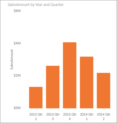
For example, consider the following visual that shows Sales Amount by Year and Quarter. A large decrease in sales occurs in 2014, with sales dropping sharply between Qtr 1 and Qtr 2. In such cases you can explore the data, to help explain the change that occurred.
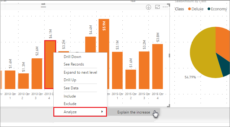
You can tell Power BI to explain increases or decreases in charts, see distribution factors in charts, and get fast, automated, insightful analysis about your data. Right-click on a data point, and select Analyze > Explain the decrease (or increase, if the previous bar was lower), or Analyze > Find where this distribution is different and insight is delivered to you in an easy-to-use window.
The insights feature is contextual, and is based on the immediately previous data point—such as the previous bar, or column.
Note
The insight feature is enabled and on by default in Power BI.
Use insights
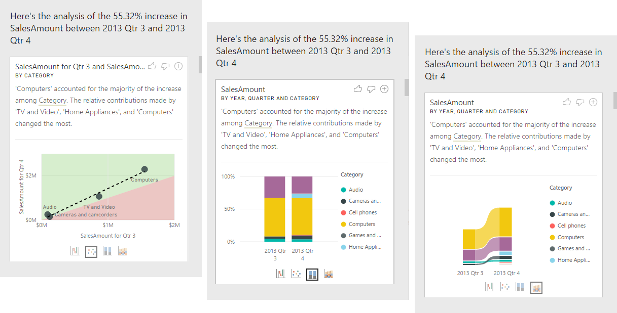
To use insights to explain increases or decreases seen on charts, just right-click on any data point in a bar or line chart, and select Analyze > Explain the increase (or Explain the decrease, since all insights are based on the change from the previous data point).
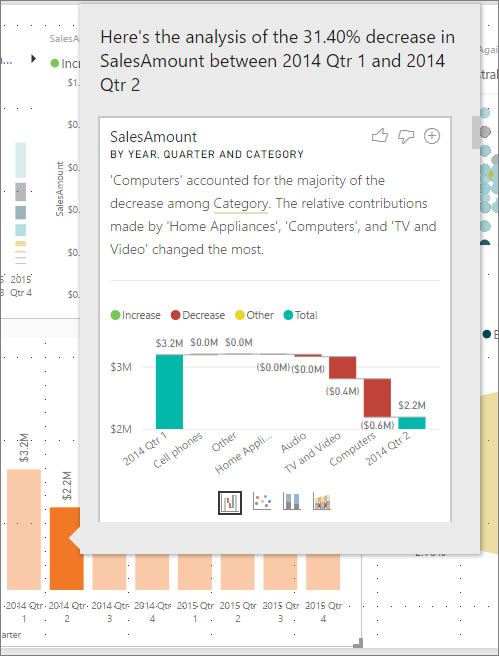
Power BI then runs its machine learning algorithms over the data, and populates a window with a visual and a description that describes which categories most influenced the increase or decrease. By default, insights are provided as a waterfall visual, as shown in the following image.
By selecting the small icons at the bottom of the waterfall visual, you can choose to have insights display a scatter chart, stacked column chart, or a ribbon chart.
The thumbs up and thumbs down icons at the top of the page are provided so you can provide feedback about the visual and the feature. Doing so provides feedback, but it doesn't currently train the algorithm to influence the results returned next time you use the feature.
Importantly, the + button at the top of the visual lets you add the selected visual to your report as if you created the visual manually. You can then format or otherwise adjust the added visual just as you would to any other visual on your report. You can only add a selected insight visual when you're editing a report in Power BI.
You can use insights when your report is in reading or editing mode, making it versatile for both analyzing data, and for creating visuals you can easily add to your reports.
Details of the results returned
The details returned by insights are intended to highlight what was different between the two time periods, to help you understand the change between them.
For example, if Sales increased by 55% overall from Qtr 3 to Qtr 4, and that's equally true for every Category of product (sales of Computer increased by 55%, and of Audio, and so on), and also true for every country or region, and for every type of customer, then there's little that can be identified in the data to help explain the change. However, that situation is generally not the case. We might typically find differences in what occurred, such that among the categories, Computers and Home Appliances grew by a much larger 63% percentage, while TV and Audio grew by only 23%, and therefore Computers and Home Appliances contributed a larger amount of the total for Qtr 4 than they had for Qtr 3. Given this example, a reasonable explanation of the increase would be: particularly strong sales for Computers and TV and Audio.
The algorithm isn't simply returning the values that account for the biggest amount of the change. For example, if most (98%) sales came from the USA, then it would commonly be the case that most of the increase was also in the USA. Yet unless the USA or other countries/regions had a significant change to their relative contribution to the total, the country or region wouldn't be considered interesting in this context.
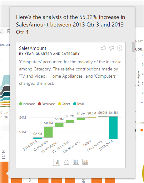
Simplistically, the algorithm can be thought of as taking all the other columns in the model and calculating the breakdown by that column for the before and after time periods. This determines how much change occurred in that breakdown and then returns those columns with the biggest change. For example, Category was selected in the previous example. The contribution made by TV and Video fell 7% from 33% to 26%, while the contribution from Home Appliances grew from nothing to over 6%.
For each column returned, there are four visuals that can be displayed. Three of those visuals are intended to highlight the change in contribution between the two periods. For example, for the explanation of the increase from Qtr 2 to Qtr 3.
The scatter plot
The scatter plot visual shows the value of the measure in the first period on the x-axis against the value of the measure in the second period on the y-axis for each value of the Category column. Thus as shown in the following image, any data points are in the green region if the value increased and in the red region if they decreased.
The dotted line shows the best fit, and as such, data points above this line increased by more than the overall trend, and those below it by less.

Data items whose value was blank in either period won't appear on the scatter plot (for example, Home Appliances in this case).
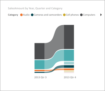
The 100% stacked column chart
The 100% stacked column chart visual shows the value of the measure before and after, by the selected column, shown as a 100% stacked column. This allows side-by-side comparison of the contribution before and after. The tooltips show the actual contribution for the selected value.

The ribbon chart
The ribbon chart visual also shows the value of the measure before and after. It's useful in showing the changes in contributions when these were such that the ordering of contributors changed. One example is if Computers were the number one contributor before, but then fell to number three.
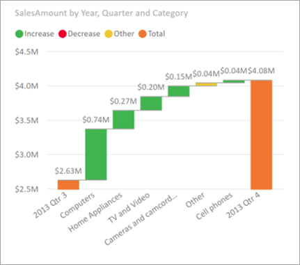
The waterfall chart
The fourth visual is a waterfall chart, showing the actual increases or decreases between the periods. This visual clearly shows the actual changes, but doesn't alone indicate the changes to the level of contribution that highlight why the column was chosen as being interesting.
When ranking the column as to which have the largest differences in the relative contributions, the following is considered:
The cardinality is factored in, as a difference is less statistically significant, and less interesting, when a column has a large cardinality.
Differences for those categories where the original values were high or close to zero are weighted higher than others. For example, if a Category only contributed 1% of sales, and this changed to 6%, that's more statistically significant. It's therefore considered more interesting, than a Category whose contribution changed from 50% to 55%.
Various heuristics are employed to select the most meaningful results, for example by considering other relationships between the data.
After the insight examines different columns, those columns that show the biggest change to relative contribution are chosen and output. For each, the values that had the most significant change to contribution are called out in the description. In addition, the values that had the largest actual increases and decreases are also called out.
Considerations and limitations
Since these insights are based on the change from the previous data point, they aren't available when you select the first data point in a visual.
The following list is the collection of currently unsupported scenarios for explain the increase/decrease:
- TopN filters
- Include/exclude filters
- Measure filters
- Non-numeric measures
- Use of "Show value as"
- Filtered measures - filtered measures are visual level calculations with a specific filter applied (for example, Total Sales for France) and are used on some of the visuals created by the insights feature
- Categorical columns on X-axis unless it defines a sort by column that's scalar. If using a hierarchy, then every column in the active hierarchy has to match this condition
- RLS or OLS enabled data models
In addition, the following model types and data sources aren't currently supported for insights:
- DirectQuery
- Live connect
- On-premises Reporting Services
- Embedding
The insights feature doesn't support reports that are distributed as an App.
Related content
For more information about Power BI, and how to get started, see: