Note
Access to this page requires authorization. You can try signing in or changing directories.
Access to this page requires authorization. You can try changing directories.
In this article, we'll go through several DirectQuery report authoring scenarios showing how you can streamline your experience with the Optimize ribbon in Power BI Desktop. With the Optimize ribbon, you can control when visuals refresh with the Pause visuals and Refresh visuals features, use Optimization presets to quickly apply predefined settings, and easily launch Performance analyzer to go deeper into the queries themselves, including the SQL queries DirectQuery generates. We'll also show how you can edit relationships right in Model view's Properties pane without running queries to preview or validate the data.
Before going through these scenarios, be sure to first check out Optimize ribbon in Power BI Desktop, which provides a great introduction to these exciting features.
Change a DirectQuery report without running queries
Let's first take a look at how we can improve our report authoring performance by pausing visuals so they don't send queries to the data source each time we make a change. In the Optimize ribbon, we select Pause visuals. When paused, visuals will update only if they don't need to send a query. If the visual does need to send a query, the visual instead enters a pending state. When pending, the visual still shows what it looked like before the change was introduced, just for context, and the tooltips are also disabled so they too don't send any queries. We can now add or remove multiple columns or measures into the field well, re-order the fields, and even filter the visual by using the Filter pane - and no queries are sent!
When done making all those changes, we select Refresh on the visual to send a query just once, select Refresh on the banner or ribbon to have all visuals on the page send a query just once, or select Resume visual queries on the banner or Paused visuals in the Optimize ribbon, to have all the visuals send a query to update now and continue to send queries with any other changes.
Let's take a closer look at that Pause visuals workflow:
Tip: Sometimes images on a page are difficult to see the detail. Be sure to use your browser's zoom feature!
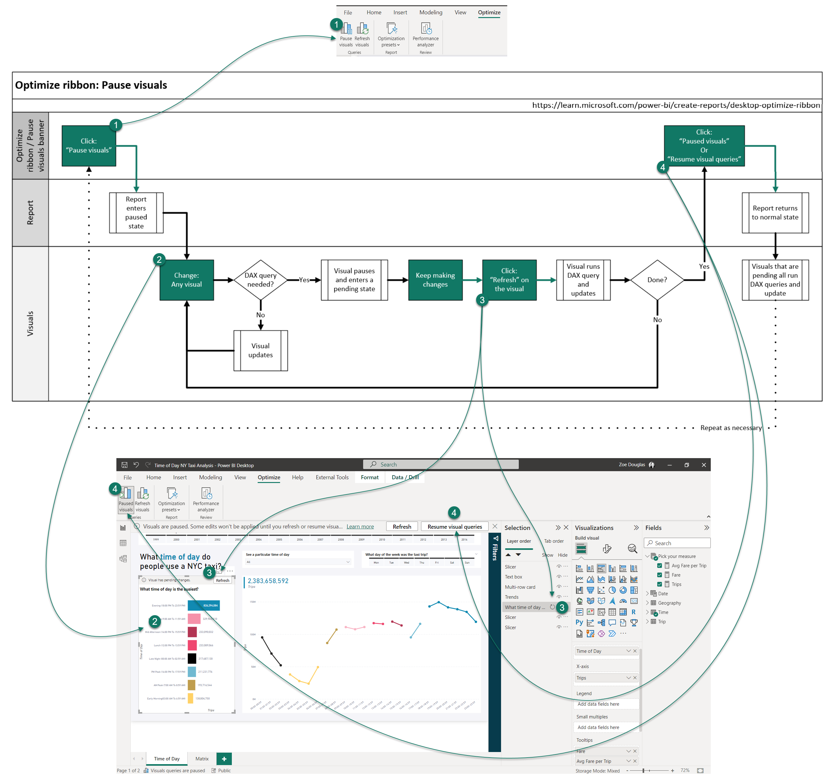
In the following animation, we show adding two measures, Fare and Average fare per trip, to two of the visual’s tooltips on the page, reordering them in the field well, and then resuming the visuals from the banner.

Without Pause visuals, each time a measure is added or moved around in the Fields well, a new visual query is sent to the DirectQuery data source. That’s three queries for each visual, so in this case six queries are sent. By using Pause visuals, each time a measure is added or moved around, no queries are sent. Only two queries are sent when the report is resumed. For this simple report change, not running the four extra queries saves time and doesn't waste valuable data source resources.
Create new visuals without running a query
In the Optimize ribbon, we select Pause visuals. We then add a new Matrix visual from the Visualization pane, and then add Trips, Day of week, and Time of the day to our new Matrix visual. When paused, the Matrix visual enters a pending state - no queries are sent. Now, we reorder the fields, but again, no queries are sent. Let's open the Filter pane, bring in the Year, and then filter to the year 2013. At this point seeing the visual will be helpful before making any more changes. We can select Refresh in the pending visuals banner or open the Selection pane to refresh the visual there. We've only sent one query, and the query was pre-filtered, speeding up the return time and reducing impact on the data source. We can make formatting changes to the visual and even in the report paused state these changes show because a DAX query isn't needed. However, adding a background color formatting change does need a query so the visual enters the pending state. When ready, we can refresh or resume visual queries to see the final Matrix visual.
Using Pause visuals when creating new visuals

Without using Pause visuals, each time a measure or column is added or moved around in the Fields well, a new visual query is sent to the DirectQuery data source. That’s six queries before we started formatting, and five of those are before we filtered the visual to a single year. Now with Pause visuals, each time the measure or column is added or moved around, no queries are sent. Only two queries are sent when the visual is refreshed or the report is resumed - and they were filtered queries. For this new visual addition, not only did avoiding the extra queries save time and not waste valuable data source resources, we also ran a smaller, targeted query and formatted the visual with minimal disruption.
Create measures without the visuals refreshing
Just like with the previous scenario, in the Optimize ribbon, we select Pause visuals to have the report enter a paused state. Normally, in a DirectQuery report, anytime a new measure is created all the visuals on the report page will refresh. But, with the report in a paused state, we can create new measures without queries being sent. The visuals are instead in a pending state. We can add the measures to the pending visuals. We can then refresh an individual visual to see results with the new measures or simply resume visual queries when done.
Using Pause visuals when creating new measures

Without using Pause visuals, each time a measure is created, all the visuals send queries to the DirectQuery data source. That’s five visuals on the page sending five queries with each model change. That's a lot of queries when creating only two new measures and adding those measures to a single visual! With Pause visuals, each time a measure is created or added to a visual, no queries are sent. Only six queries are sent when the single visual is refreshed, and then the report resumed. For these modeling changes we see a significant reduction in queries and time waiting for those queries to return data. We also significantly reduced the workload on the data source.
Edit relationships between DirectQuery tables
To edit a relationship between two DirectQuery tables in Model view in Power BI Desktop, we can now simply select on the relationship line between those tables to edit it in the Properties pane! We can change the table, column, cardinality, direction, make it active or inactive, and even turn on referential integrity if confident each table isn't missing values present in the other one. When done, we select Apply changes. We can also hold down Ctrl to select multiple relationships to make bulk changes in the properties pane, or delete them by using the Delete key.
Edit relationships in the Properties pane

Without being able to edit relationships in the Properties pane, each time a relationship is changed, queries are sent when opening the dialogue to show the data preview. With every table or column change, queries are sent to validate the cardinality and direction of the relationship. Now with optimization, when editing relationships in the Properties pane, we don't send any queries and the relationship is only validated when ready and we've selected the Apply changes button.
Apply query reduction settings
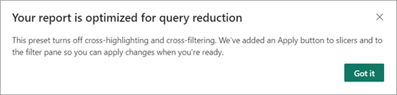
If we select the Optimization presets drop down in the Optimize ribbon, and then select Query reduction for our report, a dialogue appears describing the settings that are applied.
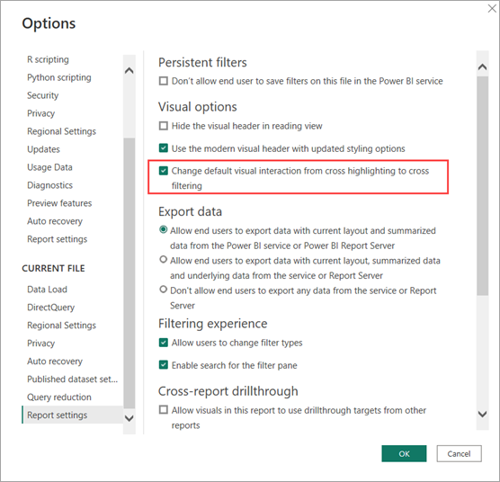
Cross-highlighting and cross-filtering is how visuals interact with each other when a data point is selected. The default is Power BI Desktop is cross-highlighting. We can change the default to cross-filtering by going to File > Options and Settings > Options > Report settings, and then selecting Change default visual interaction from cross highlighting to cross filtering.
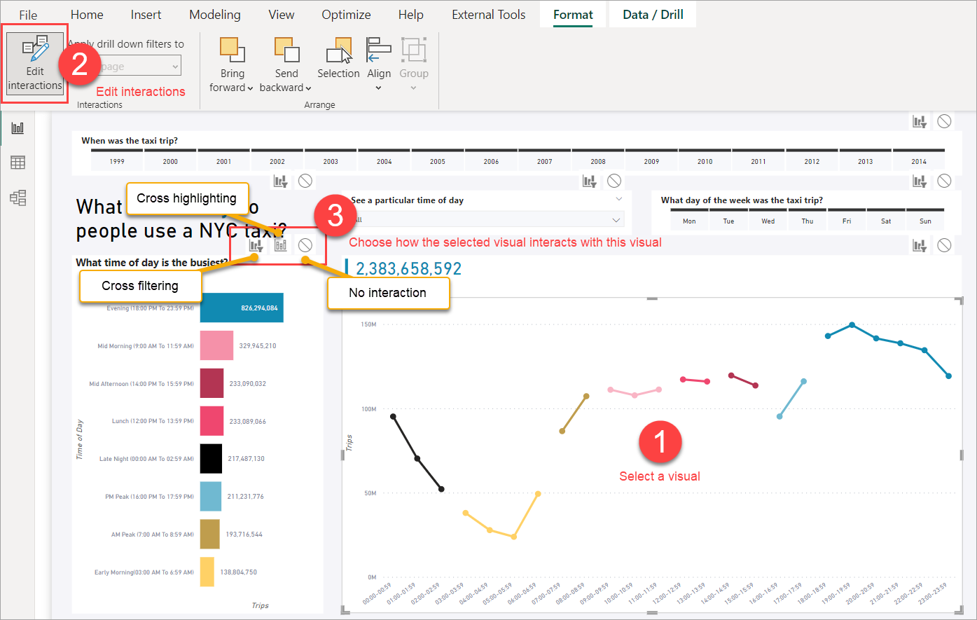
Optimization presets only turn off default cross-highlighting and cross-filtering, so any customization done at the visual level with Edit interactions isn't impacted. If we select any visual (1) to show the Format ribbon, and then select Edit interactions(2), options are then shown for other visuals in the report (3). We can then decide how they'll change when a data point is selected in the visual. In this case, from cross-filtering or cross-highlighting to not interacting at all. Let's take a look at the workflow:
If we had customized any of the Edit interactions, the Optimization preset disabling cross-highlighting and cross-filtering by default wouldn't change this customization. Any customized Edit interaction between visuals still works just as they had before.
We then add Apply buttons to the slicers. Every slicer in our report now has an Apply button and users can select or unselect multiple options in each slicer and not have any other visual in the report send a query until the Apply button is selected. The slicers are still independent of each other, so if we have two slicers with Apply buttons, each Apply button has to be selected to apply the slicer selections.
Apply buttons are added to the Filter pane. The Filter pane button added controls to all the filter selections in the pane but with only one Apply button. To learn more, see Format filters in Power BI reports - Apply filters button.
Change query reduction settings
In the Optimize ribbon, we select Optimization presets, and then select Customize to change any of the settings. In our report the slicers are for single select and the Apply buttons are more useful in multiple select, so we can keep the other settings and return the slicers to instantly apply with Customize.
Revert to instantly apply slicers

Revert to full interactivity after a data source change
In the Optimize ribbon, we select Optimization presets, and then select Interactivity for our report. These are the default settings in Power BI Desktop, so if we've chosen Query reduction or Customized to change the Optimization presets, this is how we return to the default. The dialogue confirms our settings.
Setting the Interactivity optimization preset.

In this case, we're calling out DirectQuery reporting scenarios specifically, but they can be used in other reporting scenarios.
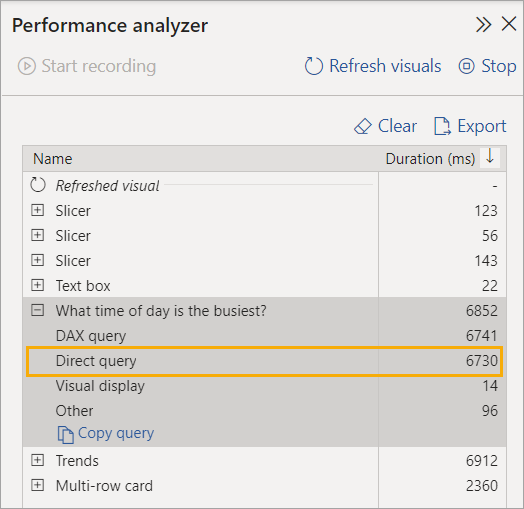
For a specific visual, we can determine if it’s using DirectQuery by using Performance analyzer to see if there's a Direct query row . You can see here, DirectQuery is used to return data for our visual:
Community
You've seen with these scenarios how you can streamline your authoring experience in Power BI Desktop with the Optimize ribbon and relationship editing in the properties pane. Be sure to give them a try with your own DirectQuery reports.
Want to learn more, or maybe have your own scenario to share? Power BI has a vibrant community where MVPs, BI pros, and peers share expertise in discussion groups, videos, blogs and more. Be sure to check out Power BI Community.
You can contribute too! With Microsoft Learn, Power BI documentation like this article is open-source. To learn more about how you can contribute, be sure to checkout the Microsoft Learn documentations contributors guide.