Note
Access to this page requires authorization. You can try signing in or changing directories.
Access to this page requires authorization. You can try changing directories.
APPLIES TO: ![]() Power BI Desktop
Power BI Desktop ![]() Power BI service
Power BI service
A good way to add meaning to a table or matrix is to add sparklines. Sparklines are tiny charts shown within cells of a table or matrix that make it easy to see and compare trends quickly. Sparklines are currently in preview. You can use them to show trends in a series of values, such as seasonal increases or decreases, economic cycles, or to highlight max and min values.

Video
Watch this video showing how to add sparklines, and then try it yourself.
Note
This video might use earlier versions of Power BI Desktop or the Power BI service.
Add a sparkline
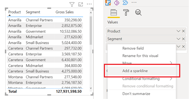
You can add sparklines to both your table and matrix visuals.
Create a table or matrix.
Select the dropdown arrow next to one of the numeric fields, and select Add a sparkline.
In the dialog box, you configure the details of your sparkline. The numeric field you started with is prepopulated for the Y-axis. You can change both the field and Summarization type, if needed. You also need to select a field, typically a date field, to use as the X-axis of the sparkline.
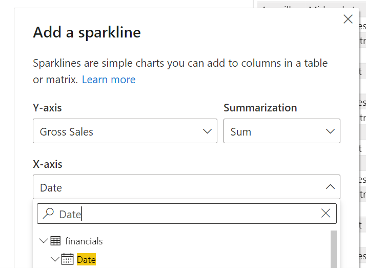
Read more about working with auto date/time fields in Power BI Desktop.
Note
When working with sparklines and calculation groups together, you can decide how a calculation group is applied to the sparkline. You can choose between Individual values (default) and Whole sparkline. See combining sparklines and calculation groups for more info.
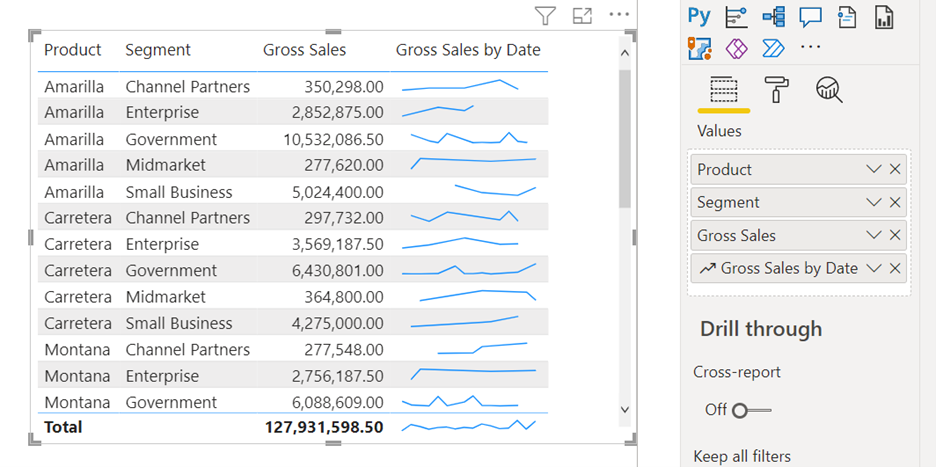
Select Create. The sparkline is automatically added to your table or matrix as a new column.


Combining sparklines and calculation groups
When using calculation groups and sparklines together, you can decide how to apply a calculation group to the sparkline. Two options are available:
- Individual values. This is the default value and applies the calculation group to each individual value on the sparkline.
- Entire sparkline. This applies the calculation group to the entire sparkline as a whole, not to the individual values. Calculation groups that perform arithmetic operations are not supported in this mode.
For example, take a sparkline that shows the Sum of Gross Sales measure by Month Number and a calculation group item that returns the value of the selected measure but only if it is above 1 million, otherwise it returns a blank value, i.e.:
IF( SELECTEDMEASURE() > 1000000, SELECTEDMEASURE(), BLANK() )
The sparkline is configured as:

When the sparkline is set to apply the calculation group to Individual values the Sum of Gross Sales for each Month Number is compared against the threshold of 1 million and if it is above that it, the value is returned, otherwise a blank value is returned. In this scenario, some sparklines might show completely, partially or not at all depending if the individual Gross Sales values met the threshold or not. The image below shows this. A matrix is added to show the individual values so you can confirm the results.

If, conversely, the sparkline is set to Entire sparkline then the Sum of Gross sales for all Months is compared against the threshold and if it is above that, the value is returned, otherwise a blank value is returned. In this scenario, sparklines are either going to show or not at all, depending if the total Gross Sales met the threshold. In the example below we have set the threshold to 3 million. Again a matrix was also added to show that indeed the Sum of Gross Sales for most products was above the threshold, but not for all.

Now, if we change the calculation group item so it performs an arithmetic operation, then sparklines that are configured to apply the calculation group to the entire sparkline (using the Entire sparkline option) will return an error:

Changing the sparkline's configuration to apply the calculation group to the sparkline's individual values will apply the calculation group to the individual values and make the sparklines show again:

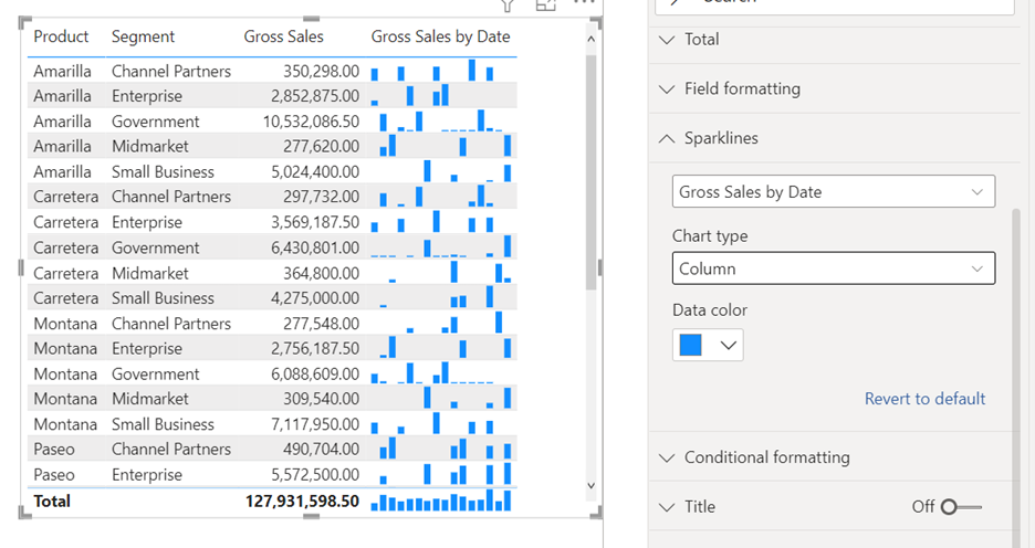
Formatting the sparkline
You can edit the sparkline’s format.
Select the dropdown arrow next to sparkline, and select Edit sparkline.
In the Sparklines card in the Format pane, modify the sparkline line and marker formatting. Change the line color and width, add markers for different value types (highest, first, last, and so on), and change the marker size, color, and shape.
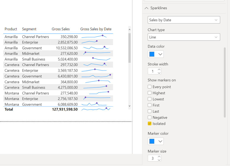
The Format pane is also where you change the chart type from a line to a column chart.


Considerations and limitations
- Power BI supports up to five sparklines per visual, and displays up to 52 points per sparkline.
- For performance reasons, the maximum number of columns in a matrix is also limited to 25 when sparklines are on.
- Sparklines are supported on Azure Analysis Services, but currently not supported on on-premises SQL Server Analysis Services.
- Visuals with sparklines don't support pinning to a dashboard.
- Applying a calculation group that performs an arithmetic operation to the whole sparkline is not supported. Change the sparkline's configuration to Individual values or remove the arithmetic operation in the calculation group.
Related content
More questions? Try the Power BI Community