Note
Access to this page requires authorization. You can try signing in or changing directories.
Access to this page requires authorization. You can try changing directories.
APPLIES TO: ![]() Power BI Desktop
Power BI Desktop ![]() Power BI service
Power BI service
Power BI can automatically generate reports for you. You can use these "quick" reports to explore your data or as starting places for creating your own custom report. We've simplified interacting with these reports to empower everyone to explore their own data.
Explore your initial report
When Power BI first generates your report, we look through your data to identify patterns and distributions and pick a couple of fields to use as starting points for creating the initial set of visuals. The initial fields we pick are selected automatically in the Your Data pane to the right of the report.
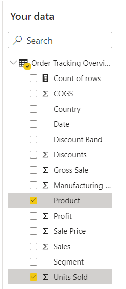
Every visual shown in the report will use one or more of the fields selected in Your Data pane, along with other unselected fields that produce interesting visuals. Every time you load your report, we rerun our visual generation algorithm, so you could potentially get new visuals, even if the same fields are selected.

Just like in normal Power BI reports, you can cross-highlight visuals. You can modify the filters on an individual visual in the Filters pane, but you can't add new filters to visuals or add page or report level filters.

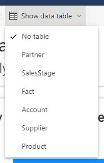
Show data table
You can see the whole data table that the report is based on. Measures aren't currently included in the data table.
Select Show data table to see the entire table you’re visualizing.

Report with a single table
If the report that you’re visualizing is based on a single table, select the Show data table button to reload the report with the entire table shown at the bottom of the report. The button updates to Hide data table. Selecting it reloads the report with the table hidden again.

Report with multiple tables
If the report that you’re visualizing is based on a semantic model with multiple tables, the Show data table button becomes a dropdown menu where you pick the table you want to view.
Modify your report
You can make basic modifications to your autogenerated report.
First, by changing which fields are selected in the Your Data pane, you can give Power BI more hints about which fields are most interesting to you. Every time you add or remove a field, we update the automatically generated visuals. As with the initially created report, all visuals include at least one of the selected fields.
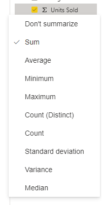
Next, use the right-click context menu for the fields in Your Data to adjust how fields are aggregated in the report. Switch between Sum, Average, Count, and so on.
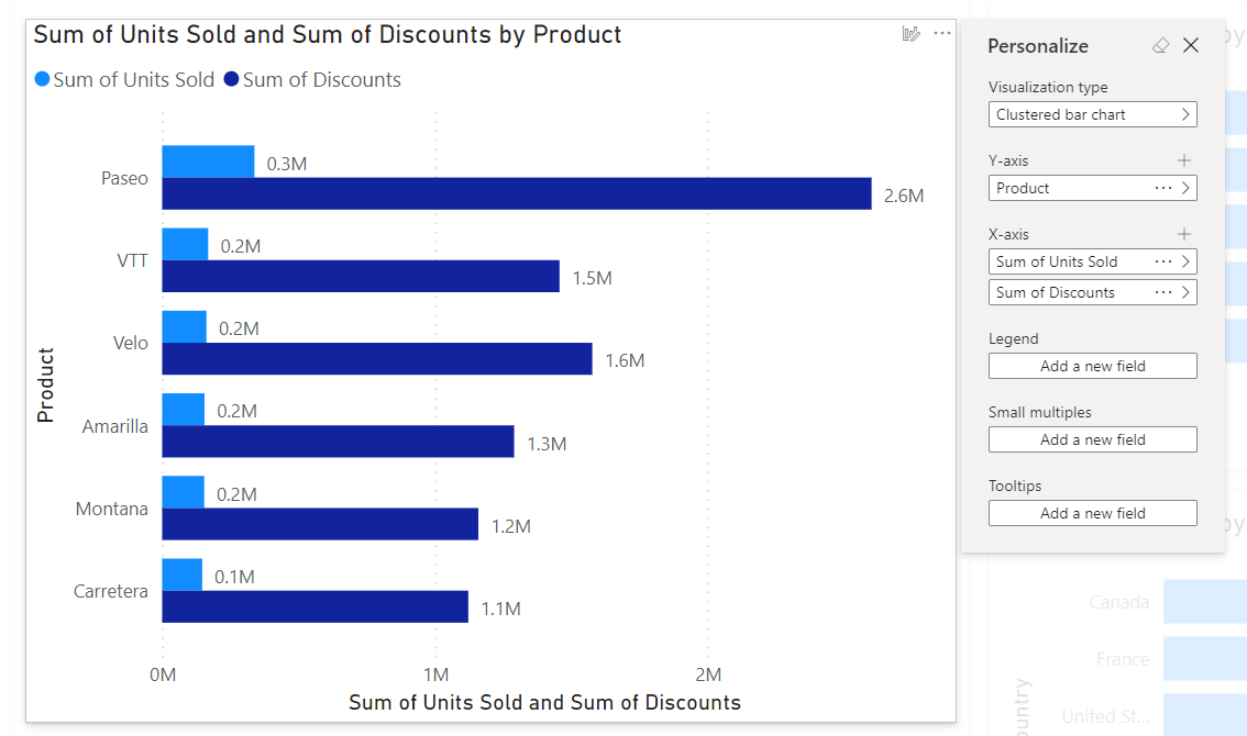
You can also customize individual visuals using the Personalize this visual feature. When you hover over a visual, you see the button to launch the customization experience.
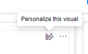
With the Personalize pane open, you can change fields, change how they’re aggregated, and add new fields. After you customize a visual, it doesn’t update anymore as you interact with the Your Data pane.
Save your report
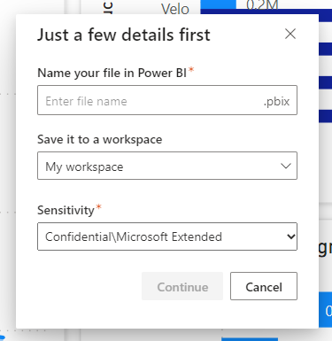
When you save your report, you can name it, pick the workspace it's saved to, and, if your organization requires it, assign it a sensitivity label. You can save to any workspace that you have a Contributor, Member, or Admin role assigned. See Roles in workspaces for details. If you have a free Fabric license, you can save to your personal My Workspace.
After you save this report, it becomes a normal Power BI report. You can share it, package it in an app, subscribe to email updates, or even download the .pbix to make further modifications.
Considerations and limitations
Licenses
You need the same license to create a quick report as you do to create any other report in Power BI. If you have a free Fabric license, you can create in your personal My Workspace. If you have a Power BI Pro license, you can create quick reports in any workspace that you have a Contributor, Member, or Admin role assigned. See Power BI service features by license type for licensing details.
Model limitations
When going through this creation process, you’re creating a model behind the scenes on the web. These web-authored models are similar to the ones created in Power BI Desktop, but do have a few limitations.
| Feature | Status | Details |
|---|---|---|
| Application lifecycle management (ALM) | Not currently supported | ALM doesn't work for web-authored semantic models. |
| Template apps | Not currently supported | You can't create template apps from workspaces with web-authored semantic models. |
Related content
- Reports in Power BI
- Create auto-generated "quick" reports in the Power BI service
- Create a report quickly from a SharePoint list in the Power BI service
- Create a report quickly from Dynamics 365
- More questions? Try the Power BI Community