Create matrix visualizations in Power BI Desktop

APPLIES TO: Power BI Desktop Power BI service

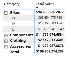
The matrix visual is similar to a table. A table supports two dimensions and the data is flat, meaning duplicate values are displayed and not aggregated. A matrix makes it easier to display data meaningfully across multiple dimensions--it supports a stepped layout. The matrix automatically aggregates the data and enables you to drill down.

You can create matrix visuals in Power BI reports and cross-highlight elements within the matrix with other visuals on that report page. For example, you can select rows, columns, and even individual cells and cross-highlight. Also, individual cells and multiple cell selections can be copied and pasted into other applications.

Screenshot that shows a matrix and a donut chart. Several matrix rows are selected, and the corresponding sections of the donut are highlighted.

There are many features associated with the matrix, and we describe them in the following sections of this article.

Note

Sharing your report with a Power BI colleague requires that you both have individual Power BI Pro licenses or that the report is saved in Premium capacity.

Understanding how Power BI calculates totals

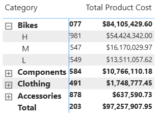
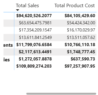
Before jumping into how to use the matrix visual, it's important to learn how Power BI calculates total and subtotal values in tables and matrices. For total and subtotal rows, Power BI evaluates the measure over all rows in the underlying data – it isn't just a simple addition of the values in the visible or displayed rows. This means you can end up with different values in the total row than you might expect.

Take a look at the following matrix visuals.

Screenshot of matrix visuals. The total in the third matrix is taken over underlying data in another matrix, not visible values in the third matrix.

In this example, each row in the matrix visual farthest to the right is showing the Amount for each salesperson/date combination. However, since a salesperson shows up against multiple dates, the numbers can appear more than once. Thus, the accurate total from the underlying data, and a simple addition of the visible values, don't equate. This mismatch is a common pattern when the value you’re summing is on the one side of a one-to-many relationship.

When you look at totals and subtotals, remember that those values are based on the underlying data. They aren't solely based on the visible values.

Expanding and collapsing row headers

There are two ways you can expand row headers. The first is through the right-click menu. You have options to expand the specific row header you selected, the entire level, or everything down to the last level of the hierarchy. You have similar options for collapsing row headers as well.

Screenshot of a matrix visual. The shortcut menu of a row header is visible, with various expansions options available.

You can also add +/- buttons to the row headers through the formatting pane under the Row headers card. By default, the icons match the formatting of the row header, but you can customize the icons’ colors and sizes separately if you want.

Once the icons are turned on, they work similar to PivotTable icons in Excel.

Screenshot of a matrix visual. A plus sign icon is visible next to each row header.

The expansion state of the matrix is saved with your report. A matrix can be pinned to a dashboard expanded or collapsed. When that dashboard tile is selected, and the report opens, the expansion state can still be changed in the report.

Screenshot of a matrix visual. Some Sales Stage rows are expanded, with Opportunity Size rows visible beneath them.

Note

If you're building a report on top of an Analysis Services multidimensional model, there are some special considerations for expand/collapse if the model uses the Default Member feature. For more information, see Work with multidimensional models in Power BI.

Using drill-down actions with the matrix visual

With the matrix visual, you can do all sorts of interesting drill-down activities that weren't available before. These activities include the ability to drill down using rows, columns, and even into individual sections and cells. Let's take a look at how each of these works.

Drill down on row headers

In the Visualizations pane, when you add multiple fields to the Rows section of the Fields well, you enable drill-down actions on the rows of the matrix visual. This is similar to creating a hierarchy, which then allows you to drill down (and then back up) through that hierarchy, and analyze the data at each level.

In the following image, the Rows section contains Sales stage and Opportunity size, creating a grouping (or hierarchy) in the rows that we can drill to see details.

Screenshot of the Visualizations and Fields panes. The Rows section of Visualizations has Sale Stage and Opportunity Size fields and is called out.

When the visual has a grouping created in the Rows section, the visual itself displays the drill and expand icons in a top corner of the visual.

Screenshot of a matrix visual. The drill and expand icons are called out.

Similar to the drill and expand behavior in other visuals, selecting those buttons lets us drill down (or back up) through the hierarchy. In this case, we can drill down from Sales stage to Opportunity size, as shown in the following image, where the drill down one level icon (the pitchfork) is selected.

Screenshot of a matrix visual. All rows are expanded. The pitchfork icon appears dimmed and is called out.

In addition to using those icons, you can select any of those row headers and drill down by choosing from the menu that appears.

Screenshot of a matrix visual. No rows are expanded. A row shortcut menu is visible, with the Expand item called out.

Notice there are a few options from the menu that appears, which generate different results:

Selecting Drill Down expands the matrix for that row level, excluding all other row headings except the row header that was selected. In the following image, Proposal > Drill Down was selected. Notice that other top-level rows no longer appear in the matrix. This way to drill is a useful feature, and becomes especially cool when we get to the cross-highlighting section.

Screenshot of a matrix visual. The Proposal row header is expanded, with three Opportunity Size rows visible beneath it.

Select the Drill up icon to get back to the previous top-level view. If you then select Proposal > Show Next Level, you get an ascending listing of all the next-level items (in this case, the Opportunity size field), without the higher-level hierarchy categorization.

Screenshot of a matrix visual. Opportunity Size rows are visible, but no Sales Stage rows are visible.

Select the Drill up icon in the upper corner to have the matrix show all top-level categories, then select Proposal > Expand to next level, to see all the values for both levels of the hierarchy - Sales stage and Opportunity size.

Screenshot of an expanded matrix visual with all Sales Stage and Opportunity Size rows visible.

You can also use the Expand menu item to control the display further. For example, select the Drill up icon. Then select Proposal > Expand > Selection. Power BI displays one total row for each Sales stage and all the Opportunity size options for Proposal.

Screenshot of a matrix visual. No Sales Stage rows are expanded except for the Proposal row, which has three Opportunity Size rows visible beneath it.

Drill down on column headers

Similar to the ability to drill down on rows, you can also drill down on columns. In the following image, there are two fields in the Columns field well, creating a hierarchy similar to what we used for the rows earlier in this article. In the Columns field well, we have Region and Segment. As soon as the second field was added to Columns, a new dropdown menu (Drill on) is displayed on the visual, it currently shows Rows.

Screenshot of a matrix visual and the Visualizations pane, with two fields in the Columns section. A drop-down list in the matrix is labeled Drill on.

To drill down on columns, select Columns from the Drill on menu that can be found next to the drill and expand icons. Select the East region and choose Drill Down.

Screenshot of a matrix visual. The Drill on list and the East region are called out. In the East shortcut menu, Drill down is also called out.

When you select Drill Down, the next level of the column hierarchy for Region > East displays, which in this case is Opportunity count. The other region is hidden.

Screenshot of a matrix visual. For each Sales Stage, Opportunity Count and Revenue data is visible only for the East region.

The rest of the menu items work on columns in the same way they do for rows (see the previous section, Drill down on row headers). You can Show Next Level and Expand to next level with columns just as you can with rows.

Note

The drill-down and drill-up icons apply to rows, and you can drill-up on columns when they're selected. In order to drill down on columns, you must use the right-click menu.

Stepped layout with matrix visuals

The matrix visual automatically indents subcategories in a hierarchy beneath each parent, called a stepped layout.

In the original version of the matrix visual, subcategories were shown in an entirely different column, taking up more space in the visual. The following image shows the table in an original matrix visual; notice the subcategories in a separate column.

Screenshot of a matrix visual. Instead of being nested under each Sales Stage row, the Opportunity Size subcategory rows appear in a separate column.

In the following image, you see a matrix visual, with stepped layout in action. Notice the category Qualify has its subcategories (Small, Medium, and Large) slightly indented, providing a cleaner and much more condensed visual.

Screenshot of a matrix visual. The Qualify Sales Stage row has three Opportunity Size rows nested under it and is called out.

You can easily adjust the stepped layout settings. With the matrix visual selected, in the Format section (the paintbrush icon) of the Visualizations pane, expand the row headers section. You have two options: the Stepped layout toggle (which turns it on or off), and the Stepped layout indentation (which specifies the indentation amount, in pixels).

Screenshot of the Format section of the Visualizations pane. Under Row headers, Stepped layout is turned on with the Stepped layout indentation at 10.

If you turn off stepped layout, Power BI shows the subcategories in another column rather than indented beneath the parent category.

Subtotals and grand totals with matrix visuals

You can turn subtotals on or off in matrix visuals, for both rows and columns. In the following image, you can see that the row subtotals are set to On and set to display at the bottom.

Screenshot of a matrix visual. Under each set of expanded Sales Stage rows, a subtotal row is visible, with the total for that Sales Stage value.

When you turn on Row subtotals and add a label, Power BI also adds a row, and the same label, for the grand total value. To format your grand total, select the format option for Row grand total.

Screenshot of the Row grand total section of the Format pane. Controls are visible for setting the font and color of values and labels.

If you want to turn off subtotals and the grand total, in the format section of the visualizations pane, expand the Row subtotals card. Turn the row subtotals slider to Off. When you do so, the subtotals aren't shown.

Screenshot of a matrix visual. All rows are expanded, and no totals are visible.

The same process applies for column subtotals.

Add conditional icons

Add visual cues to your table or matrix with conditional icons.

In the format section of the Visualizations pane, expand the Cell elements card. Turn the Icons slider to On and select the definitions icon.

Screenshot of the Cell elements card in the Visualizations pane, with the Icons slider on. A dialog has controls for icon formats and conditions.

Adjust the conditions, icons, and colors for your matrix and select OK. In this example, we used a red flag for low values, purple circle for high values, and yellow triangle for everything in between.

Screenshot of a matrix visual, with flags in cells with low values, triangles in cells with medium values, and circles in cells with high values.

Cross-highlighting with matrix visuals

With the matrix visual, you can select any elements in the matrix as the basis for cross-highlighting. Select a column in a matrix and Power BI highlights the column, as does any other visuals on the report page. This type of cross-highlighting is a common feature of other visuals and data point selections, so now the matrix visual offers the same function.

In addition, using Ctrl+Click also works for cross-highlighting. For example, in the following image, a collection of subcategories were selected from the matrix visual. Notice how items that weren't selected from the visual are grayed out, and how the other visuals on the page reflect the selections made in the matrix visual.

Screenshot of a matrix, donut chart, and bar chart. Several matrix rows are selected. Corresponding sections of the donut and bars are highlighted.

Copying values from Power BI for use in other applications

Your matrix or table might have content that you'd like to use in other applications: Dynamics CRM, Excel, and other Power BI reports. With the Power BI right-click, you can copy a single cell or a selection of cells onto your clipboard. Then, paste them into the other application.

  • To copy the value of a single cell, select the cell, right-click, and choose Copy value. With the unformatted cell value on your clipboard, you can now paste it into another application.

    Screenshot of a matrix visual. A cell shortcut menu is visible. Under Copy, the Copy Value option is called out.

  • To copy more than a single cell, select a range of cells or use CTRL to select one or more cells. Copy selection ensures that measures are formatted according to the column's formatting rules, unlike the unformatted Copy value command.

    Screenshot of a matrix visual. Three selected rows are called out. In their shortcut menu, Copy selection is called out.

  • The copy includes the column and row headers.

    Screenshot of Excel rows and columns. The cells contain the values that were copied from the matrix.

  • To make a copy of the visual itself containing only your selected cells, select one or more cells using CTRL, right-click, and choose Copy visual.

    Screenshot of a matrix with several cells selected. Their shortcut menu is visible, and Copy visual is called out.

  • If you then use Ctrl+V to paste the data onto the canvas, a copy of the matrix visualization appears, but it contains only your copied data.

    Screenshot of two matrix visuals. The second matrix only contains values that are selected in the first matrix.

Setting a matrix value as a custom URL

If you have a column or measure that contains website URLs, you can use conditional formatting to apply those URLs to fields as active links. This option is under the Cell elements card in the formatting pane.

Screenshot of a matrix visual and the Format section of the Visualizations pane. Under Cell elements, the Web URL label and switch are called out.

Turn Web URL On, and select a field to use as the URL for the column. Once applied, the values in that field (column) become active links. Hover to see the link, and select to jump to that page.

For more information, see Conditional table formatting.

Shading and font colors with matrix visuals

With the matrix visual, you can apply conditional formatting (colors and shading and data bars) to the background of cells within the matrix, and you can apply conditional formatting to the text and values themselves.

To apply conditional formatting, select the matrix visual and open the Format pane. Expand the Cell elements card and for Background color, Font color, or Data bars, turn the slider to On. Turning on one of these options makes its definitions icon available. When you select that icon, you can customize the colors and values for the color formatting.

Screenshot of a matrix visual and the Format section of the Visualizations pane. Under Cell elements, the Data bars switch and label are called out.

Select a definitions icon to display a dialog that you can use to make adjustments. This example shows the dialog for Data bars.

Screenshot of the Data bars dialog. Controls are available for configuring bar color, direction, axis, and minimum and maximum values.

Ragged hierarchy

A ragged hierarchy has levels with no data. A good example is a company employee matrix. A company has many levels, from CEO on down. The CEO is the highest level in the hierarchy and reports to no other employees. Any other company employee, on the other hand, might report to a chain of managers who report to a vice-president who reports to the CEO. Depending on their level in the hierarchy and the way their department is organized, employees might have data for one, two, five, or 10 levels in the hierarchy. And, for any given employee, there might be no data for particular hierarchy levels.

Screenshot of a matrix visual. Values are missing from several cells.

There's currently no way to hide blank rows or identical parent and child values. And you can’t control which levels of the hierarchy can and can’t be expanded. However, there are a few steps you can take to make the visual look more appealing.

  • Turn off stepped layout. In the Format pane, expand the Row headers card. Then open the Options section of the card, and set the Stepped layout toggle to Off. All the blank values for a hierarchy level now display in the same row.

    Screenshot of the Format section of the Visualizations pane. Under Options in the Row headers section, Stepped layout is turned off and called out.

  • Turn off subtotals for the matrix rows and columns. In the Format pane, set the Row subtotals slider and the Column subtotals slider to Off.

    Screenshot of the Format section of the Visualizations pane. Column subtotals and Row subtotals are turned off, and their cards are called out.

Considerations and troubleshooting

  • If the text data in your matrix's cells or headers contain new line characters, those characters are ignored unless you toggle on the 'Word Wrap' option in the element's associated formatting pane card.

  • The matrix visual displays a maximum of 100 columns.