Note
Access to this page requires authorization. You can try signing in or changing directories.
Access to this page requires authorization. You can try changing directories.
APPLIES TO:
Power BI Desktop
Power BI service
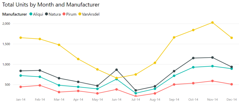
A line chart is a series of data points that are represented by dots and connected by straight lines. A line chart can have one or many lines. Line charts have an x and a y axis. Here's an example:
Prerequisites
This tutorial uses the Sales and Marketing Sample to create a line chart that displays sales by category.
Download the sample PBIX file to your desktop.
In Power BI Desktop, select File > Open report.
Browse to and select the Sales and Marketing Sample PBIX file, and then select Open.
The Sales and Marketing Sample PBIX file opens in report view.
At the bottom, select the green plus symbol
 to add a new page to the report.
Note
If you want to share your report with a colleague, you both need to have individual Power BI Pro licenses or the report needs to be saved in Premium capacity.
Create a line chart
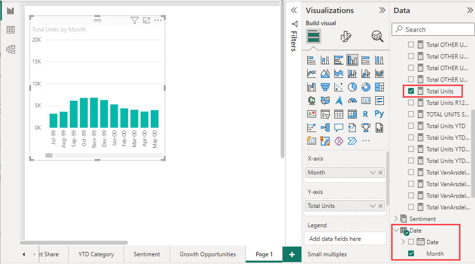
In the Data pane, expand SalesFact and select the checkbox next to Total units. Then expand Date and select the checkbox next to Month. Power BI creates a column chart on your report canvas:
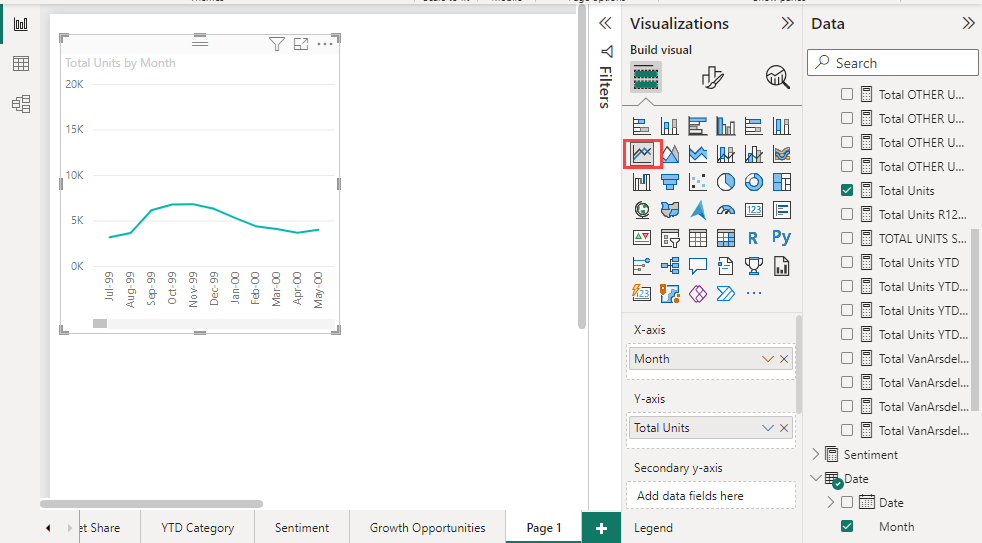
Convert the chart to a line chart by selecting the Line chart icon in the Visualizations pane:
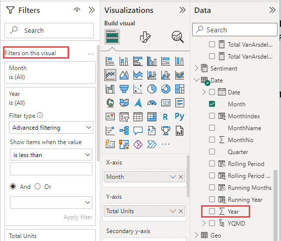
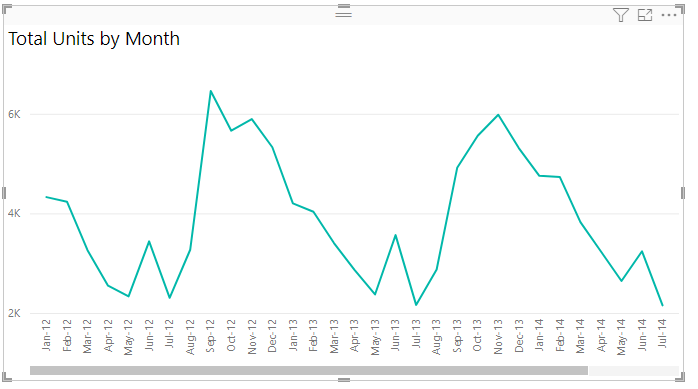
Filter your line chart to show data for the years 2012-2014. If the Filters pane is collapsed, expand it. Drag the Year field from the Data pane to the Filters pane. Drop it under the heading Filters on this visual:
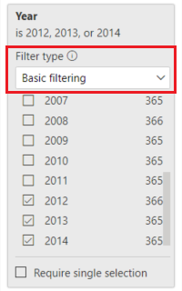
Change Advanced filtering to Basic filtering and then select 2012, 2013, and 2014.
Optionally, adjust the size and color of the chart's title.
Add lines to the chart
Line charts can display multiple lines. In some cases, the values on the lines are so different that the lines don't display well together. In this section, you add lines to the chart and learn how to format the chart when the values represented by the lines are different enough to cause display problems.
Add lines
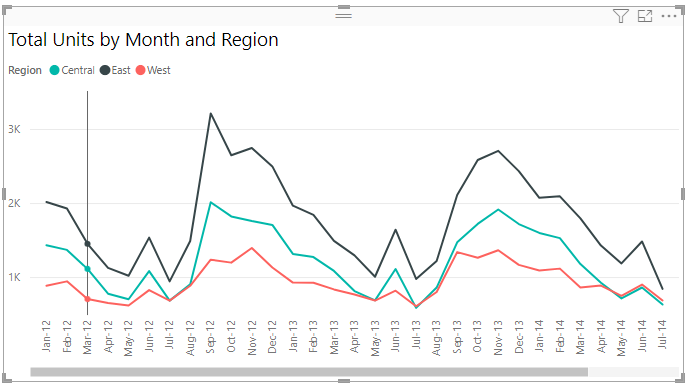
Instead of looking at total units for all regions as a single line on the chart, you can split out total units by region. Add lines by dragging Geo > Region to the chart. Here's what it looks like after you add lines:
Use two y axes
What if you want to look at total sales and total units on the same chart? Sales numbers are much higher than unit numbers, so the chart becomes unusable. In fact, the red line for total units appears to be at zero:
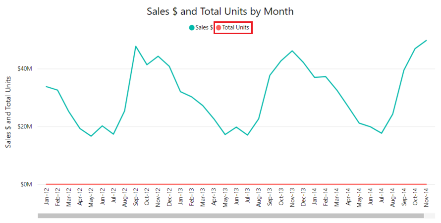
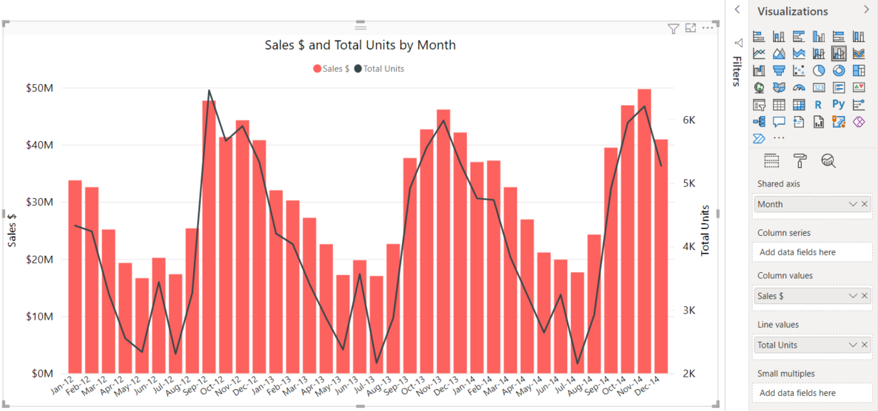
To display highly diverging values on one chart, you can use a combo chart. For more information, see Combo charts in Power BI. In the following example, a second y axis is added so we can show sales and total units together on one chart. The new axis is on the right side of the chart.
Highlighting and cross-filtering
For information about using the Filters pane, see Add a filter to a report.
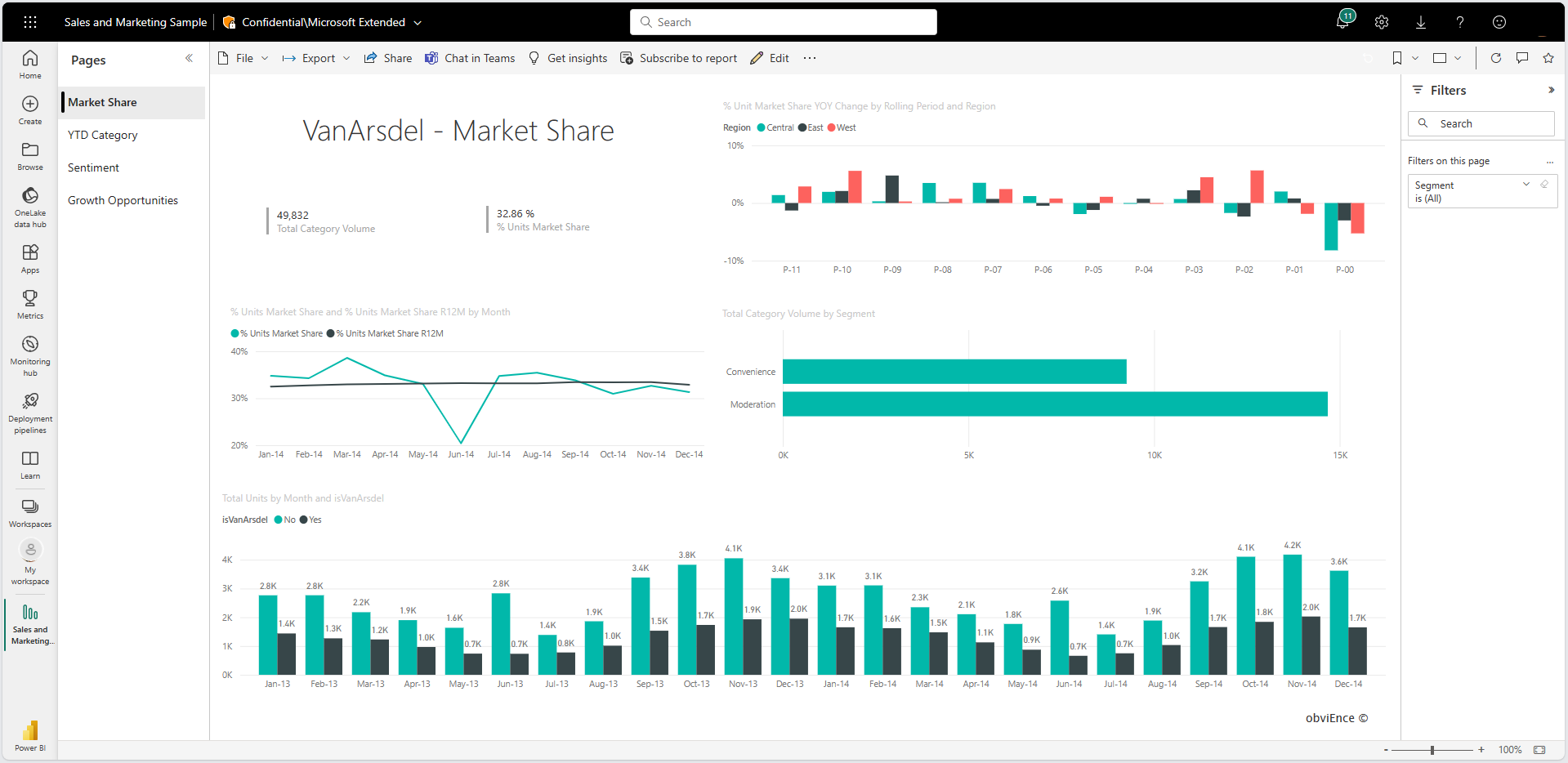
Selecting a data point on a line chart cross-highlights and cross-filters the other visualizations on the report page, and vice versa. To see an example, start by selecting the Market Share tab.
On a line chart, a single data point is the intersection of a point on the x axis and the y axis. When you select a data point, Power BI adds markers that indicate which point (for a single line) or points (if there are two or more lines) are the source for the cross-highlighting and cross-filtering of the other visuals on the report page. If your visual is complex, Power BI selects the closest point to the location you select on the visual.
In the following example, we selected a data point that corresponds to:
- July 2014
- % Units Market Share of 34.74
- % Units Market Share R12M of 33.16
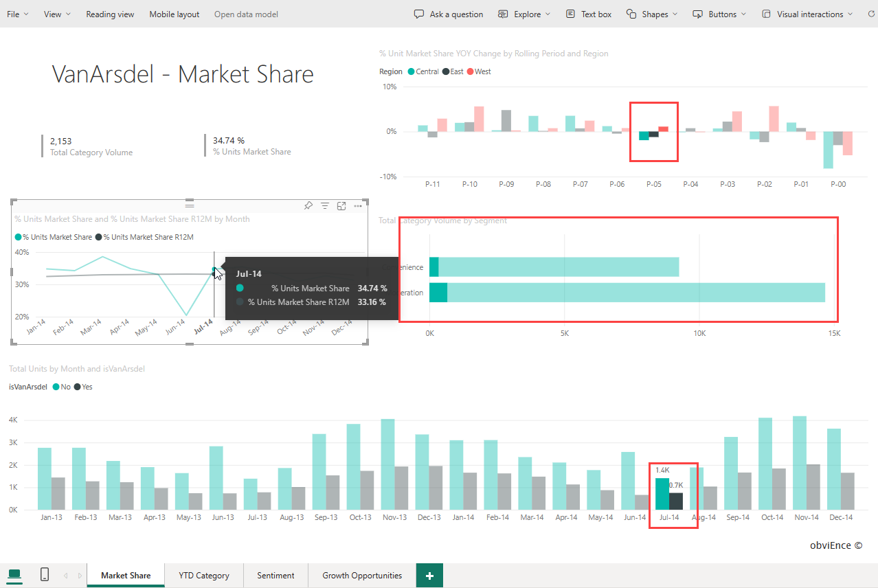
Notice how the column charts at the top and bottom are cross-highlighted, and the chart in the middle is cross-filtered.
For more information, see Filters and highlighting in Power BI reports.
Considerations and troubleshooting
- One line chart can't have dual y axes. You need to use a combo chart if you want two y axes.
- In the preceding examples, you can see charts that are formatted with increased font sizes, changed font colors, added axis titles, centered chart titles and legends, axes that start at zero, and more. The Visualizations > Format pane, which you get to by selecting the image that shows a paint brush (
 ), provides many options for making your charts look the way you want them to. The best way to learn about them is to open the Format pane and explore.
