Note
Access to this page requires authorization. You can try signing in or changing directories.
Access to this page requires authorization. You can try changing directories.
APPLIES TO:  Power BI Desktop
Power BI service
Power BI Desktop
Power BI service
The card visual in Power BI is a versatile tool for presenting summary measures in a visually appealing format. Each card can display a specific measure, such as total sales or profit growth, and you can customize it to reflect your objectives and key results (OKRs). This flexibility allows you to group multiple cards within a single visual, format them to match your report, and share a comprehensive overview in each card.
Combining multiple measures and reference labels in one visual improves the report performance by reducing visual load time and optimizing underlying queries to the semantic model.
Note
The (new) card visual became generally available as the card visual with the November 2025 Power BI release. Reports with the legacy card visual continue to use the legacy card visual.
Prerequisites
In the following guide, you use the Retail Analysis Sample file. Use the steps for your environment:
Important
Always make sure you have the latest version of Power BI Desktop installed before proceeding.
- Launch Power BI Desktop.
- From the left-side navigation pane, select Open, or select File > Open from the menu.
- Locate and select your copy of the Retail Analysis Sample PBIX. The file opens in report view.
Note
To share content (or for a colleague without edit rights to view content outside your personal My workspace) both users need either a Power BI Pro or Premium Per User (PPU) license, OR the content must reside in a workspace on a capacity (Fabric F64+ or Power BI Premium (P)). PPU workspaces behave like capacity for feature availability. Free users can only consume content that lives on a capacity.
Create a card visual
You can create a card visual in several ways:
- Start from the Visualizations pane and select the card visual icon.
- Expand the Data pane, select the necessary data fields, then select the card visual icon from the Visualizations pane.
- In Power BI Desktop, you can also start from the Insert ribbon, select New visual, then select the card visual icon from the Visualizations pane.
For this article, use the first option:
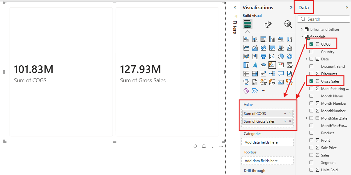
From the Visualizations pane, make sure the Build visual tab is selected, then select the card visual icon in the visual gallery.
Use the Data pane to add data to the visual. You can add data by selecting each field in the Data pane, dragging the fields to the field wells on the Visualizations pane, or dragging the fields directly to the visual placeholder on the report canvas. Expand the Sales group, then drag StoreCount and TotalSalesLY to the Value field well. You see that each data field you added is displayed as its own card.
To customize your visual, select the Format visual icon in the Visualizations pane. You can access all available settings under the Visual and General tabs. This access allows you to tailor the chart's appearance and functionality to your specific requirements.

You successfully created a card visual with Power BI. Now that you understand how to build a card visual, let's explore some of the other key features that this visual offers.
Customize the card visual layout
Let's dive into layout features that make your visuals more organized and visually appealing. Under the Visual tab, you can find different parts of the card visual to customize. The Multicategory layout formats the organization of the category headers (such as Canada, Germany). The Multicard layout customizes the layout of the cards within each category. Each card can have three sections: callout, hero image, and reference label. To understand the difference between callouts and hero images, see the Add an image section. Reference labels layout controls how the reference labels are organized.
Within each of these parts of the card, you can further customize the look and feel including gaps, padding, backgrounds, and more.

Add an image
The card visual in Power BI lets you create visually appealing cards that combine metrics with two image options for better context and branding:
- Callout: A value, label, or image that provides subtle enhancements that work well for branding elements or small visual cues without overwhelming the metric display.
- Hero image: A large, prominent image that can showcase product photos, campaign graphics, or branded imagery directly within the card.
To add images to your card visual:
- Add a hero image: With the card visual selected, select the Format visual icon in the Visualizations pane. Under the Visual tab, expand the Image card. Select your card in the Cards dropdown, and then set the Image toggle to on.
- Add a callout image: From the Visualizations pane, select the Format visual icon. Under the Visual tab, expand the Callout card. Ensure your card is selected in the Apply settings, expand the Image controls, and then set the Image toggle to on.
For both image types, you can add it by uploading from your local device, pasting an image URL, or selecting an image from a data column. You can also customize the fit of the image and choose different image effects to enhance its appearance.

Apply enhanced formatting customizations
The card visual introduces a dynamic collage layout, letting you highlight one section while the other two share the remaining space. You can also customize the display order of the callout, reference label, and hero image and give them each different background colors.

Considerations and limitations
Frequently asked questions for cards used in reports during preview
Why is the column setting reset to 5 or row setting reset to 3 when I had it previously set to a different number?
During preview, you could set a column or row number for a grid, vertical, or horizontal arrangement of cards. After the November 2025 release, only the grid arrangement setting is kept. Vertical and horizontal arrangements reset to 5 columns and 3 rows on existing reports, including published reports. Scrollbars may appear in your existing card visuals to accommodate these settings. Only reports published or created with the card visual during preview are impacted.
To return your cards to the previous column and row number, update these settings in the November 2025 Power BI Desktop and publish the report or edit the report in the web.
Why do the cards take up more space?
During preview, the default settings had less padding in the cards. After the November 2025 release, more padding and padding options were added to the card. The new default is 12px.
To find and adjust these settings, search for “Padding” in the format pane and adjust as needed. In some cases, toggling on individual padding can restore previous padding settings.
Padding can be set in a custom theme file or added to your own custom theme file to apply them to all cards in your report.
{
  "$schema": "https://raw.githubusercontent.com/microsoft/powerbi-desktop-samples/main/Report%20Theme%20JSON%20Schema/reportThemeSchema-2.149.json",
  "name": "CardVisualGA",
  "visualStyles": {
    "cardVisual": {
      "*": {
        "*": [{
            "$id": "default",
            "paddingUniform": 0
        }]
      }
    }
  }
}
See the Power BI report themes documentation or more information.
Why is there a reference label area on cards without a reference label?
During preview, the reference labels were part of the callout area when the divider was turned off. After November 2025, the reference labels have their own area. Once an area is used in at least one card, the other cards keep that area available to maintain consistency across cards.
Why is the reference label obscuring the text in the callout?
During preview, the reference labels were part of the callout area. After November 2025, the reference labels have their own area. They also now take up 50% of the card by default.
To adjust the card area sizes, go to Cards, make sure the Apply setting to control is set to All, then in Layout adjust the Callout size %.
Why is there a background color added to the card reference label?
During preview, the background color only showed when the reference label had a divider. The divider gave the reference labels their own area in the card to then apply a background to. After the November 2025 release, reference labels always have their own area with or without a divider, and a default background is used.
The background can be turned off by going to reference labels layout > background in the format pane and toggling off the setting.
This setting can be set in a custom theme file or added to your own custom theme file to apply them to all cards in your report.
{
  "$schema": "https://raw.githubusercontent.com/microsoft/powerbi-desktop-samples/main/Report%20Theme%20JSON%20Schema/reportThemeSchema-2.149.json",
  "name": "CardVisualGA",
  "visualStyles": {
    "cardVisual": {
      "*": {
        "*": [{
            "$id": "default",
            "backgroundTransparency": 100
        }]
      }
    }
  }
}
See the Power BI report themes documentation or more information.
Why can’t I see my image settings in the format pane?
During preview, the callout image was added using the image section of the format pane and showed in the callout area next to the text. After November 2025, those images previously added were kept in the callout area, and their settings move to Callout > Image section in the format pane. Setting the image section of the format pane now adds a new hero image to the card with its own area.
Why is my image now zoomed in?
During preview, the default settings for size of the image had some bugs corrected by the November 2025 update. Depending on your initial settings, the image can look “zoomed in” or different from before.
To fix the image, in the format pane, adjust the Callout > Image settings for image fit to be fit or center, and check the size and image area size controls in the same formatting section. Note this setting is in a new location, and the top-level image section is now for the hero image.
Why is my category header image gone?
Go to Category header settings and turn back on add image. Your image should still be there.
Where did the legacy card and multi-card visuals go?
The legacy single card and multi-card visuals reappear if you go to the three dots in the visualization pane and choose Restore default visuals. In a report having one of these visuals they may show in the unpinned area of the visualization pane, where you generally find custom visuals.
Why does the new card visual in a published report look different than it looks in Desktop?
Differences between Desktop and the service can happen in two scenarios.
You are using a version of Desktop before November 2025, when the card was in preview. When published to the service it was upgraded to be the generally available version of the new card visual. Either update your Power BI Desktop or edit the report in the web after publishing to adjust the style.
You are using November 2025 version of Power BI Desktop, and the update for the generally available card isn't in your service region. Once the service region is updated, the card looks the same. This behavior should only happen in a few regions in late November 2025.
Default behavior changes from public preview
During preview, the card visual's default behavior was different to how it now behaves in general availability. At general availability, we made updates to enhance the layout consistency, visual alignment, and overall user experience.
Callout image alignment: During preview, the callout image aligned was constrained to the callout label text, which may leave part of the callout container empty. Now the image aligns to the callout container.
Background image fit: During preview, the background image could repeat to fill the container. Now the image fit options align with other visual image options of fit, stretch, fill, and center.
Reference label outer padding: During preview, reference labels had an outer padding setting that unintentionally affected the callout area by pushing elements out of place around the divider. Now the outer padding setting is removed from reference labels.
Autogrid columns: During preview, the visuals would leave an empty column to match the specified number of columns. With the addition of autogrid, it arranges cards to fill the visual container based the cards present. This setting can be toggled off to return to previous behavior.
Format settings
- The (new) card visual is generally available as the card visual with the November 2025 Power BI release. If you used the card visual during the public preview phase, you might notice behavior or formatting changes that reflect the improvements in the general availability release.
- The new Card visual includes updated default styling. Newly created cards may look different from legacy cards and from cards created during Public Preview, while existing visuals remain unchanged.
- When formatting the card visual, you might notice that some of the format settings are in a different or new location, or the name of the setting is changed.
- In earlier versions of the card visual, the Callout image was available as part of the Image card. This image is now in the Callout section of the Format pane.
- Certain Layout arrangements might affect existing reports that used the card visual during its public preview phase. This effect is due to updates made to all card components as part of the general availability release, including enhancements to layout, styling, and image handling.
- If you previously relied on the Image card layout, update your visuals accordingly by using the Format pane to access and configure the Callout image settings.
Legacy Card visual
The previous (legacy) Card visual remains available for backward compatibility. Existing reports using the legacy Card visual continue to render without changes. The new Card visual is recommended for new reports. When you select the Card icon in the Visualizations pane, it creates the new Card visual introduced in the November 2025 general availability release. Users who need to maintain legacy behavior should continue using existing legacy Card visuals in their reports.