Note
Access to this page requires authorization. You can try signing in or changing directories.
Access to this page requires authorization. You can try changing directories.
APPLIES TO: ![]() Power BI Desktop
Power BI Desktop ![]() Power BI service
Power BI service
A radial gauge chart uses a circular arc to show how a single value progresses toward a goal or a Key Performance Indicator (KPI). The gauge line (or needle) represents the goal or target value. The shading represents the progress toward the goal. The value inside the arc represents the progress value. Power BI spreads all possible values evenly along the arc, from the minimum (left-most value) to the maximum (right-most value).
The following example shows a radial gauge chart for tracking car sales.
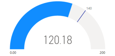
In this example, a car retailer is tracking the sales team's average sales per month. The gauge needle represents the sales goal of 140 cars sold. The minimum sales average is zero and the maximum is 200. The blue shading shows that the team is averaging approximately 120 sales this month. They have one more week to reach the goal.
When to use a radial gauge
Radial gauges are a great choice in many scenarios:
Show progress toward a goal.
Represent a percentile measure, like a KPI.
Show the health of a single measure.
Display information that's easy to scan and understand.
Prerequisites
If you want to share your report with a colleague, you both need to have individual Power BI Pro licenses. If both of you don't have individual Power BI Pro licenses, you need to save the report to a workspace in a Premium capacity to enable sharing. For more information, see sharing reports.
Download the sample data
To follow along with the procedure, download the Financial Sample Excel file. Then you can open it either in Power BI Desktop or in the Power BI service. See the article Download the Financial Sample Excel workbook for Power BI for details.
Create a gauge chart
Let's begin by creating a simple radial gauge chart in Power BI. We can track gross sales by using data from the Financial Sample Excel file.
In Power BI Desktop, select File > Open report.
Browse to and select the Financial Sample Excel file, and then select Open.
The Financial Sample Excel file opens in report view.

At the bottom, select the green plus symbol
 to add a new page to the report.
In the Data pane, expand financials and select the Gross Sales checkbox.
By default, Power BI creates a clustered column chart to display the data. On the Visualizations > Build visual pane, the Y-axis option is aligned to the Gross Sales value. Notice that by default, Power BI uses the sum value for the selected field.
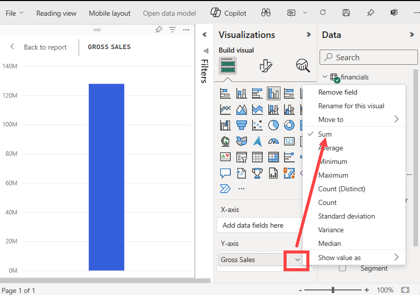
On the Visualizations pane, open the drop-down menu for the Gross Sales value under the Y-axis option and select Average.
This action changes the aggregation for the chart to use the average of gross sales rather than the sum.
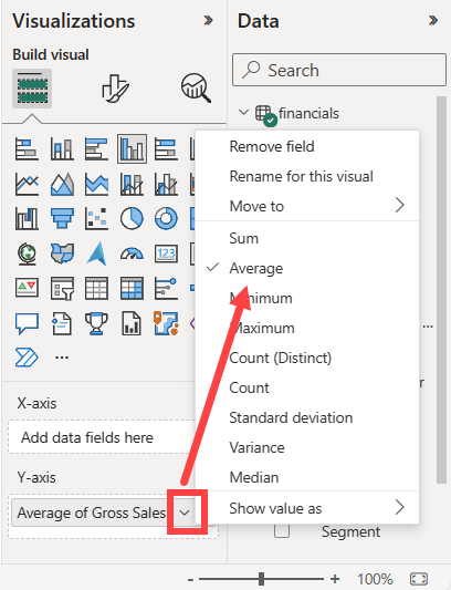
You can convert the clustered column chart visual into a gauge chart.
Select the chart visual, and then select Gauge on the Visualizations pane.
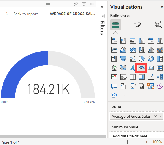
Notice the changes to the Visualizations pane. The Average of Gross Sales value is now listed under the Value option. Several other value options are listed, including the Minimum, Maximum, and Target.
By default, Power BI sets the current value (in this case, Average of Gross Sales) as the halfway point on the gauge. Because the Average of Gross Sales value is $184.21 K, the start point on the gauge (Minimum value) is set to 0. The end point on the gauge (Maximum value) is set to double the current value.
Note
Depending on when you download the Financial Sample Excel file, your chart might show different values.
Add a target value
You can modify the gauge chart to show a target value. This action creates a needle on the gauge chart to identify the target.
On the Data pane, select and drag the COGS field to the Target value option on the Visualizations > Build visual pane.
Power BI changes the chart view to show Average of Gross Sales and COGS (Sum).
On the Visualizations pane under the Value option, open the drop-down menu for the Sum of COGS value and select Average.
By default, Power BI calculates the average of the two values Gross Sales and COGS to determine the target value. Power BI adds a needle to the gauge to represent the target.
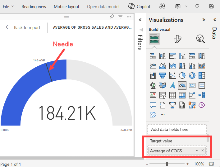
Power BI calculates the target value as $146.65K. The position of the gauge needle shows that the average of the Gross Sales and COGS values exceeds the target.
Note
You can manually specify a target value rather than using the calculation from Power BI. For more information, see the Use manual options to set values section.
Set a maximum value
Power BI uses the Value field on the Visualizations > Build visual pane to automatically set the minimum and maximum values for the gauge. You can rely on the calculations from Power BI or set your own values.
Let's see how you can set the maximum value to the highest gross sales number in your semantic model.
On the Data pane, select and drag the Gross Sales field to the Maximum value option on the Visualizations pane.
On the Visualizations pane under the Maximum value option, open the drop-down menu for the Gross Sales value and select Maximum.
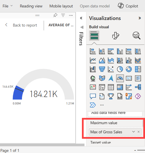
The gauge is redrawn with a new end value of 1.21 million in gross sales.
Save the report.
Use manual options to set values
You can also use manual settings in Power BI to configure the maximum, minimum, and target values for your gauge chart.
On the Visualizations > Build visual pane, remove the Max of Gross Sales value from the Maximum value option.
Select the paint brush icon to open the Format visual section.
Expand the Gauge axis option and enter values for the Min and Max settings. In our example, we set the values to 100,000 and 250,000.
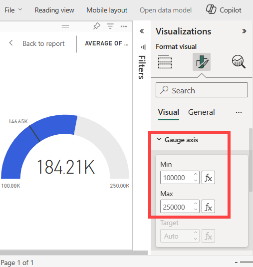
On the Data pane, clear the COGS checkbox to remove the target value.
This action makes the Gauge axis > Target value on the Format pane available for configuration.
On the Visualizations > Format visual pane, enter a Target value for the Gauge axis option. In our example, we set the target value to 200,000.
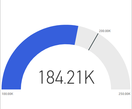
Adjust other formatting option according to your preferences, such as the chart colors and labels, and then save the report.
When you're done, you have a gauge chart similar to the following example:
Related content
- Read about Key Performance Indicator (KPI) visuals.
- Review visualization types in Power BI.
- For other questions, connect with the Microsoft Power BI Community.