Note
Access to this page requires authorization. You can try signing in or changing directories.
Access to this page requires authorization. You can try changing directories.
APPLIES TO: ![]() Power BI Desktop
Power BI Desktop ![]() Power BI service
Power BI service
Treemaps display hierarchical data as a set of nested rectangles. Each level of the hierarchy is represented by a colored rectangle called a branch node. Each branch contains smaller rectangles called leaf nodes. Power BI uses the measure value to determine the rectangle size for branches and leaves.
The rectangles are arranged by size with the largest branch node at the top left and the smallest branch at the bottom right. The arrangement of the leaf nodes within each branch follows the same order.
Consider a scenario where you need to analyze clothing sales data. You want to track product sales by clothing type and manufacturer. The branch nodes can represent the clothing categories: Urban, Rural, Youth, and Mix. The leaves can represent the clothing manufacturer data for products sold in each clothing category. The leaf nodes are sized and shaded based on the number of products sold.
The treemap represents the product sales hierarchy by clothing type and then by manufacturer.
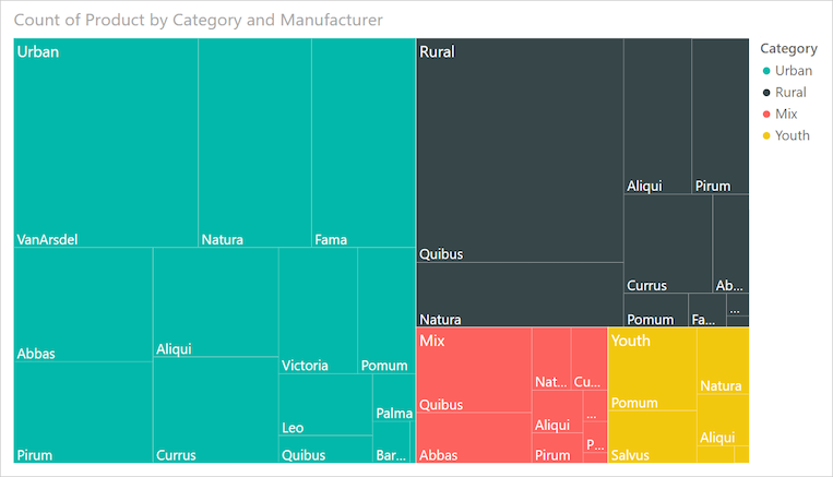
The largest branch node is for Urban clothing and the smallest branch is for Youth. Within each branch, the leaf nodes reveal the popularity of each manufacturer.
Let's look at some details:
Urban clothing has the highest sales and Youth has the lowest.
The most popular manufacturer of Urban clothing is VanArsdel. Natura and Fama are slightly less popular.
There are similar product sales for Mix and Youth clothing.
Across the four clothing types, clothes manufactured by Natura and Aliqui produce the best sales.
Salvus yields fairly strong sales for Youth clothing, but the manufacturer isn't producing noticeable sales in other categories.
You can compare the number of products sold across the clothing categories by comparing the size and shading of each leaf node. Larger and darker-shaded rectangles (nodes) indicate higher value.
When to use a treemap
Treemaps are a great choice for many scenarios:
Display large amounts of hierarchical data.
Present a large number of values that can't be effectively shown with a bar chart.
Illustrate the proportions between each part and the whole.
Reveal the measure distribution pattern across each level of categories in the hierarchy.
Show attributes by using size and color coding.
Identify patterns, outliers, most-important contributors, and exceptions.
Note
If you want to share your report with a colleague, you both need to have individual Power BI Pro or Premium Per User (PPU) licenses. If both parties don't have individual paid licenses, the report needs to be saved in Premium capacity or Fabric F64 or greater capacity to enable sharing. For more information, see sharing reports.
Get the sample
To follow along, download the Retail Analysis sample .pbix file in Power BI Desktop or the Power BI service.
This tutorial uses the Retail Analysis Sample .pbix file.
Download the Retail Analysis Sample PBIX file to your desktop.
In Power BI Desktop, select File > Open report.
Browse to and select the Retail Analysis Sample file, and then select Open.
The Retail Analysis Sample PBIX file opens in report view.

At the bottom, select the green plus symbol
 to add a new page to the report.


Create a basic treemap
The following steps create a report and treemap to display sales over time for different products.
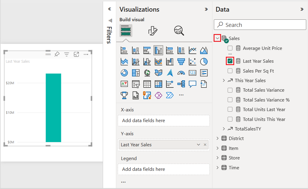
On the Data pane, expand Sales and select the Last Year Sales checkbox. By default, Power BI presents the data as a clustered column chart.
This action configures the Last Year Sales data as the Y-axis for the chart on the Visualizations pane.
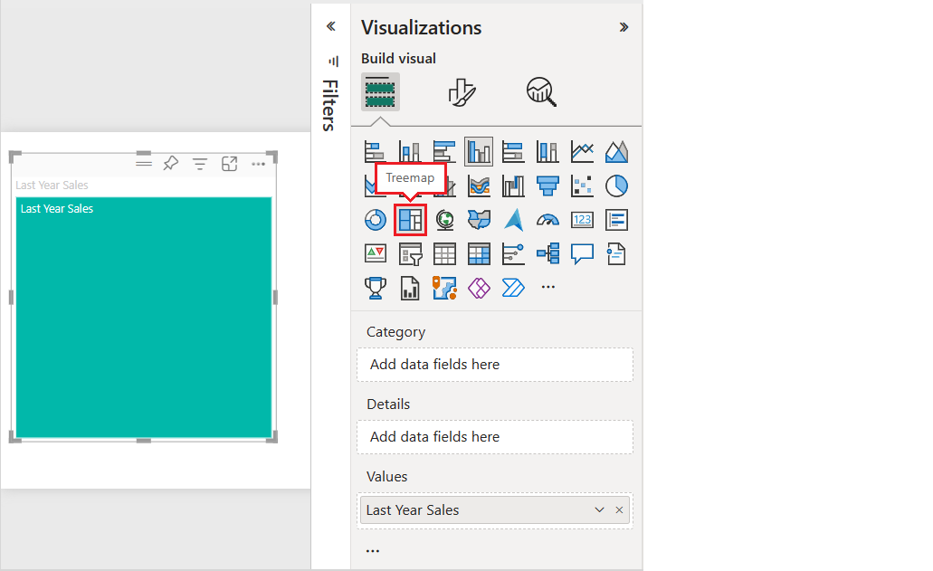
To convert the visualization into a treemap, select Treemap on the Visualizations pane.
This action exposes the Category and Details sections on the Visualizations pane. The Last Year Sales data becomes the Values for the chart on the Visualizations pane.
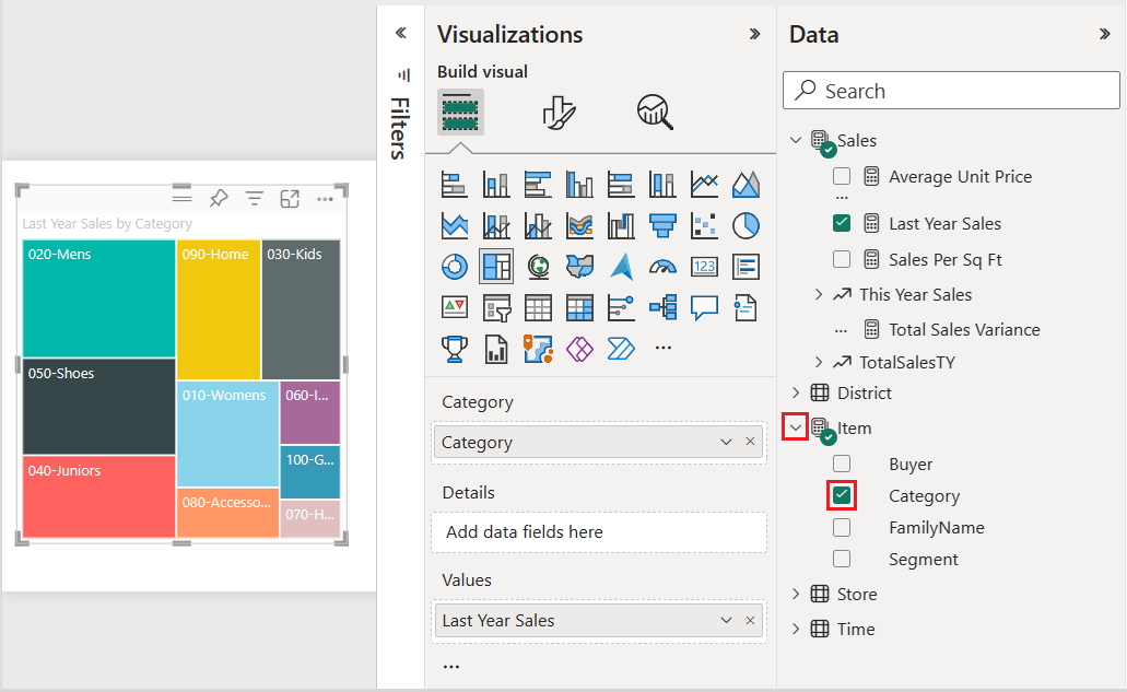
On the Data pane, expand Item and select the Category checkbox.
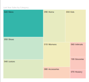
Power BI updates the treemap to show the size of the rectangles based on total sales by product. The rectangle color represents the product category. The hierarchy visually describes the relative size of total sales by product category. The Men's category has the highest sales and the Hosiery category has the lowest.
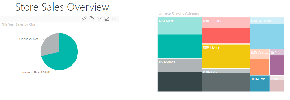
On the Data pane, expand Store and select the Chain checkbox. Chain is added to the Details field. You can now compare last year's sales by category and store chain.
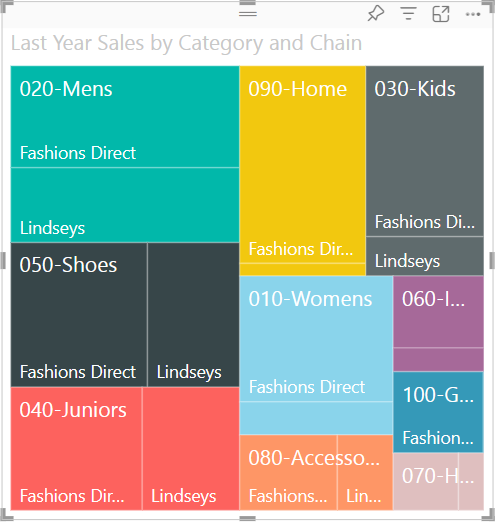
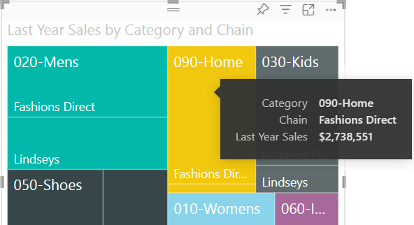
On the treemap, hover over Fashions Direct in the 090-Home rectangle to see the tooltip for Fashion Direct's portion of the Home category.
Use highlighting and cross-filtering
When you highlight a Category or Details item in a treemap, Power BI cross-highlights and cross-filters the other visualizations on the report page.
For this exercise, you need at least one other visual on the report page with the treemap.
Select File > Save to save the report page with the treemap.
At the bottom, right-click the Page 1 tab and rename the tab to Treemap.
Switch to the Overview report page.
Right-click the top menu of the pie chart visual and select Copy > Copy visual.
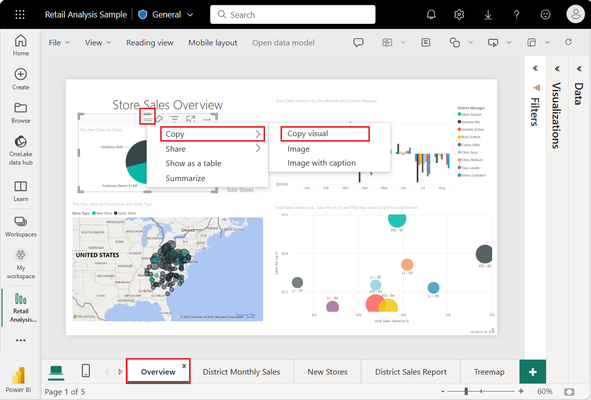
Switch back to your Treemap report page.
Enter CTRL + V and paste the copy of the pie chart visual onto the page.
Select the top of the pie chart and move the visual so all visualizations on the page are fully visible.
Now you're ready to try highlighting and cross-filtering.
Select the treemap to expose the contributing values on the Visualizations and Data panes.
In the treemap, select either a Category or a Chain within a Category.
That action cross-highlights the other visualizations on the page. When you select 050-Shoes, the visualization shows that last year's sales for shoes was $15,658,108. Fashions Direct merchandise accounts for $2,193,016 of the sales.
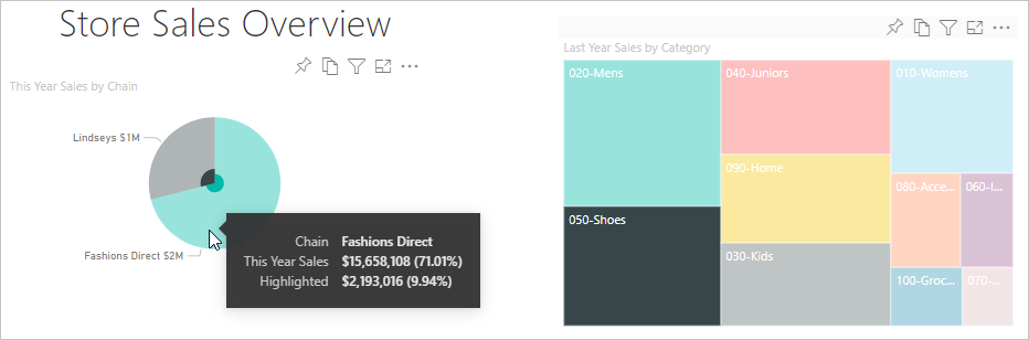
In the pie chart, select the Fashions Direct slice to cross-filter the treemap. Power BI highlights the sales for Fashions Direct in the treemap.
To manage how charts cross-highlight and cross-filter each other, see Change how visuals interact in a Power BI report.
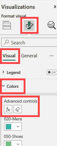
Use conditional formatting
Use conditional formatting to define the colors based on conditions that you set.
Because the Color Saturation and Details features can't be used at the same time, remove Chain from the Details field.
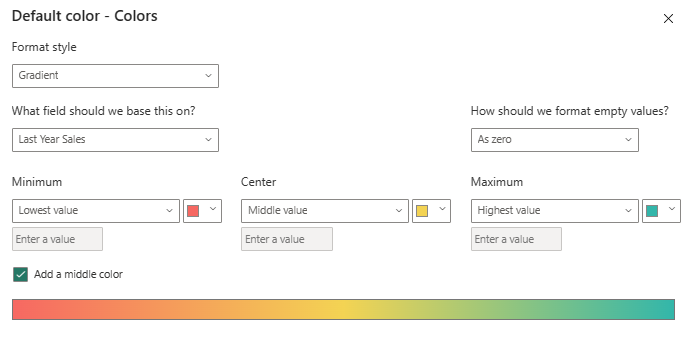
On the Visualizations pane, select the paintbrush icon and choose Visual > Colors > Advanced controls.
Format the treemap by color scale. For detailed instructions on conditional formatting, see Color by color scale.
Considerations and limitations
Keep in mind the following information when working with treemaps in Power BI.
- The Color Saturation and Details features can't be used at the same time.
Related content
- Create waterfall charts in Power BI.
- Review the visualizations overview in Power BI.