Note
Access to this page requires authorization. You can try signing in or changing directories.
Access to this page requires authorization. You can try changing directories.
If the Microsoft Dataverse form used for a basic form has an embedded subgrid, a read-only subgrid will appear on the page and display the corresponding records in a read-only list. A user must have the appropriate table permissions in order to see the list of related records.
To configure list) capabilities such as create, update, delete, and other features on the subgrid on the form, you'll need to create a basic form metadata record.
Add subgrid metadata to your form
To add subgrid metadata to a basic form, go to Basic Form Metadata by using either the top drop-down list or the subgrid on the main form of the record that you're working with. More information: Define basic forms.
To add a new record, select Add New Basic Form Metadata.
To edit an existing record, select the record in the grid. Selecting Subgrid as the Type value displays another attribute, Subgrid Name.
| Name | Description |
|---|---|
| Subgrid Name | The unique name of the subgrid on the table's related form. |
Selecting the subgrid in the form editor will display a properties window. This contains a Name field that should be used to assign to the Subgrid Name field on the Basic Form Metadata record.
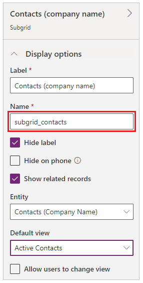
Specifying a valid subgrid name will display the subgrid configuration settings. By default, only Basic Settings are shown. Select Advanced Settings to show more settings.
By default, most settings are shown collapsed to save space. Select **** to expand a section and see additional options. Select **** to collapse the section.
Attributes
| Name | Description |
|---|---|
| Basic Settings | |
| View Actions | Use to add action buttons for actions that are applicable for the table set and will appear above the subgrid. The available actions are:
|
| Item Actions | Use to add action buttons for actions that are applicable for an individual record and will appear in each row in the subgrid, provided the associated privilege has been granted by table permissions. The available actions are:
|
| Override Column Attributes | Use to override display settings for individual columns in the grid.
|
| Advanced Settings | |
| Loading Message | Overrides the default HTML message that appears while the subgrid is loading. |
| Error Message | Overrides the default HTML message that appears when an error occurs while the subgrid is loading. |
| Access Denied Message | Overrides the default HTML message that appears when a user doesn't have sufficient permissions to read the table type associated with the subgrid. |
| Empty Message | Overrides the HTML message that appears when the associated subgrid contains no data. |
| Lookup Dialog | Controls the settings for the dialog box that appears when a user activates the Associate action. |
| Details Form Dialog | Controls the settings for the dialog box that appears when a user activates the Details action. |
| Edit Form Dialog | Controls the settings for the dialog box that appears when a user activates the Edit action. |
| Create Form Dialog | Controls the settings for the dialog box that appears when a user activates the Create action. |
| Delete Dialog | Controls the settings for the dialog box that appears when a user activates the Delete action. |
| Error Dialog | Controls the settings for the dialog box that appears when an error occurs during any action. |
| CSS Class | Specify a CSS class or classes that will be applied to the HTML element that contains the entire subgrid area, including the grid and action buttons. |
| Grid CSS Class | Specify a CSS class or classes that will be applied to the subgrid's HTML <table> element. |
| Grid Column Width Style | Configures whether the Width values in the Override Column Attributes are specified in Pixels or Percent. |
Create action
Enabling a Create action renders a button above the subgrid that, when selected, opens a dialog box with an basic form that allows a user to create a new record.
Create action settings
| Name | Description |
|---|---|
| Basic Settings | |
| Basic Form | Specifies the basic forms and custom logic that will be used to create the new record. The drop-down list includes all basic forms that are configured for the subgrid's table type. Note: If the subgrid's table type has no basic forms, the drop-down list will appear empty. If no basic form is supplied for the Create action, it will be ignored and the button won't be rendered on the subgrid's basic form. |
| Advanced Settings | |
| Button Label | Overrides the HTML label displayed in the Create action button above the subgrid. |
| Button Tooltip | Overrides the tooltip text that appears when the user points to the Create action button. |
Create Form dialog box advanced settings
| Name | Description |
|---|---|
| Loading Message | Overrides the message that appears while the dialog is loading. |
| Title | Overrides the HTML that appears in the title bar of the dialog box. |
| Dismiss Button Sr Text | Overrides the screen reader text associated with the dialog box's Dismiss button. |
| Size | Specifies the size of the Create Form dialog box. The Options are Default, Large, and Small. The default size is Large. |
| CSS Class | Specify a CSS class or classes that will be applied to the resulting dialog box. |
| Title CSS Class | Specify a CSS class or classes that will be applied to the resulting dialog box's title bar. |
Download action
Enabling a Download action renders a button above the subgrid that, when selected, downloads the data from the subgrid to an Excel (.xlsx) file.
Download action settings
| Name | Description |
|---|---|
| Basic Settings | |
| None | |
| Advanced Settings | |
| Button Label | Overrides the HTML label displayed on the Download action button above the subgrid. |
| Button Tooltip | Overrides the tooltip text that appears when the user points to the Download action button. |
Associate action
Enabling an Associate action displays a button above the subgrid that, when selected, opens a list of tables that the user can choose to associate to the table record currently being displayed by the basic form, provided the Append and AppendTo privileges have been granted by table permissions for the applicable table types.
Associate action settings
| Name | Description |
|---|---|
| Basic Settings | |
| View | Specifies the view (Saved Query) that will be used to find and display the list of eligible tables. Note: If the subgrid's table type has no saved queries, the drop-down list will appear empty. If no view is supplied for the Associate action, it will be ignored and the button won't be rendered on the subgrid's basic form. |
| Advanced Settings | |
| Button Label | Overrides the HTML label displayed in the Associate action button above the subgrid. |
| Button Tooltip | Overrides the tooltip text that appears when the user points to the Associate action button. |
Lookup dialog box advanced settings
| Name | Description |
|---|---|
| Title | Overrides the HTML that appears in the title bar of the dialog box. |
| Primary Button Text | Overrides the HTML that appears in the Primary (Add) button on the dialog box. |
| Close Button Text | Overrides the HTML that appears in the Close (Cancel) button on the dialog box. |
| Dismiss Button Sr Text | Overrides the screen reader text associated with the dialog box's Dismiss button. |
| Size | Specifies the size of the Associate dialog box. The Options are Default, Large, and Small. The default size is Large. |
| CSS Class | Specify a CSS class or classes that will be applied to the resulting dialog box. |
| Title CSS Class | Specify a CSS class or classes that will be applied to the resulting dialog box's title bar. |
| Primary Button CSS Class | Specify a CSS class or classes that will be applied to the dialog box's Primary (Add) button. |
| Close Button CSS Class | Specify a CSS class or classes that will be applied to the dialog box's Close (Cancel) button. |
| Select Records Title | Overrides the HTML that appears in the title of the Record Selection area. |
| Default Error Message | Overrides the message that appears when an error occurs while associating the selected table or tables. |
| Grid Options | Specify settings for the appearance of the table grid. See below for options. |
Lookup dialog box advanced grid options settings
| Name | Description |
|---|---|
| Loading Message | Overrides the message that appears while the grid of tables is loading. |
| Error Message | Overrides the message that appears when an error occurs while loading the grid of tables. |
| Access Denied Message | Overrides the message that appears when a user doesn't have sufficient table permissions to view the grid of tables. |
| Empty Message | Overrides the message that appears when there are no tables that can be associated with the current basic form. |
| CSS Class | Specify a CSS class or classes that will be applied to the associate grid area. |
| Grid CSS Class | Specify a CSS class or classes that will be applied to the associate grid's <table> element. |
Details action
Enabling a Details action allows a user to view a read-only basic form that is data-bound to the record of the subgrid's selected row.
Details Action settings
| Name | Description |
|---|---|
| Basic Settings | |
| Basic Form | Specifies the basic form that will be used to view the details of the selected record. The drop-down list will include all basic forms that are configured for the subgrid's table type. Note: If the subgrid's table type has no basic forms, the drop-down will appear empty. If no basic form is supplied for the Details action, it will be ignored and the button won't be rendered in the subgrid. |
| Advanced Settings | |
| Record ID Parameter Name | Specifies the name of the query string parameter that will be used to select the table to view in the selected basic form. This should match the value in that basic form's Record ID Parameter Name. The default value for this field, both here and in Basic Form configuration, is id. |
| Button Label | Overrides the HTML label for this action displayed in the subgrid row. |
| Button Tooltip | Overrides the tooltip text that appears when the user points to the button for this action displayed in the subgrid row. |
Details form dialog box advanced settings
| Name | Description |
|---|---|
| Loading Message | Overrides the HTML that appears when the dialog box is loading. |
| Title | Overrides the HTML that appears in the title bar of the dialog box. |
| Dismiss Button Sr Text | Overrides the screen reader text associated with the dialog box's Dismiss button. |
| Size | Specifies the size of the Details dialog box. The Options are Default, Large, and Small. The default size is Large. |
| CSS Class | Specify a CSS class or classes that will be applied to the resulting dialog box. |
| Title CSS Class | Specify a CSS class or classes that will be applied to the resulting dialog box's title bar. |
Edit action
Enabling an Edit action allows a user to view an editable basic form that is data-bound to the record of the subgrid's selected row, if the Write privilege has been granted by table permissions.
Edit action settings
| Name | Description |
|---|---|
| Basic Settings | |
| Basic Form | Specifies the basic form that will be used to edit the selected record. The drop-down list will include all basic forms that are configured for the subgrid's table type. Note: If the subgrid's table type has no basic forms, the drop-down list will appear empty. If no basic form is supplied for the Edit action, it will be ignored and the button won't be rendered in the subgrid. |
| Advanced Settings | |
| Record ID Parameter Name | Specifies the name of the query string parameter that will be used to select the table to edit in the selected basic form. This should match the value in that basic form's Record ID Parameter Name. The default value for this field, both here and in basic form configuration, is id. |
| Button Label | Overrides the HTML label for this action displayed in the subgrid row. |
| Button Tooltip | Overrides the tooltip text that appears when the user points to the button for this action displayed in the subgrid row. |
Edit form dialog box advanced settings
| Name | Description |
|---|---|
| Loading Message | Overrides the HTML that appears when the dialog box is loading. |
| Title | Overrides the HTML that appears in the title bar of the dialog box. |
| Dismiss Button Sr Text | Overrides the screen reader text associated with the dialog's Dismiss button. |
| Size | Specifies the size of the Edit dialog box. The Options are Default, Large, and Small. The default size is Large. |
| CSS Class | Specify a CSS class or classes that will be applied to the resulting dialog box. |
| Title CSS Class | Specify a CSS class or classes that will be applied to the resulting dialog box's title bar. |
Delete action
Enabling a Delete action allows a user to permanently delete the table represented by a row in the subgrid, if the Delete privilege has been granted by table permissions.
Delete action settings
| Name | Description |
|---|---|
| Basic Settings | |
| None | |
| Advanced Settings | |
| Confirmation | Overrides the confirmation HTML message displayed when the user activates the Delete action. |
| Button Label | Overrides the HTML label for this action displayed in the subgrid row. |
| Button Tooltip | Overrides the tooltip text that appears when the user points to the button for this action displayed in the subgrid row. |
Delete dialog box advanced settings
| Name | Description |
|---|---|
| Title | Overrides the HTML that appears in the title bar of the dialog box. |
| Primary Button Text | Overrides the HTML that appears in the Primary (Delete) button on the dialog box. |
| Close Button Text | Overrides the HTML that appears in the Close (Cancel) button on the dialog box. |
| Dismiss Button Sr Text | Overrides the screen reader text associated with the dialog box's Dismiss button. |
| Size | Specifies the size of the Delete dialog box. The Options are Default, Large, and Small. The default size is Default. |
| CSS Class | Specify a CSS class or classes that will be applied to the resulting dialog. |
| Title CSS Class | Specify a CSS class or classes that will be applied to the resulting dialog box's title bar. |
| Primary Button CSS Class | Specify a CSS class or classes that will be applied to the dialog box's Primary (Delete) button. |
| Close Button CSS Class | Specify a CSS class or classes that will be applied to the dialog box's Close (Cancel) button. |
Workflow action
Enabling a Workflow action allows a user to run an on-demand workflow against the selected record in the subgrid. You can add any number of Workflow actions to the subgrid metadata.
Workflow action settings
| Name | Description |
|---|---|
| Basic Settings | |
| Workflow | Specifies the on-demand workflow that will run when the user activates this action. Note: If the subgrid's table type has no workflows, the drop-down list will appear empty. If no workflow is supplied for the Workflow action, it will be ignored and the button won't be rendered in the subgrid. |
| Button Label | Sets the HTML label for this action displayed in the subgrid row. This setting is required. |
| Advanced Settings | |
| Button Tooltip | Overrides the tooltip text that appears when the user points to the button for this action displayed in the subgrid row. |
Disassociate action
Enabling a Disassociate action allows a user to remove the link between the record represented by the currently viewed basic form and the record represented by the selected row in the subgrid, as long as the Append and AppendTo privileges have been granted by table permissions for the applicable table types.
Disassociate action settings
| Name | Description |
|---|---|
| Basic Settings | |
| None | |
| Advanced Settings | |
| Button Label | Overrides the HTML label for this action displayed in the subgrid row. |
| Button Tooltip | Overrides the tooltip text that appears when the user points to the button for this action displayed in the subgrid row. |