Note
Access to this page requires authorization. You can try signing in or changing directories.
Access to this page requires authorization. You can try changing directories.
A control used to input date values.
Note
Full documentation and source code found in the GitHub code components repository.
Description
This code component provides a wrapper around the Fluent UI Calendar control bound to a button for use in canvas & custom pages.
Properties
Key properties
| Property | Description |
|---|---|
SelectedDateValue |
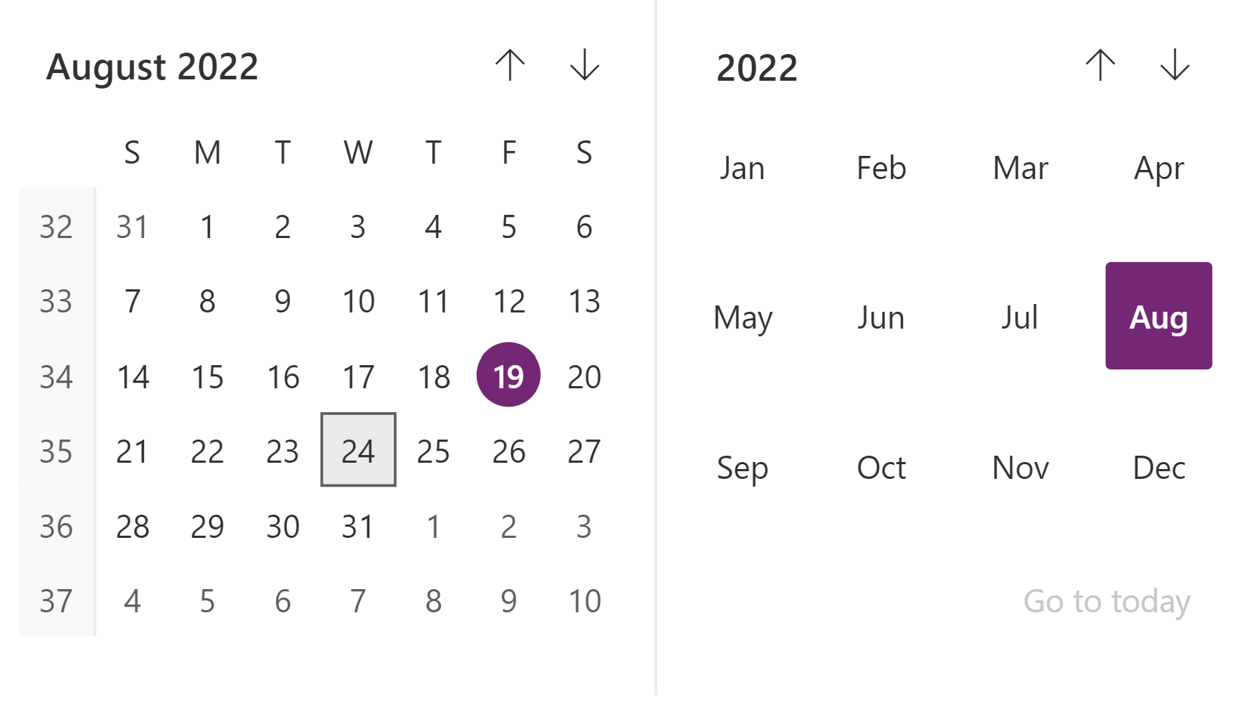
The date value to be pre-selected or Selected after on change event. For e.g. : Today's Date: Today(), Date based on language: DateValue("24/7/2022",Language()), specific regional language: DateValue("24/07/2022","en-GB") |
ShowGoToToday |
Whether the 'Go to Today' option is visible |
MonthPickerVisible |
Whether the month picker is visible |
DayPickerVisible |
Whether the day picker is visible |
HighlightSelectedMonth |
Whether the selected month is highlighted in the calendar |
HighlightCurrentMonth |
Whether the current month is highlighted in the calendar |
ShowWeekNumbers |
Whether the week numbers are visible |
ShowSixWeeksByDefault |
Whether the sixth week is visible by default. |
MinDate |
If specified a date value, navigation beyond that date will not be allowed. For correct format, refer to the example provided for Selected Date. |
MaxDate |
If specified a date value, navigation beyond that date will not be allowed. For correct format, refer to the example provided for Selected Date. |
FirstDayOfWeek |
Select the day to be displayed as first day of week in calendar. |
Style Properties
| Property | Description |
|---|---|
Theme |
Accepts a JSON string that is generated using Fluent UI Theme Designer (windows.net). Leaving this blank will use the default theme defined by Power Apps. See theming for guidance on how to configure. |
BackgroundColor |
Background color for the component. e.g. White or #ffffff |
AccessibilityLabel |
Screen reader aria-label |
Event Properties
| Property | Description |
|---|---|
InputEvent |
An event to send to the control. E.g. SetFocus. See below. |
Behavior
Supports SetFocus as an InputEvent.
Using OnChange
When a date is selected, value can be obtained by the selectedDate output property. Below is a set of sample code which can be added in 'OnChange' property, depending on how to output need to be visualized.
Set(var_SelectedDate, If(!IsBlank(Self.selectedDateValue), Text(Self.selectedDateValue, ShortDate, Language())));
// Example - Output: 7/14/2022
Set(var_SelectedDate, If(!IsBlank(Self.selectedDateValue), Text(Self.selectedDateValue, LongDate, Language())));
// Example - Output: Sunday, July 3, 2022
Set(var_SelectedDate, If(!IsBlank(Self.selectedDateValue), Text(Self.selectedDateValue, ShortDate, "en-GB")));
// Example - Output: 14/07/2022
Setting Focus on the control
When a new dialog is shown, and the default focus should be on the control, an explicit set focus will be needed.
To make calls to the input event, you can set a context variable that is bound to the Input Event property to a string that starts with SetFocus and followed by a random element to ensure that the app detects it as a change.
Example Power Fx formula:
UpdateContext({ctxResizableTextareaEvent:"SetFocus" & Text(Rand())}));
The context variable ctxResizableTextareaEvent would then be bound to the property InputEvent property.
Limitations
This code component can only be used in canvas apps and custom pages.