ExpandMenu control (Experimental)
[This article is pre-release documentation and is subject to change.]
A control used to create a navigation experience.
Important
- This is an experimental feature.
- Experimental features aren’t meant for production use and may have restricted functionality. These features are available before an official release so that customers can get early access and provide feedback.
Description
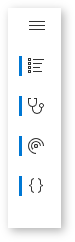
Expand menus are like Nav components used to provide navigation, which consists of links to the main areas of an app or site. You can also expand and collapse the menu, which gives the user an option for more space if they want it. The ExpandMenu control should be used with layout containers to make sure the experience is responsive due to its nature of varying width when the app is played.
This canvas component mimics the style and limited behavior of the Fluent UI Nav control.
Properties
Key properties
| Property | Description |
|---|---|
Items |
A dataset that displays items in the menu. |
IsNavigationEnabled |
Enable to navigate to the item's specified Screen on select |
DefaultExpandValue |
Whether the control is expanded on load |
Items properties
| Property | Description |
|---|---|
Label |
The text to display in the menu item. |
Icon |
Fluent UI Icon by name |
Screen |
App screen that the item will navigate to when selected. |
Example Items property:
Table(
    {
        Icon: "PowerApps",
        Label: "Power Apps",
        Screen:PowerAppsScreen
    },{
        Icon: "PowerBILogo",
        Label: "Power BI",
        Screen:PowerBIScreen
    },{
        Icon: "PowerAutomateLogo",
        Label: "Power Automate",
        Screen:PowerAutomateScreen
    },{
        Icon: "Dataverse",
        Label: "Dataverse",
        Screen:DataverseScreen
    }
)
Style properties
| Property | Description |
|---|---|
Theme |
The Theme object. See theming for guidance on how to configure. |
Event properties
| Property | Description |
|---|---|
OnExpandSelect |
Action formula triggered when the hamburger button is selected |
OnButtonSelect |
Action formula triggered when any of the buttons are selected |
Important
The screen values in the preceding example code are from a sample, and might not exist in your app. Ensure that you replace the screen values with screen names in your app, as appropriate.
Behavior
Expand and collapse
Set the Width property to the following expression. The width values can be adjusted based on the resolution of the app.
If( Self.IsExpanded, 200, 46 )
Limitations
This canvas component can only be used in canvas apps and custom pages.
Feedback
Coming soon: Throughout 2024 we will be phasing out GitHub Issues as the feedback mechanism for content and replacing it with a new feedback system. For more information see: https://aka.ms/ContentUserFeedback.
Submit and view feedback for