Note
Access to this page requires authorization. You can try signing in or changing directories.
Access to this page requires authorization. You can try changing directories.
[This article is pre-release documentation and is subject to change.]
A control used to create a navigation experience.
Important
- This is an experimental feature.
- Experimental features aren’t meant for production use and may have restricted functionality. These features are available before an official release so that customers can get early access and provide feedback.
Description
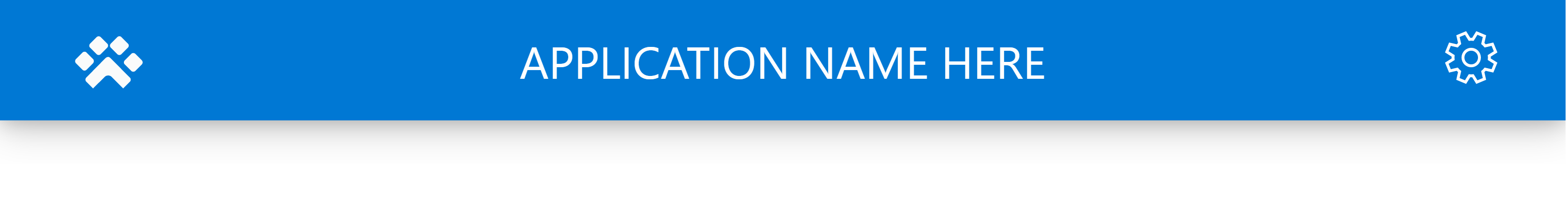
A Header is commonly used to display global app details (e.g., app name or page name) and navigation actions (e.g., navigation to home or back buttons).
The Header component can replace the default Power Apps header if you want different look or behavior.
The control should be used with layout containers to make sure the experience is responsive due to its nature of varying width when the app is played.
This canvas component mimics the style and behavior of the default Power Apps header, and can actually replace it (see Behavior section below).
Properties
Key properties
| Property | Description |
|---|---|
Text |
The text displayed in the center of the control |
BackButtonVisible |
Enable to display the back button, otherwise the LeftButtonImage is displayed (if any) |
LeftButtonImage |
An image that is displayed on the left edge of the control |
LeftButtonVisible |
Enable to display the LeftButtonImage |
RightButtonImage |
An image that is displayed on the right edge of the control |
RightButtonVisible |
Enable to display the RightButtonImage |
ContentWidth |
The width of the content within the control |
Style properties
| Property | Description |
|---|---|
Color |
The color of the control center text |
HeaderFill |
The color of the header's fill, if different from the Theme primary color is desired |
Width |
The width of the control |
Theme |
The theme object. See theming for guidance on how to configure. |
Event properties
| Property | Description |
|---|---|
OnLeftButtonSelect |
Action formula executed when the left button is selected (when displayed) |
OnRightButtonSelect |
Action formula executed when the left button is selected (when displayed) |
OnBackSelect |
Action formula executed when the back button is selected (when displayed) |
Behavior
Replace default Power Apps navigation bar with Header
*Only applies to canvas apps*
If you want to only display the header, you can hide the default navigation bar that is rendered by Power Apps player by sharing the app link with the query parameter hideNavBar:
https://apps.powerapps.com/play/APPID?source=iframe&hidenavbar=true
Where APPID is replaced with your app's value. Note that the parameters are required for it to render without the default navigation bar. Canvas apps that are played without the query parameters, such as directly from the maker portal, will still render the default bar.
Limitations
This canvas component can only be used in canvas apps. It can be used in custom pages, but is likely not needed as pages are embedded in model driven apps.