Note
Access to this page requires authorization. You can try signing in or changing directories.
Access to this page requires authorization. You can try changing directories.
A control used to provide a search experience.
Note
Full documentation and source code found in the GitHub code components repository.
Description
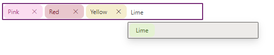
Pickers are used to select one or more items, such as tags or files, from a large list.
Picker code components allow the Fluent UI picker menu components to be used from inside canvas apps and custom pages.
The Tag Picker code component provides the following features:
- Binds to an input collection for the chosen tags.
- Binds to an input collection for suggested tags.
- Allows users to select from suggestions or enter a free-text tag.
- Raises an On Change event when a user adds or removes a tag.
- Allows programmatic Set Focus.
Datasets
The Tag Picker has the following input datasets, which are described in detail in Key properties later in this article.
TagsTagsDisplayName
SuggestionsSuggestionsDisplayNameSuggestionSubDisplayName
The Suggestions dataset should be filtered by using the SearchTerm output property, for example:
Search(colSuggestions,TagPicker.SearchTerm,"name")
Properties
Key properties
| Property | Description |
|---|---|
Items |
A collection (table) of tags. The app is responsible for adding or removing tags in response to the component's raising Add or Remove events (described in the following OnChange event section). |
Suggestions_Items |
A collection (table) of suggestions. |
TagMaxWidth |
The maximum width of the tags when rendering. Overflow text will be truncated with ellipsis's and a hover tooltip shows the full text. |
AllowFreeText |
When typing a value, do not automatically select the first suggestion so that a free text entry can be provided rather than selecting from a pre-defined list. |
SearchTermToShortMessage |
The message to display when the Search Term is less than the MinimumSearchTermLength. |
HintText |
The message to display inside the Picker when no search term is provided. |
NoSuggestionsFoundMessage |
The message to display when the Suggestions collection contains no results. |
MinimumSearchTermLength |
The minimum number of character to trigger the suggestions flyout. |
MaxTags |
The maximum number of tags that can be added. After this number, the Tag Picker will be re-only until a tag is removed. |
Error |
True when the red error border should be displayed. |
Items properties
| Property | Description |
|---|---|
TagsDisplayName |
Set to the name of the column that holds the tag display name. |
Suggestions properties
| Property | Description |
|---|---|
SuggestionsDisplayName |
set to the name of the column that holds the suggestion display name. |
SuggestionsSubDisplayName |
(Optional) set to the name of the column that holds the secondary line of text. |
Style properties
| Property | Description |
|---|---|
Theme |
Accepts a JSON string that is generated using Fluent UI Theme Designer (windows.net). Leaving this blank will use the default theme defined by Power Apps. See theming for guidance on how to configure. |
FontSize |
the font size of the tags shown inside the Picker. |
BorderRadius |
the border radius of the tags shown inside the Picker. |
ItemHeight |
the height of the tags (pixels) shown inside the Picker. |
AccessibilityLabel |
Screen reader aria-label |
Event properties
| Property | Description |
|---|---|
Input Event |
Set to the event to sent to the TagPicker |
Output properties
| Property | Description |
|---|---|
SearchTerm |
The text entered into the Tag Picker that can be used for filtering the suggestions dataset. |
TagsDisplayName |
the text that is used to create a new Tag when the On Change event is fired |
AutoHeight |
When the tag picker wraps onto multiple lines, the Auto Height property can be used to control the height of a responsive container height. |
Behavior
Supports SetFocus as an InputEvent.
OnChange event
The TagPickercomponent raises an OnChange event when tags are added or removed. The properties used are:
| Property | Description |
|---|---|
TagEvent |
The name of the event raised |
TagKey |
The key of the item that has raised the event (if the event is related to a tag) |
The event should contain an expression similar to:
If( TagPicker.TagEvent = "Add" && CountRows(Filter(colTags,name=TagPicker.TagsDisplayName)) = 0,
    Collect( colTags, { name:TagPicker.TagsDisplayName })
);

If( TagPicker.TagEvent="Remove",
 RemoveIf( colTags,name=Text(TagPicker.TagsDisplayName) )
);
Limitations
This code component can only be used in canvas apps and custom pages.