Pivot control
A control used to provide navigation.
Note
Full documentation and source code found in the GitHub code components repository.
Description
The Pivot control and related tabs pattern are used for navigating frequently accessed, distinct content categories. Pivots allow for navigation between two or more content views and rely on text headers to articulate the different sections of content.
This code component provides a wrapper around the Fluent UI Pivot control for use in canvas apps and custom pages.
Properties
Key properties
| Property | Description |
|---|---|
RenderType |
The type of control to render as. |
SelectedKey |
The key to select. This will be updated via the OnChange event when the user interacts with the control. |
Items |
The action items to render |
Items properties
Each item uses the following schema to visualize data in the component.
| Name | Description |
|---|---|
ItemDisplayName |
The Display Name of the nav item |
ItemKey |
The key to use to indicate which item is selected, and when adding sub items. The keys must be unique. |
ItemEnabled |
Set to false if the option is disabled |
ItemVisible |
Set to false if the option is not visible |
ItemChecked |
Set to true if the option is checked (e.g. split buttons in a command bar) |
ItemIconName |
The Fluent UI icon to use (see Fluent UI icons) |
ItemCount |
Show an item count on a Pivot item link. |
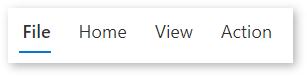
Example:
Table(
  {
      ItemKey: "tabFile",
      ItemDisplayName: "File"
  },
  {
      ItemKey: "tabHome",
      ItemDisplayName: "Home"
  },
  {
      ItemKey: "tabView",
      ItemDisplayName: "View"
  },
  {
      ItemKey: "tabAction",
      ItemDisplayName: "Action"
  }
)
Style properties
| Property | Description |
|---|---|
Theme |
Accepts a JSON string that is generated using Fluent UI Theme Designer (windows.net). Leaving this blank will use the default theme defined by Power Apps. See theming for guidance on how to configure. |
RenderSize |
The pivot control can be rendered in two sizes (large/normal) |
AccessibilityLabel |
Screen reader aria-label |
Event properties
| Property | Description |
|---|---|
InputEvent |
An event to send to the control. E.g. SetFocus. See below. |
Behavior
Supports SetFocus as an InputEvent.
Configure tab behavior
Coordinate tab pages by associating the Visible property of dependent components in your app (for example, a container that represents a page) with the value of Pivot1.Selected.ItemKey.
Visible property of a dependent control that's displayed when the tabFile itemKey is selected:
Pivot1.Selected.ItemKey = "tabFile"
Limitations
This code component can only be used in canvas apps and custom pages.
See more limitation notes in the design challenges section of the GitHub documentation.
Feedback
Coming soon: Throughout 2024 we will be phasing out GitHub Issues as the feedback mechanism for content and replacing it with a new feedback system. For more information see: https://aka.ms/ContentUserFeedback.
Submit and view feedback for