Note
Access to this page requires authorization. You can try signing in or changing directories.
Access to this page requires authorization. You can try changing directories.
A control used to create a loading experience.
Note
Full documentation and source code found in the GitHub code components repository.
Description
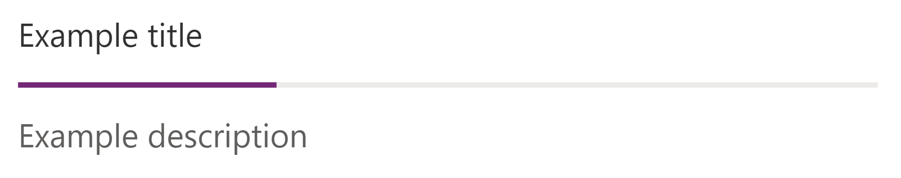
Progress indicators are used to show the completion status of an operation lasting more than two seconds. If the state of progress can't be determined, use a Spinner or use the Indeterminate Indicator type instead. Progress indicators can appear in a new panel, in a flyout window, under the UI that initiated the operation, or they can even replace the initiating UI as long as the UI can return if you cancel or stop the activity.
This code component provides a wrapper around the Fluent UI ProgressIndicator control for use in canvas & custom pages. See component documentation for best practices.
Properties
Key properties
| Property | Description |
|---|---|
Label |
Optional label for spinner. |
Percentage Complete |
Percentage of the operation completed, on the scale of 0 to 1. If not set Indeterminate Indicator will be shown. |
TypeOfIndicator |
Specifies the type of indicator style. Choices: Default Indicator or IndeterminateIndicator |
HideProgressState |
Specify true to hide progress state |
BarHeight |
Specify height of the bar as applicable |
Style properties
| Property | Description |
|---|---|
Theme |
Accepts a JSON string that is generated using Fluent UI Theme Designer (windows.net). Leaving this blank will use the default theme defined by Power Apps. See theming for guidance on how to configure. |
AccessibilityLabel |
Screen reader aria-label |
Behavior
Display loading progress
Make the ProgressIndicator control itself (or the surface it's located within) visible when a process begins, then update a variable with the value as segments of the process are completed. Hide it when the process is complete. Use a variable to control the visibility of the control, and update the values between the major code blocks of the process that need to be indicated.
UpdateContext({ var_showProgress: true , var_progressValue: 0 });

/* Some code ... */

UpdateContext({ var_progressValue: 25 });

/* Some code ... */

UpdateContext({ var_progressValue: 50 });

/* Some code ... */

UpdateContext({ var_progressValue: 75 });

/* Some code ... */

UpdateContext({ var_progressValue: 100 });

Notify("Successfully completed process", NotificationType.Success);

UpdateContext({ var_showProgress: false });
Provide the var_showProgress variable as the value for the Visible property of the ProgressIndicator (or the surface containing it), and assign the var_progressValue variable for the Value property.
Limitations
This canvas component can only be used in canvas apps and custom pages.