ResizableTextArea control
A component for user input.
Note
Full documentation and source code found in the GitHub code components repository.
Description
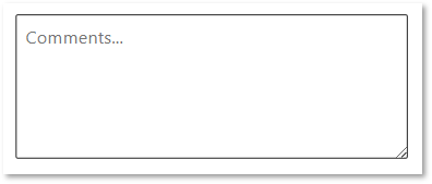
Text areas give people a way to enter and edit text. They're used in forms, modal dialogs, tables, and other surfaces where text input is required.
This component allows the user to resize the text area for convenience.
Note
Component source code and more information in the GitHub code components repository.
Properties
Key properties
| Property | Description |
|---|---|
Text |
The text value set in the control. This is the default bound property when used in a model-driven app. |
Default |
The default value that the control will have when the control is reset, or the default value is changed. This allows the control to work in a similar way to controls inside canvas app forms. |
MaxLength |
The maximum number of characters that can be entered |
HintText |
The text to display when there is no text value set |
EmptyPlaceholderText |
The text to display when there is no value, and the control does not have focus. This provides a similar style when the model-driven text control that displays --- when there is no value populated. |
DefaultHeight |
The height to set the text area to initially.If this is not set in a canvas app/custom page, the size will default to the code component height. For model-driven apps, this is required since the form does not provide an initial height. |
DefaultWidth |
The width to set the text area to initially. If this is not set in a canvas app/custom page, the size will default to the code component height. For model-driven apps, this is not required, since the default width will be the width of the form column. |
MinHeight |
The minimum height that the textarea can be resized to. Set to zero for no limit. |
MaxHeight |
The maximum height that the textarea can be resized to. Set to zero for no limit. |
Min Width |
The minimum width that the textarea can be resized to. Set to zero for no limit. |
MaxWidth |
The maximum width that the textarea can be resized to. Set to zero for no limit. |
AllowResize |
Defines which direction the textarea can be resized in. None, Both, Vertical or Horizontal. |
EnableSpellCheck |
Defines if the textarea should be spell checked by the browser or not. |
Output properties
| Property | Description |
|---|---|
Resized Height** (output) - The user adjusted height | Resized Width** (output) - The user adjusted width |
Style Properties
| Property | Description |
|---|---|
PaddingLeft |
The padding to add inside the textarea |
PaddingRight |
The padding to add inside the textarea |
PaddingTop |
The padding to add inside the textarea |
PaddingBottom |
The padding to add inside the textarea |
Left Padding Adjustment |
Inside a model driven app, even when the label is hidden there is padding on the left of the code component to hold icons (e.g. lock icon). To correct for this, the width must be reduced by setting the Left Padding Adjustment to 21. When there is also a label, the Left Padding Adjustment must be set to the width of the label. |
RenderBorderStyle |
This can be either Normal or Centered. When set to Normal, the border width will increase inside the text area box, however using Centered will center the border around the edge of the text area box. Use Centered to be compatible with the Power Apps Classic controls, and normal for model-driven and Fluent UI controls. |
Accessibility Label |
The aria label |
Not all combinations of style/state are implemented by every component. See the State Dependent Style Properties in the GitHub component documentation.
Event Properties
| Property | Description |
|---|---|
Input Event |
Set the Input Event property to a string starting in SetFocus to set focus on the control. You must include a random suffix for the event to trigger. |
Other properties are the same as the standard text input control.
Behavior
Supports SetFocus as an InputEvent.
Limitations
This code component can only be used in canvas apps, custom pages, and model-driven apps.
See more limitation notes in the design challenges section of the GitHub documentation.
Feedback
Coming soon: Throughout 2024 we will be phasing out GitHub Issues as the feedback mechanism for content and replacing it with a new feedback system. For more information see: https://aka.ms/ContentUserFeedback.
Submit and view feedback for